|
Thanks, I understand the change you recommened, but it doesn't seem to change anything. I have two different issues. I beleive I solved the first one.
- The Projects pane should be expanded on startup BEFORE it loads so the user seees the wait indicator. This bit of code in the MainWindow simulates storing and resetting it from settings later on. if there was an ExpandedExpanded (past-tense) then I could call Load() from there.
Main Window.cs
NavigationPaneInfos = new List<NavigationPaneModel>
{
new NavigationPaneModel
{
Header = "Projects",
NavigationItemType = NavigationItemType.Project,
DataSource = Functional.Apply(Repository.GetNavigationItems, NavigationItemType.Project),
IsExpanded = true
},
new NavigationPaneModel
{
Header = "Inventory",
NavigationItemType = NavigationItemType.Inventory,
DataSource = Functional.Apply(Repository.GetNavigationItems, NavigationItemType.Inventory),
},
new NavigationPaneModel
{
Header = "Companies" ,
NavigationItemType = NavigationItemType.Company,
DataSource = Functional.Apply(Repository.GetNavigationItems, NavigationItemType.Company),
},
new NavigationPaneModel
{
Header = "Employees",
NavigationItemType = NavigationItemType.Employee,
DataSource = Functional.Apply(Repository.GetNavigationItems, NavigationItemType.Employee),
}
};
so, that caused this
private static object CoerceIsPaneExpanded(DependencyObject d, object baseValue)
{
var control = (NavigationPane)d;
var newVal = control._isInitialized ? baseValue : (object)false;
return newVal;
}
and
private void NavigationPane_Initialized(object? sender, EventArgs e)
{
_isInitialized = true;
CoerceValue(IsPaneExpandedProperty);
if (_isPaneExpanded)
{
_ = Load();
}
}
so, I added this, which correctly sets _isPaneExpanded based off the value set in the main window
private static async void OnNavigationPaneModelChanged(DependencyObject d, DependencyPropertyChangedEventArgs e)
{
    var control = (NavigationPane)d;
    var model = e.NewValue as NavigationPaneModel;
    if (model != null)
    {
        control._isPaneExpanded = model.IsExpanded;
    }
}
This is where the UI is freezing up
private async Task Load()
{
if (NavigationPaneModel != null && NavigationPaneModel.DataSource != null)
{
var dataSource = NavigationPaneModel.DataSource();
List<NavigationEntity>? data = null;
if (dataSource != null)
{
data = await Task.Run(() => dataSource);
}
if (data != null)
{
Items = new ObservableCollection<NavigationEntity>(data);
}
}
}
so I tried this but....
private async Task Load()
{
if (NavigationPaneModel != null && NavigationPaneModel.DataSource != null)
{
List<NavigationEntity>? data = null;
await Task.Run(() =>
{
data = NavigationPaneModel.DataSource();
});
if (data != null)
{
Items = new ObservableCollection<NavigationEntity>(data);
}
}
}
So, it seems like all that's left is to get the backend call to fire async. The delegate was set in the UI using
NavigationPaneModel.DataSource = Functional.Apply(Repository.GetNavigationItems, NavigationItemType.Project)
How can I invoke the delegate async from Load()?
I checked my code into the repo.
If it's not broken, fix it until it is.
Everything makes sense in someone's mind.
Ya can't fix stupid.
|
|
|
|
|
I have a CustomControl which contains another custom control. I want to bubble a click event from the Inner Control and handle it on the Window.
Even better, can I somehow bind to the inner control's ButtonClicked command in the Window's VM?
I found this two SO article. It's close, but it doesn't address custom events:
https://stackoverflow.com/questions/65894582/subscribe-to-any-bubbled-up-wpf-child-control-routed-event-without-an-instance-o
Custom Controls
<ResourceDictionary xmlns="http://schemas.microsoft.com/winfx/2006/xaml/presentation"
                    xmlns:x="http://schemas.microsoft.com/winfx/2006/xaml"
                    xmlns:local="clr-namespace:BubblingEventsDemo"
                    xmlns:i="http://schemas.microsoft.com/xaml/behaviors">

    <Style TargetType="{x:Type local:InnerControl}">
        <Setter Property="Template">
            <Setter.Value>
                <ControlTemplate TargetType="{x:Type local:InnerControl}">

                    <Border Background="{TemplateBinding Background}"
                            BorderBrush="{TemplateBinding BorderBrush}"
                            BorderThickness="{TemplateBinding BorderThickness}">

                        <Button Content="Click Me"
                                Height="32"
                                Width="75">

                            <i:Interaction.Triggers>
                                <i:EventTrigger EventName="Click">
                                    <i:InvokeCommandAction Command="{Binding ButtonClickedCommand,
                                                            RelativeSource={RelativeSource TemplatedParent}}"/>
                                </i:EventTrigger>
                            </i:Interaction.Triggers>

                        </Button>

                    </Border>

                </ControlTemplate>
            </Setter.Value>
        </Setter>
    </Style>

    <Style TargetType="{x:Type local:OuterControl}">
        <Setter Property="Template">
            <Setter.Value>
                <ControlTemplate TargetType="{x:Type local:OuterControl}">

                    <Border Background="{TemplateBinding Background}"
                            BorderBrush="{TemplateBinding BorderBrush}"
                            BorderThickness="{TemplateBinding BorderThickness}">

                        <local:InnerControl Height="100"
                                            Width="150"
                                            Background="LightBlue"/>

                    </Border>

                </ControlTemplate>
            </Setter.Value>
        </Setter>
    </Style>

</ResourceDictionary>
Code Behind
using CommunityToolkit.Mvvm.Input;
using System.Windows;
using System.Windows.Controls;
using System.Windows.Input;

namespace BubblingEventsDemo
{
    public class InnerControl : Control
    {
        private ICommand? _ButtonClickedCommand;
        public ICommand ButtonClickedCommand
        {
            get
            {
                if (_ButtonClickedCommand == null)
                    _ButtonClickedCommand = new RelayCommand(ButtonClickedExecuted, ButtonClickedCanExecute);
                return _ButtonClickedCommand;
            }
        }

        public static readonly RoutedEvent ButtonClickedEvent =
                    EventManager.RegisterRoutedEvent("ButtonClicked",
                    RoutingStrategy.Bubble,
                    typeof(RoutedEventHandler),
                    typeof(InnerControl));

        public event RoutedEventHandler ButtonClicked
        {
            add { AddHandler(ButtonClickedEvent, value); }
            remove { RemoveHandler(ButtonClickedEvent, value); }
        }

        static InnerControl()
        {
            DefaultStyleKeyProperty.OverrideMetadata(typeof(InnerControl),
                new FrameworkPropertyMetadata(typeof(InnerControl)));
        }

        private bool ButtonClickedCanExecute()
        {
            return true;
        }

        private void ButtonClickedExecuted()
        {
            RaiseEvent(new RoutedEventArgs(ButtonClickedEvent));
        }
    }
}
Window XAML
<Window x:Class="BubblingEventsDemo.UI.MainWindowView"
        xmlns="http://schemas.microsoft.com/winfx/2006/xaml/presentation"
        xmlns:d="http://schemas.microsoft.com/expression/blend/2008"
        xmlns:x="http://schemas.microsoft.com/winfx/2006/xaml"
        xmlns:i="http://schemas.microsoft.com/xaml/behaviors"
        xmlns:mc="http://schemas.openxmlformats.org/markup-compatibility/2006"
        xmlns:ctrls="clr-namespace:BubblingEventsDemo;assembly=BubblingEventsDemo"
        mc:Ignorable="d"
        Title="MainWindow"
        Height="450"
        Width="800">

    <Grid>

        <ctrls:OuterControl Background="Tan"
                            Height="225"
                            Width="300"
                            ctrls:InnerControl.ButtonClicked="OuterControl_ButtonClicked"> <==== THIS CATCHES THE EVENT IN THE WINDOW'S CODE BEHIND

            <i:Interaction.Triggers>

                WHAT I WANT IS TO HANDLE IT IN THE VIEW MODEL. WHAT GOES HERE IN 'EventName'?

                <i:EventTrigger EventName="OuterControl_ButtonClicked">
                    <i:InvokeCommandAction Command="{Binding ButtonClickedCommand, RelativeSource={RelativeSource TemplatedParent}}"/>
                </i:EventTrigger>
            </i:Interaction.Triggers>

        </ctrls:OuterControl>

    </Grid>

</Window>
If it's not broken, fix it until it is.
Everything makes sense in someone's mind.
Ya can't fix stupid.
modified 12-May-23 11:15am.
|
|
|
|
|
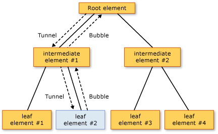
Handling an event higher up is "tunneling"; i.e. "Preview..." handlers.
"Before entering on an understanding, I have meditated for a long time, and have foreseen what might happen. It is not genius which reveals to me suddenly, secretly, what I have to say or to do in a circumstance unexpected by other people; it is reflection, it is meditation." - Napoleon I
|
|
|
|
|
|
Handling it "higher" up BEFORE it goes DOWN, is "tunneling".
The PARENT is the WINDOW ... and PREVIEW allows the PARENT to HANDLE the event before, or instead of, or in conjunction with ... the CHILD (i.e. the UC).
This is called TUNNELING.
"Before entering on an understanding, I have meditated for a long time, and have foreseen what might happen. It is not genius which reveals to me suddenly, secretly, what I have to say or to do in a circumstance unexpected by other people; it is reflection, it is meditation." - Napoleon I
|
|
|
|
|
Bubbling vs Tunneling[^]
Again, I'm trying to handle an event in the Window that was invoked in the nested child control. The event is defined as Bubbling, therefore it goes UP the UI stack
If it's not broken, fix it until it is.
Everything makes sense in someone's mind.
Ya can't fix stupid.
|
|
|
|
|
I have solved similar things before with the use of an attached behavior so you use that to bind the command to a property in the VM
|
|
|
|
|
Thanks. Do you have an example of that?
If it's not broken, fix it until it is.
Everything makes sense in someone's mind.
Ya can't fix stupid.
|
|
|
|
|
You will need to install the NuGet:
NuGet Gallery | Microsoft.Xaml.Behaviors.Wpf 1.1.39[^]
Then create a class like this one:
public class ButtonAttatchment:Behavior<Button>
{

    protected override void OnAttached()
    {
        AssociatedObject.Click += AssociatedObject_Click;
    }

    protected override void OnDetaching()
    {
        AssociatedObject.Click -= AssociatedObject_Click;
    }


    private void AssociatedObject_Click(object sender, System.Windows.RoutedEventArgs e)
    {
        if (AssociatedObject != null)
        {
            ((ButtonAttatchment)sender).IsSpinning = !((ButtonAttatchment)sender).IsSpinning;
        }
    }

    public static readonly DependencyProperty IsSpinningProperty = DependencyProperty.Register("IsSpinning", typeof(bool),typeof(ButtonAttatchment), new UIPropertyMetadata(false));

    public bool IsSpinning
    {
        get => (bool)GetValue(IsSpinningProperty);
        set => SetValue(IsSpinningProperty, value);
    }

}
This basically creates a code-behind implementation that you could use to fix complicated binding issues.
|
|
|
|
|
Thanks. I'll give it a shot
If it's not broken, fix it until it is.
Everything makes sense in someone's mind.
Ya can't fix stupid.
|
|
|
|
|
The XAML code is like this:
<Window x:Class="WPF_Tunneling_AttatchedBehavior.MainWindow"
        xmlns="http://schemas.microsoft.com/winfx/2006/xaml/presentation"
        xmlns:x="http://schemas.microsoft.com/winfx/2006/xaml"
        xmlns:d="http://schemas.microsoft.com/expression/blend/2008"
        xmlns:mc="http://schemas.openxmlformats.org/markup-compatibility/2006"
        xmlns:behavior="http://schemas.microsoft.com/xaml/behaviors"
        xmlns:local="clr-namespace:WPF_Tunneling_AttatchedBehavior"
        mc:Ignorable="d"
        Title="MainWindow" Height="450" Width="800">
    <StackPanel>
        <Button Content="Test">
            <behavior:Interaction.Behaviors>
                <local:ButtonAttatchment x:Name="vm"/>
            </behavior:Interaction.Behaviors>

        </Button>
        <TextBox Text="{Binding ElementName=vm,Path=IsSpinning}"></TextBox>
    </StackPanel>
</Window>
And I made a slight mistake but Im sure you have figured it out by now:
private void AssociatedObject_Click(object sender, System.Windows.RoutedEventArgs e)
        {
            if (AssociatedObject != null)
            {
                IsSpinning = !IsSpinning;
            }
        }
|
|
|
|
|
Thanks for the code, but I'm not sure if this solves my issue.
jFirst, see this image[^]. Second, see this[^]. It's almost what I want.
There's got to be a way to do this. I put a demo in this repo[^]. See the MainWIndow's XAML.
If it's not broken, fix it until it is.
Everything makes sense in someone's mind.
Ya can't fix stupid.
|
|
|
|
|
Ok, I don't really see what you are getting at but it can be solved extremley easy:
<Grid PreviewMouseDown="Grid_PreviewMouseDown">

    <ctrls:OuterControl Background="Tan"
                        Height="225"
                        Width="300">
And
private void Grid_PreviewMouseDown(object sender, System.Windows.Input.MouseButtonEventArgs e)
{
    if (e.OriginalSource != null)
    {

    }
}
|
|
|
|
|
Referring to the first pic with all the nested controls, I have this Routed even deep inside MyNewControl
public static readonly RoutedEvent ItemSelectedEvent =
EventManager.RegisterRoutedEvent("ItemSelected",
RoutingStrategy.Tunnel,
typeof(RoutedEventHandler),
typeof(NavigationPane));
public event RoutedEventHandler ItemSelected
{
add { AddHandler(ItemSelectedEvent, value); }
remove { RemoveHandler(ItemSelectedEvent, value); }
}
private void RaiseItemSelectedEvent()
{
vars args = new SelectedItemEventArgs(ItemSelectedEvent, SelectedItem);
RaiseEvent(args);
}
How do I catch this event in the window? What is the syntax? Using some kind of Preview_... is going to catch a LOT of events. Is there no way to subscribe directly to that event from the Window?
If it's not broken, fix it until it is.
Everything makes sense in someone's mind.
Ya can't fix stupid.
|
|
|
|
|
I've got a listbox with expanders[^] in it.
The problem is that expander's header content is not stretched. I've tried all kinds of things, but I can't seem to get it. Here's the XAML
<Expander Padding="{Binding Padding, RelativeSource={RelativeSource TemplatedParent}}"
        Margin="{Binding Margin, RelativeSource={RelativeSource TemplatedParent}}"
        BorderBrush="{Binding BorderBrush, RelativeSource={RelativeSource TemplatedParent}}"
        BorderThickness="{Binding BorderThickness, RelativeSource={RelativeSource TemplatedParent}}"
        ScrollViewer.HorizontalScrollBarVisibility="Auto"
        ScrollViewer.VerticalScrollBarVisibility="Auto"
        IsExpanded="{Binding IsPaneExpanded, RelativeSource={RelativeSource TemplatedParent}}">

    <Expander.Header>

        <Grid>

            <Grid.ColumnDefinitions>
                <ColumnDefinition Width="*"/>
                <ColumnDefinition Width="Auto"/>
            </Grid.ColumnDefinitions>

            <TextBlock Text="{Binding Header}"
                    HorizontalAlignment="Left"
                    VerticalAlignment="Center"
                    Margin="1"/>

            <Button Grid.Column="1"
                    Height="18"
                    Width="18"
                    Margin="0,1,1,1"/>

        </Grid>

    </Expander.Header>

    <CONTENT REMOVED FOR BREVITY>

</Expander>
If it's not broken, fix it until it is.
Everything makes sense in someone's mind.
Ya can't fix stupid.
|
|
|
|
|
Stretching Content in an Expander Header | Josh Smith on WPF[^]
The width binding trick won't work, as it will push the button outside of the available space. But the code-behind trick should be OK.
"These people looked deep within my soul and assigned me a number based on the order in which I joined."
- Homer
|
|
|
|
|
That did it.
I saw this article already and tried the XAML approach. I should have hep reading.
Thanks
If it's not broken, fix it until it is.
Everything makes sense in someone's mind.
Ya can't fix stupid.
|
|
|
|
|
Does anyone have any good example code that demonstrates drag and drop for LISTBOX and TREEVIEWs?
I need this using VB.NET WPF in specific!
Thanks for the help!
|
|
|
|
|
|
|
I have a listbox bound to an entity called NavigationItemEntity which displays hyperlinks as the list items:
XAML
<ListBox x:Name="itemsList"
            ItemsSource="{Binding Items, RelativeSource={RelativeSource TemplatedParent}}"
            ScrollViewer.HorizontalScrollBarVisibility="Auto"
            ScrollViewer.VerticalScrollBarVisibility="Auto"
            Margin="2"
            BorderBrush="Transparent"
            BorderThickness="0">

    <ListBox.ItemTemplate>
        <DataTemplate>

            <TextBlock>

                <local:MaroisHyperlink LinkText="{Binding Caption}">

                    <i:Interaction.Triggers>
                        <i:EventTrigger EventName="LinkClicked">
                            <i:InvokeCommandAction Command="{Binding RelativeSource={RelativeSource FindAncestor,
                                                                        AncestorType={x:Type local:MaroisNavigationPane}},
                                                                        Path=ItemClickedCommand}"
                                                    CommandParameter="{Binding Path=SelectedItem,ElementName=itemsList}"/>
                        </i:EventTrigger>
                    </i:Interaction.Triggers>

                </local:MaroisHyperlink>

        </TextBlock>

        </DataTemplate>
    </ListBox.ItemTemplate>

</ListBox>
Code behind
private ICommand _ItemClickedCommand;
public ICommand ItemClickedCommand
{
    get
    {
        if (_ItemClickedCommand == null)
            _ItemClickedCommand = new RelayCommand<NavigationEntity>(p => ItemClickedExecuted(p), p => ItemClickedCanExecute(p));
        return _ItemClickedCommand;
    }
}

private bool ItemClickedCanExecute(NavigationEntity args)
{
    return true;
}

private void ItemClickedExecuted(NavigationEntity args)
{
    RaiseItemClickedEvent(args.Id, args.ItemType);
}
The problem is that if I first don't click the list item, but just the link, then the link is sent as the command parameter. If I first click the list item, THEN click the link, then entity is passed, which is what I want.
How can I force the list item to be selected when its link is clicked?
If it's not broken, fix it until it is.
Everything makes sense in someone's mind.
Ya can't fix stupid.
|
|
|
|
|
When you click the link, it doesn't select the item first, so the SelectedItem won't be what you're expecting.
Try using:
CommandParameter="{Binding}"
"These people looked deep within my soul and assigned me a number based on the order in which I joined."
- Homer
|
|
|
|
|
That did it. Thanks
If it's not broken, fix it until it is.
Everything makes sense in someone's mind.
Ya can't fix stupid.
|
|
|
|
|
I created this dummy control to ask the question... It's a TextBox with 2 buttons.
If I wanted to give this control in an assembly to another developer, how would they modify the style to fit their needs? You can see I have named my brushes with some care, but what about changing triggers or maybe animations and other things? If this is all inside an assembly, how does the developer know how the style works what the style does?
Generica.xaml
<ResourceDictionary xmlns="http://schemas.microsoft.com/winfx/2006/xaml/presentation"
                    xmlns:x="http://schemas.microsoft.com/winfx/2006/xaml"
                    xmlns:local="clr-namespace:MyControl">

    <SolidColorBrush x:Key="Button.Normal.Foreground" Color="SteelBlue"/>
    <SolidColorBrush x:Key="Button.Normal.Background" Color="BlanchedAlmond"/>
    <SolidColorBrush x:Key="Button.Normal.Border" Color="DarkGray"/>
    <SolidColorBrush x:Key="Button.Hover.Background" Color="Orange"/>
    <SolidColorBrush x:Key="Button.Hover.Border" Color="#FF3C7FB1"/>
    <SolidColorBrush x:Key="Button.Pressed.Foreground" Color="Salmon"/>
    <SolidColorBrush x:Key="Button.Pressed.Background" Color="#FF737B7F"/>
    <SolidColorBrush x:Key="Button.Pressed.Border" Color="#FF2C628B"/>
    <SolidColorBrush x:Key="Button.Disabled.Foreground" Color="DarkGray"/>
    <SolidColorBrush x:Key="Button.Disabled.Background" Color="#FFF4F4F4"/>

    <SolidColorBrush x:Key="TextBlock.Normal.Foreground" Color="SteelBlue"/>
    <SolidColorBrush x:Key="TextBlock.Normal.Background" Color="BlanchedAlmond"/>
    <SolidColorBrush x:Key="TextBlock.Normal.Border" Color="DarkGray"/>
    <SolidColorBrush x:Key="TextBlock.Hover.Background" Color="#FFBEE6FD"/>
    <SolidColorBrush x:Key="TextBlock.Hover.Foreground" Color="Blue"/>
    <SolidColorBrush x:Key="TextBlock.Hover.Border" Color="#FF3C7FB1"/>
    <SolidColorBrush x:Key="TextBlock.Pressed.Foreground" Color="Blue"/>
    <SolidColorBrush x:Key="TextBlock.Pressed.Background" Color="#FF737B7F"/>
    <SolidColorBrush x:Key="TextBlock.Pressed.Border" Color="#FF2C628B"/>
    <SolidColorBrush x:Key="TextBlock.Disabled.Foreground" Color="DarkGray"/>
    <SolidColorBrush x:Key="TextBlock.Disabled.Background" Color="#FFF4F4F4"/>

    <SolidColorBrush x:Key="TextBox.Normal.Foreground" Color="SteelBlue"/>
    <SolidColorBrush x:Key="TextBox.Normal.Background" Color="White"/>
    <SolidColorBrush x:Key="TextBox.Normal.Border" Color="DarkGray"/>
    <SolidColorBrush x:Key="TextBox.Hover.Background" Color="#FFBEE6FD"/>
    <SolidColorBrush x:Key="TextBox.Hover.Border" Color="#FF3C7FB1"/>
    <SolidColorBrush x:Key="TextBox.Pressed.Background" Color="#FF737B7F"/>
    <SolidColorBrush x:Key="TextBox.Pressed.Border" Color="#FF2C628B"/>
    <SolidColorBrush x:Key="TextBox.Disabled.Foreground" Color="DarkGray"/>
    <SolidColorBrush x:Key="TextBox.Disabled.Background" Color="#FFF4F4F4"/>

    <Geometry x:Key="addButtonPathData">
        M20 14H14V20H10V14H4V10H10V4H14V10H20V14Z
    </Geometry>

    <Geometry x:Key="removeButtonPathData">
        M20 14H4V10H20V14Z
    </Geometry>

    <Style x:Key="pathImageButtonStyle"
           TargetType="{x:Type local:PathImageButton}">

        <Setter Property="Background" Value="{StaticResource Button.Normal.Background}"/>
        <Setter Property="Height" Value="35"/>
        <Setter Property="Width" Value="75"/>

        <Setter Property="Template">

            <Setter.Value>

                <ControlTemplate TargetType="{x:Type local:PathImageButton}">

                    <Grid x:Name="Grid">

                        <Border x:Name="border"
                                Margin="2"
                                Background="{StaticResource Button.Normal.Background}"
                                BorderBrush="DarkGray"
                                BorderThickness="1"
                                CornerRadius="5">

                            <Grid>

                                <Grid.ColumnDefinitions>
                                    <ColumnDefinition Width="Auto"/>
                                    <ColumnDefinition Width="*"/>
                                </Grid.ColumnDefinitions>

                                <Path Grid.Column="0"
                                      x:Name="path"
                                      HorizontalAlignment="Center"
                                      VerticalAlignment="Center"
                                      Data="{Binding PathData, RelativeSource={RelativeSource TemplatedParent}}"
                                      Fill="{StaticResource Button.Normal.Foreground}"
                                      Stretch="Uniform"
                                      Margin="4"/>

                                <TextBlock Grid.Column="1"
                                           x:Name="caption"
                                           Text="{Binding Caption, RelativeSource={RelativeSource TemplatedParent}}"
                                           Foreground="{StaticResource TextBlock.Normal.Foreground}"
                                           Background="{StaticResource TextBlock.Normal.Background}"
                                           HorizontalAlignment="Left"
                                           VerticalAlignment="Center"
                                           Margin="0,2,2,2"/>

                            </Grid>

                        </Border>

                    </Grid>

                    <ControlTemplate.Triggers>

                        <Trigger Property="IsMouseOver" Value="true">
                            <Setter TargetName="path" Property="Fill" Value="{StaticResource Button.Normal.Foreground}" />
                            <Setter TargetName="caption" Property="Foreground" Value="{StaticResource TextBlock.Hover.Foreground}" />
                            <Setter TargetName="border" Property="Background" Value="{StaticResource Button.Hover.Background}" />
                            <Setter TargetName="border" Property="BorderBrush" Value="{StaticResource Button.Hover.Border}" />
                            <Setter TargetName="border" Property="BorderThickness" Value="1" />
                        </Trigger>

                        <Trigger Property="IsPressed" Value="true">
                            <Setter TargetName="path" Property="Fill" Value="{StaticResource Button.Pressed.Foreground}" />
                            <Setter TargetName="caption" Property="Foreground" Value="{StaticResource TextBlock.Pressed.Foreground}" />
                            <Setter TargetName="border" Property="BorderBrush" Value="{StaticResource Button.Pressed.Foreground}" />
                            <Setter TargetName="border" Property="BorderThickness" Value="1" />
                        </Trigger>

                        <Trigger Property="IsEnabled" Value="false">
                            <Setter TargetName="path" Property="Fill" Value="{StaticResource Button.Disabled.Foreground}" />
                            <Setter TargetName="caption" Property="Foreground" Value="{StaticResource TextBlock.Disabled.Foreground}" />
                            <Setter TargetName="border" Property="BorderBrush" Value="{StaticResource Button.Disabled.Foreground}" />
                            <Setter TargetName="border" Property="BorderThickness" Value="0" />
                        </Trigger>

                    </ControlTemplate.Triggers>

                </ControlTemplate>

            </Setter.Value>

        </Setter>

    </Style>

    <Style x:Key="buttonBaseStyle"
           BasedOn="{StaticResource pathImageButtonStyle }"
           TargetType="{x:Type local:PathImageButton}">

        <Setter Property="Height" Value="32"/>
        <Setter Property="Width" Value="100"/>

    </Style>

    <Style x:Key="addButtonStyle"
           BasedOn="{StaticResource buttonBaseStyle }"
           TargetType="{x:Type local:PathImageButton}">

        <Setter Property="Caption" Value="Add"/>
        <Setter Property="PathData" Value="{StaticResource addButtonPathData}"/>

    </Style>

    <Style x:Key="removeButtonStyle"
           BasedOn="{StaticResource buttonBaseStyle }"
           TargetType="{x:Type local:PathImageButton}">

        <Setter Property="Caption" Value="Remove"/>
        <Setter Property="PathData" Value="{StaticResource removeButtonPathData}"/>

    </Style>

    <Style TargetType="{x:Type local:CustomControl1}">
        <Setter Property="Template">
            <Setter.Value>
                <ControlTemplate TargetType="{x:Type local:CustomControl1}">

                    <Border Background="{TemplateBinding Background}"
                            BorderBrush="{TemplateBinding BorderBrush}"
                            BorderThickness="{TemplateBinding BorderThickness}"
                            Width="{Binding Width, RelativeSource={RelativeSource TemplatedParent}}">

                        <Grid>

                            <Grid.RowDefinitions>
                                <RowDefinition Height="Auto"/>
                                <RowDefinition Height=""/>
                                <RowDefinition Height="Auto"/>
                            </Grid.RowDefinitions>
                            <Grid.ColumnDefinitions>
                                <ColumnDefinition Width=""/>
                            </Grid.ColumnDefinitions>

                            <StackPanel Grid.Row="0"
                                        Grid.Column="0"
                                        Orientation="Horizontal"
                                        HorizontalAlignment="Stretch">

                                <TextBox Background="{StaticResource TextBox.Normal.Background}"
                                         FontSize="18"
                                         VerticalContentAlignment="Center"
                                         Width="250"
                                         Margin="2"/>

                                <local:PathImageButton Style="{StaticResource addButtonStyle}"/>

                                <local:PathImageButton Style="{StaticResource removeButtonStyle}"
                                                       IsEnabled="True"/>

                            </StackPanel>

                        </Grid>

                    </Border>
                </ControlTemplate>
            </Setter.Value>
        </Setter>
    </Style>

</ResourceDictionary>
If it's not broken, fix it until it is.
Everything makes sense in someone's mind.
Ya can't fix stupid.
|
|
|
|
|
Well, the easiest way to let people know is if you document the styles just the way you have here. If people want to adjust the triggers and templates, they can see what is affected just by reading the documentation.
|
|
|
|
|


 General
  News
News  Suggestion
  Question
  Bug
Bug  Answer
  Joke
Joke  Praise
  Rant
Rant  Admin
Admin 


 Submit an article or tip


