
WPF Custom Visualization Part 3 of some: Templates
5.00/5 (4 votes)
(Yet Another) Investigation of WPF Templates
Content
- Introduction
- Ways of Customization
- Templates in WPF: we're not just tweaking some properties here, this is much bigger
- ControlTemplates: if it acts like a button, it is a button (allthough it doesn't look like one)
- DataTemplates: give me a type and I'll show you the values
- DataTemplateSelector: give me a value and I'll show you the values (in some specific way)
- HierarchicalDataTemplate: give me a hierarchy and I'll show you the values and their children
- Reach out: accessing properties of the templated control from within the template
- Get in: accessing elements in the template from the templated control
- Get notified: binding events in the Template
- A somewhat special case: the ItemsControl
- Conclusion
- Version history
Introduction
This series of articles is a deep dive into the possibilities for customization of controls in WPF. Allthough there are allready various articles explaining the possibilities of customizing WPF controls, I wanted this one to provide an extensive explanation on the subject and also to provide examples on what works but also on what doesn't.
Of course, it is up to you to decide if I succeeded.
The article only handles using XAML as a way for customization (with some exceptions if certain things require coding)
Ways of Customization
WPF provides 2 main ways of customizing controls:
- Styling: with Styling you can set various properties on the controls.
- Templating: with Templating you can completely replace the standard look of your control with something else.
For this, I split the series in N parts, for which I currently have the following planned:
- WPF Custom Visualization Part 1 of N: Styling
- WPF Custom Visualization Part 2 of N: Styling with Triggers
- WPF Custom Visualization Intermezzo: Resources
- WPF Custom Visualization Intermezzo 2: Binding
- WPF Custom Visualization Part 3 of N: Templating (this article)
- WPF Custom Visualization Part 4 of N: Adorners
Templates in WPF: we're not just tweaking some properties here, this is much bigger
When using Styles and Triggers we where able to change some of the existing properties of a control, but we couldn't change the visuals of the control fundamentally: we could change the backgroundcolor of for example a button or change its foregroundcolor when certain things where happening, but we couldn't make it a circular button.
But with templates we can: each control in WPF is constructed from a set of drawing primitive which together make the default controltemplate. And what WPF allows us to do is replace this controltemplate with one of our own, thus replacing the standard visuals of a control. The phrasing "Drawing Primitives" is perhaps a bit misleading or too narrow: you can use other controls inside the template of the control you are redefining.
But not only that, we can even change the template used depending on the type of data shown by the control!
To enable this WPF has two kinds of templates:
- ControlTemplate: specifies the primitives to use to draw a control.
- DataTemplate: specifies the primitives to use when drawing certain type of data.
Well, let's just jump in...
ControlTemplates: if it acts like a button, it is a button (allthough it doesn't look like one)
Concepts
As stated above, this allows you to completely replace the visuals used to display a control.
If you take a tool like Snoop and inspect a Window with a Button on it, you will see something like the following:

What we see here is not just two objects, but between the Window and the Button are a number of other elements and the button itself also contains a numebr of other elements Thus:
- The window is composed of a number of primitives
- The button itself is also composed of a number of primitives
This makes clear how WPF works under the hood: each control is a composition of various primitives which together create the visuals of a control. This composition is also called the Visual Tree. It gets constructed from what is called the Logical Tree. You can read Josh Smith's article for a clear explanation on how they relate but a long story short (and not entirely correct): the Logical Tree is defined by the controls you place in for example a Window and the Visual Tree is defined by the primitives used to render your control. And these primitives are defined by the ControlTemplate of which each control has a default one.
How to do it?
Let's consider a default button. We can specify the Content of the button by providing a value for the Content property of the Button:
<!-- no templates applied -->
<Button Grid.Row="0" Content="A default button" />
<Button Grid.Row="1" >
	<TextBox Text="A button with some strange content" />
</Button>
This results in following visuals:

A first remark here: the first button looks like the buttons we are familiar with. The second button however looks somewhat strange: because we specify a Control for the Content, WPF renders this control directly inside the button. This hasn't really anything to do with Templates but everything with the way WPF works. (Although this is not entirely the truth as you will see shortly)
So, how can we replace the default template? The basic way is to specify the Template property
<ControlTemplate x:Key="templateWithNoContent" TargetType="{x:Type Button}">
	<Border Background="Red" />
</ControlTemplate>

<Button Content="A (wrongly) templated button" Template="{StaticResource ResourceKey=templateWithNoContent}" />
This results in following visuals:

There is however a problem: where is the content of our button? The solution is simple: you must specify a ContentPresenter in your template and bind it to the Content property of your button. This is not specific for Buttons but is true for all ContentControl derived controls. Also, there are two correct ways of "binding" to the Content property of our control:
- The first one is to specify a
TargetTypeon theControlTemplateinstance: WPF will then automatically bind to theContentproperty of the specifiedTargetType - The second way is to explicitly bind to the control's, in this case a
Button,Contentproperty.
<!-- specifying the TargetType -->
<ControlTemplate x:Key="templateWithContentAndTargetType" TargetType="{x:Type Button}">
	<Border BorderBrush="Green" BorderThickness="5" >
		<ContentPresenter />
	</Border>
</ControlTemplate>

<Button Grid.Row="3" Content="A (rightly) templated button with TargetType" Template="{StaticResource ResourceKey=templateWithContentAndTargetType}" />


<!-- binding to the Content property -->
<ControlTemplate x:Key="templateWithContentAndExpliciteBinding" >
	<Border BorderBrush="Green" BorderThickness="5" >
		<ContentPresenter Content="{TemplateBinding ContentControl.Content}"/>
	</Border>
</ControlTemplate>

<Button Grid.Row="4" Content="A (rightly) templated button with Explicite binding" Template="{StaticResource ResourceKey=templateWithContentAndExpliciteBinding}" />
Both of these result in the same visuals:

Notice how in the second case we are binding to the Content property of the templated Control by using a so called TemplateBinding. This is a type of binding which allows you to reference the properties of the templated Control inside the Template. We will discuss it in more detail further.
In the above we simply specified our template using resources but we can of course use various permutations of what we have learned in our previous article to specify our template: using styles to set the Template we can apply it to a single specific control or to every instance of a type. But it will probably be clear that this does what it does because of the way Styles work and in essence has nothing to do with Templates.
And while we are at the subject of Styles: what happens if we define a template for a control and use that control inside a Template? Will the Style be applied also inside the Template? And more generally, if we define a Style for something and use that something inside a template, what will happen? Let us find out. The general rule is No, the Style will not be applied if it is implicit, meaning it does not have a key specified but only a targettype. There is however a noteable exception: Controls.
So, in practice we have the following:
<Border Grid.Row="11">
<!-- How far so styles reach? Are they also applied in Templates? -->
	<Border.Resources>
		<Style TargetType="TextBox" >
			<Style.Setters>
				<Setter Property="Background" Value="Red" />
			</Style.Setters>
		</Style>
		<Style TargetType="TextBlock">
			<Style.Setters>
				<Setter Property="Background" Value="Blue" />
			</Style.Setters>
		</Style>
		<Style x:Key="textboxWithKey" TargetType="TextBlock">
			<Style.Setters>
				<Setter Property="Background" Value="Green" />
			</Style.Setters>
		</Style>
	</Border.Resources>
	<StackPanel>
		<TextBox Text="Default text"/>
		<Button>
			<TextBox Text="Textbox as content of button"/>
		</Button>
		<Button>
			<Button.Template>
				<ControlTemplate TargetType="{x:Type Button}">
					<Grid>
						<Grid.ColumnDefinitions>
							<ColumnDefinition Width="*" />
							<ColumnDefinition Width="*" />
							<ColumnDefinition Width="*" />
							<ColumnDefinition Width="*" />
						</Grid.ColumnDefinitions>
						<TextBox Grid.Column="0" Text="textbox inside a ControlTemplate" />
						<TextBlock Grid.Column="1" Text="textblock inside a ControlTemplate" />
						<TextBlock Style="{StaticResource textboxWithKey}" Grid.Column="2" Text="textblock inside a ControlTemplate (with a key)" />
						<ContentPresenter Grid.Column="3" />
					</Grid>
				</ControlTemplate>
			</Button.Template>
			<Button.Content>
				De content van de button
			</Button.Content>
		</Button>
	</StackPanel>
</Border>
Notice how the Style is applied to the TextBox but not to the TextBlock, unless we reference it with a x:Key

There is however one way to circumvent this: apply the style in the resource section of the application
DataTemplates: give me a type and I'll show you the values
Concepts
In the above we replaced our Button template with a totally new look. But you may have wondered how WPF got to display the actual content of the button? After all, what we replaced was everything around the content, but where this content is to be rendered we simply put a ContentPresenter.
When using Snoop, you will see that WPF uses primitives to render our content. But where do those come from? Enter DataTemplates.
How to do it?
We have following resources defined:
<Window.Resources>
	<local:CustomData x:Key="theContent" DataMember1="1" DataMember2="DM2_CONTENT" XCoord="11" YCoord="12" />
	<local:CustomContext x:Key="theDataContext" DataContextBrush="Yellow" />
	<local:CustomData x:Key="theContentForContext" DataMember1="2" DataMember2="DM2_CONTEXT" XCoord="21" YCoord="22" />
	<local:CustomContext x:Key="theDataContextWithContent" DataContextBrush="Orange" TheData="{StaticResource theContentForContext}" />
</Window.Resources>
Then we have a label which uses one of the resources for its Content, but no DataTemplate defined. Notice how the value returned by the ToString() method of the class is used.
<StackPanel Grid.Row="0">
	<Label Content="{StaticResource theContent}" />
	<Label Content="{StaticResource theOtherContent}" />
</StackPanel>
This results in following visuals:

Ok, so here is a simple usage of a DataTemplate:
<StackPanel.Resources>
	<DataTemplate DataType="{x:Type local:CustomData}" >
		<Grid>
			<Grid.ColumnDefinitions>
				<ColumnDefinition />
				<ColumnDefinition />
			</Grid.ColumnDefinitions>
			<Grid.RowDefinitions>
				<RowDefinition />
				<RowDefinition />
				<RowDefinition />
				<RowDefinition />
			</Grid.RowDefinitions>
			<Border Grid.Column="0" Grid.Row="0" Background="Blue">
				<!-- This property only exists on the type used as a DataContext and not on the type used for the Content -->
				<Label Background="{Binding DataContextBrush}" Content="RS.Type.DataMember1" />
			</Border>
			<TextBlock Grid.Column="1" Grid.Row="0" Text="{Binding DataMember1}" />
			<Label Grid.Column="0" Grid.Row="1" Content="RS.Type.DataMember2" />
			<TextBlock Grid.Column="1" Grid.Row="1" Background="Green" Text="{Binding DataMember2}" />
			<Label Grid.Column="0" Grid.Row="2" Background="Red" Content="RS.Type.XCoord" />
			<TextBlock Grid.Column="1" Grid.Row="2" Text="{Binding XCoord}" />
			<Label Grid.Column="0" Grid.Row="3" Content="RS.Type.YCoord" />
			<TextBlock Grid.Column="1" Grid.Row="3" Background="Green" Text="{Binding YCoord}" />
		</Grid>
	</DataTemplate>
</StackPanel.Resources>
<!-- Using the DataTemplate specified in the resource section (only because there we used the TargetType property)-->
<Button Content="{StaticResource theContent}" />
<Label Content="{StaticResource theContent}" >
	<Label.ContentTemplate>
		<DataTemplate>
			<Grid>
				<Grid.ColumnDefinitions>
					<ColumnDefinition />
					<ColumnDefinition />
				</Grid.ColumnDefinitions>
				<Grid.RowDefinitions>
					<RowDefinition />
					<RowDefinition />
					<RowDefinition />
					<RowDefinition />
				</Grid.RowDefinitions>
				<Label Background="{Binding DataContextBrush}" Content="LC.DataMember1" />
				<TextBlock Grid.Column="1" Grid.Row="0" Text="{Binding DataMember1}" />
				<Label Grid.Column="0" Grid.Row="1" Content="LC.DataMember2" />
				<TextBlock Grid.Column="1" Grid.Row="1" Background="Green" Text="{Binding DataMember2}" />
				<Label Grid.Column="0" Grid.Row="2" Background="Red" Content="LC.XCoord" />
				<TextBlock Grid.Column="1" Grid.Row="2" Text="{Binding XCoord}" />
				<Label Grid.Column="0" Grid.Row="3" Content="LC.YCoord" />
				<TextBlock Grid.Column="1" Grid.Row="3" Background="Green" Text="{Binding YCoord}" />
			</Grid>
		</DataTemplate>
	</Label.ContentTemplate>
</Label>

In the first example, with the button, the specific DataTemplate is choosen because we used the DataType property to specify the Type for which it should be applied. If we where to use another type for the Content value the default behaviour would be used of using the ToString() of our Type, unless of course we also defined a DataTemplate for that type. The second example explicitely sets the DataTemplate for the specific control by using the ContentTemplate property.
Ok, this all looks simple enough. But I would like to elaborate a bit more on the interaction between DataTemplate, DataContext en Bindings:
First of all: DataContext and DataTemplate are completely different things:
- The object assigned to the DataContext property is a provider of values for regular Bindings for the Control. It is typically used in the MVVM pattern as a way to provide values for the Bindings.
- The object assigned to the Context property of controls derived from ContentControl is used to select the DataTemplate used to display it. This selection is based on the class (or Type) of the object. Bindings inside the DataTemplate will be resolved against this object and NOT against the object of the DataContext.
So, we have one syntax for Binding and depending on the situation, two different sources for the value. Let's see this in practice.
Watch the above definition for DataTemplate carefully: notice how a property DataContextBrush is bound in the first label.
Now we define the following XAML:
<Label DataContext="{StaticResource theDataContext}" Background="{Binding DataContextBrush}" Content="{StaticResource theContent}" />
This results in following visuals:

Notice how:
- The background of the label is bound to the DataContextBrush value of the DataContext resulting in a yellow background: this is because bindings on the control itself are resolved using the DataContext object.
- The background of the label in our DataTemplate displaying the DataMember1 property is NOT yellow: the DataTemplate has no knowledge of the DataContext of the control. It looks for a DataContextBrush property on the type for which it was defined, in this case CustomData, and doesn't find one.
Of course, if we also bind our Content property, then it is also resolved against the DataContext:
This results in following visuals:

So, is it really not possible to bind the DataContext inside a DataTemplate? Yes, there is a way:
<StackPanel Grid.Row="2">
	<StackPanel.Resources>
		<DataTemplate DataType="{x:Type local:CustomData}" >
			<Grid>
				<Grid.ColumnDefinitions>
					<ColumnDefinition />
					<ColumnDefinition />
				</Grid.ColumnDefinitions>
				<Grid.RowDefinitions>
					<RowDefinition />
				</Grid.RowDefinitions>
				<Border Grid.Column="0" Grid.Row="0" Background="Blue" BorderBrush="Red">
					<Label Background="{Binding DataContext.DataContextBrush, RelativeSource={RelativeSource FindAncestor, AncestorType=Control}}" Content="DataMember1" />
				</Border>
			</Grid>
		</DataTemplate>
	</StackPanel.Resources>
	<Label DataContext="{StaticResource theDataContext}" Background="{Binding DataContextBrush}" Content="{StaticResource theContent}" />
</StackPanel>
This results in following visuals:

Remember the RelativeSource property with a FindAncestor method of the Binding: with this we can search for a specific type of control in the visual tree and bind to a property of that control. We can use this technique here to bind the DataContext property of the templated control.
Mind however that you are creating a dependency of your DataTemplate to the DataContext of the control it is used upon.
It is unfortunately not possible to use a TemplateBinding to get at the templated control. Following does not work:
<StackPanel.Resources>
	<DataTemplate DataType="{x:Type local:CustomData}" >
		<Grid>
			<Grid.ColumnDefinitions>
				<ColumnDefinition />
				<ColumnDefinition />
			</Grid.ColumnDefinitions>
			<Grid.RowDefinitions>
				<RowDefinition Height="auto" />
				<RowDefinition Height="auto" />
				<RowDefinition Height="auto" />
			</Grid.RowDefinitions>

			<!-- TemplateBinding does not work inside a DataTemplate -->
			<Border Grid.Column="0" Grid.Row="1" Background="Blue" BorderBrush="Red">
				<Label Background="{TemplateBinding DataContext}" Content="DataMember2" />
			</Border>

		</Grid>
	</DataTemplate>
</StackPanel.Resources>
<Label DataContext="{StaticResource theDataContext}" Background="{Binding DataContextBrush}" Content="{StaticResource theContent}" />
This results in following visuals:

Notice how the label is blue and not yellow is you might have expected. The blue color is comming form its parent Border, but not through binding but because it is transparent!
The above is a specific use case of the more generic problem: how to get at properties of the templated control from within a DataTemplate. You must however be carefull with specifying the type of the ancestor control: the search for the control starts at the control on which the binding is applied and NOT at the control on which the template is applied. The sample below illustrates this:
 <!-- How to get at properties of the control from the DataTemplate ? -->
<StackPanel.Resources>
	<DataTemplate DataType="{x:Type local:CustomData}" >
		<Grid>
			<Grid.ColumnDefinitions>
				<ColumnDefinition />
				<ColumnDefinition />
			</Grid.ColumnDefinitions>
			<Grid.RowDefinitions>
				<RowDefinition Height="auto" />
				<RowDefinition Height="auto" />
				<RowDefinition Height="auto" />
			</Grid.RowDefinitions>

			<!-- Using the FindAncestor source: be carefull with the type of control as you might not end up at the desired templated control
				In the below example we are binding to the Border Background -->
			<Border Grid.Column="0" Grid.Row="2" Background="Blue" BorderBrush="Red">
				<Label Foreground="{Binding Background, RelativeSource={RelativeSource FindAncestor, AncestorType=FrameworkElement}}" Content="DataMember1" />
			</Border>
		</Grid>
	</DataTemplate>
</StackPanel.Resources>
<Label DataContext="{StaticResource theDataContext}" Background="{Binding DataContextBrush}" Content="{StaticResource theContent}" />
This results in following visuals:

Notive how we have blue text because we've bound the Foreground of the Label to the blue Background of its parent Border which is a FrameworkElement derived class.
In the above examples we defined the DataTemplate in the resource section. By doing this in combination with specifying the TargetType property on the DataTemplate, the DataTemplate is used by all ContentControls in the scope of the Resource section. But all ContentControls also have a property ContentTemplate making it possible to define a DataTemplate specific for the Content of that Control. This allows you to specify a specific DataTemplate for a single ContentControl.
Also notice how we defined the type to which the DataTemplate will be applied by setting the DataType attribute. But as with all resources we can also apply the x:Key attribute and then reference the template by this key. DataTemplates defined with a x:Key attribute will of course not automatically be applied: after all, how is WPF to know to which type it has to be applied. We can however reference it through the ContentTemplate property:
<StackPanel.Resources>
	<DataTemplate x:Key="KeyedDataTemplate" >
		<Grid>
			<Grid.ColumnDefinitions>
				<ColumnDefinition />
				<ColumnDefinition />
			</Grid.ColumnDefinitions>
			<Grid.RowDefinitions>
				<RowDefinition />
				<RowDefinition />
				<RowDefinition />
				<RowDefinition />
			</Grid.RowDefinitions>
			<Border Grid.Column="0" Grid.Row="0" Background="Blue">
				<Label Background="{Binding DataContextBrush}" Content="RS.Key.DataMember1" />
			</Border>
			<TextBlock Grid.Column="1" Grid.Row="0" Text="{Binding DataMember1}" />
			<Label Grid.Column="0" Grid.Row="1" Content="RS.Key.DataMember2" />
			<TextBlock Grid.Column="1" Grid.Row="1" Background="Green" Text="{Binding DataMember2}" />
			<Label Grid.Column="0" Grid.Row="2" Background="Red" Content="RS.Key.XCoord" />
			<TextBlock Grid.Column="1" Grid.Row="2" Text="{Binding XCoord}" />
			<Label Grid.Column="0" Grid.Row="3" Content="RS.Key.YCoord" />
			<TextBlock Grid.Column="1" Grid.Row="3" Background="Green" Text="{Binding YCoord}" />
		</Grid>
	</DataTemplate>
</StackPanel.Resources>
<!-- DataTemplates in the resource section with a key but no TargetType are not automatically applied -->
<Label Content="{StaticResource theContent}" />
<!-- They can however be applied to specific controls through the use of the ContentTemplate property -->
<Label Content="{StaticResource theContent}" ContentTemplate="{StaticResource KeyedDataTemplate}" />
This results in following visuals:

Notice how for the first Label we revert to the standard behaviour of showing the value of the ToString() method.
DataTemplateSelector: give me a value and I'll show you the values (in some specific way)
Concepts
Where a DataTemplate allows you to specify a way of showing data based on the type of the data, a DataTemplateSelector allows you to specify a specific way to show some data based on some condition. And because that condition can be just about anything, you do need some programming to implement the condition.
How to do it?
Using DataTemplateSelectors requires some coding.
You create a class derived from DataTemplateSelector and override the DataTemplate SelectTemplate(object item, DependencyObject container) method. The first parameter is the object used for the Content of the control on which the DataTemplateSelector is used, and the container is the object on which the DataTemplateSelector is set, in most cases the Control itself.
public class MyDataTemplateSelector : DataTemplateSelector
{
	public override DataTemplate SelectTemplate(object item, DependencyObject container)
	{
		FrameworkElement element = container as FrameworkElement;

		if (element != null && item != null && item is CustomData)
		{
			CustomData taskitem = item as CustomData;

			if (taskitem.XCoord >= taskitem.YCoord)
				return
					element.FindResource("XCoordIsBiggerThenOrEqualToYCoord") as DataTemplate;
			else
				return
					element.FindResource("XCoordIsSmallerThenYCoord") as DataTemplate;
		}

		return null;
	}
}
<StackPanel Grid.Row="4">
	<StackPanel.Resources>
		<local:CustomData x:Key="XBiggerThenY" DataMember1="1" DataMember2="DM2_CONTENT" XCoord="15" YCoord="12" />
		<local:CustomData x:Key="YBiggerThenX" DataMember1="1" DataMember2="DM2_CONTENT" XCoord="10" YCoord="12" />
		<local:MyDataTemplateSelector x:Key="myDataTemplateSelector"/>
		<DataTemplate x:Key="XCoordIsBiggerThenOrEqualToYCoord" >
			<StackPanel Orientation="Horizontal">
				<TextBlock Text="{Binding XCoord}" />
				<TextBlock Text=" is greater than or equal to " />
				<TextBlock Text="{Binding YCoord}" />
			</StackPanel>
		</DataTemplate>
		<DataTemplate x:Key="XCoordIsSmallerThenYCoord" >
			<StackPanel Orientation="Horizontal">
				<TextBlock Text="{Binding XCoord}" />
				<TextBlock Text=" is smaller than " />
				<TextBlock Text="{Binding YCoord}" />
			</StackPanel>
		</DataTemplate>
	</StackPanel.Resources>
	<Label Content="{StaticResource XBiggerThenY}" ContentTemplateSelector="{StaticResource myDataTemplateSelector}" />
	<Label Content="{StaticResource YBiggerThenX}" ContentTemplateSelector="{StaticResource myDataTemplateSelector}" />
</StackPanel>
This results in following visuals:

As with a lot of things, there are multiple ways of getting to Rome. A full XAML alternative to the DataTemplateSelector is DataTriggers. Remember from the article on Triggers you can use DataTriggers to set properties of a Control. I deliberatly provided a property with which we can achieve the same as above:
<Label DataContext="{StaticResource XBiggerThenY}">
	<Label.Style>
		<Style>
			<Style.Triggers>
				<DataTrigger Binding="{Binding Path=XIsBiggerThanY}" Value="True">
					<Setter Property="Label.Template" Value="{StaticResource XCoordIsBiggerThenOrEqualToYCoordCtrl}" />
				</DataTrigger>
				<DataTrigger Binding="{Binding Path=XIsBiggerThanY}" Value="False">
					<Setter Property="Label.Template" Value="{StaticResource XCoordIsBiggerThenOrEqualToYCoordCtrl}" />
				</DataTrigger>
			</Style.Triggers>
		</Style>
	</Label.Style>
</Label>

There are a few things to notice here. Because allthough the visuals are the same, there are some differences in the implementation which are important to notice
- When using the DataTemplateSelector, we use the object of the Content property to bind to. After all, the DataTemplates operate on (bind to) the object of the Content property. However, when using the DataTrigger technique we set the DataContext because DataTriggers bind to properties of the object in the DataContext!
- When using DataTriggers we must use the DataContext property and thus we set the Template Property because Bindings in the Template property bind to the DataContext. Bindings in the DataTemplate bind to the object in the Content property which we can not use.
The below example shows what happens if we use DataTriggers in combination with the Content property: we just see the standard visualization of custom types, that is showing the value of the ToString() method. After all, no DataContext has been set, so the triggers are not, well, triggered, so the Label has its default Template and the default behaviour is executed:
<Label Content="{StaticResource XBiggerThenY}">
	<Label.Style>
		<Style>
			<Style.Triggers>
				<!-- Triggers do not operate on Content, so no Templates are applied -->
				<DataTrigger Binding="{Binding Path=XIsBiggerThanY}" Value="True">
					<Setter Property="Label.Template" Value="{StaticResource XCoordIsBiggerThenOrEqualToYCoordCtrl}" />
				</DataTrigger>
				<DataTrigger Binding="{Binding Path=XIsBiggerThanY}" Value="False">
					<Setter Property="Label.Template" Value="{StaticResource XCoordIsBiggerThenOrEqualToYCoordCtrl}" />
				</DataTrigger>
			</Style.Triggers>
		</Style>
	</Label.Style>
</Label>

The below example shows what happens if we use the ContentTemplate: no values are shown because the Bindings in the provided DataTemplates look at the object in the Content property which has not been set.
<Label DataContext="{StaticResource XBiggerThenY}">
	<Label.Style>
		<Style>
			<Style.Triggers>
				<!-- ContentTemplates bind to properties of the Content and NOT the DataContext
				As a result, no values ar shown (but the Templates themselved are applied )-->
				<DataTrigger Binding="{Binding Path=XIsBiggerThanY}" Value="True">
					<Setter Property="Label.ContentTemplate" Value="{StaticResource XCoordIsBiggerThenOrEqualToYCoord}" />
				</DataTrigger>
				<DataTrigger Binding="{Binding Path=XIsBiggerThanY}" Value="False">
					<Setter Property="Label.ContentTemplate" Value="{StaticResource XCoordIsBiggerThenOrEqualToYCoord}" />
				</DataTrigger>
			</Style.Triggers>
		</Style>
	</Label.Style>
</Label>

Another difference is that with DataTriggers we can only use equality of values and no comparison or other complex calculations. That is why for the above to work I had to create a special property for the DataTrigger to bind to.
HierarchicalDataTemplate: give me a hierarchy and I'll show you the values and their children
Concepts
Until now we've only been showing rather simple datatypes, but what if we want to show a hierarchy of objects? For his we have the HierachicalDataTemplate. This type of DataTemplate has, amongst some other properties, a property called ItemsSource. This property allows you to tell WPF what property of the datatype to use for showing the child data.
Let's see some examples:
How to do it?
For all following examples we have the following hierarchical data:
List<TopLevelData> datasource = new List<TopLevelData>(){(new TopLevelData() {
	Name = "Top 1",
	Lvl1Children = new List<Lvl1Data>() {
		new Lvl1Data(){ Name = "Lvl1 1.1", Lvl2Children = new List<Lvl2Data>(){
			new Lvl2Data(){ Name = "Lvl2 1.1.1" },
			new Lvl2Data(){ Name = "Lvl2 1.1.2" }}
		},
		new Lvl1Data(){ Name = "Lvl1 1.2", Lvl2Children = new List<Lvl2Data>(){
			new Lvl2Data(){ Name = "Lvl2 1.2.1" },
			new Lvl2Data(){ Name = "Lvl2 1.2.2" }}
		}
	}
})};
datasource.Add(new TopLevelData() { Name = "Top 2" });
datasource.Add(new TopLevelData() { Name = "Top 3" });
First, we'll need to use a control which supports the showing of hierachical data. The classical example is the TreeView. So let's try it:
Our first attempt is to use a TreeView without any Template specification:
<TreeView x:Name="StandardTreeView" />

Yep, same ol' thing here: just the ToString() method being called
Ok, let's apply a template then:
<TreeView x:Name="ItemTemplatedAttemptOneTreeView" >
	<TreeView.ItemTemplate>
		<DataTemplate>
			<StackPanel>
				<TextBlock Background="Red" Text="{Binding Name}"/>
			</StackPanel>
		</DataTemplate>
	</TreeView.ItemTemplate>
</TreeView>
This results in following visuals:

As you can see there isn't very much hierarchy in the visualization allthough our data clearly has some hierarchy. Of course, this isn't really very surprising: how is WPF to know what makes up the hierarchy? What property represents the children. You could of course use a ListView in the template to show the children, but then we miss the expand/collapse functionality of the TreeView
<TreeView x:Name="ItemTemplatedAttemptTwoTreeView" >
	<TreeView.ItemTemplate>
		<DataTemplate>
			<!-- Ok, so we got our second level, however we're missing the collapse feature a treeview normally has-->
			<StackPanel>
				<TextBlock Background="Red" Text="{Binding Name}"/>
				<ListView ItemsSource="{Binding Lvl1Children}" />
			</StackPanel>
		</DataTemplate>
	</TreeView.ItemTemplate>
</TreeView>
This results in following visuals:

Clearly we need something different: enter the HierarchicalDataTemplate:
<!-- Let us try this again with a HierarchicalDataTemplate: using this kind of datatemplate
	allows us to specify the child property to use for showing the children-->
<TreeView x:Name="ItemTemplatedAttemptThreeTreeView" >
	<TreeView.ItemTemplate>
		<HierarchicalDataTemplate ItemsSource="{Binding Path=Children}">
			<StackPanel>
				<TextBlock Background="Red" Text="{Binding Name}"/>
			</StackPanel>
		</HierarchicalDataTemplate>
	</TreeView.ItemTemplate>
</TreeView>
This results in following visuals:

As you can see in the above example, we use the ItemsSource property to specify the property to use for rendering the children. This ItemTemplate is recursively applied to all levels of the hierarchy because each level in the hierarchy has a Children property. If we however where to use the property Lvl1Children then only level 1 will be shown:
<!-- The above ItemTemplatedAttemptThreeTreeView only shows the complete tree because we've bound the ItemsSource
	of the HierarchicalDataTemplate to the Children property which exists on all levels
	If however we bind the Lvl1Children property, which only exists on the TopLvel class, the treeview will stop
	showing items at Level1-->
<TreeView x:Name="ItemTemplatedAttemptThreeFailTreeView" >
	<TreeView.ItemTemplate>
		<HierarchicalDataTemplate ItemsSource="{Binding Path=Lvl1Children}">
			<StackPanel>
				<TextBlock Background="Red" Text="{Binding Name}"/>
			</StackPanel>
		</HierarchicalDataTemplate>
	</TreeView.ItemTemplate>
</TreeView>
This results in following visuals:

WPF does not know what property to use for continueing the hierarchy.
There are two solutions for the above: you can either use the ItemTemplate property of the HierarchicalDataTemplate to specify the next level, or you can specify the DataType for which the DataTemplate must be selected
<TreeView x:Name="ItemTemplatedAttemptFour1TreeView" >
	<TreeView.ItemTemplate>
		<HierarchicalDataTemplate ItemsSource="{Binding Path=Lvl1Children}">
			<HierarchicalDataTemplate.ItemTemplate>
				<HierarchicalDataTemplate ItemsSource="{Binding Path=Lvl2Children}">
					<HierarchicalDataTemplate.ItemTemplate>
						<DataTemplate >
							<TextBlock Background="Azure" Text="{Binding Name}"/>
						</DataTemplate>
					</HierarchicalDataTemplate.ItemTemplate>
					<StackPanel>
						<TextBlock Background="Gainsboro" Text="{Binding Name}"/>
					</StackPanel>
				</HierarchicalDataTemplate>
			</HierarchicalDataTemplate.ItemTemplate>
			<StackPanel>
				<TextBlock Background="Orange" Text="{Binding Name}"/>
			</StackPanel>
		</HierarchicalDataTemplate>
	</TreeView.ItemTemplate>
</TreeView>

<TreeView x:Name="ItemTemplatedAttemptFour2TreeView" >
	<TreeView.Resources>
		<HierarchicalDataTemplate DataType="{x:Type local:TopLevelData}"  ItemsSource="{Binding Path=Lvl1Children}">
			<StackPanel>
				<TextBlock Background="Red" Text="{Binding Name}"/>
			</StackPanel>
		</HierarchicalDataTemplate>
		<HierarchicalDataTemplate DataType="{x:Type local:Lvl1Data}"  ItemsSource="{Binding Path=Lvl2Children}">
			<StackPanel>
				<TextBlock Background="Green" Text="{Binding Name}"/>
			</StackPanel>
		</HierarchicalDataTemplate>
		<DataTemplate DataType="{x:Type local:Lvl2Data}" >
			<TextBlock Background="Yellow" Text="{Binding Name}"/>
		</DataTemplate>
	</TreeView.Resources>
</TreeView>
This results in following visuals:

Also notice that simply specifying DataTemplates for all types in the hierarchy is not enough. Again, WPF cannot know which properties to use to navigate the hierarchy:
<TreeView x:Name="ItemTemplatedAttemptFourAlternativeTreeView" >
	<TreeView.Resources>
		<DataTemplate DataType="{x:Type local:TopLevelData}" >
			<StackPanel>
				<TextBlock Background="DarkRed" Text="{Binding Name}"/>
			</StackPanel>
		</DataTemplate>
		<DataTemplate DataType="{x:Type local:Lvl1Data}" >
			<StackPanel>
				<TextBlock Background="DarkGreen" Text="{Binding Name}"/>
			</StackPanel>
		</DataTemplate>
		<DataTemplate DataType="{x:Type local:Lvl2Data}" >
			<TextBlock Background="Orange" Text="{Binding Name}"/>
		</DataTemplate>
	</TreeView.Resources>
</TreeView>
This results in following visuals:

Reach out: accessing properties of the templated control from within the template
Concepts
Sometimes in your template you will want to access properties of the templated control to bind to things like the background color.
How to do it?
It is typically used for binding properties like the Background, Margins, Padding, ...
<ControlTemplate x:Key="templateWithBinding" TargetType="{x:Type Button}">
	<Border BorderBrush="{TemplateBinding Control.BorderBrush}" BorderThickness="5" >
		<ContentPresenter />
	</Border>
</ControlTemplate>

<Button Content="A templated button with binding No Value" Template="{StaticResource ResourceKey=templateWithBinding}" />
<Button Content="A templated button with binding and Value" BorderBrush="Brown" Template="{StaticResource ResourceKey=templateWithBinding}" />
Both of these result in the same visuals:

An alternative way of specifying the properties of the templated control is through using RelativeSource Binding to the TemplatedParent:
<ControlTemplate x:Key="templateWithRelativeBinding" TargetType="{x:Type Button}">
	<!-- Don't specify the class type in de path: following will not work
		{Binding RelativeSource={RelativeSource TemplatedParent}, Path=Control.BorderBrush}
	-->
	<Border BorderBrush="{Binding RelativeSource={RelativeSource TemplatedParent}, Path=BorderBrush}" BorderThickness="5" >
		<ContentPresenter />
	</Border>
</ControlTemplate>

<Button Content="A templated button with relative binding and Value" BorderBrush="Red" Template="{StaticResource ResourceKey=templateWithRelativeBinding}" />
This results in following visuals:

As you can see in the above example, using the TemplateBinding you must specify the type on which the property you are binding is declared. However, with the RelativeSource TemplatedParent you mustn't (and actually you can't). A TemplateBinding is evaluated at compile time and thus needs this extra information. If the Property does not exist you will get a compile time error. As always, Stackoverflow has a clear explanation on the difference.
Get in: accessing elements in the template from the templated control
Concepts
The above examples with the button where simple enough. It is clear what you want to happen if you click anywhere on the button: you want the click eventhandler to be called.
But a more complex control may need to know which parts of the template represent what part of the functionality. Not everything can be done with XAML so in the code of the control you may need to find a specific part to be able to bind things like events etc.... So how does it know and how are you to know what to provide? Enter the Name XAML attribute and the TemplatePartAttribute class.
By defining the TemplatePartAttribute attribute on your control, you are telling anyone who wants to replace the template of the control which names must exist in the template for you to be able to provide all functionality. Then in the code of the control you can search for that part using that name en do whatever you need to do.
How to do it?
Let me make something clear first to temper your expectations: this article is about changing visuals on existing controls and not about creating new controls. So what I am about to show you is how parts influence your template, not on how to use them in code!
Ok, that being said, let's try something:
Let's say we make a ComboBox without parts. (I will not be showing the template here because it is rather big, but what I did was extract the template of a regular combobox and replaced all instances of the text PART with NOPART)
Then we define two ComboBox like following:
<ComboBox IsEditable="True" ItemsSource="{Binding ComboxSource}" Grid.Row="0"/>
<ComboBox Style="{DynamicResource ComboBoxStyleNoParts}" IsEditable="True" ItemsSource="{Binding ComboxSource}" Grid.Row="1"/>
This results in following visuals:

As you can see, the visuals are completely wrong. That is because in the code of the ComboBox, when the template has been applied, the code searches for elements with predefined names to provide certain functionality. If it cannot find an element with that name, the ComboBox can not provide that functionality. If you look at the MSDN documentation of the ComboBox, you will see the Part attributes defined on the class:
[LocalizabilityAttribute(LocalizationCategory.ComboBox)]
[TemplatePartAttribute(Name = "PART_EditableTextBox", Type = typeof(TextBox))]
[TemplatePartAttribute(Name = "PART_Popup", Type = typeof(Popup))]
[StyleTypedPropertyAttribute(Property = "ItemContainerStyle", StyleTargetType = typeof(ComboBoxItem))]
public class ComboBox : Selector
For those curious on how this can be used in custom controls, you can have a look at my article on creating a custom Graph control. Without going to deep, here is how you can find a named part in the temlate:
<Style TargetType="...">
	<Setter Property="Template">
		<Setter.Value>
			<ControlTemplate TargetType="...">
				<Grid x:Name="PART_ConnectionArea">
					<ContentPresenter ></ContentPresenter>
				</Grid>
			</ControlTemplate>
		</Setter.Value>
	</Setter>
</Style>
private Canvas GetConnectionPanel()
 {
	 if(connectionPanel == null)
		 connectionPanel = (Canvas)this.Template.FindName("PART_ConnectionArea", this);
	 return connectionPanel;
 }
A similar technique can be used to bind events to controls inside a template: in the controls code you can search the part using the technique above and can then attach any events to it.
Get notified: binding events in the Template
Concepts
There are two use cases for this:
First, if you define a custom control with for example a button in it, it is possible you want to provide some functionality when the button is clicked. An example is the ComboBox above: when the expand button is clicked you want to show the dropdown. (This is not to say that the ComboBox implements this funcitonality in this way).
At other times when you want to bind an event of a control in the Template defined in a screen to a piece of code. The normal procedure, outside of Templates, for doing this is to write an eventhandler in the codebehind of the Window or UserControl on which you want to use the Control and assign this handler to the Control in xaml. Basically, this is still possible, however there is a problem:
- When reusing Templates defined in the UserControl or the Window, then the same eventhandler will be used by all instantiatons of your Template
- When the Template is defined in a Resource, then you must define the handler in the code-behind of the Resource. Again: this eventhandler will be called by all instantiations of the Template
How to do it?
Lets start with the first use case: defining templates for custom controls:
public class CustomControl : TextBox
{
	static CustomControl()
	{
		DefaultStyleKeyProperty.OverrideMetadata(typeof(CustomControl), new FrameworkPropertyMetadata(typeof(CustomControl)));
	}

	private void Button_Click(object sender, RoutedEventArgs e)
	{
		MessageBoxResult result = MessageBox.Show("Message from Button_Click hoping for the best",
			"Message",
			MessageBoxButton.OK,
			MessageBoxImage.Information);
	}
}
<Style TargetType="{x:Type local:CustomControl}" BasedOn="{StaticResource {x:Type TextBox}}">
<Setter Property="Template">
<Setter.Value>
<ControlTemplate TargetType="{x:Type local:CustomControl}">
<Border Background="{TemplateBinding Background}"
BorderBrush="{TemplateBinding BorderBrush}"
BorderThickness="{TemplateBinding BorderThickness}">
<StackPanel Orientation="Horizontal">
<Button x:Name="cc1Button" Content="The button in the template" />
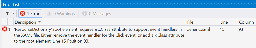
<!-- You cannot bind an event from a controltemplate -->
<!--<Button x:Name="cc1Button" Content="The button in the template" Click="Button_Click" />-->
<TextBlock Text="{TemplateBinding Text}" />
</StackPanel>
</Border>
</ControlTemplate>
</Setter.Value>
</Setter>
</Style>
Notice that if we try to attach an eventhandler like this the compilation will fail. Because the Template is defined in a ResourceDictionary, WPF searches for the eventhandler in the code-behind of the ResourceDictionary, which we don't have, hense the compilation error. WPF does not look in the definition of the class!
The correct way for doing this is by using PARTS:
<Style TargetType="{x:Type local:CustomControlWithEventBinding}">
	<Setter Property="Template">
		<Setter.Value>
			<ControlTemplate TargetType="{x:Type local:CustomControlWithEventBinding}">
				<Border Background="{TemplateBinding Background}"
						BorderBrush="{TemplateBinding BorderBrush}"
						BorderThickness="{TemplateBinding BorderThickness}">
					<StackPanel Orientation="Horizontal">
						<Button x:Name="PART_Button" Content="The button in the template (with event attached)" />
						<TextBlock Text="{TemplateBinding Text}" />
					</StackPanel>
				</Border>
			</ControlTemplate>
		</Setter.Value>
	</Setter>
</Style>
public class CustomControlWithEventBinding : TextBox
{
	static CustomControlWithEventBinding()
	{
		DefaultStyleKeyProperty.OverrideMetadata(typeof(CustomControlWithEventBinding), new FrameworkPropertyMetadata(typeof(CustomControlWithEventBinding)));
	}

	public override void OnApplyTemplate()
	{
		DependencyObject d = GetTemplateChild("PART_Button");
		if (d != null)
		{
			(d as Button).Click += new RoutedEventHandler(Button_Click);
		}

		base.OnApplyTemplate();
	}

	private void Button_Click(object sender, RoutedEventArgs e)
	{
		MessageBoxResult result = MessageBox.Show("Message from Button_Click using PARTS",
			"Message",
			MessageBoxButton.OK,
			MessageBoxImage.Information);
	}
}

What remains is a discussion of using eventhandlers in code behind. Something which you should of course prevent using.
The first case is the simplest and most straight forward:
<Label Grid.Row="3" Content="Text for fourth label">
	<Label.Template>
		<ControlTemplate TargetType="{x:Type Label}">
			<Border BorderBrush="Blue" BorderThickness="2" >
				<StackPanel Orientation="Vertical">
					<ContentPresenter />
					<Button Content="Text on the button" Click="ButtonInsideLocalTemplate_Click" />
				</StackPanel>
			</Border>
		</ControlTemplate>
	</Label.Template>
</Label>
In the codebehind of the Window on which this Label is defined we have following eventhandler:
        private void ButtonInsideLocalTemplate_Click(object sender, RoutedEventArgs e) {
            MessageBox.Show("The local button was clicked");
        }
This results in the following visuals
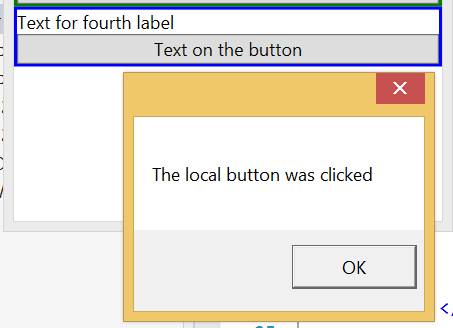
I think it is clear what is going on here. And because we are using the Template only for this specific Label we are sure from which button the eventhandler is invoked
But what if we are defining the Template in the resourcesection?
<Grid.Resources>
	<ResourceDictionary>
		<ControlTemplate x:Key="someTemplateWithEventHandler" TargetType="{x:Type Label}">
			<Border BorderBrush="Red" BorderThickness="2">
				<StackPanel Orientation="Vertical">
					<ContentPresenter />
					<Button Content="Text on the button" Click="ButtonFromResourceSection_Click" />
				</StackPanel>
			</Border>
		</ControlTemplate>
	</ResourceDictionary>
</Grid.Resources>

<Label Grid.Row="0" Template="{StaticResource someTemplateWithEventHandler}">Text for first label</Label>
<Label Grid.Row="1" Template="{StaticResource someTemplateWithEventHandler}">Text for second label</Label>
In the codebehind of the Window on which this Label is defined we have following eventhandler:
private void ButtonFromResourceSection_Click(object sender, RoutedEventArgs e) {
	if(sender is Button)
		MessageBox.Show("A button was clicked");
	else
		MessageBox.Show("A control was clicked with a type: " + sender.GetType());

	if (sender is DependencyObject) {
		Label parentLabel = FindAncestor<Label>(sender as DependencyObject);
		MessageBox.Show("A button was clicked from the Label with text: " + parentLabel.Content.ToString());
	}

}

public static T FindAncestor<T>(DependencyObject dependencyObject) where T : class {
	DependencyObject target = dependencyObject;
	do {
		target = VisualTreeHelper.GetParent(target);
	}
	while (target != null && !(target is T));
	return target as T;
}
This results in the following visuals if the button in the first label is clicked:


This results in the following visuals if the button in the second label is clicked:

Because we define the ControlTemplate in the resource section all instantiations of the template use the same eventhandler. If we want to differentiate between the instances we must use some code to differentiate between the various instances. In the above code we walk the visual tree to get at the label which was templated. It will be clear this is NOT a pretty solution!
And finally we can do something similar but now in a ResourceDictionary:
<ResourceDictionary x:Class="WpfVisualCustomization.Templating.EventsInResourceDictionary"
					xmlns="http://schemas.microsoft.com/winfx/2006/xaml/presentation"
					xmlns:x="http://schemas.microsoft.com/winfx/2006/xaml"
					xmlns:local="clr-namespace:WpfVisualCustomization.Templating">
	<ControlTemplate x:Key="someTemplateInResourceWithEventHandler" TargetType="{x:Type Label}">
		<Border BorderBrush="Green" BorderThickness="2">
			<StackPanel Orientation="Vertical">
				<ContentPresenter />
				<Button Content="Text on the button in resource" Click="Button_Click" />
			</StackPanel>
		</Border>
	</ControlTemplate>
</ResourceDictionary>
And in the codebehind of the ResourceDictionary:
partial class EventsInResourceDictionary : ResourceDictionary {
	private void Button_Click(object sender, RoutedEventArgs e) {
		if (sender is Button)
			MessageBox.Show("A button from within a resource was clicked");
		else
			MessageBox.Show("A control from within a resource was clicked with a type: " + sender.GetType());

		if (sender is DependencyObject) {
			Label parentLabel = FindAncestor<Label>(sender as DependencyObject);
			MessageBox.Show("A button was clicked from the Label with text: " + parentLabel.Content.ToString());
		}

	}

	public static T FindAncestor<T>(DependencyObject dependencyObject) where T : class {
		DependencyObject target = dependencyObject;
		do {
			target = VisualTreeHelper.GetParent(target);
		}
		while (target != null && !(target is T));
		return target as T;
	}
}
We then can use this ControlTemplate in a Window
<Grid.Resources>
	<ResourceDictionary>
		<ResourceDictionary.MergedDictionaries>
				<ResourceDictionary Source="/EventsInResourceDictionary.xaml" />
		</ResourceDictionary.MergedDictionaries>
	</ResourceDictionary>
</Grid.Resources>

<Label Grid.Row="2" Template="{StaticResource someTemplateInResourceWithEventHandler}">Text for third label</Label>
This results in the following visuals

No surprises here, perhaps one remark: allthough we defined the eventhandler in the codebehind of the ResourceDictionary, because we walk the visual tree we end up at the Label defined in the Window. But this shouldn't come as a surprise.
A somewhat special case: the ItemsControl
Concepts
- Template: used to replace the template used for the ItemsControl itself
- ItemTemplate: used for showing the items in the ItemsSource
- ItemsPanel: used for arranging the items in the ItemsSource. It must be of a type ItemsPanelTemplate
How to do it?
Ok,so lets just see what happens when using the standard ItemsControl and ListControl:
<ItemsControl Grid.Row="0" x:Name="StandardItemsControl"/>
<ListView Grid.Row="1" x:Name="StandardListView"/>
List<CustomData> dataSource = new List<CustomData>();
dataSource.Add(new CustomData() { XCoord = 10, YCoord = 10, DataMember1 = 1, DataMember2 = "String1"});
dataSource.Add(new CustomData() { XCoord = 100, YCoord = 20, DataMember1 = 2, DataMember2 = "String2" });

StandardItemsControl.ItemsSource = dataSource;
StandardListView.ItemsSource = dataSource;
This results in the following visuals

<ListView Grid.Row="2" x:Name="ItemTemplatedListView" Background="Yellow" Foreground="Blue">
	<ListView.ItemTemplate>
		<DataTemplate>
			<StackPanel>
				<Border Background="Fuchsia" Padding="5">
					<TextBlock Background="Red" Text="{Binding DataMember1}"/>
					<TextBlock Background="Red" Text="{Binding DataMember2}" />
				</Border>
			</StackPanel>
		</DataTemplate>
	</ListView.ItemTemplate>
</ListView>
This results in the following visuals

This does look a lot better, doesn't it?
<Border Grid.Row="3">
	<Border.Resources>
		<DataTemplate DataType="{x:Type local:CustomData}">
			<StackPanel>
				<TextBlock Background="Green" Text="From DataTemplate"/>
				<TextBlock Background="Green" Text="{Binding DataMember2}" />
			</StackPanel>
		</DataTemplate>
	</Border.Resources>
	<ListView x:Name="ResourceTemplatedListView">
	</ListView>
</Border>
This results in the following visuals

<ListView Grid.Row="2" x:Name="ItemTemplatedListView" Background="Yellow" Foreground="Blue">
	<ListView.ItemContainerStyle>
		<Style TargetType="ListViewItem">
			<Setter Property="Background" Value="Brown" />
		</Style>
	</ListView.ItemContainerStyle>
	<ListView.ItemTemplate>
		<DataTemplate>
			<Border Background="Fuchsia" Padding="5">
				<StackPanel>
					<TextBlock Background="Red" Text="{Binding DataMember1}"/>
					<TextBlock Background="Red" Text="{Binding DataMember2}" />
					<!-- ItemTemplate must be of type DataTemplate and this doesn't support TemplateBindings -->
					<!--<TextBlock Background="{Binding RelativeSource={RelativeSource TemplatedParent}, Path=Background}" />-->
					<!--<TextBlock Background="{TemplateBinding ListViewItem.Background}" />-->
					<TextBlock Background="{Binding RelativeSource={RelativeSource FindAncestor, AncestorType={x:Type ListViewItem}}, Path=Background}" />
				</StackPanel>
			</Border>
		</DataTemplate>
	</ListView.ItemTemplate>
</ListView>
This results in the following visuals

<ItemsControl Grid.Row="5" Template="{StaticResource ResourceKey=templateWithItemsPresenter}" x:Name="TemplatedItemsControl1a">
	<ItemsControl.ItemTemplate>
		<DataTemplate>
			<StackPanel>
				<TextBlock Background="Fuchsia" Text="With ItemsPresenter"/>
				<TextBlock Background="Fuchsia" Text="{Binding DataMember2}" />
			</StackPanel>
		</DataTemplate>
	</ItemsControl.ItemTemplate>
	<ItemsControl.ItemsPanel>
		<ItemsPanelTemplate>
			<StackPanel Orientation="Horizontal" />
		</ItemsPanelTemplate>
	</ItemsControl.ItemsPanel>
</ItemsControl>
This results in the following visuals

But we aren't limited to the StackPanel. We can use any Panel we want, yes even a Canvas:
<ItemsControl Grid.Row="6" Template="{StaticResource ResourceKey=templateWithItemsPresenter}" x:Name="TemplatedItemsControl2">
	<ItemsControl.ItemTemplate>
		<DataTemplate>
			<StackPanel>
				<!-- following will not work !!!
						you can only bind the canvas properties on direct children
						and there is an ItemContainer inbetween this ItemTemplate and the ItemsPanel-->
				<!--<TextBlock Canvas.Left="{Binding XCoord}" Canvas.Top="{Binding YCoord}" Text="{Binding DataMember2}" />-->
				<TextBlock Text="{Binding DataMember2}" />
			</StackPanel>
		</DataTemplate>
	</ItemsControl.ItemTemplate>
	<ItemsControl.ItemContainerStyle>
		<Style TargetType="ContentPresenter">
			<Setter Property="Canvas.Left" Value="{Binding Path=XCoord}" />
			<Setter Property="Canvas.Top" Value="{Binding Path=YCoord}" />
		</Style>
	</ItemsControl.ItemContainerStyle>
	<ItemsControl.ItemsPanel>
		<ItemsPanelTemplate>
			<Canvas />
		</ItemsPanelTemplate>
	</ItemsControl.ItemsPanel>
</ItemsControl>
This results in the following visuals

- We are using an ItemsControl: an ItemsControl uses ContentPresenters to display the items in the ItemsSource
- Canvas.Left and Canvas.Top are attached properties: we can set them on the ContentPresenter
<ControlTemplate x:Key="templateWithItemsPresenter" TargetType="{x:Type ItemsControl}">
	<StackPanel>
		<TextBlock Text="Below this is the ItemsPresenter" />
		<ItemsPresenter x:Name="ItemsPresenter" ></ItemsPresenter>
	</StackPanel>
</ControlTemplate>

<ItemsControl Grid.Row="5" Template="{StaticResource ResourceKey=templateWithItemsPresenter}" x:Name="TemplatedItemsControl1a">
	<ItemsControl.ItemTemplate>
		<DataTemplate>
			<StackPanel>
				<TextBlock Background="Fuchsia" Text="With ItemsPresenter"/>
				<TextBlock Background="Fuchsia" Text="{Binding DataMember2}" />
			</StackPanel>
		</DataTemplate>
	</ItemsControl.ItemTemplate>
	<ItemsControl.ItemsPanel>
		<ItemsPanelTemplate>
			<StackPanel Orientation="Horizontal" />
		</ItemsPanelTemplate>
	</ItemsControl.ItemsPanel>
</ItemsControl>
This results in the following visuals

<ControlTemplate x:Key="templateWithFixedPanel" TargetType="{x:Type ItemsControl}">
	<StackPanel>
		<TextBlock Text="Look mama: without an ItemsPresenter!" />
		<StackPanel IsItemsHost="True" ></StackPanel>
	</StackPanel>
</ControlTemplate>

<ItemsControl Grid.Row="6" Template="{StaticResource ResourceKey=templateWithFixedPanel}" x:Name="TemplatedItemsControl1b">
	<ItemsControl.ItemTemplate>
		<DataTemplate>
			<StackPanel>
				<TextBlock Background="Fuchsia" Text="With IsItemsHost"/>
				<TextBlock Background="Fuchsia" Text="{Binding DataMember2}" />
			</StackPanel>
		</DataTemplate>
	</ItemsControl.ItemTemplate>
	<!-- This will do absolutely nothing! We're not using an ItemsPresenter but using a StackPanel with an IsItemsHost property
		In practice you are saying to WPF: always use my panel and neglect the ItemsPanel property -->
	<ItemsControl.ItemsPanel>
		<ItemsPanelTemplate>
			<StackPanel Orientation="Horizontal" />
		</ItemsPanelTemplate>
	</ItemsControl.ItemsPanel>
</ItemsControl>
This results in the following visuals

<ControlTemplate x:Key="templateWithFixedPanelNoHost" TargetType="{x:Type ItemsControl}">
	<Border Background="Red" Margin="10" Padding="10">
		<StackPanel Orientation="Horizontal" ></StackPanel>
	</Border>
</ControlTemplate>

<ItemsControl Grid.Row="6" Template="{StaticResource ResourceKey=templateWithFixedPanelNoHost}" x:Name="TemplatedItemsControl1c">
	<ItemsControl.ItemTemplate>
		<DataTemplate>
			<StackPanel>
				<TextBlock Background="Fuchsia" Text="Without IsItemsHost"/>
				<TextBlock Background="Fuchsia" Text="{Binding DataMember2}" />
			</StackPanel>
		</DataTemplate>
	</ItemsControl.ItemTemplate>
	<ItemsControl.ItemsPanel>
		<ItemsPanelTemplate>
			<StackPanel Orientation="Horizontal" />
		</ItemsPanelTemplate>
	</ItemsControl.ItemsPanel>
</ItemsControl>
This results in the following visuals

Conclusion
Anyway, I hope you learned something by reading this article, I know I did explaining the concepts.
Version history
- Version 1.0: Initial version