
Create Custom Windows in WPF with Ease
4.86/5 (13 votes)
Declaratively and visually create custom windows in WPF
Introduction
One of the features I wanted to add to Synergy toolkit was the ability to quickly create custom theme windows with all the features of standard windows. In this article, I am demonstrating how to create a custom window theme visually using declarative XAML and apply it to windows in your applications.
You can download Synergy SDK with the full source code here. You may also want to see my window docking solution in Synergy here. I will be posting updates on Synergy SDK on my twitter account: MixModes.
The sample application Synergy uses main window as the custom window whose theme is defined within Windows.xaml resource dictionary within MixModes.Synergy.Themes project.
Declarative is the Key
As we all know, XAML is declarative and simple and so there is no reason why traditional approach of writing code for windows and controls should apply. One must be able to simply create a visual and stick it in a control template to get things working. That was exactly my motivation when I started out developing look-less window functionality in Synergy.
Declare a Template
The first thing you may want to do in creating a custom window is to actually create a visual template. The easiest way to create this template is to create a user control in Microsoft Blend and then define extension points in XAML that look-less control will liven up once the template is applied. Once the visual is ready, all that needs to be done is a style creation for CustomWindow where the template can be pasted and then the temporary user control can be discarded.
The following extension points are supported for current implementation:
PART_TITLEBAR (UIElement)- For displaying window title, dragging and maximize / restore operationsPART_MINIMIZE (Button)– Window minimize buttonPART_MAXIMIZE_RESTORE (Button)– Maximize restore buttonPART_CLOSE (Button)– Close buttonPART_LEFT_BORDER (UIElement)– Left resizable borderPART_RIGHT_BORDER (UIElement)– Right resizable borderPART_TOP_BORDER (UIElement)– Top resizable borderPART_BOTTOM_BORDER (UIElement)– Bottom resizable border
One more thing to note is that while defining the window template, you must declare the ContentPresenter (which ultimately contains window content) within AdornerDecorator tag (which is the adorner layer for the window) as this is a WPF requirement.
Here is the template I have created within Windows.xaml resource dictionary within MixModes.Synergy.Themes project:
<ResourceDictionary xmlns="http://schemas.microsoft.com/winfx/2006/xaml/presentation"
                      xmlns:x="http://schemas.microsoft.com/winfx/2006/xaml">
    <Style x:Key="MainWindow"
           TargetType="{x:Type Window}">
        <Setter Property="Foreground"
                Value="{DynamicResource {x:Static SystemColors.WindowTextBrushKey}}" />
        <Setter Property="Template">
            <Setter.Value>
                <ControlTemplate TargetType="{x:Type Window}">
                    <Grid>
                        <Border x:Name="MainBorder"
                                BorderBrush="{DynamicResource MainWindowBorderBrush}"
                                BorderThickness="1"
                                CornerRadius="2"
                                Background="{DynamicResource MainWindowBackgroundBrush}">
                            <DockPanel LastChildFill="True">
                                <Rectangle x:Name="PART_LEFT_BORDER"
                                           Width="2"
                                           Cursor="SizeWE">
                                    <Rectangle.Fill>
                                        <SolidColorBrush Color="Transparent" />
                                    </Rectangle.Fill>
                                </Rectangle>
                                <Rectangle x:Name="PART_RIGHT_BORDER"
                                           Cursor="SizeWE"
                                           Width="2"
                                           DockPanel.Dock="Right">
                                    <Rectangle.Fill>
                                        <SolidColorBrush Color="Transparent" />
                                    </Rectangle.Fill>
                                </Rectangle>
                                <Rectangle x:Name="PART_TOP_BORDER"
                                           Cursor="SizeNS"
                                           DockPanel.Dock="Top"
                                           Height="2">
                                    <Rectangle.Fill>
                                        <SolidColorBrush Color="Transparent" />
                                    </Rectangle.Fill>
                                </Rectangle>
                                <Rectangle x:Name="PART_BOTTOM_BORDER"
                                           Cursor="SizeNS"
                                           Height="2"
                                           DockPanel.Dock="Bottom">
                                    <Rectangle.Fill>
                                        <SolidColorBrush Color="Transparent" />
                                    </Rectangle.Fill>
                                </Rectangle>
                                <Border x:Name="PART_TITLEBAR"
                                        Margin="2,0,2,2"
                                        Height="40"
                                        DockPanel.Dock="Top"
                                        CornerRadius="2"
                                        Background="Transparent">
                                    <DockPanel LastChildFill="False">
                                        <TextBlock Margin="8,0,0,4"
                                                   VerticalAlignment="Center"
                                                   FontStretch="UltraExpanded"
                                                   Foreground="Black"
                                                   TextTrimming="CharacterEllipsis"
                                                   TextWrapping="NoWrap"
                                                   Text="{TemplateBinding Title}"
                                                   FontSize="16" />
                                        <Button x:Name="PART_CLOSE"
                                                DockPanel.Dock="Right"
                                                Style="{DynamicResource FlatButton}"
                                                VerticalAlignment="Center"
                                                Margin="0,0,4,0">
                                            <Image Source="/MixModes.Synergy.Resources;
						component/Resources/Close.png"
                                                   Stretch="None"
                                                   Margin="4" />
                                        </Button>
                                        <Button x:Name="PART_MAXIMIZE_RESTORE"
                                                DockPanel.Dock="Right"
                                                HorizontalAlignment="Center"
                                                VerticalAlignment="Center"
                                                Style="{DynamicResource FlatButton}">
                                            <Image x:Name="MaximizeRestoreImage"
                                                   Source="/MixModes.Synergy.Resources;
						component/Resources/Restore.png"
                                                   Stretch="None"
                                                   Margin="4" />
                                        </Button>
                                        <Button x:Name="PART_MINIMIZE"
                                                HorizontalAlignment="Center"
                                                Style="{DynamicResource FlatButton}"
                                                VerticalAlignment="Center"
                                                DockPanel.Dock="Right">
                                            <Image Margin="4"
                                                   Source="/MixModes.Synergy.
						Resources;component/Resources/
						Minimize.png"
                                                   Stretch="None" />
                                        </Button>
                                    </DockPanel>
                                </Border>

                                <!-- Title bar separator-->
                                <Border Height="1"
                                        DockPanel.Dock="Top"
                                        Background="{DynamicResource
					MainWindowTitleBarSeparator}" />

                                <!-- Actual Window Content -->
                                <AdornerDecorator DockPanel.Dock="Bottom">
                                    <ContentPresenter />
                                </AdornerDecorator>
                            </DockPanel>
                        </Border>
                    </Grid>
                    <ControlTemplate.Triggers>
                        <DataTrigger Binding="{Binding RelativeSource=
				{RelativeSource Self}, Path=Maximized}"
                                     Value="False">
                            <Setter TargetName="MaximizeRestoreImage"
                                    Property="Source"
                                    Value="/MixModes.Synergy.Resources;
				component/Resources/Maximize.png" />
                        </DataTrigger>
                    </ControlTemplate.Triggers>
                </ControlTemplate>
            </Setter.Value>
        </Setter>
    </Style>
</ResourceDictionary>
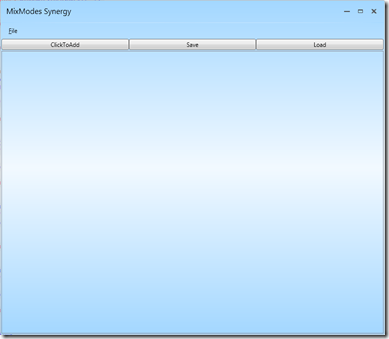
This is a pretty simple theme which creates a rounded rectangle window with 2 pixel wide resizers and custom window minimize, maximize and restore buttons. It also contains a template trigger that changes the image of maximize restore button if window is not maximized.
The window created using this theme looks like the following:
Inherit from CustomWindow Class
The final step is to inherit from CustomWindow class (which in turn inherits from Window class) instead of directly inheriting from Window class and refer to the style created in the previous step. This is again very simple:
- Import visual framework namespace:
xmlns:visualFx="http://mixmodes.com/visualFx" - Inherit from
CustomWindowclass:
use “visualFx:CustomWindow” as your window tag in XAML - Refer to the style created in previous step in your visualFx:CustomWindow tag:
Style="{DynamicResource MainWindow}"
That’s all you have to do to get your custom window working !
How Does It Work?
If you crack open the CustomWindow class, you will see that bulk of the work happens in the AttachToVisualTree method which is called from OnApplyTemplate (which in turn is called anytime template is applied to our custom window).
AttachToVisualTree in turn calls AttachCloseButton, AttachMaximizeButton, AttachMaximizeRestoreButton, AttachTitleBar and AttachBorders methods, each of which queries for visual parts (the PART_… named parts we defined in the template) and attaches functionality via events.
So that’s it ! Creating custom windows using Synergy is really that simple!
History
- 27th December, 2010: Initial post