
Nice Custom Controls Library
3.77/5 (21 votes)
Custom Controls Library offers you a set of different custom controls and API functions.
Introduction
Custom Controls Library offers you a set of different custom controls and API functions.
Features
- MFC wrapper classes for MFC applications
- WTL wrapper classes for WTL applications
- Tooltips
- Color Scheming (customizable text and background colors)
- Notification masks
- Custom drawing
- Nice Theme API
- Nice Graphics API
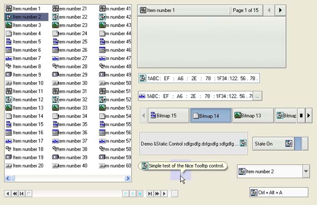
Individual Custom Controls Included in Custom Controls Library
| Nice ComboBox | A combobox control is a composite control that contains a list of items from which the user can choose. |
| Nice Histogram control | A histogram is a control window that shows the statistical graph. |
| Nice Hot Key control | A Hot Key control is a window that enables the user to enter a combination of keystrokes to be used as a hot key. |
| Nice Hyperlink control | A hyperlink control displays text as a hyperlink (like the ones in web browsers). |
| Nice Lookup IP Address | A Lookup IP Address control is a composite control that allows you to browse, enter, view and edit an address in Internet Protocol (IP) address format. |
| Nice Infobar control | An Infobar control is a control that allows you to display application specific information with text and images. |
| Nice IP Address control | An IP Address control is a control that allows you to enter, view and edit an address in Internet Protocol (IP) address format. |
| Nice ListBox control | A Listbox is a control window that contains a list of items from which the user can choose. |
| Nice Outbar control | The outbar control acts like a container for child windows as seen in a Microsoft® Outlook. |
| Nice Page control | The Page control provides a convenient way to present information in multipage-page format. |
| Nice Scrollbar | A scrollbar control is a control that allows you to translate the value of the bar to the viewable contents of the other components. |
| Nice SheetTab control | The sheettab control provides the functionality to easily switch between different views in a frame window. |
| Nice Static control | A static control is a noneditable control that contains text or a graphic that identifies a control or provides additional information about the control. |
| Nice SwitchBar control | A Switchbar control is a control that allows you to switch between different sources. |
| Nice Toggle | A toggle control is a control that maintains a selected state. |
| Nice Tooltip control | A ToolTip control is a small pop-up window that contains a text and image describing a tool. |
Implementation Details
Custom Controls
All custom controls are written from scratch.
Using Custom Controls Library
Integrating with Your Project
To integrate a nice custom control library with your program, you must include cuctrl.h in your source files and link with the cuctrl.lib library.
For MFC application, you must include cuctrl.hpp in your source files and link with the nicefc.lib library.
For WTL application, just include atlnicectrls.h in your source files and link with the cuctrl.lib library.
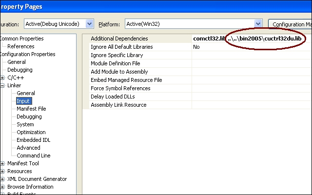
Linking sample (Debug Unicode) for Visual Studio 2005:
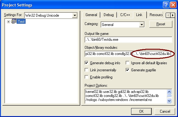
Linking sample (Debug Unicode) for Visual Studio 6:
Library Naming Conventions
The DLLs and libraries included in this distribution follow a structured naming convention. This makes it easier to know which DLL or library you should be using for which purpose.
The import libraries needed to build applications or extension DLLs that use these DLLs have the same base name as the DLL but have a .lib file name extension.
The DLL and library names have the following form:
CuCtrl[d|][u|].lib (dll)
where the letters are placeholders for specifiers whose meanings are shown in the following table:
| Library/DLL Name | Build | Charset |
|---|---|---|
| CuCtrl | Release | Ansi |
| CuCtrld | Debug | Ansi |
| CuCtrlu | Release | Unicode |
| CuCtrldu | Debug | Unicode |
Using Custom Controls
You can create a nice custom control by calling the CreateWindowEx function, specifying the appropriate WC_NICE* window class. This window class is registered when the custom controls Dynamic Link Library (DLL) is loaded. To ensure that the DLL is loaded, use the CuCtrl_InitControls function.
You can send messages to a nice custom control to affect the control's appearance and behavior. Each message has a corresponding macro that you can use instead of sending the message explicitly.
The following samples create switchbar custom control.
Win32 Application
The following function creates a switchbar control and adds buttons:
HWND WINAPI CreateControl(HWND hWndParent, HINSTANCE hInst)
{
    SWBUTTON    swb;
    HWND        hWndSwb;

    hWndSwb = CreateWindow(
                WC_SWITCHBAR, "",
                WS_CHILD | WS_CLIPSIBLINGS | WS_VISIBLE |
                SWS_RIGHTNAVBUTTONS | SWS_LISTBUTTON | SWS_LISTDIALOG | SWS_TOOLTIPS,
                0, 0, 120, 18,
                hWndParent, NULL, hInst, NULL);


    if (hWndSwb == NULL)
        return NULL;

    swb.uiMask = SWIF_TEXT | SWIF_IMAGE | SWIF_ID;
    swb.lpszText = TEXT("Item number 1");
    swb.iImage = 0;
    swb.uiId   = 1000;

    SwitchBar_AddButton(hWndSwb, &swb);


    swb.lpszText = TEXT("Item number 2");
    swb.iImage = 1;
    swb.uiId   = 1001;

    SwitchBar_AddButton(hWndSwb, &swb);

    return hWndSwb;
}
Dialog Template
Another way is to create a switchbar custom control in a dialog template, in this case the Microsoft Visual Studio 6 used.
- Select the custom control tool from toolbox:

- Drop it onto dialog:

- Edit properties:
Caption text is not used by switchbar control.
Set Class to "NiceSwitchBar32" so windows can create switchbar control.
Fill Style and ExStyle with WS_*, SWS_* and WS_EX_* values as you need.
- The resulting dialog with a switchbar control:

Using API Functions Provided by Custom Controls Library
Custom Controls Library implements a set of API functions you can use. The following section describes some of the most useful functions.
CuCtrl_InitControlsRegisters given custom control classes and ensures that cuctrl.dll is loaded.
NiceGraphics_GetCharDimensionsandNiceGraphics_GetCharsInWidthThese are for calculating average
chardimensions and number of characters that will fit within a given width.
Using Nice Theme API
With Nice Theme API, you can add visual styles to your application. Nice Theme resources located in *.ntr files (ntr - nice theme resource) or in *.njr files (njr - nice join theme resource). The .ntr and .njr files are regular DLLs, that contains the bitmaps and data for the nice theming engine. Nice theme engine adds join theme resource to the nice theme resource, so you can create your own theme resource for the existing nice theme resource.
Nice Theme API also provides functionality to register and unregister nice theme resource for common use and for specific application use.
- The following XML file contents describes listbox visual theme.
<class name="listbox"> <parts items="2"> <part name="Common" index="0"> <property name="BackgroundType" value="BorderFill" /> <property name="FillColor" value="RGB(0, 254, 254)" /> <property name="BorderColor" value="RGB(255, 171, 63)" /> <property name="BorderSize" value="1" /> <property name="MinSize" value="5, 5" /> <themetext> <property name="TextColor" value="RGB(0, 0, 0)" /> </themetext> <states items="5"> <state name="Active" index="0"> </state> <state name="ActiveHot" index="1"> </state> <state name="Inactive" index="2"> <property name="FillColor" value="RGB(240, 240, 240)" /> </state> <state name="InactiveHot" index="3"> <property name="FillColor" value="RGB(240, 240, 240)" /> </state> <state name="Disabled" index="4"> <themetext> <property name="TextColor" value="RGB(161, 161, 146)" /> </themetext> </state> </states> </part> <part name="List" index="1"> <property name="FillColor" value="RGB(255, 255, 255)" /> <property name="BorderColor" value="RGB(0, 60, 116)" /> <property name="BackgroundType" value="ContentFill" /> <themetext> <property name="TextColor" value="RGB(0, 0, 0)" /> </themetext> <gradients items="4"> <gradient name="Selected" items="3" index="0"> <gradientitem index="0"> <property name="StartColor" value="RGB(224, 224, 191)" /> <property name="EndColor" value="RGB(212, 212, 43)" /> <property name="Ratio" value="45" /> </gradientitem> <gradientitem index="1"> <property name="StartColor" value="RGB(212, 212, 43)" /> <property name="EndColor" value="RGB(212, 212, 43)" /> <property name="Ratio" value="10" /> </gradientitem> <gradientitem index="2"> <property name="StartColor" value="RGB(212, 212, 43)" /> <property name="EndColor" value="RGB(248, 248, 8)" /> <property name="Ratio" value="45" /> </gradientitem> </gradient> <gradient name="Selected" items="2" index="1"> <gradientitem index="0"> <property name="StartColor" value="RGB(255, 254, 226)" /> <property name="EndColor" value="RGB(255, 223, 124)" /> <property name="Ratio" value="38" /> </gradientitem> <gradientitem index="1"> <property name="StartColor" value="RGB(255, 214, 96)" /> <property name="EndColor" value="RGB(255, 234, 169)" /> <property name="Ratio" value="62" /> </gradientitem> </gradient> <gradient name="Selected" items="2" index="2"> <gradientitem index="0"> <property name="StartColor" value="RGB(255, 217, 170)" /> <property name="EndColor" value="RGB(255, 187, 110)" /> <property name="Ratio" value="40" /> </gradientitem> <gradientitem index="1"> <property name="StartColor" value="RGB(255, 171, 63)" /> <property name="EndColor" value="RGB(254, 225, 122)" /> <property name="Ratio" value="60" /> </gradientitem> </gradient> <gradient name="SelectedInactive" items="2" index="3"> <gradientitem index="0"> <property name="StartColor" value="RGB(255, 254, 228)" /> <property name="EndColor" value="RGB(255, 232, 167)" /> <property name="Ratio" value="45" /> </gradientitem> <gradientitem index="1"> <property name="StartColor" value="RGB(255, 215, 103)" /> <property name="EndColor" value="RGB(255, 230, 158)" /> <property name="Ratio" value="55" /> </gradientitem> </gradient> </gradients> <states items="11"> <state name="Active" index="0"> </state> <state name="ActiveHot" index="1"> </state> <state name="Inactive" index="2"> <property name="FillColor" value="RGB(240, 240, 240)" /> <themetext> <property name="TextColor" value="RGB(100, 100, 100)" /> </themetext> </state> <state name="InactiveHot" index="3"> <property name="FillColor" value="RGB(240, 240, 240)" /> </state> <state name="Disabled" index="4"> <themetext> <property name="TextColor" value="RGB(161, 161, 146)" /> </themetext> </state> <state name="Selected" index="5"> <renderitems items="2"> <renderitem type="gradient" index="0"> <property name="GradientIndex" value="2" /> <property name="GradientType" value="VerticalGradient"/> </renderitem> <renderitem type="fill" index="1"> <property name="BackgroundType" value="BorderFill" /> <property name="BorderColor" value="RGB(255, 171, 63)" /> </renderitem> </renderitems> </state> <state name="SelectedInactive" index="6"> <themetext> <property name="TextColor" value="RGB(100, 100, 100)" /> </themetext> </state> <state name="SelectedDisabled" index="7"> <property name="FillColor" value="RGB(97, 104, 139)" /> <themetext> <property name="TextColor" value="RGB(243, 244, 248)" /> </themetext> </state> <state name="Visited" index="8"> <property name="BackgroundType" value="BackgroundFill" /> <property name="FillColor" value="RGB(255, 244, 215)" /> </state> <state name="VisitedInactive" index="9"> <property name="FillColor" value="RGB(221, 221, 221)" /> </state> <state name="VisitedDisabled" index="10"> <property name="FillColor" value="RGB(230, 230, 230)" /> </state> </states> </part> </parts> </class> - The following function draws a selected
listboxitem:void DrawThemedSelectedListItem(HNICETHEME hTheme, HDC hdc) { RECT rcItem = { 10, 10, 150, 45 }; NiceTheme_DrawBackground( hTheme, hdc, LBXPT_LIST, LBXLST_SELECTED, &rcItem, NULL); } - The result looks like this:

Using Color Schemes
All custom controls drawings based on build in color scheming. Every custom control state (active, inactive, disabled, ...) has its own colors for text and background. You can change scheme colors by using *_SETCOLORCHEME message or *_Set*ColorScheme macros.
- The following function changes
InfoBaractive state color scheme.void SetInfoBarColorScheme(HWND hWndIb) { NICECOLORSCHEME ncs; ncs.uiMask = CLRSCHF_TEXTCOLOR | CLRSCHF_BACKCOLOR; ncs.crText = RGB(255, 128, 255); ncs.crBack = RGB(0, 128, 192); NiceInfoBar_SetActiveColorScheme(hWndIb, &ncs); } - An
InfoBarwith default(system) color scheme and custom color scheme:
Using Notification Masks
Notification mask enables or disables specified notification(s), so your application gets needed notifications only. You can change notification masks by using *_SETNOTIFYMASK message or *_SetNotifyMask* macros.
- The following function enables or disables custom drawing in
PageCtrl(parent of thePageCtrlcontrol receives theNCN_CUSTOMDRAWnotification).void EnablePageCtrlCustomDrawing(HWND hWndPage, BOOL fEnable) { DWORD dwNotify = fEnable ? PCNMF_CUSTOMDRAW : 0; PageCtl_SetNotifyMaskEx(hWndPage, dwNotify, PCNMF_CUSTOMDRAW); } - A
PageCtrlwith disabled and with enabled custom draw notification:
Custom Controls Library Reference
For a detailed reference, see the documentation included in this distribution.
Latest Updates
Latest updates is available here[^].
Revision History
06.08.2007 - 1.1b1 New beta version
- New controls
- Histogram control
- Hyperlink control
- Outbar control
- SheetTab control
- New control features
- ComboBox control
- ListBox control
- New Nice Theme features
- Theme registration and loading
- Application specific theme registration and loading
- Theme file format changes
- Documentation
- Bug fixes
29.03.2007 - 1.01 Bug Fix, article update
- Bug fix
- In nice scrollbar (bin60\test.exe), Controls\Scrollbar... menu, click on the [>|] button, the scrollbar goes to the far right, then click on the [|<] button without hovering on the scrollbar, it isn't redrawn until you hover over it... (Thanks to Kochise).
28.03.2007 - 1.0 Initial public release
Feedback
If you have serious problems concerning running this software or if you discover any bugs, feel free to contact me.
My mail address is: Tarmo Kalda tka1969 'att' gmail 'dot' com.
License
Copyright (c) 2007 Tarmo Kalda.
This software is provided 'as-is', without any express or implied warranty. In no event
will the authors be held liable for any damages arising from the use of this software.
Permission is granted to anyone to use this software for any purpose, including commercial
applications, subject to the following restrictions:
- The origin of this software must not be misrepresented; you must not claim that you
wrote the original software. If you use this software in a product, an acknowledgment
(see the following) in the product documentation is recommended.
Copyright (c) 2007 Tarmo Kalda. - You may not use it for "Ad-Ware", "Spy-Ware", or "Mass-Emailing" (Spamming) Applications.
- You may not sell, rent or lease this software as a software product.
- Altered source versions must be plainly marked as such, and must not be
misrepresented as being the original software. - This notice may not be removed or altered from any source distribution.