
PhotoViewer Application in WPF (Visual Studio 2008 Beta 2)
2.50/5 (7 votes)
This article explains how to create a PhotoViewer application based on WPF in Visual Studio 2008
Introduction
Using Windows Presentation Foundation (WPF) for designing is fun and using it for developing a fully-functional application is far more than fun. Actually it is a kind of adventure exploring .NET 3.5 and WPF features and classes. Though I have written few pieces of XAML to see its glory, this application has really taken me into a roller-coaster ride of its greatness most of the times and its pitfalls occasionally.
PhotoViewer application, as you guess, is intended for viewing photos in a gallery or a folder. It has its own features to offer you with Zooming and Navigation behaviour. Zooming the photo using the slider is simple and easy-to-use feature as Navigation has the flexibility of choosing a photo from a collection of photo files stored in a folder. Currently, PhotoViewer supports picture files of type JPEG, GIF, PNG and BMP. Interestingly, this PhotoViewer application is developed using Visual Studio 2008 (Beta 2) with minimal support of C# language features.
In this article, I would like to explain how this application has been developed, how to use XAML code to design the interactive UI and how to write code-behind for certain events. The source code zip file is available for download with this article. Altogether, I hope this application would be very useful for a beginner to learn WPF and this article would give readers an interesting way to do learn WPF elements and their behaviour.
Creating a WPF Windows Application
Open Visual Studio 2008 (Beta 2) and create a new project using the template WPF Application from a list of all other templates on the right panel of the New Project Dialog.
Name the project as "PhotoViewer" and click OK to see your solution opening up in the Visual Studio IDE. In the solution explorer, you can see App.Xaml which is the main XAML file for any WPF application. This is actually a representation of the class App derived from System.Windows.Application class. StartupUri element implies the startup object of the application and in this case it is Window1.Xaml.
<Application x:Class="PhotoViewer.App"
    xmlns=http://schemas.microsoft.com/winfx/2006/xaml/presentation
    xmlns:x="http://schemas.microsoft.com/winfx/2006/xaml" StartupUri="Window1.xaml">
Window1.Xaml is another file you can see in the Solution Explorer and is placed by Visual Studio automatically when you create a project. Open the file in design mode and to begin with, place a stack panel control from the tool box.
StackPanel is a container control used to place more than one control as you do in a panel control in WinForms application. It supports both horizontal and vertical orientation and much more features like Resources, Triggers, Styles etc.
Drag and drop InkCanvas and Image controls into the stackpanel. InkCanvas control offers you with a drawing canvas and you can draw anything on it with the mouse pointer. Inside the InkCanvas, the Image control sits pretty and transformations applied on the InkCanvas, its parent, is applied to itself.
<InkCanvas Width="300" Height="200"
    Background="Bisque" Name="inkCanvas1">
<Image Source="{Binding ElementName=fnameTextBox, Path=Text}" Width="300"
    Height="200" Name="image1"
    HorizontalAlignment="Center" VerticalAlignment="Center" />
<InkCanvas.LayoutTransform>
<ScaleTransform
CenterX="{Binding ElementName=inkCanvas1, Path=Width,
    Converter={StaticResource centerXConv}}"
CenterY="{Binding ElementName=inkCanvas1, Path=Height,
    Converter={StaticResource centerYConv}}"
ScaleX ="{Binding ElementName=slider1, Path=Value}"
ScaleY="{Binding ElementName=slider1, Path=Value}"
>
</ScaleTransform>
</InkCanvas.LayoutTransform>
</InkCanvas>
Zooming Effect
In the LayoutTransform, you put ScaleTransform element along with its attributes, CenterX and CenterY (X and Y co-ordinate at the centre of the image). Setting these two attributes is important so as to scale the Image from its center point to provide even zooming. The other two attributes ScaleX and ScaleY take the incremental value, proportionate to which the zooming in and out takes place when the user moves the slider.
Data Binding for Zooming
Data Binding in WPF means to supply values to the properties (Dependency Properties are bindable) from a data source, be it an XML file, a controls' property or any other customary object. This provision of supplying values to the controls is called as Binding and this would take into effect when you change the value of the property, or when an event is triggered.
CenterX and CenterY attributes are bound to the Width property of the InkCanvas and it uses the custom class called ZoomPercentageConverter to calculate the center point co-ordinates. This Converter class must be defined earlier in the StackPanel and is inherited from IValueConverter Interface which is usually used for converting values from one type to another. This converter is specified for both the attributes CenterX and CenterY in XAML.
<StackPanel.Resources>
<local:ZoomPercentageConverter x:Key="centerXConv" />
    <local:ZoomPercentageConverter x:Key="centerYConv" />
</StackPanel.Resources>
public class ZoomPercentageConverter : IValueConverter
{
public object Convert(object value, Type targetType, object parameter, CultureInfo culture)

{
double center = ((double) value) / 2;
return center;
}

public object ConvertBack(object value, Type targetType, object parameter, CultureInfo culture)

{
throw new NotSupportedException("Cannot convert back");
}
}
Zooming Limit Validation
The PhotoViewer window is re-sizable and the user can zoom the image inside the InkCanvas only to the extent of the Windows' width. Validation is included here as to check the limit as below by writing the code in the LayoutChanged eventhandler of the InkCanvas.
Loading Photos
// This constant used to check the boundaries while zooming
public const int PaddingFactor = 24;
this.slider1.Value = 1; // Initial value
this.image1.Width = inkCanvas1.Width;
this.image1.Height = inkCanvas1.Height;

void inkCanvas1_LayoutUpdated(object sender, EventArgs e)
{
InkCanvas ic = (InkCanvas)App.Current.Windows[0].FindName("inkCanvas1");
if ((ic.DesiredSize.Width + PaddingFactor) >= this.ActualWidth)
{
MessageBox.Show("You cannot zoom it further beyond the width of the window.
    Maximize the window and then try!!!", "ZoomLimit");
this.slider1.Value = 1;
}
}
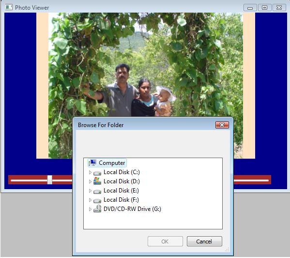
The PhotoViewer uses the WinForms control FolderBrowserDialog thus becoming a Hybrid application. This Dialog is used to select the folder from which the user wants to view the photo images. Once the user selects the folder, all image files are stored in the PhotosCollection object as an array. The PhotosCollection is a helper class that is used to collect image files and supply data about the current image index and the name of the file to the required binding controls.
public class PhotosCollection
{
int myindex;
string filename;
public static Array photofiles=null;

public int MyIndex
{
get{return myindex; }
set{myindex = value; }
}

public string FileName
{
get{return filename; }
set{filename = value; }
}

public PhotosCollection()
{
this.MyIndex = 0;
this.FileName = "";
}

public static int GetPhotoCollection()
{
FolderBrowserDialog fbd = new FolderBrowserDialog();
fbd.ShowNewFolderButton=false;
fbd.RootFolder = System.Environment.SpecialFolder.MyComputer;
fbd.ShowDialog();
if (fbd.SelectedPath == "")
{
MessageBox.Show("Click 'Select folder' to choose the folder containing photos
    and then proceed!");
return 0; // No files or folder
}
else
{
photofiles = System.IO.Directory.GetFiles(fbd.SelectedPath, "*.jpg");
return photofiles.Length;
}
}
}
Data Binding for Displaying Images
Binding the Source property of the Image element in XAML is specified as below:
<Image Source="{Binding ElementName=fnameTextBox, Path=Text}"
    Width="300" Height="200" Name="image1"
    HorizontalAlignment="Center" VerticalAlignment="Center" />
The Binding is done to a textbox value which stores the name of the photo file as the user navigates by clicking the Next and Previous buttons.
<StackPanel Orientation="Horizontal" HorizontalAlignment="Center">
<TextBox Name="fname" Text="{Binding Source={StaticResource photo},
Path=FileName}" Width="150" HorizontalAlignment="Center" />
<Button Height="22" Width="28" Foreground="Blue"
Name="btnNext" ToolTip="Next Photo">
<Button.BitmapEffect>
<BevelBitmapEffect BevelWidth="3" Smoothness="0.3" EdgeProfile="BulgedUp" />
</Button.BitmapEffect> >
</Button>
<Button Height="22" Width="28" Foreground="Blue"
Name="btnPrevious" ToolTip="Previous Photo">
<Button.BitmapEffect>
<BevelBitmapEffect BevelWidth="3" Smoothness="0.3"
EdgeProfile="BulgedUp" />
</Button.BitmapEffect> <
</Button>
<Button Height="22" Width="75" Foreground="Blue"
Name="btnSelect" ToolTip="Select Folder containing Photos">Select Folder</Button>
</StackPanel>
The above XAML code defines the second StackPanel containing a TextBox, three Buttons; one to get the Previous Image file and another to get the Next file; the third one to load the photos from the user selected folder.
The Text property of the TextBox is bound to the FileName property of the custom object you defined in the PhotosCollection class.
Navigating Next and Previous Images
The code below shows the event handlers written for the Next and Previous buttons. Note the TextBox value is set each time the user clicks these two buttons.
void btnPrevious_Click(object sender, RoutedEventArgs e)
{
if (pc.MyIndex <= 0)
return;
pc.MyIndex -= 1;
pc.FileName = PhotosCollection.photofiles.GetValue(pc.MyIndex).ToString();
fnameTextBox.SetValue(TextBox.TextProperty, pc.FileName);
}

void btnNext_Click(object sender, RoutedEventArgs e)
{
if (pc.MyIndex >= PhotosCollection.photofiles.Length-1)
return;
pc.MyIndex += 1;
pc.FileName = PhotosCollection.photofiles.GetValue(pc.MyIndex).ToString();

fnameTextBox.SetValue(TextBox.TextProperty, pc.FileName);
}
That's it. Now save all the files and build the solution ready to run the application.
Running the PhotoViewer Application
Download the zip file to a folder and load the solution using Visual Studio 2008 Beta 2. Currently, this is not tested with systems running Visual Studio 2005 WPF Extensions.
At the start of the application, FolderBrowserDialog appears and the user has to choose the folder where the photo files are stored.
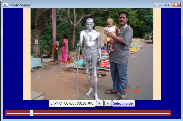
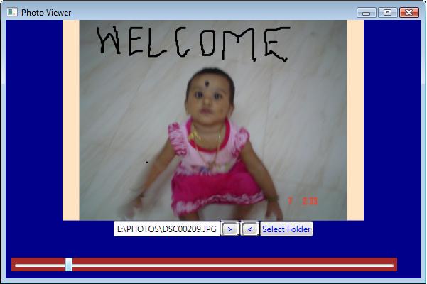
The window appears displaying the first photo. The user can use the Slider at the bottom of the window to see the zooming in and out of the image. The best choice is to maximize the window to its full size and perform the Zoom operation. The > button indicates the Next image and < button indicates the Previous image. To choose another folder to view the photos, click the 'Select Folder' Button.
Bonus Features
You may draw anything you want on the InkCanvas, even on top of the photos displayed in the PhotoViewer application, to add your own markings and point it to the guy sitting next to you. Hey, don't add extra-animated features on his own photo to baffle him!
Enjoy WPF!
History
- 19th November, 2007: Initial post