
WPF: IconButton
4.54/5 (14 votes)
Creating a little push button from an icon
Introduction
While there are a few demo videos on how to create nice buttons with Expression Blend, I didn't find a straight forward description on how to create a nice button from an image. This article tries to fill this gap and a bit more. The IconButtonStyle takes the contents of the button, decorates them with a little shadow and when the user presses the button, it generates a subtle animation "pushing" the content into the screen.
Background
Styles are XAML's way of collecting common properties into a reusable definition. Usually styles are defined in the Apps.Resources or Window.Resources section of XAML.
An in-depth discussion of the presented material can be found in the Customizing Controls For Windows Presentation Foundation article of the MSDN Magazine.
Using the Code
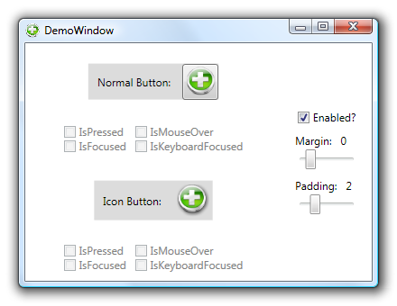
The attached demo project has a single window with a few controls to exercise and inspect a normal Button and compare it to the created icon Button. If you want to use this in your own project, the relevant styles and resources for the icon Button are all collected in the App.xaml's Resources section. There, you will find the original styles generated by Expression Blend 2 (September Review) and the Style I wrote.
To use the style, just copy the whole IconButtonStyle from the App.xaml into your own Resources and set the Style property of your button to "{DynamicResource IconButtonStyle}". Although the style was primarily designed to contain items, the Button's contents can be any XAML element you choose.
<Button Style="{DynamicResource IconButtonStyle}">
    <Image Source="/WpfIconButton;component/Icons/Symbol-Add.png" />
</Button>
Points of Interest
The general structure of the style looks like this:
<Style x:Key="IconButtonStyle" TargetType="{x:Type Button}">
    <!-- set default values -->
    <!-- set the visual tree of the control -->
    <Setter Property="Template">
        <Setter.Value>
        <ControlTemplate TargetType="{x:Type Button}">
                <!-- here come the actual sub-controls -->
        <ControlTemplate.Triggers>
            <!-- the triggers define the reactions to various state
                         changes -->
Most of the interesting logic happens within the triggers, which -- amongst other things -- modify the "translation" RenderTransform and the "shadow" Effect on the ContentPresenter to create the "push" effect. Here are the relevant parts of the ControlTemplate:
<ContentPresenter ... >
    <ContentPresenter.Effect>
        <!-- give the content a bit of shadow -->
        <DropShadowEffect x:Name="shadow"
            ShadowDepth="2"
            Opacity="0.7"
            BlurRadius="3" />
    </ContentPresenter.Effect>
    <ContentPresenter.RenderTransform>
        <!-- push the content a bit to the left and the top -->
        <TranslateTransform x:Name="translation"
            X="-1" Y="-1"/>
    </ContentPresenter.RenderTransform>
</ContentPresenter>
<ControlTemplate.Triggers>
    <Trigger Property="IsPressed" Value="True">
        <Trigger.EnterActions>
            <BeginStoryboard> <Storyboard>
                <DoubleAnimation
                    Duration="0:0:0"
                    To="0"
                    Storyboard.TargetName="shadow"
                    Storyboard.TargetProperty="(DropShadowEffect.ShadowDepth)"/>
                <DoubleAnimation
                    Duration="0:0:0"
                    To="0"
                    Storyboard.TargetName="translation"
                    Storyboard.TargetProperty="(TranslateTransform.X)"/>
                <DoubleAnimation
                    Duration="0:0:0"
                    To="0"
                    Storyboard.TargetName="translation"
                    Storyboard.TargetProperty="(TranslateTransform.Y)"/>
            </Storyboard> </BeginStoryboard>
        </Trigger.EnterActions>
        <Trigger.ExitActions>
            <BeginStoryboard> <Storyboard>
                <!-- The ExitActions StoryBoard reverses the made changes -->
            </Storyboard> </BeginStoryboard>
        </Trigger.ExitActions>
    </Trigger>
</ControlTemplate.Triggers>
Acknowledgements
- Arthur Zaczek gave me hints and helped me polish the article
- The Symbol-Add.png icon was downloaded from VistaICO.com
History
- 2008-02-07: First version released
- 2009-11-20: Updated to use H/W accelerated effect instead of
BitmapEffect