Introduction
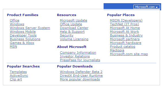
This article describles the ASP.NET Flyout Control and its application. Flyout can make your webpage contain more information, look neater and more stylish. Above images shows how Flyout is used as QuickLinks in Microsoft MSDN website. The Flyout control that I would like to introduce here is from obout inc. This Flyout is features-rich and total free: free to download, free to use, free to distribute.
List of features
Below are some key features:
- Able to wrap any content.
- Able to customize opening position.
- Provided with 4 types of effect
- Design-time preview support
- Easy to use: It takes less than 3 min to get it work.
How to add Flyout to your page
Adding Flyout control to your page is very simple
Using Flyout control
Below is some sample code to start with:
<asp:Button runat="server" ID="myButton" Text="My Button"/>

<obout:Flyout runat="server" ID="myFlyout" AttachTo="myButton">
    <div style="background-color:lightblue;width:200px;height:100px;">
        Flyout
    </div>
</obout:Flyout>
By putting ID of Button into AttachTo property of Flyout, you have made Flyout attach to a Button.
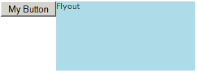
And here is result of our work:

When the mouse hovers the button, Flyout opens at bottom center of the button.
Customize open position of Flyout
Flyout can be open not only at bottom of the target object, but also at other relative positions. Four properties which will control position of Flyout are Position, Align, RelativeLeft and RelativeTop.
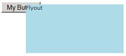
How can I can make Flyout attach Button like this?

Pretty easy, here comes the code:
<asp:Button runat="server" ID="myButton" Text="My Button"/>

<obout:Flyout ... Position="MIDDLE_RIGHT" Align="TOP" ...>
    <div style="background-color:lightblue;width:200px;height:100px;">
        Flyout
    </div>
</obout:Flyout>
If you want your Flyout to have a custom position, like this:

Do this:
<asp:Button runat="server" ID="myButton" Text="My Button"/>

<obout:Flyout ... Position="ABSOLUTE" RelativeLeft="50" RelativeTop="5" ...>
    <div style="background-color:lightblue;width:200px;height:100px;">
        Flyout
    </div>
</obout:Flyout>
To know more about other positioning styles you may have a look at Flyout positions and alignment
Customize OpenEvent
Default behavior of Flyout is top open on cursor hover over target element. This behavior can be changed. For example, to open on click event:
<input type="button" id="myButton" value="My Button"/>

<obout:Flyout ... OpenEvent="ONCLICK" ...>
     <div style="background-color:lightblue;width:200px;height:100px;">
        Flyout
    </div>
</obout:Flyout>
OpenEvent property has a number of pre-defined events for you to choose.
Customize opening effect
Flyout provide 4 types of effects:
FlyingEffect: The default effect of Flyout FadingEffect: The Flyout will appear and dissolve gradually. SlidingEffect:The Flyout will appear, slide then stop NoneEffect: Flyout will just appear without any effect
It is possible to set multiple effects on the same Flyout. For example, if you want Flyout to open by sliding from the left and fading at the same time:
<input type="button" id="myButton" value="My Button"/>

<obout:Flyout ... SlidingEffect="LEFT" FadingEffect="true" ...>
     <div style="background-color:lightblue;width:100px;height:50px;">
        Flyout
    </div>
</obout:Flyout>
Here is the result of sliding and fading
Cool applications
- Initially hidden quick links or site map, feedback form, extra information about a product, tooltips. View
- Flyout can be used as a menu. View
- Flyout can be used with grid to show more information View
- Anything else.
Summary
In this article, I have shown you how to use a Flyout control from obout. This component will help you save alot of layout space on your webpages and provide extra information to your users. I hope that you find it useful. In the zip file, along with this article, there are many examples of Flyout that you can start with. You may get the latest version of Flyout anytime from obout Suite. All the best.
