Introduction
In the first part of this article we learned the different ways that WPF offers us to customize our controls, focusing on styles and control templates. We gave an overview of the basic theory of common elements and resource dictionaries.
If you missed it or want to give a review here it is:
This time we go straight to the heart of the matter, by scrutinizing how to customize various standard WPF controls:
- Button
- Textbox
- Scrollbar (horizontal & vertical)
- ProgressBar

[View larger image]
Button
The button is one of the controls easier to customize, but in turn is one of the most commonly used controls and the user interacts a lot with them. It is therefore important to make them as attractive as we can:
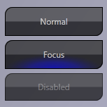
One very important thing to remember when we create our own templates is that they completely replace the default template of control, so if you want to give visual cues that our button is enabled, disabled, pressed, with a focus or mouse over it, we do so. We will achieve this by taking advantage of the Triggers of control. The first thing we do is to define a new style for all controls of type Button. We do not want to apply it selectively to certain buttons, we want the default appearance of any button on your application:
<Style TargetType="{x:Type Button}">

</Style>
In the header just set the type property TargetType to Button.
Now let's include some default settings for our button within this block style:
<Setter Property="OverridesDefaultStyle" Value="True" />
<Setter Property="SnapsToDevicePixels" Value="True" />
<Setter Property="Foreground" Value="White" />
The object Setter is a simple Property attribute that specifies the name of the property that we establish, and the Value attribute that specifies the value to be applied to that property. The property OverridesDefaultStyle indicates our control that never use the default theme of control for any property, even if not defined in our style or template, if we have not implemented anything, it is because we do not need or otherwise we supply. SnapsToDevicePixels tells our style as the drawing of our control should use device-dependent pixels.
By default, WPF uses the current DPI for resolution independence when it comes to drawing, but this effect can cause a diffuse or fuzzy drawing, and in our case we want our precious controls look good. So avoid this by indicating this property drawn diffuse or fuzzy. Foreground, well not much to say, in the case of our button Foreground property affects the text. Since our button is dark and the default text color is black, would be a nuisance to be going through all the buttons by changing the text to white or another color and just want to change the look of our application is done centrally, so that by including this property all the buttons get white text.
The last Setter object we need to set the Template property of the button and within this Setter define our Control Template:
<Setter Property="Template">
    <Setter.Value>
        <ControlTemplate x:Name="tmpltButton">
        </ControlTemplate>
    </Setter.Value>
</Setter>
Different from style, which established its property TargetType in ControlTemplate establish x: Name as it is contained within the style and is automatically applied wherever the style is applied.
Within ControlTemplate object can start defining our button, this is where WPF hits you with a burst of reality: ControlTemplate is a blank slate on which you can paint anything else that you want and the end result will be the look of your button; there are no rules (or not many), just creativity.
Our button is going to be made up of six basic controls: a Borders to create the shape and fill, and a ContentPresenter will present the contents of the button. The result would be something like:
<Grid>
    <Border x:Name="BaseRectangle"
            Background="{StaticResource BaseColor}"
            CornerRadius="10,0,10,0">
    </Border>
    <Border x:Name="GlassRectangle"
            Background="{StaticResource GlassFX}"
            CornerRadius="10,0,10,0">
    </Border>
    <Border x:Name="GlowRectangle"
            Background="{StaticResource GlowFX}"
            CornerRadius="10,0,10,0"
            Opacity="0">
    </Border>
    <Border x:Name="ButtonBorder"
            CornerRadius="10,0,10,0"
            BorderBrush="Black"
            Opacity="1"
            BorderThickness="1">
    </Border>
    <ContentPresenter x:Name="ButtonContent"
                      Opacity=".7"
                      Content="{Binding Path=Content,
                      RelativeSource={RelativeSource TemplatedParent}}"
                      HorizontalAlignment="center"
                      VerticalAlignment="center">
    </ContentPresenter>
</Grid>
We just have a grid that contains our Border controls and ContentPresenter, the Border BaseRectangle first is our base coat of paint, as you see all colors are defined with a link to resources that are already established in our resource dictionary. This way if we change the BaseColor, the color will change at all sites where it is applied. Borders all share the same value for the control, CornerRadius have the desired appearance, the four values follow the order CornerRadius clockwise:
- Upper right corner
- Top left corner
- Bottom left corner
- Bottom right corner
Using a value of 10 in the upper right and lower left, and a value of 0 in the others, we get the desired effect. The Background property of the first two Borders define the overall look of our button, the first applying a base color (our resource BaseColor) and the second using a gradient called GlassFX that is responsible for giving our button the glass mirror effect .The third Border defined in the resource GlowFX background and is the animation used for button focus by default. We set the Opacity to 0, to encourage this property later with EventTriggers of our staff. The last Border define the outer edge of the button, in this case does not define the Background property so it is transparent but BorderBrush that define property sets the border color and BorderThickness set the border thickness. The appearance of our button is almost complete, we just need to display content that has every button, whether text, images or any combination thereof. For this we use the ContentPresenter control. The property more interesting is the Content, linked directly to our button content:
Binding Path: Indicates the property to which we link up. RelativeSource: Indicates the source of this property, in our case went to a source on templated parent type, i.e. the parent object of our staff, which in this case will each button to wear.
This is the already fully completed the look of our button. If we place a button on a test window, we see that our style is used automatically. When you run, however, we note that the button does not react in any way when you mouse over or click, which is not very intuitive for the end user. This we will solve it using the Triggers of ControlTemplates. Just after the Grid, add a ControlTemplate.Triggers object:
<ControlTemplate.Triggers>
    <EventTrigger RoutedEvent="Button.MouseLeave">
        <EventTrigger.Actions>
            <BeginStoryboard Storyboard="{StaticResource GlowOut}">
            </BeginStoryboard>
        </EventTrigger.Actions>
    </EventTrigger>
    <EventTrigger RoutedEvent="Button.MouseEnter">
        <EventTrigger.Actions>
            <BeginStoryboard Storyboard="{StaticResource GlowIn}">
            </BeginStoryboard>
        </EventTrigger.Actions>
    </EventTrigger>
    <EventTrigger RoutedEvent="Button.LostFocus">
        <EventTrigger.Actions>
            <BeginStoryboard Storyboard="{StaticResource GlowOut}">
            </BeginStoryboard>
        </EventTrigger.Actions>
    </EventTrigger>
    <EventTrigger RoutedEvent="Button.GotFocus">
        <EventTrigger.Actions>
            <BeginStoryboard Storyboard="{StaticResource GlowIn}">
            </BeginStoryboard>
        </EventTrigger.Actions>
    </EventTrigger>
    <Trigger Property="Button.IsPressed" Value="True">
        <Setter Property="Background" TargetName="GlowRectangle"
                Value="{StaticResource GlowFXPressed}">
        </Setter>
        <Setter Property="Opacity" TargetName="ButtonContent"
                Value="1">
        </Setter>
    </Trigger>
    <Trigger Property="IsEnabled" Value="False">
        <Setter Property="Opacity" TargetName="ButtonContent"
                Value=".3">
        </Setter>
        <Setter Property="Opacity" TargetName="ButtonBorder"
                Value=".5">
        </Setter>
        <Setter Property="Background" TargetName="GlassRectangle"
                Value="{StaticResource GlassFXDisabled}">
        </Setter>
    </Trigger>
</ControlTemplate.Triggers>
As you can see in this snippet, we have two types of triggers: Trigger and EventTrigger.
The Trigger is fired when the property indicated has the value indicated, while EventTriggers are triggered when the specified event is thrown. The biggest difference is that with EventTriggers we can launch animations as visual indication of a change in the control state.
In the case of our button, it responds to four events: MouseEnter, MouseLeave, LostFocus and GotFocus.
Each defines an EventTrigger.Action. EventTrigger and within this BeginStoryboard finds the object that starts the animation shown on your property Storyboard (in the first chapter we talked about animation and explained how to create simple animations).
We also monitor the change of two properties: IsPressed and IsEnabled.
Each of these two triggers will be launched when the property has the value indicated above (when IsPressed is true and when IsEnabled is false) and implemented through Setter objects to other property values. Each object defines Setter Property indicating the name of the property to modify. TargetName indicating the name of the object of our staff to be affected by the amendment and value that indicates the new value that will be the owner.
If we run our project, we now see that, thanks to the Triggers, our button reacts when you mouse over it, loses mouse focus, gets or loses tab focus, pressing it and disabling it; visual feedback that we consider very important to our end user.
Textbox
In general our Textbox control is made much like the button, the biggest change in the composition of control is, in this case, instead of using a ContentPresenter control we use a ScrollViewer control, to allow the user to use the vertical and horizontal scroll bars in a multiline text box:

the XAML code for ScrollViewer object is this:
<ScrollViewer x:Name="PART_ContentHost"
              Opacity=".7"
              Content="{Binding Path=Content,
                        RelativeSource={RelativeSource TemplatedParent}}"
              HorizontalAlignment="{Binding Path=HorizontalAlignment,
                                    RelativeSource={RelativeSource TemplatedParent}}"
              VerticalAlignment="{Binding Path=VerticalAlignment,
                                  RelativeSource={RelativeSource TemplatedParent}}"
              Width="{Binding Path=Width,
                      RelativeSource={RelativeSource TemplatedParent}}"
              Height="{Binding Path=Height,
                       RelativeSource={RelativeSource TemplatedParent}}">
</ScrollViewer>
In this case except for ScrollViewer Opacity, all the other properties (Content, HorizontalAlignment, VerticalAlignment, Width and Height) have been linked to the parent of the template control to illustrate that any property shared between a control template and the parent control can be linked.
The ScrollViewer's defined name is not random, this control is linked to the ScrollViewer code in the original template. This is a small limitation and one of the few that we find in WPF. To keep things working properly, we must respect the name, in this case PART_ContentHost. Microsoft recommends that you always have to use an object code of a template for what we call PART_Xxx thus following a common nomenclature.
Here the Triggers used are simpler than those of the button, we use two EventTrigger LostFocus and GotFocus, and Trigger property IsEnabled:
<ControlTemplate.Triggers>
    <EventTrigger RoutedEvent="TextBox.LostFocus">
        <EventTrigger.Actions>
            <BeginStoryboard Storyboard="{StaticResource GlowOut}">
            </BeginStoryboard>
        </EventTrigger.Actions>
    </EventTrigger>
    <EventTrigger RoutedEvent="TextBox.GotFocus">
        <EventTrigger.Actions>
            <BeginStoryboard Storyboard="{StaticResource GlowIn}">
            </BeginStoryboard>
        </EventTrigger.Actions>
    </EventTrigger>
    <Trigger Property="IsEnabled" Value="False">
        <Setter Property="Opacity" TargetName="PART_ContentHost"
                Value=".3">
        </Setter>
        <Setter Property="Opacity" TargetName="BorderExtern"
                Value=".5">
        </Setter>
        <Setter Property="Fill" TargetName="GlassRectangle"
                Value="{StaticResource GlassFXDisabled}">
        </Setter>
    </Trigger>
</ControlTemplate.Triggers>
Scrollbars
The scrollbar control will give us a little more work than the first two controls, because it involves moving parts and can change orientation from vertical to horizontal.
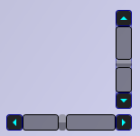
For this control we must define several styles and two ControlTemplates separately, one for the vertical and one for the horizontal bar.
First start by defining the styles of the controls that make up a scrollbar, LineButtons, PageButtons and ScrollThumb:
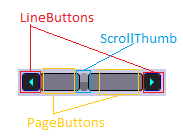
LineButton
The LineButtons are the buttons on the ends of the scrollbar, the type of control is RepeatButton and the ControlTemplate is very simple:
<ControlTemplate x:Name="tmplRepeatButton">
    <Border Background="#FF222222" BorderBrush="DarkBlue"
            BorderThickness="1" CornerRadius="3">
        <Path HorizontalAlignment="Center"
              VerticalAlignment="Center"
              Data="{Binding Path=Content,
                     RelativeSource={RelativeSource TemplatedParent}}"
              Fill="Cyan" >
        </Path>
    </Border>
</ControlTemplate>
It consists of only two controls - a border that defines the appearance of control, and contains a Path object. Data owned associates with the Content property of the control that will add this template. The great power of the Path object is given by the Data property; it has a "mini language" to specify complex geometries quickly and easily. You can find a comprehensive reference on MSDN here. Its name is indicated by the action it performs, because every time you press a LineButton it moves up or down one line on the control we use.
PageButtons
The PageButtons act as the background of the bar on which we move the scrollbar. As the name suggests, they are responsible for moving forward or backward one full page. The type of control is also RepeatButton.
Its control template is very simple and consists of a single Border object:
<ControlTemplate x:Name="tmplRepeatButton">
    <Border Background="#66000000" BorderBrush="Black"
            BorderThickness="1" CornerRadius="3">
    </Border>
</ControlTemplate>
As you can see, both the template of LineButton like the PageButton have the same name, this is because the templates to be embedded within a style, its scope is the style and not collide.
ScrollThumb
The ScrollThumb is the moving part of the scrollbar, it is resized as needed more scroll or less, and can be clicked and dragged to move the content. The type of control used is Thumb, since it includes functionality for drag & drop natively. Their template control is also more complex than the previous buttons:
<ControlTemplate x:Name="tmplScrollThumb">
    <Grid>
        <Rectangle RadiusX="3" RadiusY="3" Fill="#66222222">
        </Rectangle>
        <Border CornerRadius="3" BorderBrush="DarkBlue"
                Background="{StaticResource GlassFX}">
            <Path HorizontalAlignment="Center"
                  VerticalAlignment="Center"
                  Data="{Binding Path=Content,
                         RelativeSource={RelativeSource TemplatedParent}}">
            </Path>
        </Border>
    </Grid>
</ControlTemplate>
We have a grid that will contain our controls, a rectangle that acts as the basis of Thumb, a Border to give it a glass effect and within this a Path object for us to include a custom geometry if we wish.
Now that we've defined templates and styles based on our audits, we can go on to define the templates of both vertical and horizontal Scrollbar:
Vertical Scrollbar
<ControlTemplate x:Key="VerticalScroll" TargetType="{x:Type ScrollBar}">
    <Grid>
        <Grid.RowDefinitions>
            <RowDefinition Height="18"></RowDefinition>
            <RowDefinition Height="0.00001*"></RowDefinition>
            <RowDefinition Height="18"></RowDefinition>
        </Grid.RowDefinitions>
        <Border Grid.RowSpan="3" CornerRadius="3"
                BorderBrush="DarkBlue" BorderThickness="1"
                Opacity=".6">
        </Border>
        <RepeatButton Grid.Row="0"
                      Style="{StaticResource LineButton}"
                      Height="18" Command="ScrollBar.LineUpCommand"
                      Content="M 0 4 L 8 4 L 4 0 Z">
        </RepeatButton>
        <Track Name="PART_Track" Grid.Row="1" IsDirectionReversed="True">
            <Track.DecreaseRepeatButton>
                <RepeatButton Style="{StaticResource PageButton}"
                              Command="ScrollBar.PageUpCommand" />
            </Track.DecreaseRepeatButton>
            <Track.Thumb>
                <Thumb Style="{StaticResource ScrollThumb}" />
            </Track.Thumb>
            <Track.IncreaseRepeatButton>
                <RepeatButton Style="{StaticResource PageButton}"
                              Command="ScrollBar.PageDownCommand" />
            </Track.IncreaseRepeatButton>
        </Track>
        <RepeatButton Grid.Row="2"
                      Style="{StaticResource LineButton}"
                      Height="18" Command="ScrollBar.LineDownCommand"
                      Content="M 0 0 L 4 4 L 8 0 Z">
        </RepeatButton>
    </Grid>
</ControlTemplate>
This is already a template control more complex, consisting of more controls. To start we have a grid which will define 3 rows. The first and last contain the buttons up and down using RepeatButtons, to which we apply the style you created earlier LineButton. In the middle of the grid, define a Track object, since this part of a code associated scrollbar is given the same name as the original: PART_Track, and within it we have three properties that we fill in: DecreaseRepeatButton, Thumb and IncreaseRepeatButton.
In the IncreaseRepeatButton define DecreaseRepeatButton, RepeatButtons, PageButton style you created earlier and define a control Thumb Thumb ScrollThumb style. Something to consider is the content of the style used in RepeatButton and LineButton, these combinations of letters and numbers are the "mini language" of geometry using the Path object uses to draw shapes. It is very useful and interesting, the section of LineButton style you have a link to a full description of this language.
Horizontal Scrollbar
The horizontal scrollbar is identical to the vertical scrollbar, only instead of dividing the Grid into rows we divide it into columns, using the first and last column for LineButtons and the center column for Track:
<ControlTemplate x:Key="HorizontalScroll" TargetType="{x:Type ScrollBar}">
    <Grid>
        <Grid.ColumnDefinitions>
            <ColumnDefinition Width="18"></ColumnDefinition>
            <ColumnDefinition Width="0.00001*"></ColumnDefinition>
            <ColumnDefinition Width="18"></ColumnDefinition>
        </Grid.ColumnDefinitions>
        <Border Grid.ColumnSpan="3" CornerRadius="3"
                BorderBrush="DarkBlue" BorderThickness="1"
                Opacity=".6" >
        </Border>
        <RepeatButton Grid.Column="0"
                      Style="{StaticResource LineButton}"
                      Width="18" Command="ScrollBar.LineLeftCommand"
                      Content="M 4 0 L 4 8 L 0 4 Z">
        </RepeatButton>
        <Track Name="PART_Track" Grid.Column="1" IsDirectionReversed="False">
            <Track.DecreaseRepeatButton>
                <RepeatButton Style="{StaticResource PageButton}"
                              Command="ScrollBar.PageLeftCommand" />
            </Track.DecreaseRepeatButton>
            <Track.Thumb>
                <Thumb Style="{StaticResource ScrollThumb}" />
            </Track.Thumb>
            <Track.IncreaseRepeatButton>
                <RepeatButton Style="{StaticResource PageButton}"
                              Command="ScrollBar.PageRightCommand" />
            </Track.IncreaseRepeatButton>
        </Track>
        <RepeatButton Grid.Column="2"
                      Style="{StaticResource LineButton}"
                      Width="18" Command="ScrollBar.LineRightCommand"
                      Content="M 0 0 L 4 4 L 0 8 Z">
        </RepeatButton>
    </Grid>
</ControlTemplate>
Finally we only need to define a common style for the Scrollbar control to decide which template to apply depending on the orientation designated by the control:
<Style TargetType="{x:Type ScrollBar}">
    <Setter Property="OverridesDefaultStyle" Value="True" />
    <Setter Property="SnapsToDevicePixels" Value="True" />
    <Style.Triggers>
        <Trigger Property="Orientation" Value="Vertical">
            <Setter Property="Width" Value="18"></Setter>
            <Setter Property="Height" Value="Auto"></Setter>
            <Setter Property="Template" Value="{StaticResource VerticalScroll}">
            </Setter>
        </Trigger>
        <Trigger Property="Orientation" Value="Horizontal">
            <Setter Property="Width" Value="Auto"></Setter>
            <Setter Property="Height" Value="18"></Setter>
            <Setter Property="Template" Value="{StaticResource HorizontalScroll}">
            </Setter>
        </Trigger>
    </Style.Triggers>
</Style>
This is a simple style, simply have two triggers that control the Orientation property, depending on its value and apply a template or another.
ProgressBar
The progress bar is a very useful control to provide user information about performing a task that takes time. In this case, apart from giving a more attractive appearance, we are also going to make it a more functional, allowing the user to see the percentage of work performed numerically. We also support for a work with an undetermined period of execution:
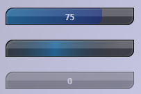
In the picture above we can see three states of a ProgressBar: Determined, Undetermined, and Disabled. As you can see in certain state and disabled provides a visual information from the % done in the form of number. The control template is very similar to any other control that we have seen:
<ControlTemplate TargetType="{x:Type ProgressBar}">
    <Grid MinHeight="14" MinWidth="20">
        <Border x:Name="BaseRectangle"
                Background="{StaticResource BaseColor}"
                CornerRadius="10,0,10,0">
        </Border>
        <Border x:Name="GlassRectangle" CornerRadius="10,0,10,0"
                Background="{StaticResource GlassFX}">
        </Border>
        <Border x:Name="animation" CornerRadius="10,0,10,0"
                Opacity=".7" Background="{StaticResource GlowFXProgress}"
                HorizontalAlignment="Left">
        </Border>
        <Border x:Name="PART_Indicator" CornerRadius="10,0,10,0"
                Background="{StaticResource GlowFXProgress}"
                HorizontalAlignment="Left">
        </Border>
        <Border x:Name="PART_Track" BorderThickness="1"
                CornerRadius="10,0,10,0" BorderBrush="Black">
        </Border>
        <Border x:Name="BordeCabeceraSombra" BorderThickness="2"
                CornerRadius="10,0,10,0" BorderBrush="DarkGray"
                Opacity=".2" Margin="1,1,1,0">
        </Border>
        <Label x:Name="Progress" VerticalAlignment="Stretch"
               HorizontalAlignment="Stretch"
               HorizontalContentAlignment="Center"
               VerticalContentAlignment="Center"
               FontWeight="Bold" Foreground="White" Opacity=".7"
               Content="{Binding Path=Value,
                         RelativeSource={RelativeSource TemplatedParent}}">
        </Label>
    </Grid>
    <ControlTemplate.Triggers>
        <Trigger Property="IsIndeterminate" Value="True">
            <Setter Property="Visibility" TargetName="Progress" Value="Hidden">
            </Setter>
            <Setter Property="Background" TargetName="PART_Indicator">
                <Setter.Value>
                    <MultiBinding>
                        <MultiBinding.Converter>
                            <wintheme:ProgressBarHighlightConverter/>
                        </MultiBinding.Converter>
                        <Binding Source="{StaticResource GlowFXProgressAnimated}"/>
                        <Binding Path="ActualWidth"  ElementName="BaseRectangle"/>
                        <Binding Path="ActualHeight" ElementName="BaseRectangle"/>
                    </MultiBinding>
                </Setter.Value>
            </Setter>
        </Trigger>
        <Trigger Property="IsEnabled" Value="False">
            <Setter Property="Opacity" Value=".5"></Setter>
        </Trigger>
    </ControlTemplate.Triggers>
</ControlTemplate>
This template is long but not complicated, interesting as it is in two points: first, the label control that makes up the template, whose content is linked to the Value property of the progress bar, thus subject to change property value will be reflected in the label control.
The second is on the trigger that controls when IsIndeterminate property is true, changes the background property value control using a MultiBinding PART_Indicator Converter, this is a class that accepts multiple input values and returns an output value. In our case we want to preserve the functionality of Windows Vista and Windows 7 indeterminate bars, which requires that we include in our project a reference to the assembly: PressentationFramework.Aero and referenced in the XAML file of our theme as follows:
xmlns:wintheme="clr-namespace:Microsoft.Windows.Themes;
                assembly=PresentationFramework.Aero"
With this our progressbar works fine.
Conclusion
Black Crystal theme includes other controls such as DataGrid, TabControl and GroupBox. I leave it as an exercise to the reader. With what you have seen here, you will see that it's not complicated to understand.
A big hello and Happy Coding!
History
- 05 June 2010 - Initial Release.

