
In this article, I’ll show how to add another dimension to your web pages and applications with the new 3D transformation functions and properties in CSS. We’ll look at transform, translate, rotations, scaling, perspective and more, along with issues to do with z-index, browser gotchas, and the best use cases for these functions.
HTML elements can be transformed in three dimensions:
- the horizontal x-axis
- the vertical y-axis, and
- the depth z-axis
On a two-dimensional screen, it’s useful to think of the surface being at z co-ordinate zero. A positive z-value moves an object toward you (in front of the screen) while a negative z-value moves an object away (behind the screen). When perspective is added, a more distant z-value can cause the object to disappear entirely.
There are some things to note here:
- CSS can only transform two-dimensional HTML elements in three-dimensional space. The elements themselves remain flat and have zero depth. It’s possible to scale in the z-plane, but that will not extrude a square into a cube. You can still create a cube, but would need six elements to make each side.
- CSS 3D transformations are great for page effects — but don’t expect that you’ll be able to create the next MineCraft or Call of Duty. Complex models are better implemented using a technology such as WebGL.
3D transformations are well-supported in all modern browsers (IE10+), but:
- Internet Explorer doesn’t support
transform-style: preserve-3d, which makes it impossible to create a 3D scene. - All versions of Safari must use the vendor-prefixed
-webkit-backface-visibilityto hide rear faces. All other browsers supportbackface-visibility.
The following sections describe the 3D transformation properties and functions. The demonstration page illustrates how most are used.
The transform Property
Any element can have a single transform property applied. It can be assigned a function with one or more parameters. For example:
.element {
  transform: function1(parameter1, [...parameterN]);
}
If two or more transformations are required, any number of space-separated functions can be defined:
.element {
  transform: function1(p1, [...pN]) function2(p1, [...pN]);
}
For example, to scale in the horizontal plane and transform vertically:
.element {
  transform: scaleX(2) translateY(50px);
}
Finally, transform: none; removes all existing transforms.
Translation (Moving) Functions
You have possibly used translate functions to move an element horizontally along the x axis or vertically along the y axis:
transform: translateX(50px);        /* 50px to right */
transform: translateY(-100%);       /* 100% up */
transform: translate(50px, -100%);  /* both together */
Any length unit can be used. Percentages reference the size of the transformed element so a 100px high block with translateY(80%) applied moves it down by 80 pixels.
Moving into the third dimension, we can also use translateZ:
transform: translateZ(-200px); /* 200px 'into' the screen */
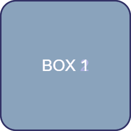
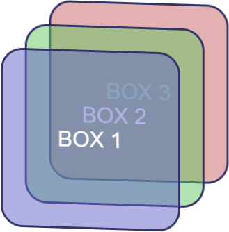
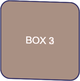
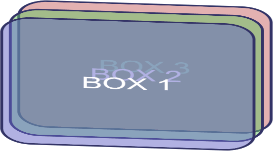
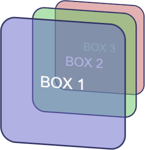
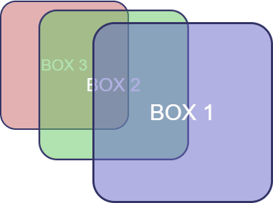
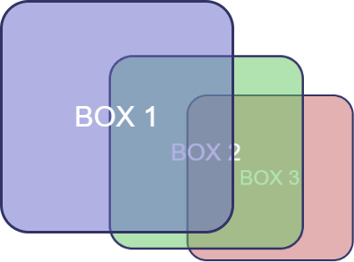
Given three elements, #box1, #box2 and #box3, absolutely positioned in the same place, with translateZ(-200px) applied to #box2 and translateZ(-400px) applied to #box3. The result is fairly uninspiring:
However, if we rotate the whole outer #scene container, the z-axis transformations become more evident:
#scene {
  transform-style: preserve-3d;
  transform: rotateX(-10deg) rotateY(-10deg);
}
The shorthand translate3d function allows an element to be moved along all three axes accordingly:
transform: translate3d(50px, 100%, 7em); /* x, y, z axis */
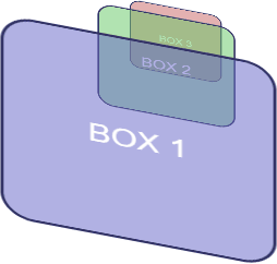
transform-style Property
By default (and always in IE), transform-style is set to flat. This indicates that all transformed children of an element lie in the plane of the element itself. In other words, inner elements could have any transform applied but they would be squashed into the flat plane of the container:
In most situations, transform-style: preserve-3d; must be used to indicate the child elements are positioned in 3D space and any transformation of the container will transform all accordingly.
Rotation Functions
The 2D rotate() function actually rotates elements around the z-axis and is identical to rotateZ(). For example:
transform: rotateZ(45deg); /* or rotate(45deg) */
rotateX() rotates around the horizontal axis and rotateY() around the vertical.
Angles can be defined in:
turn— e.g.0.5turnis half a turn clockwisedeg— degrees, e.g.90degis one quarter turn clockwiserad— radians, e.g.-3.1416radis half a turn counter-clockwisegrad— gradians. One full turn is400grad, so-200gradis half a turn counter-clockwise.
Three axes of rotation can be set with the rotate3d() function. Somewhat confusingly, it accepts four values, which describe a vector:
x— the x-coordinate of the vector denoting the axis of rotation (0 to 1).y— the y-coordinate of the vector denoting the axis of rotation (0 to 1).z— the z-coordinate of the vector denoting the axis of rotation (0 to 1).a— the angle of rotation. A positive angle denotes clockwise rotation and negative is counter-clockwise.
Math masochists can read full details of rotate3d() at MDN.
Scaling (Size) Functions
The functions scaleX() and scaleY() stretch or shrink an element in the horizontal and vertical planes accordingly:
transform: scaleX(2);   /* twice as wide */
transform: scaleY(0.5); /* half as tall */
scaleZ() does the same for the depth plane. In the example above, transform: scaleZ(0.5); therefore reduces the spacing between each element by half.
The scale3d(x, y, z) function can apply scaling in all planes in one command. For example:
#scene {
  transform-style: preserve-3d;
  transform: scale3d(2, 1, 0.5) rotateX(-10deg) rotateY(-10deg);
}
Transform Origin
By default, an element is rotated and scaled around its center point. This can be modified by setting transform-origin with up to three space-separated values:
- one-value syntax: a length or percentage of the x origin. A single
left,center,right,toporbottomkeyword can also be used wheretopandbottomset the y origin with a center x origin. - two-value syntax: the x and y origins. A length, percentage or keyword can be used.
- three-value syntax: the x, y and z origins. The z value may only be a length unit such as
pxorem.
Moving one origin affects the rotational plane of the others. For example, transform-origin: left center 0; moves the origin to the center of the left-hand edge. This will affect rotateY() and rotateZ() functions.
Backface Visibility
The rear of an element is shown when it’s rotated around the x or y axis by more than 90 but less than 270 degrees in either direction. The rear is effectively a mirror image and it’s visible by default.
The rear can be hidden by setting backface-visibility: hidden; — if it’s applied to #box2:
#box2 {
  backface-visibility: hidden;
}

#scene {
  transform: rotateX(-10deg) rotateY(-135deg);
}
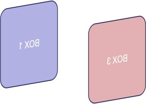
backface-visibility: hidden; is often used for card-flipping animations where two elements show the front and back of a card but only one can be visible at a time.
Perspective
The examples shown above don’t apply perspective. An element moved deeper into the z plane remains the same size no matter how far away it is from the viewer. The perspective property defaults to none but it can be set to any positive length. For example:
#scene {
  perspective: 1000px;
  transform: rotateX(-15deg) rotateY(-15deg);
}
The smaller the perspective length, the closer the vanishing point and the more pronounced the 3D effect:
#scene {
  perspective: 200px;
  transform: rotateX(-15deg) rotateY(-45deg);
}
Perspective Vanishing Point
By default, the perspective vanishing point is at the center of the element being transformed. It can be modified by setting perspective-origin: x y;, where:
xis a keyword (left,center, orright) or a percentage relative to the width of the element (0%,50%and100%is equivalent to the keywords).yis a keyword (top,center, orbottom) or a percentage relative to the height of the element (0%,50%and100%is equivalent to the keywords).
Top-left vanishing point:
#scene {
  perspective-origin: left top; /* or 0% 0% */
  perspective: 1000px;
}
Bottom-right vanishing point:
#scene {
  perspective-origin: right bottom; /* or 100% 100% */
  perspective: 1000px;
}
There’s also a perspective() function — for examle, transform: perspective(200px). However, it doesn’t appear to respect any perspective-origin.
All Together Now
Finally, scaling, rotation, and translation can be defined in a single matrix3d() function which requires no less than 16 values for a three-dimensional affine transformation.
This is probably best used in JavaScript and attempted by those with a degree in geometry! For CSS, a list of transformation functions is likely to be more readable and maintainable.
Further Reading
Working in three dimensions can be conceptually difficult, but CSS transformations are an easier route to object manipulation. The demonstration page provides an interactive tool which will help you understand how the properties and functions work together.
You can find stunning examples of CSS 3D transformations, including virtual reality viewers, first-person shooters, image galleries and Star Wars scrolling text. Many are proof-of-concept demonstrations which are unlikely to have use in typical projects. However, a few subtle, progressively-enhanced 3D effects can add another dimension to your web pages and applications.
Frequently Asked Questions about CSS 3D Transformation Functions
What are the basic 3D transformation functions in CSS?
CSS 3D transformation functions allow you to manipulate elements in a three-dimensional space. The basic functions include rotateX(), rotateY(), rotateZ(), translate3d(), translateZ(), scale3d(), and perspective(). Each function has a unique effect on the element. For instance, rotateX() rotates the element around the X-axis, while translateZ() moves the element along the Z-axis. These functions can be combined to create complex 3D transformations.
How does the perspective() function work in CSS 3D transformations?
The perspective() function in CSS 3D transformations defines how far the object is away from the user. It creates the illusion of depth and perspective in a 3D-transformed element. The function takes one parameter, which is the perspective value in pixels. A lower value creates a more pronounced perspective effect than a higher value.
Can I combine multiple 3D transformation functions in CSS?
Yes, you can combine multiple 3D transformation functions in CSS. This is done by listing each function, separated by a space, within the transform property. The functions are applied in the order they are listed. This allows you to create complex 3D effects by combining rotations, translations, and scaling.
What is the difference between 2D and 3D transformations in CSS?
The main difference between 2D and 3D transformations in CSS is the dimension in which the transformations occur. 2D transformations affect elements in the X and Y axes, while 3D transformations also include the Z-axis, adding depth to the transformations. This means that 3D transformations can rotate, move, and scale elements in three dimensions, creating a more immersive and dynamic effect.
How can I control the backface visibility in CSS 3D transformations?
The backface-visibility property in CSS controls whether the back face of an element is visible when not facing the viewer. This property is particularly useful in 3D transformations where an element rotates and its back face becomes visible. The property takes two values: “visible”, which shows the back face, and “hidden”, which hides it.
What is the use of the transform-origin property in CSS 3D transformations?
The transform-origin property in CSS 3D transformations allows you to specify the origin for the transformations. By default, the transformations originate from the center of the element. However, you can change this to any point within the element using the transform-origin property. This property takes two or three values, representing the X, Y, and optionally, the Z axis.
Can I animate CSS 3D transformations?
Yes, you can animate CSS 3D transformations using CSS transitions or animations. This allows you to create smooth, gradual transformations that enhance the user experience. You can control the duration, timing function, and delay of the animation using the respective CSS properties.
Are CSS 3D transformations supported in all browsers?
Most modern browsers support CSS 3D transformations. However, it’s always a good idea to check the specific browser support for each function, as some older versions may not fully support all features. You can use tools like Can I Use to check the current browser support for CSS 3D transformations.
How can I create a 3D flip effect using CSS 3D transformations?
A 3D flip effect can be created using CSS 3D transformations by combining the rotateY() or rotateX() function with a transition. The rotate function flips the element around its Y or X axis, while the transition creates the flipping animation. You can control the speed and timing of the flip using the transition-duration and transition-timing-function properties.
What is the matrix3d() function in CSS 3D transformations?
The matrix3d() function in CSS 3D transformations allows you to specify a 4×4 transformation matrix containing 16 values. This function can represent any 3D transformation, making it a powerful tool for creating complex 3D effects. However, it can be quite complex to use, as it requires a deep understanding of matrix mathematics.
 Craig Buckler
Craig is a freelance UK web consultant who built his first page for IE2.0 in 1995. Since that time he's been advocating standards, accessibility, and best-practice HTML5 techniques. He's created enterprise specifications, websites and online applications for companies and organisations including the UK Parliament, the European Parliament, the Department of Energy & Climate Change, Microsoft, and more. He's written more than 1,000 articles for SitePoint and you can find him @craigbuckler.