
WPF Form Designer Prototype (MVVM)
4.83/5 (31 votes)
Form designer with editable display properties and bindings. Generates XAML forms.
Introduction
The main purpose of this article is to present a prototype for a basic form designer in WPF/C# with the following characteristics and functionality:
- Can be used to create data entry forms generating XAML that can be stored in a file system or in a database and then reloaded back again.
- Dragging and dropping any control from the toolbox to the design surface
- Re-sizing/merging, removing controls
- Add/Remove rows from the form
- Setting data bindings for each type of control through a properties window
- Setting display properties for each control through a properties window, filtering properties (showing only desired ones)
This is just a sample of the type of forms that can be created with this application:

Background
This prototype was the result of a year-effort after giving up trying to find a free hostable Design Surface to create WPF forms, similar to the one available in Windows Forms. Unfortunately Visual Studio Cider designer is not open so developers can't include it in third party applications.
The chosen design pattern for this prototype was MVVM. However, code-behind had to be used in certain areas of the application due to heavy UI manipulation. I also wanted to point out that the real application was implemented using Avalon Dock library to provide IDE style docking, but it was removed from this prototype to reduce the scope and complexity of the article.
The main concept behind this application is to build a fixed-column Grid where rows can be added dynamically and where controls can be dragged from a Toolbox to each grid cell. Right-clicking each control and then -> 'Properties' or single left click will display the chosen control properties in the properties panel.
Using the code
Here is the VS 2010 Solution: Download WPFFormDesigner.zip
There are three main external libraries/projects used in this sample application:
- WPF Property Grid - Provides all the functionality for displaying control properties, with lots of customizable features, like grouping, filtering, creating extended editors, etc
- Simple MVVM Toolkit - Very easy to understand MVVM framework, provides message bus capability to communicate between ViewModels, simplifies property notifications
- FluidKit - Used only for Drag/Drop enhancements and simplification.
This is how the main application looks like:

The main project in the Visual Studio solution is called WPFFormDesigner. All the View related files are located at the Root level.

The name of the main View files are self-explanatory, an can be easily identified in the application screenshot above. Like the FormDesignerSurface , the PropertiesView, MainWindow and ToolboxView. Most of this views have a corresponding ViewModel located in the ViewModel folder.
In this case the MainWindow is the main application Window.
Grid Manipulation
Most of the Grid manipulation happens in the WPFControlUtils\FormDesignerGridExtensions.cs class. This class contains extension methods to manipulate the grid like adding rows, removing rows, readjusting columns, etc.
Drag & Drop
The drag and drop related files using the FluidKit libraries are located under: WPFControlUtils\DragDrop folder.
Adding rows
The initial row must be added through the 'Add Row' button.

The subsequent rows can be added below by using the 'insert below icon':

Removing rows
Rows can be removed by clicking on the red (-) circle button shown in the image above.
Contextual Menus

By right-clicking a dragged control in the grid we get three options:
- Show Properties - Will set this as the selected control in the property grid
- Remove Control - Will remove the control from this cell and will prepare the cell to be drag destination again
- Merge Cells - This is an experimental feature, it only works setting the
ColumnSpanof the selected control to 6 which is the number ofColumnDefinitions. This is useful when dragging an expander for example, we just merge the cells and the expander will occupy the whole row:
Notice also that the Expander will also contain 6 internal columns where controls can be added.
Control Re-sizing Adorners
Again, I'm not trying to re-invent the wheel here, for Control resizing I found a good alternative in Denis Vuyka article: WPF. Simple adorner usage with drag and resize operations .
This allows you to display an adorner around the selected control so it can be resized.

The resize logic can be found in the FormDesignerSurface.xaml.cs , look for this line:
#region Resizing Adorner Section And it uses Denis's WPFFormDesigner.WPFControlUtils.ResizingAdorner.cs class.
Experimental Serialize option

The 'Serialize' button in the Design surface will open a floating window with the XAML generated for the form. This is useful for troubleshooting and making sure the form is correct. It uses the XamlSerializedOutputWindow.xaml control to display the XAML. Notice that the right panel is empty, this is meant to display the 'cleaned' XAML, after XSLT cleanup. The one that will be rendered to the user for data entry.
Main Menu
The main 'File' menu contains three options:
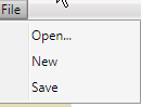
- Open - Will display a dialog to browse for an existing XAML file located in users computer
- New - Will display a new form with no rows ready to be created
- Save - Will display a dialog to save the existing form to a selected location
XAML Serializer
Initially the normal XAMLWriter.Save method was used to serialize, but it turned out to be very limited and was not serializing a lot of the MarkupExtensions used in data bindings. For that reason, a set of custom XAML Serialization classes were created under
the XamlSerializer folder based on AlexDov's XamlWriter and Bindings Serialization CodeProject article:

It is important to notice that every class that uses the
XAMLSerializer needs to be initialized with the following (MultiBinding registration is optional, if form does not define a multibinding):
EditorHelper.Register<BindingExpression, BindingConvertor>();
//Serialize Multibinding too!!
EditorHelper.Register<MultiBindingExpression,MultiBindingConvertor>();
The EditorHelper class contains a static Register method, where it registers all the different MarkupExtensions we want to serialize,
like SelectedValue, SelectedItem, SelectedIndex, etc:
internal static class EditorHelper
{
    public static void Register<T, TC>()
    {
        Attribute[] attr = new Attribute[1];
        TypeConverterAttribute vConv = new TypeConverterAttribute(typeof (TC));
        attr[0] = vConv;
        TypeDescriptor.AddAttributes(typeof (T), attr);
        //Register ItemsControl provider to serialize ComboBox ItemsSource binding!!!
        ItemsControlTypeDescriptionProvider.Register();
        SelectedValueTypeDescriptionProvider.Register();
        SelectedItemTypeDescriptionProvider.Register();
        SelectedIndexTypeDescriptionProvider.Register();
        //Item Template Selector for ListBox collection
        //Templates
        ListBoxItemTemplateSelectorTypeDescriptionProvider.Register();
    }
}
Control Properties
Every control in the toolbox has a corresponding Proxy class under the WPFPropertyGridProxies folder. This proxy classes are just wrapper classes that only expose certain properties of that control so they can be shown in the Properties View. In this sample application we just expose basic properties like Height, Width, Name, Background, etc. When right-clicking -> 'Properties' or left clicking on a control, the WPFPropertyGridProxyConverter will be invoked which will convert the selected control into its related proxy:
if (value is TextBox)
   return new TextBoxProxy(value as TextBox);

if (value is Label)
    return new LabelProxy(value as Label);

if (value is CheckBox)
    return new CheckBoxProxy(value as CheckBox);
Extended templates
There are certain Proxy properties that require extended templates in the PropertiesView panel.
This templates are configured at the bottom section of the PropertiesView.xaml file. For example the TextBoxProxy will require an extended template to configure
its bindings to the "Text" property:
<WpfPropertyGrid:PropertyGrid.Editors>
	<WpfPropertyGrid:PropertyEditor DeclaringType="{x:Type WPFPropertyGridProxies:TextBoxProxy}"
	  PropertyName="Text" InlineTemplate="{StaticResource TextProxyEditor_Inline}"
	  ExtendedTemplate="{StaticResource TextProxyEditor_Extended}" />
</WpfPropertyGrid:PropertyGrid>
Those templates are defined under the Resources\DataTemplates\PropertiesViewDataTemplates.xaml file.
It looks like this in the Properties View panel (Inline template and Extended template respectively):


For more information on Properties templates please refer to the WPF PropertyGrid project page.
Data Bindings
Data bindings for specific control properties like Text are configured mostly through the Extended template shown above.
New Bindings
When a new control is dragged to the Design surface and its bindings are configured through the 'Set Bindings' button,
then the OnSetBindings_Click method will be executed in the Resources\DataTemplates\PropertiesViewDataTemplates.cs class.
private void OnSetBindings_Click(object sender, RoutedEventArgs e)
Here the specific binding information for each type of control will be set. Notice that when a new control is dragged its background will be red.

This indicates that the control has no binding configured yet. As soon as a valid binding is entered, then a Behavior is used to set its background back to white:
ControlHasBindingBehavior.SetHasBinding(chk, true);
This attached property just indicates whether a certain control has binding or not. Triggers are used in the FormDesignerSurface.xaml to set the default background color:
<Style TargetType="TextBox">
    <Style.Triggers>
        <Trigger Property="Behaviors:ControlHasBindingBehavior.HasBinding" Value="False">
            <Setter Property="Background" Value="Red"/>
        </Trigger>
    </Style.Triggers>
</Style>
Existing Bindings
The Converters\BindingInfoToBindingEditorControlsConverter IMultiValueConverter class is referenced
in the Resources\DataTemplates\PropertiesViewDataTemplates.xaml file. This converter is used to read the binding information from a previously
created control and display it in the PropertyView grid.
List View configuration
Most of the basic toolbox controls in this application (e.g. TextBox, CheckBox, DatePicker, etc.) can be configured through
the Properties window at a basic level, like changing display properties or even setting data bindings for specific properties.
However, ItemsControl like ListView needs to be handled in a special way because user should be able
to modify its cell templates dynamically, like adding cell templates to the ListView, specifying what type of control we want
to use for each cell template and also set the data binding for those.
First of all, let's look at the ListView configured PropertyGrid Editors at the bottom of PropertiesView.xaml:
<WpfPropertyGrid:PropertyGrid.Editors>
	<WpfPropertyGrid:PropertyEditor DeclaringType="{x:Type WPFPropertyGridProxies:ListViewProxy}"
	  PropertyName="Columns" InlineTemplate="{StaticResource ListViewProxy_Columns_Inline}"
	  ExtendedTemplate="{StaticResource ListViewProxy_Columns_Extended}" />
	<WpfPropertyGrid:PropertyEditor DeclaringType="{x:Type WPFPropertyGridProxies:ListViewProxy}"
	  PropertyName="ItemsSource" InlineTemplate="{StaticResource ListViewProxy_Columns_Inline}"
	  ExtendedTemplate="{StaticResource TextProxyEditor_Extended}" />
	<WpfPropertyGrid:PropertyEditor DeclaringType="{x:Type WPFPropertyGridProxies:ListViewProxy}"
	  PropertyName="SelectedItem" InlineTemplate="{StaticResource ListViewProxy_Columns_Inline}"
	  ExtendedTemplate="{StaticResource TextProxyEditor_Extended}" />
</WpfPropertyGrid:PropertyGrid.Editors>
In the section above we can see that three extended editors have been configured for ListView control type:

Columns Editor - Here is where we can add cell templates, set Control Type for Column template and set bindings.

Let's focus on the Columns extended template shown above for a minute.
First we need to click the 'Add Column' button to create a new CellTemplate. At this point we can enter the name
of the Column Header, Control Type and the data binding settings.
Notice that all this logic takes place in the WPFPropertyGridProxies\ListViewProxy.cs class,
specifically in the OnAddColumn method:
private void OnAddColumn(object obj)
{
    var pg = UIHelper.FindParent<PropertyGrid>(obj as FrameworkElement, false);
    if (pg == null) return;
    var lvp = pg.SelectedObject as ListViewProxy;
    if (lvp == null) return;
    var gv = lvp.Component.View as GridView;
    if (gv == null) return;

    //Create First Dummy Column
    var gvc = new GridViewColumn();
    gvc.Header = "New Column";
Once we're done configuring the new Cell template we click the 'Set Template' button which will call the following method in the same ListViewProxy.cs file to build the corresponding Template:
private void OnSetColumnTemplateCommand(object obj)
{
    if (SelectedColumnTemplateControlType != null &&
          SelectedColumn != null && SelectedColumn.CellTemplate != null)
    {
        switch(SelectedColumnTemplateControlType.Name)
        {
            case "ComboBox":
                BuildComboBoxTemplate();
                break;
            case "TextBox":
                BuildTextBoxTemplate();
                break;
            case "TextBlock":
                BuildTextBlockTemplate();
                break;
            case "CheckBox":
                BuildCheckBoxTemplate();
                break;
            case "DatePicker":
                BuildDatePickerTemplate();
                break;
        }
    }
}
Same procedure needs to be repeated depending on the number of Columns (Cell Templates) we want to configure. Columns can be re-configured by selecting
a Column from the Column ComboBox on top of the Columns editor.

Once all columns are configured then just click the 'Done' button.
Notice that there is a 'Show remove button' CheckBox right above the 'Done' button. If this is enabled it will add
a ListView cell template with a Remove button at the last column so end users can remove this row.
ItemsSource and SelectedItem extended editors can be used to configure the bindings to the source Collection in the backing
ViewModel and the SelectedItem property, respectively.
Here is how the resulting XAML looks after creating a sample
two column
ListView (only showing part of the ListView definition):
<ListView MinWidth="130"
          ItemsSource="{x:Null}"
          ItemTemplateSelector="{x:Null}"
          SelectedItem="{x:Null}">
  <ListView.View>
    <GridView>
      <GridViewColumn DisplayMemberBinding="{x:Null}">
        <GridViewColumn.CellTemplate>
          <DataTemplate>
            <TextBox Width="100" Height="20"
              Text="{Binding Path=Col1.Property, Mode=TwoWay, UpdateSourceTrigger=PropertyChanged}" />
          </DataTemplate>
        </GridViewColumn.CellTemplate>My 1st Col</GridViewColumn>
      <GridViewColumn DisplayMemberBinding="{x:Null}">
        <GridViewColumn.CellTemplate>
          <DataTemplate>
            <CheckBox IsChecked="{Binding Path=Col2.Property, Mode=TwoWay,
                            UpdateSourceTrigger=PropertyChanged}" />
          </DataTemplate>
        </GridViewColumn.CellTemplate>My 2nd Col</GridViewColumn>
      <GridViewColumn DisplayMemberBinding="{x:Null}">
    <GridViewColumn.CellTemplate>
      <DataTemplate>
        <Button Command="{Binding Path=DataContext.RemoveObservableCollectionItemCommand,
          RelativeSource={RelativeSource Mode=FindAncestor, AncestorType=UserControl, AncestorLevel=1}}"
          CommandParameter="{Binding Path=ItemsSource, RelativeSource={RelativeSource Mode=FindAncestor,
            AncestorType=ListView, AncestorLevel=1}}">Remove</Button>
      </DataTemplate>
    </GridViewColumn.CellTemplate>Remove</GridViewColumn>
</GridView>
</ListView.View>
Points of Interest / Limitations
I hope you find useful this alternative, which I believe has a lot of potential for improvement. Here is a list of things to consider and some limitations that can be worked out in the future:
- The XAML generated by the app contains design-time UI elements that need to be removed in order
to be displayed to the user for data entry. This could be accomplished through an XSLT transform. - The grid column definitions are fixed to 6 but this number should be configurable ideally
- Only the basic controls are included in the toolbox like
DatePicker,Label,TextBox,Checkbox,Expander,ListView. More custom controls can be added - The 'Merge' option is very limited, can be enhanced in multiple ways
Wishlist
Here is a list of things I'd like to incorporate to the WPF Form Designer in the future:
- Multi-selection of controls to change properties of multiple controls at once
- Grouping of controls. Add a GroupBox to the toolbox to group controls
- Re-position of rows/columns. Be able to drag/ drop Grid rows or columns to move to different location
like swapping or re-locating. - Configurable number of columns
- Have a friendly way to merge cells (
ColumnSpan), similar to Excel.
Hope you find it useful and I'll be more than happy to hear about suggestions, bugs found, enhancements, etc.
History
- 3/31/2013 - Added documentation on how to configure a
ListViewcontrol (structure + bindings) - 4/3/2013 - Added Wishlist section of potential future enhancements.
- 4/3/2013 - Added Resizing documentation and acknowledgements for Denis Vuyka for Resizing Adorner and Alex Dov for Xaml Serialization