
WPF DataGrid With Excel Style Column Filter
4.93/5 (11 votes)
WPF DataGrid with columns having drop down filter option (Excel style)
Introduction
This article explains a way to create a DataGrid in WPF which has drop down filters embedded in column.

Background
When I looked for an neat/intact filtering UI for DataGrid, I could not locate the one I wanted. Some worth mentioning here:
- http://www.codeproject.com/Articles/42227/Automatic-WPF-Toolkit-DataGrid-Filtering
- http://www.codeproject.com/Articles/442498/Multi-filtered-WPF-DataGrid-with-MVVM
- http://www.codeproject.com/Articles/9947/DataGrid-with-built-in-filter-functionality
This one came closest to my idea: http://www.codeproject.com/Articles/32602/Autofiltering-Support-for-Silverlight-DataGrid. But I did not like the interface. So, I started working on a template of my own.
Note: This template will evolve to eventually discard using the ContextMenu for a more powerful pop up filter window, something like in the "Autofiltering-Support-for-Silverlight-DataGrid" article.
Using the code
Code is mostly XAML based code, with prime focus on the DataGridColumnHeader template. I have added a couple of brushes to change the look react to mouse activity. This can be customized as per need.
First, we will create a simple WPF application.
<Window x:Class="WpfCustomHeaderGrid.MainWindow"
    xmlns="http://schemas.microsoft.com/winfx/2006/xaml/presentation"
    xmlns:x="http://schemas.microsoft.com/winfx/2006/xaml"
    Title="MainWindow" Height="350" Width="525">
    <Grid></Grid>
</Window>
Then, we will add references of
in the XAML. You can choose the themes as per your requirement. | 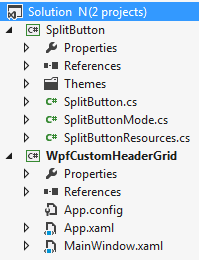 |
Here is the modified XAML code:
<Window x:Class="WpfCustomHeaderGrid.MainWindow"
        xmlns="http://schemas.microsoft.com/winfx/2006/xaml/presentation"
        xmlns:x="http://schemas.microsoft.com/winfx/2006/xaml"
        xmlns:aero="clr-namespace:Microsoft.Windows.Themes;assembly=PresentationFramework.Aero"
        xmlns:sb="clr-namespace:Wpf.Controls;assembly=Wpf.SplitButton"
        Title="MainWindow" Height="350" Width="525">
    <Grid></Grid>
</Window>
Next, I would add couple of brushes to give the custom header a decent look  " />
" />
<!--Brushes-->
<!--Light brush, to highlight.-->
<LinearGradientBrush x:Key="lightBrushBack" EndPoint="0.5,1" StartPoint="0.5,0">
	<GradientStop Color="#7EFFFFFF" Offset="0"/>
	<GradientStop Color="#03FFFFFF" Offset=".4"/>
	<GradientStop Color="#00030000" Offset=".5"/>
	<GradientStop Color="#0AFFFFFF" Offset=".55"/>
	<GradientStop Color="#7EFFFFFF" Offset="1"/>
</LinearGradientBrush>

<!--Normal brush, little darker than light brush.-->
<LinearGradientBrush x:Key="normalBrushBack" EndPoint="0.5,1" StartPoint="0.5,0">
	<GradientStop Color="#7EF0F0F0" Offset="0"/>
	<GradientStop Color="#03FFFFFF" Offset=".4"/>
	<GradientStop Color="#00030000" Offset=".5"/>
	<GradientStop Color="#0AFFFFFF" Offset=".55"/>
	<GradientStop Color="#3EFFFFFF" Offset="1"/>
</LinearGradientBrush>
Another addition would be a custom button look. A default button adds a lot of margin between the content and the boundary, in addition to a bloated design. We want just a small button.
<!--Custom Button Styling-->
<Style x:Key="RectPlainButton" TargetType="{x:Type Button}">
  <Setter Property="SnapsToDevicePixels" Value="True"/>
  <Setter Property="OverridesDefaultStyle" Value="True"/>
  <Setter Property="Template">
    <Setter.Value>
      <ControlTemplate TargetType="{x:Type Button}">
        <Grid Background="{TemplateBinding Background}">
          <Border x:Name="border" BorderThickness="1" BorderBrush="Transparent" />
          <ContentPresenter HorizontalAlignment="Center" VerticalAlignment="Center"/>
          <Border x:Name="glow" Opacity="0" HorizontalAlignment="Stretch" CornerRadius="4" Background="{StaticResource lightBrushBack}" />
        </Grid>
        <ControlTemplate.Triggers>
          <Trigger Property="IsMouseOver" Value="True">
            <Setter TargetName="glow" Property="Opacity" Value="1" />
            <Setter TargetName="border" Property="BorderBrush" Value="#FFFFFFFF" />
          </Trigger>
        </ControlTemplate.Triggers>
      </ControlTemplate>
    </Setter.Value>
  </Setter>
</Style>
Now, let us get to DataGrid part. I will put a datagrid in the MainWindow:
<Grid>
    <DataGrid x:Name="dataGrid" RowBackground="Transparent" Background="#FF81BEF7" />
</Grid>
Now that will put up a simple blue colored datagrid in the window. What do we populate this datagrid with? I will show a list of files and folders in C drive root folder. You are welcome to make data source more complicated " />
This is the C# code behind the window class:
using System.Linq;
using System.Windows;

namespace WpfCustomHeaderGrid {

  public partial class MainWindow : Window {

    public MainWindow() {
      InitializeComponent();
      dataGrid.Loaded += dataGrid_Loaded;
    }

    void dataGrid_Loaded(object sender, RoutedEventArgs e) {
      dataGrid.Loaded -= dataGrid_Loaded;
      dataGrid.ItemsSource = System.IO.Directory.GetDirectories("c:\\", "*",
                      System.IO.SearchOption.TopDirectoryOnly)
                      .Select(f => new FileName() { Name = f });
    }
  };

  // Small class to hold the data to be displayed in the data grid
  public class FileName {
    public string Name { get; set; }
  };
}
Now that we have something to display in datagrid, let's redesign it. Whatever XAML code I will put down now, will belong to section
<DataGrid><DataGrid.Resources></DataGrid.Resources></DataGrid>
Item 1 - Custom Column Header Gripper styling
<!--Custom Column Header Gripper styling-->
<!--Thanks to Nipun Tomar (http://www.c-sharpcorner.com/UploadFile/nipuntomar/wpf-datagrid-style/)-->
<Style x:Key="ColumnHeaderGripperStyle" TargetType="{x:Type Thumb}">
  <Setter Property="Width" Value="3"/>
  <Setter Property="Foreground" Value="Transparent" />
  <Setter Property="Cursor" Value="SizeWE"/>
  <Setter Property="Template">
    <Setter.Value>
      <ControlTemplate TargetType="{x:Type Thumb}">
        <Border Padding="{TemplateBinding Padding}" Background="{TemplateBinding Foreground}"/>
      </ControlTemplate>
    </Setter.Value>
  </Setter>
</Style>
This part tells datagrid how to behave when mouse cursor hovers over the thumb (left/right boundary in this case) of a column. The cursor changes to horizontal East-West mode, signaling that you can resize the column.
Item 2 - Custom Column Header template to show extra elements in the header
<!--Custom Column Header template to show extra elements in the header-->
<Style TargetType="{x:Type DataGridColumnHeader}">
  <Setter Property="Template">
    <Setter.Value>
      <ControlTemplate TargetType="{x:Type DataGridColumnHeader}">
        <!--Let's keep the top section grid to contain the DataGridHeaderBorder, and left+right thumbs.-->
        <Grid x:Name="fullHeader" Background="{StaticResource normalBrushBack}">
          <!--Here is the theme based DataGridHeaderBorder. I've used Aero here.-->
          <aero:DataGridHeaderBorder x:Name='HeaderBorder'
                         SortDirection="{TemplateBinding SortDirection}"
                         IsHovered="{TemplateBinding IsMouseOver}"
                         IsPressed="{TemplateBinding IsPressed}"
                         IsClickable="{TemplateBinding CanUserSort}"
                         BorderThickness="0,0,1,1"
                         BorderBrush="{TemplateBinding Foreground}"
                         Background="Transparent"
                         SeparatorVisibility="{TemplateBinding SeparatorVisibility}"
                         SeparatorBrush="#FFC9CACA">
            <!--We will put 3 elements inside the border: Content of header, a drop down button, and a sort order indicator.-->
            <Grid Margin="0,0,0,0">
              <Grid.ColumnDefinitions>
                <!--For ContentPresenter-->
                <ColumnDefinition Width="*" />
                <!--For drop down button-->
                <ColumnDefinition Width="14" />
                <!--For sort order indicator-->
                <ColumnDefinition Width="12" />
              </Grid.ColumnDefinitions>
              <!--A hidden rectangle is placed to be shown when mouse hovers on the column (to highlight the column.)-->
              <Rectangle x:Name="HoverRectangle"
                 Stretch="Fill"
                 Grid.ColumnSpan="3"
                 Fill="{StaticResource lightBrushBack}"
                 Opacity="0"
                 StrokeThickness="0"
                 />
              <!--Content of the header.-->
              <ContentPresenter Grid.Column="0"
                  SnapsToDevicePixels="{TemplateBinding SnapsToDevicePixels}"
                  VerticalAlignment="{TemplateBinding VerticalContentAlignment}"
                  HorizontalAlignment="{TemplateBinding HorizontalContentAlignment}"
                  Margin="{TemplateBinding Padding}"
                  Cursor="{TemplateBinding Cursor}" />
              <!--A drop down filter button.-->
              <!--Thanks to "alrh" (http://www.codeproject.com/Articles/20612/A-WPF-SplitButton) -->
              <sb:SplitButton x:Name="PART_DropDown"
                      Grid.Column="1"
                      Mode="Dropdown"
                      Background="{TemplateBinding Background}"
                      BorderBrush="{TemplateBinding Foreground}"
                      Foreground="{TemplateBinding Foreground}"
                      Style="{StaticResource RectPlainButton}"
                      >
                <sb:SplitButton.Content>
                  <!--A filter symbol-->
                  <Path Data="M 0,0 L 1,1 1,3 2,3 2,1 3,0 Z"
                      Stretch="UniformToFill"
                      Stroke="{TemplateBinding Foreground}"
                      Fill="{TemplateBinding Foreground}"
                      Margin="2"
                      />
                </sb:SplitButton.Content>
                <!--Dummy menu items, to be displayed when use clicks the filter button.-->
                <MenuItem Header="Filter 1"/>
                <MenuItem Header="Filter 2"/>
                <MenuItem Header="Filter 3"/>
              </sb:SplitButton>
              <!--A sort order arrow icon.-->
              <!--Thanks to Nipun Tomar (http://www.c-sharpcorner.com/UploadFile/nipuntomar/wpf-datagrid-style/)-->
              <Path x:Name="SortArrow"
                  Grid.Column="2"
                  HorizontalAlignment="Right" VerticalAlignment="Center"
                  Width="8"
                  RenderTransformOrigin=".5,.5"
                  Visibility="Visible"
                  Fill="{TemplateBinding Foreground}"
                  Stretch="Uniform"
                  Data="F1 M -5.215,6.099L 5.215,6.099L 0,0L -5.215,6.099 Z">
              </Path>
            </Grid>
          </aero:DataGridHeaderBorder>
          <Thumb x:Name="PART_LeftHeaderGripper" HorizontalAlignment="Left" Style="{StaticResource ColumnHeaderGripperStyle}" />
          <Thumb x:Name="PART_RightHeaderGripper" HorizontalAlignment="Right" Style="{StaticResource ColumnHeaderGripperStyle}" />
        </Grid>

        <ControlTemplate.Triggers>
          <Trigger Property="SortDirection" Value="Descending">
            <Setter TargetName="SortArrow" Property="RenderTransform">
              <Setter.Value>
                <RotateTransform Angle="180" />
              </Setter.Value>
            </Setter>
          </Trigger>
          <Trigger Property='IsMouseOver' SourceName="fullHeader" Value='True'>
            <Trigger.EnterActions>
              <BeginStoryboard>
                <Storyboard>
                  <DoubleAnimation BeginTime="00:00:00" Duration="00:00:00.20000"
                           Storyboard.TargetName="HoverRectangle"
                           Storyboard.TargetProperty="(UIElement.Opacity)"
                           To='1.0' />
                </Storyboard>
              </BeginStoryboard>
            </Trigger.EnterActions>
            <Trigger.ExitActions>
              <BeginStoryboard>
                <Storyboard>
                  <DoubleAnimation BeginTime="00:00:00" Duration="00:00:00.20000"
                           Storyboard.TargetName="HoverRectangle"
                           Storyboard.TargetProperty="(UIElement.Opacity)"
                           To='0' />
                </Storyboard>
              </BeginStoryboard>
            </Trigger.ExitActions>
          </Trigger>
        </ControlTemplate.Triggers>
      </ControlTemplate>
    </Setter.Value>
  </Setter>
</Style>
<!--End of custom DataGridColumnHeader template-->
This is the main code to change the look of a datagrid header. This header will contain 3 major parts:
- Content of the header
- A drop down filter button
- A sort order arrow indicator
However, this introduces a slight visible problem. There is a default DataGridColumnHeader object in the DataGridColumnHeadersPresenter, called "PART_FillerColumnHeader". Since this is also a header object, it is shown to us as a (usually) non-interactable, no text/data header. Why?
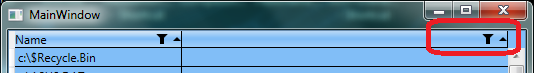
If you take a note of XAML in item 2, ContentPresenter represents the column data (text/button etc.), and is responsible to display the column data. Since, we added extra items (button and sort order arrow icon) which don't belong to any default column type available in .NET framework (obviously), DataGridColumnHeadersPresenter doesn't bother to hide them. So, we constantly see a permanent, annoying, untouchable, drop down filter button in the datagrid header area, especially, if the datagrid size is wider than all columns width. Oh, and let's not forget the sort icon which never changes the direction!
I think this problem can be fixed by creating a custom column type class by deriving from the most significant .NET Framework datagrid column class for your project. But this presents additional problems, like you need to know which type of columns you want to display in DataGrid, and limit the flexibility. More about default column types here.
I will use a simpler XAML approach in item 3.
Item 3 - Custom DataGridColumnHeadersPresenter
<!--A custom DataGridColumnHeadersPresenter is required to "not" display the custom ColumnHeader template as background of the datagrid header-->
<Style TargetType="{x:Type DataGridColumnHeadersPresenter}">
  <Setter Property="Template">
    <Setter.Value>
      <ControlTemplate TargetType="{x:Type DataGridColumnHeadersPresenter}">
        <Grid>
          <!--"part_fillercolumnheader" (DataGridColumnHeader type) is removed.-->

          <!--Leave the item presenter in its place.-->
          <ItemsPresenter x:Name="itemsPresenter" />
        </Grid>
      </ControlTemplate>
    </Setter.Value>
  </Setter>
</Style>
<!--End of custom DataGridColumnHeadersPresenter template-->
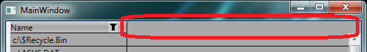
So, how do we remove the annoying controls in ghost column header? We remove the column header object from the DataGridColumnHeadersPresenter template. But this leaves a blank area in the header portion,which looks even uglier.
I filled that with a Rectangle of the same style, as that of a column header that I styled in item 2.
<!--A custom DataGridColumnHeadersPresenter is required to "not" display the custom ColumnHeader template as background of the datagrid header-->
<Style TargetType="{x:Type DataGridColumnHeadersPresenter}">
  <Setter Property="Template">
    <Setter.Value>
      <ControlTemplate TargetType="{x:Type DataGridColumnHeadersPresenter}">
        <Grid>
          <!--"part_fillercolumnheader" (DataGridColumnHeader type) is removed, and a plain rectangle is placed in its place.-->
          <Rectangle Fill="{StaticResource normalBrushBack}" />

          <!--Leave the item presenter in its place.-->
          <ItemsPresenter x:Name="itemsPresenter" />
        </Grid>
      </ControlTemplate>
    </Setter.Value>
  </Setter>
</Style>
<!--End of custom DataGridColumnHeadersPresenter template-->
Points of Interest
I would like to highlight couple of works, which helped me in designing this solution quickly.
- http://www.c-sharpcorner.com/UploadFile/nipuntomar/wpf-datagrid-style
- http://www.codeproject.com/Articles/20612/A-WPF-SplitButton
Points of Concerns
For consistency sake, make sure the themes and styling you apply are evenly applied to the Rectangle in DataGridColumnHeadersPresenter and "fullHeader" Grid in DataGridColumnHeader.
History
- 2013-Sep-23: Article published, along with code.
- 2013-Sep-25: Item 2 section revised.