This is the fifth in a series of articles for Expression Blend and Silverlight tutorial. In this article, we will be focusing on ScrollBars, which are a core component of a ListBox.
Introduction
Welcome to my fifth beginners tutorial for Expression Blend and Silverlight.
And this time, we will be focusing on ScrollBars, which are a core component of a complicated and nested Control like a ListBox.
My intention in this series of tutorials, is to make a snazzy/styled ListBox, so we can start to think about Styling an entire application. It won't be a very complicated application, as it will be based on Defwebserver's MVVM File Manager CodeProject article, that he extended on his blog: Enabling Design-Time Data
So how difficult can it be? Not at all, as long as we remember that something like a ListBox is not just one thing. It has multiple components, or Parts!
For example, the Template (Control Template) of a ListBox, consists of multiple elements, and a "Control Part" in the guise of a ScrollViewer.

A Control Part is denoted by the small icon next to the Eye symbol. - (Not sure what it's meant to be?)
Basically, the ScrollViewer "Controls" the Template for this part of the ListBox Control, (which is the overall basic look). And there is more than one Template for this Control, but we will get to that later. First, let us explore this ScrollViewer Control Part, as there is more to see if we delve deeper. And if we look inside the ScrollViewer Template, we will find 3 more Control Parts: ScrollContentPresenter, VerticalScrollBar and HorizontalScrollBar.
So in a ListBox, we have nested Controls and are building a complex Control, from multiple simpler Controls. And you can prove this by finding all these Controls as Assets in their own right. The names I think are self explanatory, and what is obviously apparent: Is that the ScrollBars drive the Content pane scroll function. Now the Content pane has no current Content and this is because a ContentPresenter is a placeholder and has no real content of its own. The "Content" for this control is controlled/formatted by another area of the ListBox Control. This is where things get more complicated, but just remember that these Additional Templates, basically describe the look and layout of the Generated Items (Data/Content).
Now I don't want to go steaming into these Additional Templates and adding complexity, that we can't even see until we get some content! So instead, I would like to start by looking at the ScrollBars in the ScrollViewer Template. As we can see, these and almost every complicated Control has a ScrollBar. So I figure we should start with these, as they are quite important...
Again, before commencing this tutorial, I recommend that you read my previous CodeProject tutorials.
I am writing them as a series and as such, this tutorial will presume prior knowledge.
Scroll Bars
Section 1 - Page Setup and Thumb Template
Start up a new Silverlight project in Expression Blend, (I'm using Version 4 Beta) and call it "MVVMListBox".
From the Assets menu, drag out a ListBox in the Artboard and then drag out a ScrollBar, as shown in the image below:
Select the ScrollBar and choose Edit Template > Edit a Copy.
Name this ScrollBar Style to "MVVMScrollBarStyle" and click OK.
In the Objects and Timeline, there is a HorizontalRoot and a VerticalRoot (which I have expanded).
It is the Vertical root we are interested in, as this is the orientation of the ScrollBar we have (are editing).
So what we got in a ScrollBar then? Lots more Control Parts and 3 Rectangles.
Let's look at the Rectangle's first and the clue to their function, is looking at the Visual States Manager!
(as well as using the Eye icon to hide, or unhide the element)
In a complicated Control, we can have Visual States at multiple levels of the Control, so keep your eyes open!
Now the ScrollBar I have in mind for this application, does not want these Background elements.
I want the Scroll Bar to float and these Rectangles will be no use to us, so Delete them all.
With the VerticalRoot selected, the ScrollBar and its layout Grid, will now look like the image below:
Now the only bit that is currently fully visible, is the VerticalThumb element, so let us start with that.
Select the VerticalThumb element and choose Edit the Template. (But this time, you can choose edit the Current Template).
This is basically because a ScrollBar has to have a Thumb, so one is defined or generated by default.
The VerticalThumb is not a proper Control, available as an Asset and has no Style of its own.
But it does have Visual States to interact with, as shown in the image below:
Have a look at the various States and see which ones have Keyframes, as shown in the image below:
Also look at the structure of the Template elements and notice that we have MouseOver and Pressed elements, that act as overlays.
So let us Delete all the elements in the ThumbVisual Grid and design a new Thumb from scratch.
Insert a new Rectangle set to Stretch and 0 Margins, in the ThumbVisual Grid and called it "BGround".
Now Template Bind the Fill to the Background and the Stroke to the BorderBrush.
But what have we just Template Bound to, if this Control Part has no Style of its own?
It has Template Bound, to its parent Background and BorderBrush properties.
So if we want to set these colours in the Style, we need to also Template Bind the parent Control Part, to the ScrollBar Style.
The structure or hierarchy is at the top of the Artboard, as shown in the image below:
So Template Bind the VerticalThumb to the ScrollBar Style and set some Solid Fill colours for BackGround and BorderBrush in the Style.
Go back to the BGround element in the VerticalThumb Template and set a corner Radius of 4, for both X and Y on the Rectangle.
Now duplicate the Rectangle and rename the new Rectangle to "Texture",
Remove the Stroke and Fill Bindings and set the Fill to a Linear gradient orientated as shown in the image below:
Make sure the Gradient Stops are white and add 3 more Gradient Stops at 25, 50 and 75 on the Ribbon.
Change the Alpha value's to 30%, 80%, 100%, 80% and 30% on the Ribbon, as shown in the image below:
Now set the element Opacity to 60% and depending on the colours you picked in the ScrollBar Style, you will have something like the image below:
Now you might be thinking that we could set this gradient in the Style, for greater flexibility from the Style, but this is trickier when testing colour schemes.
So instead, I believe it is better to generate gradients as an overlay, which we can still tweak in one place like the Style. But instead, it will be defined as a Resource.
Select the Fill of the Texture element and in the Advanced Properties, choose Convert to New Resource, as shown in the image below:
Name this new Resource to "ScrollBarVerticalTexture" and hit OK. (We will be using this texture again later.)
Now select the Texture element and duplicate it to generate a new element, which we will rename Pressed.
Set the Fill of the Pressed element to a Solid black colour and change the element Opacity to 0%.
Now in the VSM, select the Pressed State and change the Pressed element Opacity to 20%.
Now go to the MouseOver State and change the Opacity of the texture element to 80%.
And that is it for the VerticalThumb! But before we see it in action, let us apply it to our ListBox Style.
Section 2 - Applying the Styles
Come out of the ScrollBar Template and go into the Template for the ListBox.
Name the ListBox Style to "ListBoxStyleMVVM", or something similar.
Then into the ScrollViewer Template and name this Style to "ScrollViewerStyleMVVM", or something similar.
Select the VerticalScrollBar, choose Edit Template > Apply Resource > MVVMScrollBarStyle.
Now do the same for the HorizontalScrollBar (will save time later!)
This has made no visible change to the ListBox, but this is because there is nothing to display or Scroll...
And I could force the ScrollBars to be visible, but the Thumb would still not be visible, as there is no content!
So instead, we will inject some Sample Data into the ListBox to reveal the ScrollBars.
Come out of the ListBox Template and go to the Data tab in the top left of Blend, as shown in the image below:
Create a sample data source, of type "New Sample Data", name it "MVVMSampleData" and click OK (or leave the name as default...)
This will generate a Collection of rubbish data to populate our ListBox and show our ScrollBars.
So drag the Collection from the Data tab onto the ListBox and with a bit of luck and magic, we should have the image below:
Now the Horizontal ScrollBar is not looking too hot, but we can address that in a minute.
First, let us have a quick look at the Generated Content, which is the Sample Data that we have just populated the ListBox with.
So select the ListBox and choose Edit Additional Templates > Edit Generated Items > Edit Current.
We don't need to Edit a Copy, as we generated the Current Template when we inserted the Sample Data Source.
In the Objects and Timeline, we should have a StackPanel, as shown in the image below:
Laid out in the StackPanel is the Sample Data, consisting of a TextBlock and a CheckBox.
How we are viewing these Sample Data items, is down to the StackPanel and it's orientation.
So select the StackPanel and in the Layout section of the Properties tab, change the Alignment to Horizontal, as shown in the image below:
This should change the layout of the Sample Data, as shown in the image below:
But it is still not quite as I would like, I'd prefer the CheckBox first in the list.
And you might think we need to switch the Sample Data around to do this.
But "No", don't be silly!!! - Expression Blend makes it a lot easier than that!
All we need to do is select the TextBlock element and drag it below the CheckBox element, as shown in the image below:
This re-orders the structure of the StackPanel and the CheckBox becomes the first item displayed, as shown in the image below:
That is all I will say for the Generated Items Template for the minute, as I want to finish the ScrollBars!
And by now you probably realized that I have set this ListBox up, with a ScrollBar next to it that we are actually editing.
(Very similar to how I have shown to do buttons! - The reason is touched upon later...)
So before we head back into the ScrollBar Template, let us setup a Horizontal ScrollBar along the bottom of our ListBox.
Ensuring you are not in any Templates, select the ScrollBar Control and duplicate it.
Resize the duplicated ScrollBar and place below the ListBox as shown in the image below:
(Do not rotate it, just drag out to the shape in the image above).
In the Properties tab, change the duplicated ScrollBar's Orientation to Horizontal.
Which should helps sort out the ScrollBar a little and make it look like the ListBox ScrollBar, as shown in the image below:
Still not right, but we will get to the Horizontal ScrollBar later, let us get back to finishing the VerticalScrollBar!
Section 3 - Back to the Vertical ScrollBar
Select the Vertical ScrollBar again in the Artboard (To the right of the ListBox) and go into the Template.
This time, I want to edit the VerticalSmallDecrease and go into the Template for this Control Part.
This reveals a list of elements that make up the VerticalSmallDecrease, as shown in the image below:
But currently, we can only see the Path element and this is due to the VSM (Visual States Manager).
Play with the various States and you should notice we have States for MouseOver, Pressed and Disabled.
So with that in mind, let us Delete the lot and start again.
Select the Root and insert a Rectangle with a corner Radius of 4, for both the X and Y values.
Rename the Rectangle to "BGround" and Template Bind the Fill and Stroke to the parent Control Part.
(Remember that this parent Control Part will now need Binding to the ScrollBar Template Style!)
So with that all linked together, we should look something like the image below (depending on your Style colours).
(Notice how I'm playing with the ScrollBar, but the ListBox is automatically updating!) - I love it!
So let us duplicate the BGround element and set up an overlay texture just like we did for the Thumb.
Rename the duplicated Rectangle to "Texture" and set the Fill to "ScrollBarVerticalTexture" Resource, as shown in the image below:
Remove the Stroke of the Texture element, duplicate it and rename it to "Pressed".
(Don't worry if it defaults to "Pressed1", Blend just thinks it still has an element by this name in this Control Part).
Set the Fill to black and the element Opacity to 0%.
Now change to the Pressed State and set the Opacity of the Pressed element to 20%.
Then in the MouseOver State, change the Opacity of the Texture element to 80%.
With some basic animation now setup, now all we need is an Arrow and a Disabled State.
Lets do the Arrow first and to keep things simple, we will use/modify the existing Arrow.
Which we deleted from the VerticalSmallDecrease, but still exists in the VerticalSmallIncrease Control Part as a Path.
So copy the Arrow Path element from the VerticalSmallIncrease Control Part, into the VerticalSmallDecrease Control Part.
Rename the Path to "UpArrow", Reset the Margins and with a bit of luck, you will have the same as the image below:
The UpArrow is the wrong way up, so in the Transform section, Flip the Y axis.
Now duplicate the UpArrow and set the Fill of this new element to any other colour. (I used red.)
Select the UpArrow again and change the Width and Height to Auto.
In the Artboard, you should hopefully have the same as the image below:
(Remember we are working on the right one of these 2 ScrollBars.)
If your having layout problems, check your Margin and Stretch settings!
Now select the smaller red copied Arrow and set a Scale Transform of 3 for the X axis.
Move the red Arrow down using the arrow keys (Margins), until it looks like the image below:
Now shift select the original black UpArrow (the Pastry) and then the red copied UpArrow (the Cutter).
Then from the Object menu, select Combine > Subtract.
(You may get different results if you right click in the Artboard to do this step.)
Undo and repeat the last couple of steps, until you have something like the image below:
Reset the Margins and change the Width and Height to 10 and 8 pixels respectively.
Next Template Bind the Fill, to the parent Control Part BorderBrush. (Not the Background brush!)
This should hopefully give us an UpArrow, that works for both the ScrollBar and the ListBox ScrollBar.
It is a bit bold and we could try placing it under the Texture element, but this would obscure it too much.
Instead, just change the UpArrow element Opacity to 75% to soften it a little.
Now all we need is the Disabled element and we are finished in the VerticalSmallDecrease Control Part.
So duplicate the Pressed element and rename it to "Disabled", set the Fill to white and the element Opacity to 0%.
Now in the VSM, go to the Disabled State and set the element Opacity to 70%.
And that is it for this Control Part, but we now need to do the same for the VerticalSmallIncrease Control Part.
So still in the VerticalSmallDecrease, select all the Control Part elements to the clipboard (Ctrl + C).
Now go to the VerticalSmallIncrease, Delete all the existing elements and Paste in the clipboard elements.
With all the Pasted elements still selected, Reset the Margins to ensure proper placement.
Select just the UpArrow element, rename it to "DownArrow" and Flip the Y axis.
That should make the VerticalSmallIncrease look like the image below:
The colours are all wrong, because the current parent Control Part, is not Template bound to the ScrollBar Style.
So come out of the Control Part, select the VerticalSmallIncrease and Template Bind the Background and BorderBrush's.
That should fix the colour issues and the only thing left is the Visual States in the VSM.
(Unfortunately Blend can't really be expected to copy these as well..)
So set up Visual States for MouseOver, Pressed and Disabled, based on the setting we used before.
While you are at it, setup a Duration for the State change of 0.1 seconds to the CommonStates group.
Repeat this Duration for the VerticalSmallDecrease and the VerticalThumb Control Part Templates.
Run the application (F5) and review your results, as shown in the image below:
Now we have discussed 3 of the 5 Control Parts, it is time for a quick mention of the other 2 Control Parts.
The VerticalLargeDecrease and VerticalLargeIncrease are empty, there is nothing in there except a blank Grid.
But it doesn't mean there couldn't be...
The main reason for these parts, are to define the gap between the Thumb and the VerticalSmallIncrease/Decrease.
(So that it receives a click event to move the Thumb one page length - A Large Increase/Decrease)
Section 4 - Still the Vertical ScrollBar
We now have all the moving, or interacting components that is required in a ScrollBar.
But we can Style it a bit more, so it looks like the Thumb is sliding along a Rail.
So ensure you are not in a Control Part Template and select the VerticalRoot, as shown in the image below:
Drag out a Rectangle with no corner Radius, so it fills all the sub-divisions of the ScrollBar Grid.
Rename this Rectangle to BGround and Template Bind the Fill and Stroke to the ScrollBar Style.
Now set the Margins of the BGround Rectangle to 5 for the Left and Right and 1 for the Top and Bottom.
That should give you the same as the image below and be aware we are designing in the right ScrollBar, but looking at the left one as the real Style!
(I'm far more interested in these ScrollBars working at the default setting used by Complex Controls, than a super fat version!)
(And ScrollBars do not often get Scaled or Grow like buttons, so have defined the width/size of this Rail using Margins)
Select the BGround Rectangle, right click and choose Group Into > Grid and rename the Grid to "Rail".
(Clever old Blend takes the Margins, that were applied to the BGround Rectangle and instead applies them to the Grid)
In the Objects and Timeline, select the Rail Grid and move it above the 5 Control Parts, as shown in the image below:
Select the BGround element, Duplicate it and rename this new element to "Texture".
Reset the Stroke, set the Fill to the "ScrollBarVerticalTexture" and the element Opacity to 80%.
Now in the VSM change to the MouseOver State and change the Texture element Opacity to 90%.
Set a Duration of 0.1 seconds for the Visual State change and run your application!
The last thing is to reduce the size of the VerticalThumb Control Part, which we will do by setting a Margin of 2 on the left and right side.
Run the application again and then set Margins of 2 to the top and bottom of the VerticalThumb Control Part.
Again run the application and see that the ScrollBar behaves strangely, when the Thumb goes to the bottom.
See how the VerticalSmallIncrease gets pushed down and is partially out of picture.
(This is because of the top and bottom Margins we just set, conflict with how much room the ScrollBar thinks it now has.)
So we don't want to use Margins on the top and bottom of the Thumb! (Remove them.)
Select the VerticalSmallDecrease and change the bottom Margin of 1 to 3 (bottom only), as shown in the image below.
Then select the VerticalSmallIncrease and apply a Margin of 3 to the top of this Control Part.
And that is it for the Vertical ScrollBar, now we need to repeat all this for the Horizontal ScrollBar...
Section 5 - Horizontal ScrollBar Styling
Come completely out of the Vertical ScrollBar and select the Horizontal ScrollBar below the ListBox.
Go into the Template, expand the HorizontalRoot, as well as the VerticalRoot, as shown in the image below:
Remember we are still editing the same ScrollBar Style, that we edited for the Vertical ScrollBar!
(See the Rail Grid in the VerticalRoot for proof.)
Delete the 4 Rectangle's in the HorizontalRoot so we can start fresh.
Select the Rail from the VerticalRoot and place a Copy of it in the HorizontalRoot.
Don't worry about changing the name, but move it up the list order as shown in the image below:
The ScrollBar in the Artboard should look like the image below:
Drag out the Rail_Copy Grid, so that it fill all of the ScrollBar, then set Margins of 1 for the left and right and 5 for the top and bottom.
The Horizontal ScrollBars should now look like the image below:
(But the gradient is running the wrong way!)
So select the Texture element in the HorizontalRoot and change the Fill to a Gradient brush.
Using the Gradient Tool, change the orientation as shown in the image below:
If you are sad like me, you can set the values exactly as shown in the image below:
Convert this Gradient Brush to a new Resource and name it "ScrollBarHorizontalTexture".
Set the Opacity of the Texture element to 90%, for the MouseOver State.
Now go to the VerticalRoot, into the VerticalSmallDecrease and Copy all the elements.
Next go back to the HorizontalRoot and into the HorizontalSmallDecrease Control Part.
Delete all the existing elements and Paste in the clipboard elements.
Reset the Margins for all the elements and with some luck, the Artboard will look like the image below:
The colours are wrong because the parent Control Part, is not Template Bound to the Style, so do that now!
Next select the UpArrow, rename it to "LeftArrow", Reset the applied Transforms (the Flip) and Rotate it 90 degrees.
The LeftArrow is not centred and this is because the Center Point of the Path needs to be Reset.
(This got messed about then we were cupping Pastry!)
Go to the Center Point and set values of 0.5 for both the X and Y, as shown in the image below:
(These Center Point corrections, should also be applied to the Vertical Up and Down Arrows.)
So try to edit the VerticalSmallDecrease from the Template of the Horizontal ScrollBar, and see what happens...
You will probably end up with something like the image below:
This is because Blend does not have any real values to base the size of this Control Part on, as it is for a Vertical ScrollBar.
And the Template we are in, is for a Horizontal ScrollBar!
You can still change the Center Point to 0.5 for both the X and Y and repeat for the VerticalSmallIncrease.
Use the Return Scope icon when you are finished, to return to a proper view of the Artboard.
Go to the Horizontal ScrollBar Template, into the HorizontalSmallDecrease Control Part and select the Texture element.
Now change the Fill of the Texture element, to the ScrollBarHorizontalTexture Resource.
This should correct the gradient to run inline with the ScrollBar, as shown in the image below:
All we need to do now is setup the Visual States and repeat everything we did for the Vertical ScrollBar.
So I will leave you to finish this, doing the HorizontalSmallIncrease and setting up the size of the Horizontal Thumb.
Don't forget the Visual States and setting Durations for these...
(and you may not need a Margin change for the left of the HorizontalSmallIncrease to space out the Thumb.)
And that is it, you have your very own Styled Scroll Bars, that can be plugged in to almost any complex Control.
Section 6 - Final Adjustments (ScrollBars)
Just to finish off the ScrollBar section of the ListBox, let us go to the ListBox and apply some final Styling to the ScrollBars.
So in the Control Template of the ListBox, select the ScrollViewer and go into its Control Template.
Select the Rectangle, which is the pale blue square at the bottom right of the ListBox and set the Visibility to Collapsed.
Now select the VerticalScrollBar and change the Margins to 2 on all sides, then do the same for the HorizontalScrollBar.
Look at the ScrollBar Width's and Height's and see that they have a fixed size. If you want to change their Widths, then do it here!
(I've changed the Width of my ScrollBars to 22 in the image above.)
And I think that is it for this Article/Tutorial, as otherwise it will be huge!!!
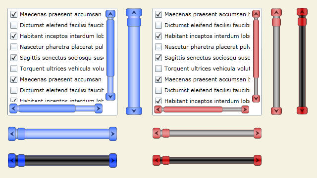
Play with the Texture Resources that we created to make the bolder ScrollBars shown in the intro image.
The Arrows, as well as the SmallIncrease/Decrease can also be modified/changed with a little bit of effort in say: Expression Design.
I plan to continue this ListBox tutorial in my next Article, where I will discuss more aspects of the ListBox, so we can continue Styling it!
But ScrollBars are ticked off the list and should be a useful addition to everyone's Silverlight toolbox - Enjoy!
(Feel free to rename the Resources to suit your need, but I will leave mine as they are until Part 2.)
The final thing I should mention about Control Parts, is that they are expected, so don't just go deleting them or renaming them. The Control Parts can be seen in the Parts tab.
Cheers and please vote!
Section 7 - Source
Obviously, you will learn more if you complete the tutorial, but for those of you that just want to plug-em in and play, here it is.
History
- 14th April, 2010: Initial version

