Introduction
My custom control, DateRangePicker, provides the ability to select not just single dates but arbitrary date ranges. It is a trivially extended Calendar control.
Background
I needed to provide users with the ability to select date ranges. Two calendars side by side take up a lot of space, so I had a look for custom controls. I noticed that Windows Forms let you select date ranges, but web form calendars can select days, weeks, or months. There were some commercial products on the internet, but once I saw what methods could be overridden on Calendar, I knew it would be easy enough to implement my own.
User Interface
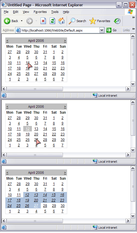
The first time a user selects a date, that date is recorded as one end of the date range. Then, the second click on the same calendar will set the other end of the date range. A third click will clear the old date range and record a new date as the starting point of a date range, and so on.
Using the code
Once you have the code in a custom web control library project, all you have to do is drag the control from your toolbox onto the designer, just like any other custom control.
You should see something like the following code added to your page:
<%@ Register Assembly="CustomWebControls"
      Namespace="CustomWebControls" TagPrefix="cc1" %>

...

<cc1:DateRangePicker ID="DateRangePicker1"
     runat="server"></cc1:DateRangePicker>
How it works
There are two classes that make up the DateRangePicker control - DateRange, and DateRangePicker. DateRange is a struct to represent a range of dates, and DateRangePicker is the custom web control that extends System.Web.UI.Calendar.
DateRange
A DateRange is essentially a from date and a to date. It would be possible to implement a DateRangePicker without this, but it helps us keep logic out of the UI code. It's marked as Serializable so that the WebControl can keep it in the viewstate. The most important logic method is Include, which adds a DateTime or another DateRange to the instance. We use this when a second DateTime is clicked, and it means the user doesn't have to click the earliest date first. Equals, HashCode, and the operators == and != are all overridden for efficiency.
using System;
namespace CustomWebControls
{
[Serializable]
public struct DateRange
{
public static readonly DateRange EMPTY = new DateRange();
readonly DateTime from;
readonly DateTime to;
public DateRange(DateTime from, DateTime to)
{
this.from = from;
this.to = to;
}
public DateTime From
{
get { return from; }
}
public DateTime To
{
get { return to; }
}
public TimeSpan TimeSpan
{
get
{
return to - from;
}
}
public bool Contains(DateTime time)
{
return from <= time && time < to;
}
public DateRange Include(DateRange otherRange)
{
return Include(otherRange.From).Include(otherRange.To);
}
public DateRange Include(DateTime date)
{
if (date < from)
return new DateRange(date, to);
else if (date > to)
return new DateRange(from, date);
else
return this;
}
public static DateRange CreateDay(DateTime dateTime){
return new DateRange(dateTime, dateTime.AddDays(1));
}
#region operators and overrides
public override int GetHashCode()
{
return from.GetHashCode() + 29*to.GetHashCode();
}
public override bool Equals(object obj)
{
if (ReferenceEquals(this, obj)) return true;
if (!(obj is DateRange)) return false;
DateRange dateRange = (DateRange) obj;
if (!Equals(from, dateRange.from)) return false;
if (!Equals(to, dateRange.to)) return false;
return true;
}
public static bool operator == (DateRange d1, DateRange d2)
{
return d1.Equals(d2);
}
public static bool operator !=(DateRange d1, DateRange d2)
{
return !d1.Equals(d2);
}
#endregion
}
}
DateRangePicker
This is the class that overrides Calendar. It has two properties, one for styling the selected DateRange and another to store the selected DateRange.
By default, the style has a BackColor of LightSteelBlue. This is initialised in the static constructor. The style is stored in a private variable, because whenever a Page is initialised, the new style will be set by the designer code. SelectedDateRange, however, is stored in the ViewState because it needs to persist across multiple page requests. If you don't use ViewState, you will need to find another way to persist this variable.
OnSelectionChanged is where we change the DateRange. OnDayRender is where we apply the styling to a DateRange. Note the special handling of whole days in OnSelectionChanged.
using System.ComponentModel;
using System.Drawing;
using System.Web.UI;
using System.Web.UI.WebControls;
namespace CustomWebControls
{
[DefaultProperty("Text")]
[ToolboxData("<{0}:DateRangePicker runat="server"></{0}:DateRangePicker>")]
public class DateRangePicker : Calendar
{
static readonly TableItemStyle defaultSelectedDateRangeStyle = new TableItemStyle();
static DateRangePicker()
{
defaultSelectedDateRangeStyle.BackColor = Color.LightSteelBlue;
}
TableItemStyle selectedDateRangeStyle = defaultSelectedDateRangeStyle;
protected override void OnDayRender(TableCell cell, CalendarDay day)
{
if (SelectedDateRange.Contains(day.Date))
{
cell.ApplyStyle(selectedDateRangeStyle);
}
}
protected override void OnSelectionChanged()
{
base.OnSelectionChanged();
bool emptyDateRange = SelectedDateRange == DateRange.EMPTY;
bool dateRangeAlreadyPicked = SelectedDateRange.TimeSpan.TotalDays > 1;
if (emptyDateRange || dateRangeAlreadyPicked)
{
SelectedDateRange = DateRange.CreateDay(SelectedDate);
}
else
{
SelectedDateRange =
SelectedDateRange.Include(DateRange.CreateDay(SelectedDate));
}
}
<Browsable(false)>
public DateRange SelectedDateRange
{
get { return (DateRange) (ViewState["SelectedDateRange"]??DateRange.EMPTY); }
set { ViewState["SelectedDateRange"] = value; }
}
[Category("Styles")]
[Description("The Style that is aplied to cells within the selected Date Range")]
[DesignerSerializationVisibility(DesignerSerializationVisibility.Content)]
[NotifyParentProperty(true)]
[PersistenceMode(PersistenceMode.InnerProperty)]
public TableItemStyle SelectedDateRangeStyle
{
get { return selectedDateRangeStyle; }
set { selectedDateRangeStyle = value; }
}
}
}
Future Work
- Better designer support.
- Further extensions to
OnDayRender to give the user more tooltips regarding what to do. - Your suggestions! I value all feedback. I'd love to hear if this works well for you, or if you have any improvements you'd like to offer.
This member has not yet provided a Biography. Assume it's interesting and varied, and probably something to do with programming.


 General
  News
News  Suggestion
  Question
  Bug
Bug  Answer
  Joke
Joke  Praise
  Rant
Rant  Admin
Admin 


 Submit an article or tip

