Introduction
In this article, we will learn about translate method of CSS3. It’s part of CSS3 2D and 3D transformations. This method comes with five variants out of which three methods are for 2D transform and the other two are for 3D transform. We will learn about the following five variants of translate method:
- Translation on X-axes – translateX(K)
- Translation on Y-axes – translateY(K)
- Translation on X/Y-axes – translate(K1,K2)
- Translation on Z-axes – translateZ(K)
- Translation on X/Y/Z-axes – translate3d(K1,K2,K3)
So let’s start our discussion with the first variant of translate method.
Translation on X-axes – translateX(K)
Translation stands for shifting an element by some distance. Let that distance be K. When the element is transferred along X-axes, it is known as translation along X-axes. It is similar to absolute position with left offset equal to the K. K is any number given in pixels and it can vary from negative integers to positive integer.
Example 1
<div id="box-X"></div>
CSS
#box-X{
  width:100px;
  height:100px;
  border:1px solid black;
  position:absolute;
  top:40px;
  left:40px;
  -webkit-transition:all 0.5s;
}
#box-X:hover{
  -webkit-transform:translateX(200px);
}
On running the above example, we will see the translation of the box along X-axes from origin (0,0) to (200,0), i.e. translation by an amount of 200px along X-axes. The same can also be achieved by setting the left property to 200px. The output of the above code is as follows:

Translation on Y-axes – translateY(K)
This variant of method is used for translating the element along the Y-axes. The element’s X-coordinate remains the same but Y-coordinates changes by an amount equal to K where K is any integer.
Example 2
<div id="box-X"></div>
CSS
#box-X{
  width:100px;
  height:100px;
  border:1px solid black;
  position:absolute;
  top:40px;
  left:40px;
  -webkit-transition:all 0.5s;
}
#box-X:hover{
  -webkit-transform:translateY(200px);
}
On executing the above code, we will see the translation of box along Y-axes. The box will be translated from (0,0) to (0,200), i.e., translation by an amount of 200px along Y-axes. The same effect can be achieved by setting the “top” property equal to 200px.

Translation on X/Y-axes – translate(K1,K2)
This variant of method allows us to translate any element on X-Y plane. Each X, Y coordinate can be translated independently of each other by an amount of K1 and K2 respectively.
Example 3
CSS
#box-X{
  width:100px;
  height:100px;
  border:2px solid red;
  position:absolute;
  top:40px;
  left:40px;
  -webkit-transition:all 0.5s;
}
#box-X:hover{
  -webkit-transform:translate(200px,200px);
}
On executing the above code, the element will be translated on X-Y plane by an amount of 200px along X-axes and 200px along Y-axes. It is the same as translation of element from (0,0) to (200,200). The same can be achieved by setting the both “left” and “top” property.

Translation on Z-axes – translateZ(K)
This variant of translation is mainly used in 3D transforms. It causes an element to translate along Z-axes by an amount equal to K. To make this effect visible, we need to enable the 3D settings of CSS3. This can be done by setting the “transform-style” to “preserve-3d” and perspective distance.
Example 4
CSS
body{
  -webkit-perspective:1000px;
}
#box-X{
  width:100px;
  height:100px;
  border:2px solid red;
  position:absolute;
  top:40px;
  left:80px;
  -webkit-transform-style:preserve-3d;
  -webkit-transition:all 0.5s;
}
#box-X:hover{
  -webkit-transform:translateZ(100px);
}
On executing the above, we will see an element raised towards the user. This is because the element is translated along Z-axes. The translation of element on Z-axes causes the distance between the user eye and element to decrease and this decrement in distance causes the element to look bigger then original. In the above code, the element center is transferred from (0,0,0) to (0,0,50). This effect cannot be achieved by using absolute position settings.


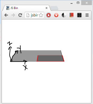
Translation on X/Y/Z-axes – translate3d(K1,K2,K3)
This variant of translation is also from 3D transformations. By the use of this method, user can translate the element on X-Y-Z plane along X-axes, Y-axes and Z-axes by an amount equal to K1, K2 and K3 respectively. This effect requires you to enable the 3D effect on web page as we did in the previous method.
Example 5
HTML
<div id="camera">
<div id="stub1?></div>
<div id="box-X"></div>
</div>
CSS
#camera{
  -webkit-perspective:1000px;
}
#box-X{
  -webkit-transform-style:preserve-3d;
  width:100px;
  height:100px;
  border:2px solid red;
  position:absolute;
  top:40px;
  left:40px;
  background-color:rgba(50,50,50,0.5);
  -webkit-transition:all 0.5s;
 -webkit-transform:rotateX(85deg);
}

#stub1{
  position:absolute;
  top:40px;
  left:40px;
  width:200px;
  height:200px;
  border:1px solid black;
  background-color:rgba(50,50,50,0.5);
 -webkit-transform:rotateX(85deg);
}
#box-X:hover{
  -webkit-transform:rotateX(85deg)   translate3d(100px,50px,-50px);
}
On executing the above code, the box-x coordinate will be translated from (0,0,50) to (100,50,0). This effect can’t be achieved using absolute position or any other setting.

Demo List
Summary
That’s all for this article. I hope you have enjoyed reading this article and found it useful. In case of any doubt, feel free to ask in the comments section.
Note: The above code will work on Chrome browser only. As CSS3 is new and all of its feature are not implemented yet, so you need to use a browser specific prefix if you are testing the code on different browsers. Some of the prefix codes are as follows:
- Chrome -webkit-
- Internet Explorer -ie-
- Firefox browser -moz-
Filed under: CodeProject, CSS 

This member has not yet provided a Biography. Assume it's interesting and varied, and probably something to do with programming.


 General
  News
News  Suggestion
  Question
  Bug
Bug  Answer
  Joke
Joke  Praise
  Rant
Rant  Admin
Admin 


 Submit an article or tip

