1. Introduction
Windows 10 is here and is designed to replace all previous versions of Windows. No longer is there Windows for desktop, phone, Xbox, etc. that you need to separately target. Instead they is now just one. We just target the Universal Windows Platform (UWP) and our app automatically runs on all Windows 10 implementations.
In this article I will describe how to use the GridView XAML control.
For those new to Universal Windows Platform apps, see links Below ...
2. Contents
- Overview
- Data Models
- Test Data
- Code Behind
- XAML Code
- Further Study
The GridView is a flexible WPF control designed to display collections of data. These collections can be grouped by any category of your choice. Each grouping can be individually tailored, allowing greater freedom to customize the display of data.
Think of a GridView as a collection of ListView controls.
For each category or group, we have a model class that defines its data. For each data type, we create templates to define the appearance and behavior of group headers, body, etc.
For each data item, we have a model class that defines its data. For each data item's data type, we create templates to define how the data is displayed.
Add to that controls like semantic zoom and we have a powerful display system.
Possible uses of GridView is:
- Display contacts, grouped by first letter
- Main page of app, grouping all your app functionality. Each group can be formatted separately, since their data models are different.
For this article, I will assume we are using the GridView to create a music app. We will then dispaly the songs by category.
To create a music app, we need to create a model to define:
- An individual song
- A collection to store songs of a specific category or genre
- A group of all genres together
1. For song model, we have:
public class Song
{
    public string Title {get; set;}
    public string Genre {get; set;}
    public string Image {get; set;}
}
2. For our group model, we have:
public class SongGroup
{
    public string Title {get; set;}
    public string Image {get; set;}

    public ObservableCollection<Song> Items {get; set;}
}
In each group we can store music from each genre. Ex: Jazz, Rock and Roll, Hip Hop, etc.
3. Now we put all our music together in a single song collection (SongGroups). This can be done in either our viewmodel or code behind.
public class MainPageViewModel
{
public ObservableCollection<SongGroup> GroupedMusicList {get; set;}
public MainPageViewModel()
{
GroupedMusicList = DataManager.GetMusicList();
}
}
The next step is to obtain the data needed to display. The included sample project contains sample data in a JSON file, along with a helper method to load the data into the model.
Since this is not a tutorial on loading JSON data, we will assume the data is already loaded.
The code-behind file will define our view model class. The model is exposed as a property so that the XAML can directly use it.
public sealed partial class MainPage : Page
{
    public MainPageViewModel MainModel { get; }

    public MainPage()
    {
        InitializeComponent();

        MainModel = new MainPageViewModel();
    }
}
We shall now see the XAML that is used to display our data.
The important thing about the GridView control is that it displays collections of collections. As a result the standard binding will not work. For this we need a now control. This is CollectionViewSource. It supplies the data in a format GridView expects.
<CollectionViewSource
    x:Name="ContactGroupsSource"
    Source="{x:Bind MainModel.MusicList}"
    IsSourceGrouped="true"
    ItemsPath="Items"
    />
7.1.1. Source
The Source attribute tells the control where your data collection is located.
For Source, I'm using the new Windows 10 {x:Bind} binding statement, since it is statically bound, and so has greater performance than the old {Binding} statement.
Please note I'm not using DataContext. Instead I'm referring to the MainModel property in the code-behind file.
Note: In the current version of Visual Studio 2015, errors in data binding may not be correctly reported. If the app fails to launch when you press F5, then check the output window. It will list the bindings that are incorrect.
Note: In the current version of Visual Studio 2015, the IDE can freeze if the data bindings are incorrect. Hiding the visual editor prevents the problem.
7.1.2. IsSourceGrouped="true"
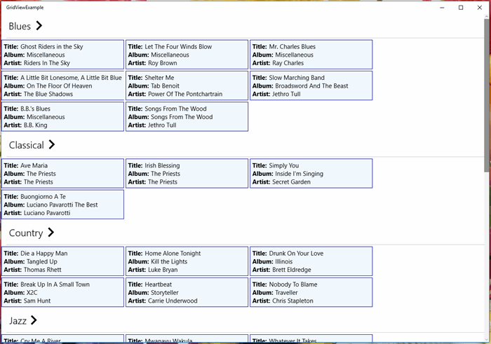
The top level collection is a collection of SongGroupModel models. IsSourceGrouped="true" tells the control SongGroupModel represents an individual category (Blues, Classical, Country, etc.)
When IsSourceGrouped="true", then ItemsPath represents the collection of individual songs. In this case it points to Items (which is a collection of songs.)
7.1.3. IsSourceGrouped="false"
If we don't want to group items by category, then we set IsSourceGrouped="false".
When IsSourceGrouped="false", ItemsPath is ignored. Source will then point to a collection of Song.
Using this:
<CollectionViewSource
    x:Name="UngroupedMusicListSource"
    Source="{x:Bind MainModel.UngroupedMusicList}"
    IsSourceGrouped="False"
    />
Gives this result.

Now that all the plumbing is in place we can now talk about the GridView control.
<GridView ItemsSource="{Binding Source={StaticResource GroupedMusicListSource}}"
          Name="GuestGridView"
          IsItemClickEnabled="True"
          ItemClick="GuestGridView_ItemClick" >
</GridView>
7.2.1. ItemsSource
For ItemsSource, we are using data binding to get the data. However your data binding isn't your normal one.
ItemsSource="{Binding Source={StaticResource GroupedMusicListSource}}"
First, ItemsSource has a binding.
Second, the source is also bound. Without this double binding, data will not display.
Simply switching the data source can change grouping. For grouped we use GroupedMusicListSource. For ungrouped we use UngroupedMusicListSource.
7.2.2. IsItemClickEnabled="True"
For IsItemClickEnabled, we are setting IsItemClickEnabled="True". This allows data items to act as buttons and kickoff functionality.
7.3. GridView.GroupStyle
GridView.GroupStyle controls the appearance of individual groups.
For our example we will use HeaderTemplate to define the headers of the groups.
<GridView.GroupStyle >
    <GroupStyle>
        <GroupStyle.HeaderTemplate >
            <DataTemplate x:DataType="models:SongGroupModel" >
                <!-- Code to define how headers are displayed -->
            </DataTemplate>
        </GroupStyle.HeaderTemplate>
    </GroupStyle>
</GridView.GroupStyle>
7.3.1. x:DataType
x:DataType tells the compiler what data types to expect in the data template. This is necessary when using the x:Bind statement.
For the sample, the header is just a Button with the genre name and a right-pointing chevron. It's included here for completeness.
The genre title is displayed using {x:Bind}
<Button
    Foreground="{ThemeResource ApplicationHeaderForegroundThemeBrush}"
    IsEnabled="{x:Bind HasGroupDetails}"
    Click="Header_Click"
    Style="{StaticResource TextBlockButtonStyle}" >
    <RelativePanel >
        <TextBlock
            Name="TitleBlock"
            RelativePanel.AlignLeftWithPanel="True"
            RelativePanel.AlignVerticalCenterWithPanel="True"
            Text="{x:Bind Title}" Margin="0,0,10,0"
            Style="{StaticResource TitleTextBlockStyle}" />
        <TextBlock
            RelativePanel.RightOf="TitleBlock"
            RelativePanel.AlignVerticalCenterWithPanel="True"
            Text="{StaticResource ChevronGlyph}"
            FontFamily="Segoe MDL2 Assets"
            FontWeight="Normal"
            Style="{StaticResource TitleTextBlockStyle}" />
    </RelativePanel>
</Button>
7.4. GridView.ItemTemplate
GridView.ItemTemplate allows us to format how individual items are displayed.
<GridView.ItemTemplate>
<DataTemplate x:DataType="models:SongModel" >
</DataTemplate>
</GridView.ItemTemplate>
Again for completeness, here is the code to format the data items. It is just a stack panel with Title, Album and Artist being displayed.
<StackPanel
    Orientation="Horizontal"
    HorizontalAlignment="Center"
    Width="300"
    BorderThickness="1" BorderBrush="DarkBlue"
    Background="AliceBlue"
    >
    <StackPanel HorizontalAlignment="Center" Padding="5" >
        <StackPanel Orientation="Horizontal" >
            <TextBlock Text="Title:" FontWeight="Bold" />
            <TextBlock Name="AlbumBlock" Margin="5,0,0,0"
               Text="{x:Bind Title}" />
        </StackPanel>

        <StackPanel Orientation="Horizontal" >
            <TextBlock Text="Album:" FontWeight="Bold" />
            <TextBlock Name="ArtistBlock" Margin="5,0,0,0"
               Text="{x:Bind Album}" />
        </StackPanel>

        <StackPanel Orientation="Horizontal" >
            <TextBlock Text="Artist:" FontWeight="Bold" />
            <TextBlock Name="TitleBlock" Margin="5,0,0,0"
               Text="{x:Bind Artist}" />
        </StackPanel>
    </StackPanel>
</StackPanel>
Points of Interest
- This control was seen more often on Windows 8/8.1, possibly because it was used in the standard templates in Visual Studio.
- I'm using the Free Visual Studio 2015 Community Edition: https://www.visualstudio.com/en-us/products/visual-studio-community-vs.aspx.
- In the included project, ModelGroupBase, RelayCommand, and ViewModelBase come from a lightweight MVVM framework I'm currently working on. The purpose of the framework is to simplify the managment of application state. However, performance when dealing with very large data sets hasn't been tested. A previous version, designed for Windows 8.1, is described in: Encapsulating property state in MVVM WPF applications.
For those new to Universal Windows Platform apps, see:
Don't forget tutorials on YouTube, CodeProject.com, etc.
History
Keep a running update of any changes or improvements you've made here.
I’ve been a software developer for the last 11 years.
My language of choice is C#.
My strength lies in windows based programming as an SDET.
Strengths include:
• Object Oriented Programming
• Design Patterns
• Data Structures, Algorithms
• Windows Automation
Principle technologies include:
• Visual Studios 2010 (Ultimate, TFS, Test Manager)
• C# 4.0, XML, WPF, SQL Server
Education includes:
• BSEE - Concordia University, Quebec, Canada
• Programmer Analyst Certificate - John Abbott College, Qc, Canada
• Certified Scrum Master Training - Danube, Bellevue, WA
• Windows Azure Training - Wintellect, Bellevue, WA
Certification:
• Microsoft Certified Solution Developer for the MS.NET Platform


 General
  News
News  Suggestion
  Question
  Bug
Bug  Answer
  Joke
Joke  Praise
  Rant
Rant  Admin
Admin 


 Submit an article or tip


