While data visualization (charts, graphs, tables, etc.) is a common practice in financial reporting, few have learned the design practices that make them effective. Often, when it comes to creating financial statements and reports in .NET, companies neglect report design fundamentals and the opportunities strategic design can generate. A well-designed .NET report can offer an opportunity to engage with stakeholders, to tell the company story, help create business intelligence, and accomplish company goals. Numbers are essential to our understanding of performance. We obtain significant value from quantitative data; however, we rarely consider the significance of how to present this information. Numbers cannot always speak for themselves.
Being able to leverage quantitative data into dynamic visualizations is essential. Delivering insights through analytics allows companies to make informed decisions based on business intelligence. Without quantitative information presented in easily digestible visuals, time is wasted struggling to understand the meaning and significance of data. If your .NET financial report lacks design — if it is confusing, boring, or uses tables, charts, and graphs ineffectively, you run the risk of losing your audience and overall message. With the expansion of technology, poor graphical presentation has become a widespread practice. Excel almost encourages people to produce bad graphs, partly because of the lack of design choices. Many have lost sight of the real purpose of quantitative visual communication. While the intention might be right, the execution falls short.
Your .NET financial report should provide a visual representation of useful data that is easy to understand. How do you visually communicate revenues and expenses, net income, net worth, retained earnings, long-term liabilities, or long-term debts without the document overly-complicated with text, facts, and figures?
You can communicate quantitative data effectively through design.
10 Common Mistakes in Financial Report Design
When analyzing quantitative data, weak visual design undermines the usefulness of the data.
Here are 10 frequent design problems, particularly in .NET report design.
- Overloading information in one report. Don’t have one massive report. Instead, break it up into several reports.
- Interactivity — don’t make end-users expand every section to see the information.
- Overusing typography — keep a consistent font, don’t overuse bold or italics.
- Non-scannable text, lack of a clear hierarchy
- Arranging information poorly
- Misusing or overusing color
- Inconsistent use (or misuse) of range/scale in charts. If you have one chart showing hundreds of dollars on the x-axis, and then the next chart showing tens of thousands of dollars on the x-axis, and then a third in millions, it can be confusing for readers to compare or use the data shown to make conclusions. Visuals should have a standard design language, not only in color and style but also in the way data is presented.
- Over complicating charts. All charts should tell a small and simple story that illustrates a point. Overuse of gridlines, annotations, and design elements (like 3D charts) ultimately distract and can distort the data you're trying to show.
- Choosing the wrong chart type for the type of data you’re trying to show. Bar charts are for comparison; line charts are for trends. Don’t use line charts to show proportions between values. Don’t use pie charts to represent data over time or when comparing a large data set.
- Breaking from the convention. Don’t try to reinvent the chart. Always stick to traditional designed patterns. Charts are an essential component of reporting and everyone. Your audience shouldn’t have to learn (or re-learn) how to interpret your visuals. Avoid cognitive dissonance at all costs.
Essentials of .NET Financial Report Design
Remember to design for the intended audience and medium. In this case, the medium is the web. How is this intended audience going to interact with your reports? Keep in mind the way people are accustomed to browsing the internet — skimming and clicking. In .NET reporting, your report should ultimately guide the viewer to (and through) the vital information.
Design for your Audience
In .NET reporting, it is crucial that your report serves the needs of your intended audience.
- Know your audience and be respectful to them.
- Are these shareholders who want a top-level view?
- Are they financial managers who need more detail?
- Do we need to analyze all the data or are you giving a summarized display?
Define the Quantitative Relationships in Your Story.
Quantitative stories are about relationships. Before you begin your report, ask yourself: What is the story? What are the most important details? What is the relationship between the numbers, and what is the best way to clearly show them?
Quantitative stories feature two types of data — quantitative and categorical.
- Quantitative values measure things
- Categories divide information into useful groups
Understanding the difference between quantitative and categorical data can help you decide when to use a table or graph. Tables are usually best if you want to look up specific information or if the values must be reported precisely. Graphs are best for illustrating trends and making comparisons, a visual display of quantitative information along two axes.
.NET Reporting: Design for Easy Scanning
Just as having short sentences, short paragraphs, and one central idea presented per paragraph are principles in effective report writing, the same principles exist in .NET financial report design. Visual hierarchy is the order in which a user processes information. Its function is to allow users to understand data easily. Adding headings, subheadings, and descriptions in the report body can accommodate readers by making it easy to scan. Headings and subheadings designed with color and scale can help keep your content organized while providing a visual hierarchy. This makes it easy to navigate through the report and increases memory retention.
People first scan a page to get a sense of whether they are interested, before committing to reading the content. Scanning patterns are usually one of two shapes, an “F” or a “Z” scan pattern. This pattern refers to the motion of the reader's eyes as they scan the page. Knowing these scanning patterns can help with the design of the report. Align your essential information left and make use of short, bolded headlines, and bullet points to break-up content or data blocks. For Z scanning, you can place the most important information in the corners, orienting other significant data along the top and bottom bars and connecting diagonal.
Financial Reports Design Basics
Design and data visualization should help tell a story.
When designing traditional financial reports, you may think that they all start to look the same, blending in a convergence of “meh.” Many report authors who repeatedly create such reports don’t realize they stick with the same look throughout each report, even when the reports are for different end-users.
These report designers often find themselves subconsciously designing reports that lack any differentiating elements, such as logos, colors, or use of negative space. The problem this poses to the end-users is a lack of excitement.
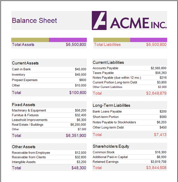
Designing a .NET Balance Sheet
Balance sheets are one of the notorious financial reports that are commonly created by financial institutions. Typically, balance sheets are black and white with a straightforward layout and generally lacking any aesthetic value. This does not need to be the case! When you add a compelling design to your report, it creates more meaning and value to the contents of the report — it brings your readers’ attention to the critical elements of the document.
Be sure to consult your company’s brand standards guide (or brand assets guide). A brand standards guide is a set of rules that explain how your brand visually communicates. These guidelines typically include necessary information such as a mission statement, logo usage, color palette, and style of fonts (typography) used in print and digital communications. Use a consistent design language based on established brand standards to reinforce brand retention and give the viewer reassurance you stand behind the data.
Consistency and Simplicity are Virtues
Consistency is key. You want to develop a simple and easily understandable hierarchy and rhythm of information and implement that standard across every report.
Other design principles:
- Try and keep reports comparable if possible. Use the same placement and scale of data between reports.
- Immediately draw readers to the element of greatest importance via visual cues such as color, border, background, and typography.
- All the visual elements should work toward one goal of clearly telling a larger story.
In the screenshot below, you can see that the balance sheet has organizational branding, a consistent theme, and balanced color. The purple fonts in the report title and Total Assets fields emphasize their sum values, while the black fonts elsewhere indicate the fields as category titles and specific values. The red font used for Total Liabilities and Total Shareholders’ Equity indicate payable amounts, while still fitting with the purple tone and light blue-gray hues.
Designing .NET Income Statements
Keep It Simple
With income statements, it’s better to have a simple and straightforward design (as opposed to a balance sheet). The income statement below is a good representation of a professional and a well-designed report, while still maintaining a defined color scheme. With this income statement, we still have organizational branding, with a matching purple font color to keep a consistent theme to the report. However, you’ll notice we do not use any other colors besides the light blue-gray hue and the rich purple font color.

This keeps the income statement as simple as possible. When designing, you are anticipating your end-users’ experience. In this example, the gray border lines on the cells of the table help differentiate each line and add to the overall theme of the report by matching the feel of the other colors. Using these design principles, simple lines, and use of white (negative space) you’ll support key data points. However, when you take away the lines, the income statement report becomes much more difficult to read and understand.
Below, you can see a financial report hosted neatly in a centralized server, categorized by Financial. End-users can simply log on and get the report quickly!
Report Design for Non-Designers
Instinctively, we are programmed to process information visually. This is why data visualization is the most powerful medium for communicating volumes of information.
To present quantitative data effectively, your .NET report should have content that is clear, engaging, and easy to understand. Your company’s brand style standards can guide you toward a consistent, branded design. Remember to present data in the most compelling format (e.g., practical use of bar charts, line charts, and tables). For example, when a multiple series line chart has a high density of data points, the visualization may become cluttered and appear confusing. Be sure all the visual elements are working toward one goal of telling a larger story.
Even if you do not have a background in design, you can create engaging .NET financial reports. ActiveReports is a complete .NET reporting tool that provides endless possibilities for designing balance sheets, income statements, or any other type of financial report. ActiveReports gives the report author infinite potential for reporting on any organization, whether it is .NET reporting for financial institutions, healthcare, insurance, government, marketing, IT, HR, or general business operations.
ActiveReports Server is a .NET reporting solution specializing in hosting, managing, distributing, and creating reports. A scalable, flexible report server for enterprise teams, Active Reports Server offers a responsive HTML5 Report Portal for end-users.
With the Active Reports Server, you can have a multi-tenant environment where users from various departments, companies, or other specifications can log in, view their reports (and only their reports), export the data, or set up a distribution schedule for reports. This allows you to be free of the stress involved with ensuring every end-user receives the correct report. In another article, we discuss how to easily create multiple reports with the same style or layout with Active Reports Server.
With the drag and drop control behavior, an intuitive reporting engine, and a set of complete .NET reporting tools, you can produce compelling quantitative reports without writing a line of code.
Deliver beautifully-designed .NET reports in less time with the ActiveReports Designers.
Download a Free Trial of Active Reports


 General
  News
News  Suggestion
  Question
  Bug
Bug  Answer
  Joke
Joke  Praise
  Rant
Rant  Admin
Admin 


