Introduction
This is the fourth in a series of six articles, following the design, development and practical use of a fully functional ASP.NET custom control.
The full list of articles is as follows:
These articles are not intended to be a comprehensive look at custom control development (there are 700+ page books that barely cover it), but they do cover a significant number of fundamentals, some of which are poorly documented elsewhere.
The intent is to do so in the context of a single fully reusable and customizable control (as opposed to many contrived examples) with some awareness that few people will want many parts of the overall article but many people will want few parts of it.
This article examines techniques to make the control work correctly from the Visual Studio .NET toolbox, to customize rendering in the designer and to further customize rendering of Databound controls. It is intended for those who are experienced in writing web controls but do not understand the functionality provided by the .NET Framework to make your controls appear professional in a WYSIWYG designer, such as Visual Studio .NET.
It assumes at least a basic knowledge of C#, WebControl-derived classes and .NET Framework attributes.
Downloads are available from the first article in the series.
Adding Designer Functionality
One of the least documented aspects of WebConrtol development is how to make a control "look" good in a WYSIWYG designer.
If we limit our code to what we have covered in articles 2 and 3, the control will not work properly from the toolbar, will appear as a small box if none of the properties are populated, will appear with an encrypted email address in the .Text property (because the designer does not support JavaScript) and may not appear at all when databound.
None of this is good news for the web page developer, so it is important to include a little designer functionality.
Toolbox Operations
A custom control will not operate properly from the toolbox unless you inform the designer what the control tag should look like.
[
// ...
ToolboxData("<{0}:NoSpamEmailHyperlink runat=server></{0}:NoSpamEmailHyperlink>"),
// ...
]
public class NoSpamEmailHyperlink : System.Web.UI.WebControls.WebControl
{
}
The ToolboxDataAttribute uses string formatting to create the full tag wherever you drop it within the page, or parent control.
By default, the {0} marker is replaced with "cc1". This prefix can be customized using a TagPrefixAttribute.
[assembly: TagPrefix("CP.WebControls", "cpspam")]
This attribute can be defined anywhere in the project, but as it is scoped to the assembly, it makes more sense to define it in AssemblyInfo.cs.
In addition to adding the relevant tag to the page, the designer will check that the assembly has been "registered" with the page, using a line such as:
<%@ Register TagPrefix="cpspam" Namespace="CP.WebControls"
    Assembly="CP.WebControls.NoSpamEmailHyperlink" %>
If the same assembly is already registered using a different TagPrefix, the TagPrefixAttribute is ignored and the registered prefix will be used to build the tag.
If another assembly is already registered using the same TagPrefix then a number is appended to make it a unique registration, and is subsequently used to build the tag for further instances of controls in this assembly.
If neither the assembly or the TagPrefix are registered then a <%@ Register ... %> line is added by the designer.
Custom Toolbox Icon
There is also a custom icon included with the NoSpamEmailHyperlink. This is easy enough to do and adds an element of style to your control.
Just create a 16x16 .bmp bitmap with the same base filename as your control (in this case, NoSpamEmailHyperlink.bmp). Use bright green (RGB = 00FF00) for pixels you wish to be transparent and draw yourself an icon.
Visual Studio .NET users can select the file in the Solution Explorer, change the "Build Action" property to "Embedded Resource". Developers using other IDEs should consult their documentation to see how to do this.

Note that the bitmap will assume the default namespace of the project and that this should match the namespace of your control class, otherwise you must use the ToolboxIconAttribute to point the control to its icon.
Personal disclaimer: I readily admit that I am not good with design - it is an envelope and that's the best I can do in a 16x16 space. If anyone has a better icon, I will be happy to consider replacing it.
Custom ControlDesigner Class
The WebControl class is attached to a ControlDesigner class which handles the way the control appears at design time. It essentially uses the control's .Render() method to generate some HTML. If that is zero-length then it generates some standard HTML to make the control visible.
In many cases this is sufficient but there are two common purposes for a custom ControlDesigner class.
- Overriding
GetDesignHtml() to simulate some JavaScript that is not handled by the designer.
- Overriding
GetEmptyDesignHtml() to create a custom marker when the HTML returned by .Render() is empty.
public class NoSpamEmailHyperlinkDesigner : ControlDesigner
{
}
We inform our control that it has a custom designer using the ControlDesignerAttribute.
[
// ...
ControlDesigner(typeof(NoSpamEmailHyperlinkDesigner)),
// ...
]
public class NoSpamEmailHyperlink : System.Web.UI.WebControls.WebControl
{
}
For the NoSpamEmailHyperlink, we do not want the email address to appear encrypted in the designer when it is included in the text - after all, it will not appear that way at run-time (see above). Thus we need a NoSpamEmailHyperlinkDesigner class to simulate the JavaScript.
All implementations of a custom designer should override the .Initialize() method to throw an exception where the ControlDesigner is used with a type of control not derived from the one it is intended for.
public override void Initialize(System.ComponentModel.IComponent component)
{
if (! (component is NoSpamEmailHyperlink))
{
throw new InvalidOperationException(
this.GetType().FullName
+ " only supports controls derived"
+ " from CP.WebControls.NoSpamEmailHyperlink"
);
}
base.Initialize (component);
}
This allows any overloaded methods to make certain assumptions about the type of control it is dealing with, as demonstrated in the code below.
Rather than parsing the HTML returned by base.GetDesignTimeHtml() and decoding the email address wherever found, we can set the control's .EncodeInText property for the duration of the rendering.
It is a much more efficient solution than encoding and decoding every time the control is rendered and is completely invisible to anyone using the control. As long as we return the control to its initial state after rendering, the page designer will never see the change.
This is, in fact, a recommended design strategy for any custom implementation of .GetDesignTimeHtml():
- Change the nature of the control.
- Call the base implementation.
- If anything fails, use the exception to generate an error marker.
- Return the control to its initial state.
- If there is no HTML to return then get an empty control marker.
public override string GetDesignTimeHtml()
{
NoSpamEmailHyperlink nseh = (NoSpamEmailHyperlink)Component;
bool storeEncodeInText = nseh.EncodeInText;
string rtn = null;
try
{
nseh.EncodeInText = false;
rtn = base.GetDesignTimeHtml();
}
catch (Exception ex)
{
rtn = GetErrorDesignTimeHtml(ex);
}
finally
{
nseh.EncodeInText = storeEncodeInText;
}
if (rtn == null || rtn.Length == 0)
rtn = GetEmptyDesignTimeHtml();
return rtn;
}
The only problem is that the control's .Render() method will return open and close tags (<a></a>), even if there is nothing in the .Text or .Email properties. So the control will appear as a small empty box in the designer, which is not particularly easy to select.
This problem can be bypassed by overriding the control's .Render() method.
protected override void Render(HtmlTextWriter output)
{
if (Email.Length == 0 && Text.Length == 0 && Controls.Count == 0)
return;
base.Render(output);
}
Now a non-databound NoSpamEmailHyperlink control will usually appear to the page designer exactly as it would to the end-user. If it will be invisible in a browser, it is still displayed to the page designer, but using a standard display string that will be recognizable to the page developer.
Custom DataBindingHandler Class
When a WebControl is databound, the bound properties are considered blank when rendering in design mode. One exception to this is an innertext property where the content is only partly databound. In this case, any text completely outside of the bound area is used, anything else is considered blank.
For example, the following control definition can be included in a DataGrid:
<cpspam:NoSpamEmailHyperlink id="nseh" runat="server"
    Email='<%# DataBinder.Eval(Container.DataItem, "Email") %>'
    ScrambleSeed='<%# DataBinder.Eval(Container.DataItem, "ID") %>'>
    <%# DataBinder.Eval(Container.DataItem, "Name") %>
    (<%# DataBinder.Eval(Container.DataItem, "Email") %>)
</cpspam:NoSpamEmailHyperlink>
In the Visual Studio .NET designer, the .Email and .ScrambleSeed properties are treated as null, while the .Text inner property is considered to be ")".
In the case of a control that's otherwise visible, such as a TextBox or a DropDownList, this does not matter at all. We do not need to see the text to know that the control is there.
But in a text-only control, such as Label or NoSpamEmailHyperlink, we need to put some text into the properties or the control will be invisible in the designer.
This is achieved by implementing a DataBindingHandler class, overriding the .DataBindControl() method and informing our control of its new design-time responsibilities via the DataBindingHandlerAttribute.
[
// ...
DataBindingHandler(typeof(NoSpamEmailHyperlinkDataBindingHandler)),
// ...
]
public class NoSpamEmailHyperlink : System.Web.UI.WebControls.WebControl
{
}
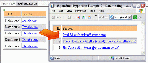
A Label control implements the TextDataBindingHandler, which simply populates the .Text property of the label with the string "Databound".
The control then appears within the designer as a piece of text: "Databound"
For the NoSpamEmailHyperlink, we want the control to appear as a hyperlink in the designer. Thus we must populate both the .Text and .Email properties in our DataBindingHandler class.
public class NoSpamEmailHyperlinkDataBindingHandler : DataBindingHandler
{
public override void DataBindControl(
System.ComponentModel.Design.IDesignerHost designerHost,
System.Web.UI.Control control
)
{
NoSpamEmailHyperlink nseh = control as NoSpamEmailHyperlink;
if (nseh != null)
{
nseh.Text = "Databound";
nseh.Email = "Databound@Databound.com";
}
}
}
It makes absolutely no practical difference what is used to populate the .Email property. The contents will never be seen. The only rule is that it cannot be zero length because if it is then the href attribute of our tag is not populated and the control appears as plain text in the designer.
Conclusion
Most of the techniques detailed in this article are extremely easy to implement and add a certain element of quality to your control that cannot be quantified in terms of sales value.
A ToolboxDataAttribute and Icon should be implemented for any custom control. A custom ControlDesigner class is only required wherever JavaScript is used to change the appearance after rendering, or wherever the default "empty" design-time HTML is not sufficient. A custom DataBindingHandler is necessary wherever a control may appear invisible or otherwise incorrect when bound to data which is not available at design-time.
Having now examined the full code required for the NoSpamEmailHyperlink, all that remains is to consider a few examples and to look at how the NoSpamEmailHyperlink can be customized to further confuse anyone trying to get past the control functionality and harvest our hidden addresses.


 General
  News
News  Suggestion
  Question
  Bug
Bug  Answer
  Joke
Joke  Praise
  Rant
Rant  Admin
Admin 


 Submit an article or tip

