Contents
- Introduction.
- Everything is in one.
- How does it work? The demo application.
- Conclusion.
Introduction
The idea of this project appeared when I implemented a project, when a client wanted to receive a control that wasn’t in standard Microsoft libraries. I decided to write my own control. In the process of work on the project, the class acquired additional modules and various extenders. Some of them became classes, some of them could not be in a class. As a result, it was a small library including dozens of classes and several interfaces. During the writing of these classes, I had got a lot of questions and it wasn’t simple to find answers to them. The purpose of this article is to provide a description of the functionality of the components developed by me and their application. It will be interesting to view some of the parts of my source code. C# was used to create the classes. The source code is taken from a real application (http://www.eboris.com/, http://www.borisbord.com/).
Everything is in one.
In the library, I combined the functionality of TabControl with ToolBar. I implemented DragAndDrop of buttons-tab-headers with a possibility to select buttons and corresponding pages (TabPage). In the developed library, there is a control that can work as a standard TabControl. However, we aren’t limited in the selection of forms, colors and other properties. This control can also be used as ToolBar with a possibility of selection of forms, colors and positions. Now, one object executes various functions.
Implementation of the library classes.
ImageButton - the button is inherited from PictureBox. It includes 8 properties.
NormalDisableImage
NormalLeaveImage
NormalPressImage
NormalEnterImage
CheckedDisableImage
CheckedLeaveImage
CheckedPressImage
CheckedEnterImage
The button can display images from these properties' corresponding internal modes. Each of these modes is activated with mouse events. ImageButton implements functions of a standard Button control but it is inherited from PictureBox. It allows having freedom in appearance. Several events and methods were added into it. I will not describe most of the new properties and methods. I will mark only some new events: CheckedChanged, DragStarting*, DragFinished. I think they are interesting. ImageButton class is used to move buttons.

DragStarting*, DragFinished- enabled in the conditional compilation.
TabButton is inherited from ImageButton and expands its possibilities. It adds necessary properties for the functionality of TabHeader. Since it was inherited from ImageButton, it can have any form and look like a bookmark or a figured button.
There are several new properties in TabButton that allows functioning with TabHeader/TabPage.
TabPage is inherited from a standard System.Windows.Forms.Panel control with additional properties and functions expanding its possibilities. One of the differences of the developed TabPage is HeaderButton property which determines a button as TabButton. This property gives a possibility to join each TabPage with a button and to control its behavior. In the code of the library, the described function is implemented with joining of a corresponding delegate to an event of a condition of a header button such as TabButton: BorisBord.WinForms.TabPage is activated/deactivated with a Visible property of the page.
TabHeader is inherited from BorisBord.WinForms.TabPage and includes properties and methods allowing the universal control being TabControl and ToolBar. Since TabHeader is inherited from TabPage, it has got the same functionality, it can be TabControl and appear on the form when the button-bookmark is activated.
Some of the properties and possibilities of TabHeader:
int Interval - an integer that allows setting a distance between TabButtons on TabHeader.
bool Multiselect - a property, that gives a possibility to activate the button-bookmark of one of TabHeader headers and the corresponding TabPage at the same time.
bool Vertical – it gives a possibility to place a button in Vertical direction.
TabDragHelper – This is an example of implementation of two important operations DragOverButtons and DragDropButtons. The implementation of this class can depend on a concrete task.
TabButtonExtender – This is an example of a class that is not inherited from ImageButton class but adds more possibilities. This class expands ImageButton properties only if ImageButton.OwnerDraw property is true:
I placed the corresponding condition in CanExtend method:
bool IExtenderProvider.CanExtend(object target)
{
if (target is BorisBord.WinForms.ImageButton )
   {
     if(((BorisBord.WinForms.ImageButton)target).OwnerDraw)return true;
    .........
After ImageButton.OwnerDraw property is set as true and the project is recompiled, the instance of ImageButton has got new 9 properties: 8 of them are int (8 modes of the button) + PaintExtender, providing displaying of images during the program execution.
Expanded methods of ImageButton:
NormalDisableImageIndex , NormalLeaveImageIndex, NormalPressImageIndex, NormalEnterImageIndex, CheckedDisableImageIndex, CheckedLeaveImageIndex, CheckedPressImageIndex, CheckedEnterImageIndex - status of the buttons that can have got positive values of the icon number corresponding to ImageList set in TabButtonExtender.ImageList field. If a value of one of 8 properties is -1 then an image will be taken from a corresponding property of ImageButton. It means that a programmer has a possibility to select a place where the image is taken from: ImageList or ImageButton property.
PaintExtender gives a possibility to join any classes inherited from BorisBord.WinForms.IPaintHelper interface:
public interface IPaintHelper
{
  void Paint(object sender, System.Windows.Forms.PaintEventArgs pe);
}
In addition to it, the expanded class has a possibility that is set during the creation of an instance. This property of ImageList type shows what ImageList created by you is connected with this instance of the class.
There are 3 “eccentricities” PaintHelperRect, PaintHelperRhomb, PaintHelperEllipse.
They are inherited from BorisBord.WinForms.IPaintHelper interface showing variants of dispbookmark of ImageButton. Each of them has got 6 properties: 5 of them have got System.Drawing.Color type corresponding to 4 statuses EnterBackColor, LeaveBackColor, CheckBackColor, PressBackColor and the BorderColor border color. There is also Alpha parameter of transparence of background for darkening.
The implementation of these classes should be spoken about separately that’s why I wrote them only to show that using of TabButton + TabHeader + TabPage bunch allows creating miracles. They implement one of the variants of button backlighting (similar to OfficeXP) and draw darkening in rectangle, rhomb or ellipse shape. I wrote them fast and they are all clones of each other except Paint method (object sender, …) but the result is interesting.
How does it work? The demo application.
The application is a form with tab pages. All functions in the application can be done with a mouse. At the bottom part of the form, there is a window where promptings are shown. The size of the window can be changed with Splitter. Try to move the mouse over the form. When the cursor is over a functional region, you will see messages that will help you.
Each page is an example showing one or several possibilities of the developed classes.
- “TabControl” Panel - shows examples of
TabHeader + TabPage as standard TabControl. Here there are possibilities that the standard TabControl doesn’t have. The header of TabHeader can be placed separately independent from TabPage and since TabHeader is inherited from TabPage it can be used as TabPage. It will appear and disappear also from the screen as well as usual TabPage. Affiliated TabHeader can have its own TabPage or TabHeader. By the way, already on this page, it is possible to take advantage of function DragAndDrop. You can drag TabButton three affiliated TabHeader from one to another. In these TabHeader pages TabPage are not moved behind buttons.
- "Buttons" Panel shows opportunities of buttons of
TabButton class. They are shown as tab headers and various variants of a kind of buttons. At the left is TrackBar that allows changing darkening of a background of buttons with the expanded properties.
- "DragAndDrop" Panel represents
ToolBar panels carrying out functions of TabControl at the same time. And, each of its page is an independent TabHeader.
Now try to grasp a button (selected or not selected) and move them all over again on one TabHeader, and then do it with others.
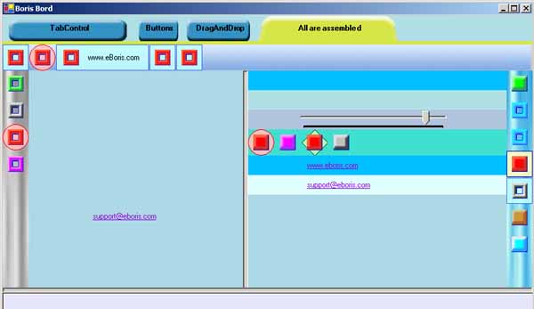
- "All are assembled" Panel represents overlapping all opportunities given by the developed classes.
I want you to notice, that all you see looks absolutely on miscellaneous, but everything is made with only three controls TabHeader, TabPage and TabButton.
Conclusion
In summary, I want to note, that the given article describes receptions and methods applied in the library a little. A lot of code has been written quickly and is not optimized. I will be glad to answer all your questions and if you are interested, I shall keep on publications, discussions and updating of the code. I am waiting for your comments.
My name is Boris Bord and I'm a Computer Programmer and Software Developer by trade. My 23 years experience comes from computer programming for United Nations, US Navy, US Air Force, GE, Nokia, Kraft Foods in conjunction with my work for Banks, Insurances, Software and Dotcom companies. I'm a whiz with C/C++, C#, Java, Visual Basic, ASP, JSP, Delphi, HTML, XML, XSLT, .NET, ColdFusion, PHP, Flash, SQL and Oracle. Proven track record bringing projects from the conception stage to completion. Consistently ahead of schedule and within budget. I accept programming and web development projects worldwide and would like to do programming for you.


 General
  News
News  Suggestion
  Question
  Bug
Bug  Answer
  Joke
Joke  Praise
  Rant
Rant  Admin
Admin 


 Submit an article or tip


 I did run into one annoyance. When I clicked on the "See" button, I was faced with a full screen window, with only one option -- download flash
 I don't use flash or any other activex controls, and many other companies and people routinely block them. You might want to make that screen a little less annoying (had to kill with task manager), and add screen shots for people who cannot use or hate flash.