Introduction
This article shows a sample user control for displaying an enum.
Often when building a form for user input, the situation arises where you would like to provide a list of options for the user to select from. These items may be represented as an enum in code, either single-select or multi-select (bit-set). This user control can help create these form selections, based on a provided enumeration.
Background
Whilst developing an application, I found myself wishing for a simple way to display / set option values from an enum. So I started to write a simple user control to display an enum as a set of radio-buttons. This wasn't too difficult, but then I thought, wouldn't it be nice to have a simple control for bit-sets as well. And that's where the fun started. Using bit-set raised the following issues:
- Need to group controls, so a combined-value could be selected.
- Need to handle 'linked-values'. This arises when two combined-values share a value (see the
color enum in the example). In this case, an enum value is displayed twice, so to keep the interface consistent, the buttons must remain synchronized.
- Need to be aware of combined-values resulting in unnamed
enums. This isn't supported, only named values can be displayed as buttons.
[Flags]
enum ABC
{
A = 8,
B = 12,
C = 14,
};
To sort through this, I decided to convert the enum to a simple XML document. In this way, I can easily express the groupings introduced by bit-sets, and I can cross-reference values to handle linked-values.
The final result is a control that presents an enum type, or a bit-set as a group of run-time generated buttons.
Using the code
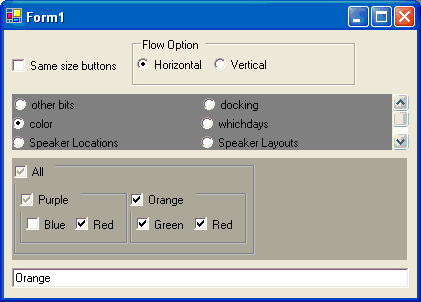
To use the control, make a EnumSelect user control and specify the enum to use via the SourceEnum property. It will create buttons for each enum, and lay them out. The button labels reflect the enum name, use a '_' to display a name with white space.
If the provided enum has the [Flags] attribute, the buttons will be check-boxes, with group boxes used for combined-values.
A SelectedObjectItemChanged event will be raised whenever the user alters a selection, and the SelectedObjectItem property can be used to return the selected enum value.
You can also change the layout to flow horizontally or vertically using the FlowOption property.
Points of Interest
The main classes in this control are shown in the following class diagram.

Represent the enum values in XML
Conversion of an enum to XML is a little involved. All of the code for this is in the EnumXDoc class. Internally, this class converts the enum into an ordered list of long values. In this way, bitwise checks can be made to determine the break-down of enums that represent bit-sets. The long type was chosen because it is the largest CLS type that an enum can use as its base-type. It is possible to use an unsigned long, but I chose not to since ulong is not CLS compliant. Following is an outline of the code used to convert an enum to an XML document.
The enum is converted to an XML document by the EnumXDoc class. The EnumDoc.BuildDoc() method handles the setup of the document, determining whether this is a bit-set or not. It also builds an ordered list of the defined enum-values as a list of longs, storing them for later. BuildDoc() then calls either TreeList() or TreeBranch() to add the enum value entries to the document.
TreeList() simply adds a list of values to the provided XML element, whilst TreeBranch() adds a particular value, and then recursively adds any 'parts' of the given value, it's used for bit-sets.
The two other methods Parts() and TopValues() are used to analyze bit-sets. Parts() takes a long value, and returns the direct children that make-up the bit-set. It does this by looking for enum values, that are less than itself, but contained by it. TopValues() finds all the long values that don't have a corresponding combined value. It does this by search for values that are bigger than itself, in which it is contained.
Recursive groups of items
To be able to support selection of a compound enum value, a CheckGroupBox control is used. This is a user control containing a group box, and a group-checkbox. The CheckGroupBox automatically updates the group-check and child checkboxes, using CheckGroup_CheckedChanged() and CB_CheckChanged() respectively. While the CheckGroupBox changes owned controls, it must ignore events raised to report the fact. I use an event-guard (isProcessingCheck) to ignore these additional events.
Note: controls in a CheckGroupBox need to be added to the internal ControlGroup. Attempting to add controls to the CheckGroupBox itself will assert.
Control layout
I started by simply creating controls and using Docking to lay them out. Using Docking, the controls would re-size to fill the white space, and tended to introduce a scroll bar. Instead, I created a base control FLowUserControl to handle positioning of child controls. This doesn't re-size contained controls, instead it places them one after the other, wrapping them to fill space in either the horizontal or vertical direction.
To use flow layout, all controls must have a defined size, the EnumSelect class sets the size on all controls while creating them, in the MakeControl() method. This method recursively adds child controls, based on the previously loaded EnumXDoc. Button sizes are set to either a size to hold their own text, or a common size, depending on the FixedButtonSize property.
The CheckGroupBox user control contains a group of other controls. To define its size, it provides a PreferredSize property. The EnumSelect control uses this to define the size for a group.
The FlowUserControl user control manages the layout for all contained controls. It provides a 'flow' layout.
Flow layout attempts to arrange the set of child controls, so that no scroll-bar is shown; particularly in a specific direction. By setting the FlowOption property, the layout arranges the controls to fill along a particular axis.
Linked enum values
In addition to the problem introduced by a user selecting items in a bit-set, it is possible to define an enum, where two independent groups, have a Linked button. This occurs in bit-sets, where two groupings, both belonging to the same parent grouping, and one of these groups has a part of the other. See the example using a color bit-set.
The LinkedButton class can be used to synchronize two check box buttons. This class simply attaches to the provided controls, and keeps their check state in-sync. The EnumSelect FixupRefLinks method finds linked buttons, and uses a LinkedButton object to keep them in sync.
History
Created: March-2004
G'day, the name's Derek Kowald.
I've been a software engineer for 10+ years.
For 9 of those I developed software with C++, MFC.
Now I'm into C#, .NET.


 General
  News
News  Suggestion
  Question
  Bug
Bug  Answer
  Joke
Joke  Praise
  Rant
Rant  Admin
Admin 


 Submit an article or tip


![Beer | [beer]](https://codeproject.global.ssl.fastly.net/script/Forums/Images/beer.gif)