This is Part 6 of the blog post series, “Creating Menus – Simple To Complex“. In my last post, I explained how we can create a responsive menu using HTML, CSS & jQuery. In this post, we will see how we can create a responsive menu in ASP.NET. We will be using the “meanmenu” plugin from github to create our menu responsive. The menu will automatically resize itself as we increase/decrease browser’s width.
To start with, we have a Menu declaration as below on our master page or any of the other pages:
<asp:menu ID="Menu1" runat="server" CssClass="menu">
     <items>
         <asp:menuitem NavigateUrl="#" Text="C#"></asp:menuitem>
         <asp:menuitem NavigateUrl="#" Text="VB.Net"></asp:menuitem>
         <asp:menuitem NavigateUrl="#" Text="F#"></asp:menuitem>
         <asp:menuitem NavigateUrl="#" Text="Python"></asp:menuitem>
         <asp:menuitem NavigateUrl="#" Text="Ruby"></asp:menuitem>
         <asp:menuitem NavigateUrl="#" Text="PhP"></asp:menuitem>
         <asp:menuitem NavigateUrl="#" Text="SalesForce"></asp:menuitem>
     </items>
 </asp:menu>
The corresponding CSS to the above Menu is as below:
.menu{
    margin: 0px auto;
    font-family: Arial, Helvetica, sans-serif;
    font-weight: bold;
    font-size: 14px;
}
.menu ul li a:link, div ul li a:visited {
    display: block;
    background-color: #f1f1f1;color:#000;
    text-align: center;
    text-decoration: none;
    padding: 4px;
    border-bottom: 1px solid #fff;
    width: 150px;
}
.menu ul li a:hover{
    background-color: #ccc;
}
.menu ul {
    list-style-type: none;
    margin: 0px;
    padding: 0px;
}
.menu ul li {
    float: left;
    margin-left: 5px;
}
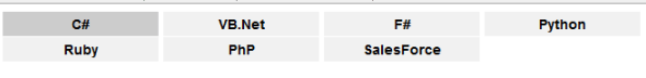
After the above is complete, the menu will look like something below in iPhones/iPads or small devices.
On the ASPX or master page, we will add a reference to the jQuery, plugin’s JS file “jquery.meanmenu.js” and plugin’s CSS file “meanmenu.css”.
<script src="js/jquery-1.8.3.js"></script>
<script src="js/jquery.meanmenu.js"></script>
<link href="Styles/meanmenu.css" rel="stylesheet" />
Below the end of <body> tag, we call the plugin’s function on the menu selector which we want to make as responsive as below. Here, I am passing value to “meanScreenWidth” as 768 which means the responsive menu will start displaying when the browser width is less than or equal to 768px.
<script>
        jQuery(document).ready(function () {
            jQuery('.menu').meanmenu({
                meanScreenWidth:"768"
            });
        });
</script>
Now, after we implement the plugin on our menu, the menu will look like below in small devices.

You can download the complete source code for the menu here.
Hope you like this post! Keep learning and sharing! Cheers!
A passionate developer with over 10 years of experience and building my software company code by code. Experience withMS Technologies like .Net | MVC | Xamarin | Sharepoint | MS Project Server and PhP along with open source CMS Systems like Wordpress/DotNetNuke etc.
Love to debug problems and solve them. I love writing articles on my website in my spare time. Please visit my Website for more details and subscribe to get technology related tips/tricks. #SOreadytohelp


 General
  News
News  Suggestion
  Question
  Bug
Bug  Answer
  Joke
Joke  Praise
  Rant
Rant  Admin
Admin 


 Submit an article or tip


