Contents
Dashboards are growing in popularity and support, and with good reason, but often it is not obvious to everyone what’s so special about a dashboard – many people just assume it is a fancy kind of report.
While discussing with a client what should go on their system’s dashboard, I said "Dashboards are for steering." Every time someone suggested that it would be cool to have a gauge on the dashboard that showed the aggregate year-to-date average widget output for all facilities, I said it again. And again. And again. And after some more discussion of key performance indicators, real-time status drivers, fundamental business factors, et al, they finally they got it with a simple analogy:
Imagine that you're building a dashboard for a car, and you can only have one gauge on it. Would the aggregate year-to-date average daily fuel level for all cars in the corporate fleet be the gauge you would choose? Or would you rather see the current fuel level for your car?
This is not to say that the aggregate year-to-date average widget output for all facilities is not a useful metric; it most certainly is, and should probably appear on some report somewhere. But it does not belong on the dashboard because it (alone) cannot help you understand what is happening "right now". And "right now" is the main concern of dashboard applications.
A more accurate statement would be "dashboards are for driving", but the analogy should be obvious - any information displayed on the dashboard should reflect the current value of a metric that is useful for recognizing when the performance of whatever is being monitored needs to be changed. There is a reason that car dashboards show current fuel level and current speed (among other things). If you are low on fuel, you can stop and get some more. If your current speed is too slow or too fast for the current situation, you can speed up or slow down to change it. The dashboard on a car helps you drive the car. Dashboards for a business have the same purpose.
Generically, the purpose of a dashboard is to give the user a coherent picture of the current state of a system or part of a system "at a glance", so that significant changes are easily noticed and the user can react in a timely manner. Thus it is important to identify the key performance indicators (KPIs) that will be used as the basis of the dashboard display.
The difference between a report and a dashboard is really one of intent. Technically, a dashboard is a form of report, but not all reports are dashboards. A report can logically show anything the user is interested in seeing. A dashboard should only show information that reflects the current status and that is useful for making decisions in real-time.
Imagine your car’s speedometer had a five-minute lag time and only updated once a minute. Would it still be as useful? Sort of, but not nearly as useful as a real-time display! Similarly, software dashboards must have a lag time that is small enough so that changes can be noticed and adjustments made before things get too much worse. Software dashboards must also be updated frequently enough that significant changes will not be missed. Each business must determine dashboard lag and update-frequencies that are acceptable for their operation.
Many application-monitoring systems use a dashboard to display current application and resource status. For example:
One of my favorite quotes is:
Make everything as simple as possible, but not simpler. -- Albert Einstein
This applies especially well to dashboards. The user needs to be able to understand the significance of the dashboard information at a glance. Time spent contemplating the meaning of the dashboard display is time wasted that would be better spent reacting to the current situation – or enjoying that pleasant feeling when everything is going well.
In general dashboards should not scroll, they should scale. There may be exceptions to this rule, but I can't think of any. If you need to comprehend the system status at a glance, then scrolling is to be avoided. On the other hand, even a tiny dashboard can be useful in your peripheral vision. For example:

Even though the text in is too small to read, you can clearly see that two applications are in trouble because they are red. Scaling of the display allows the same screen to be used on a large LCD display easily visible from across the room. If you cannot easily scale the dashboard display, try to provide a few useful sizes, e.g. small, medium, and large.
So, in most situations, opt for simple and direct instead of complex and abstract, i.e., if you just want to know whether your applications are behaving or not, a single unwavering bright light bulb will be easier to understand at a glance than a bunch of fluctuating bar charts and gauges.
Dashboard controls are unlimited in potential complexity and graphical richness, but there are some very basic control types that appear frequently.
- A Boolean status indicator. For example, a light bulb that is either on or off.
- A multi-state status indicator. For example, a light bulb that can display a few meaningful colors, e.g. green for everything-is-ok, yellow for something-might-be-wrong, and red for something-is-wrong.
- A continuum status indicator. For example, a bar-graph or gauge that shows a value between zero and a maximum, or one that shows a variance above or below zero.
- Simplifications of the above. For example, a text label that says either "on" or "off" is a form of Boolean status indicator.
- Combinations of the above. For example, a gauge with color-coded sections indicating acceptable/questionable/critical operating ranges is a combination of multi-state and continuum status indicators.
- Even more complex controls, such as bar charts, surface maps, 3D axes, etc.. For examples, look at an airplane cockpit or flight simulator, or browse some of the dashboard control vendors’ web sites.
The most useful kind of dashboard control, I believe, is one that shows the variance between the expected situation and the current actual situation. Variances help eliminate many of the considerations of measurement units and scaling, which makes it much easier to see when things are going off-track without having to reference (or memorize) other metrics. For example, if the expected pipeline utilization is 100 liters per second, the capacity is 1000 liters per second, but the actual utilization is 150 liters per second, it may be difficult to see that there is a problem if only the absolute values are shown – the visual difference between 100 and 150 on a scale of 1000 may not be noticeable at all. But if the expected vs. actual variance is shown, the dial would be pointing at a very obvious variance of +50%!
The use of historical displays on a dashboard is debatable; sometime they can provide important context, other times they are just clutter. One very useful historical display, especially for variance metrics, is a simple line graph of the last N units of time. Any noticeable spikes in the line indicate a time when the metric passed out of its safe range.
Critical metrics should be monitored, not just displayed. It is relatively easy to implement a periodic sampling mechanism for dashboard metrics that checks the value or a windowed average value against a safe range, and alerts someone when the values fall outside of this range.
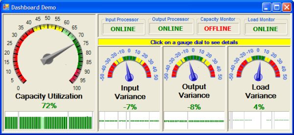
The dashboard demo uses the gauge control from A fast and performing gauge by A.J.Bauer (refactored into its own library). The values displayed on the dashboard controls are random, but reflect some key performance indicators (KPIs) that might be used in a real system. Clicking on a dashboard control brings up a details grid in a separate form, which contains completely made-up data just for illustration purposes. In a real application, the KPIs would relate to the business and the drill-down data would support or expand the summary information. The dashboard demo also displays the status of four simulated applications as either "online" or "offline". The simulation assumes a 95% uptime for each application.
The code for the dashboard demo is nothing special, just a simple simulation that makes the dials move. It is interesting to watch it run - for a minute or two. The purpose of the code is just to show a dashboard "in action", which hopefully will spur additional thought and discussion on the true purpose and utility of business dashboards. Show it to a client, and see if it sparks their interest. Ask them what their three top KPIs would be.
The only points of interest in the code might be the reusable gauge library, refactored from the original article. Beginners may find the use of a generic collection for pop-up form activation/reactivation interesting. Also, the code uses a 'bump' or 'perturb' or 'impulse' mechanism for the random gauge values, i.e. the random-number generator is used to generate random delta values to add to the current gauge values; this keeps the gauge needles from jumping all over the place. The history graph is drawn using GDI+ on a label; a custom control would be more appropriate in a real application of course.
Dashboards are immensely useful not only for business data but also for business applications, but only if they display metrics that can be used to "drive" (or "steer") in real-time. It is absolutely critical that the users understand this distinction from a "normal" report, otherwise they may ask for and get a very pretty panel full of gauges and dials and whatnot that is impressive, but practically useless. Opt for simplicity in dashboard displays; don’t make the user have to think about what the dashboard information means. Variance displays are especially useful if expectations can be quantified. Dashboard displays should not have scrollbars; if they do, rethink the presentation. Dashboard displays should scale with the window size whenever possible. Truly critical metrics should be monitored with an alerting system when values fall out of safe ranges.
- 08/22/2008
- Initial article published
- 08/25/2008
- Minor edits to emphasize that dashboard displays should not scroll but they should scale
- 09/05/2008
- Added remarks about the usefulness of historical graphs and metric monitoring with alerts
- 09/14/2008
- Altered code to draw the last 50 points as a bar-chart. A gray bar is used to denote missing/offline value placeholders.
- Altered AJ Bauer's gauge library slightly to add a function to return the range-display color for a given value, and used this function to draw the bar-chart.
Steven A. Lowe is a consultant, software developer, inventor, entrepreneur, author, musician, and lover of puns. He ran an innovative custom software development company for nearly a decade before joining ThoughtWorks as a Principal Consultant in 2014. He admits to being the author of "From Burnout to Bonfire" and a willing participant in the band Noise in the Basement, but neither confirms nor denies being the science-fiction author Steven Ayel.


 General
  News
News  Suggestion
  Question
  Bug
Bug  Answer
  Joke
Joke  Praise
  Rant
Rant  Admin
Admin 


