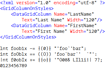
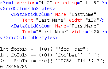
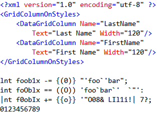
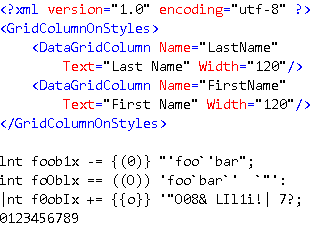
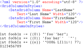
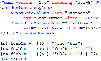
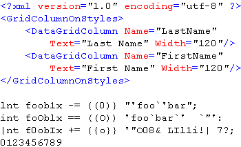
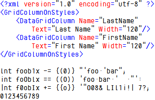
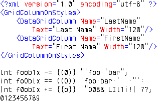
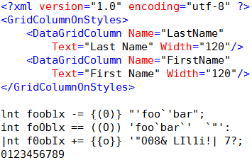
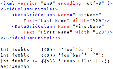
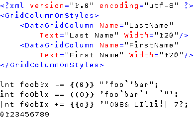
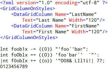
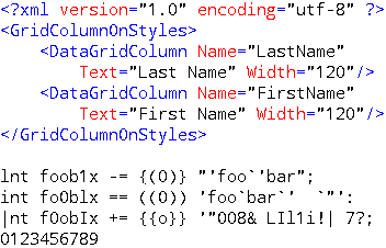
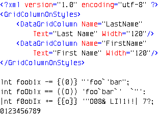
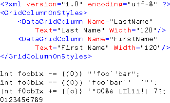
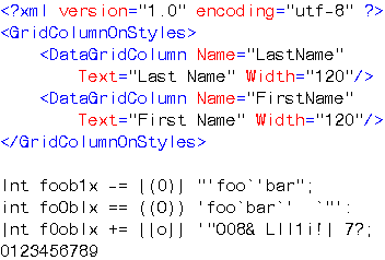
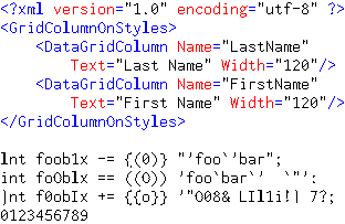
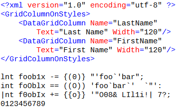
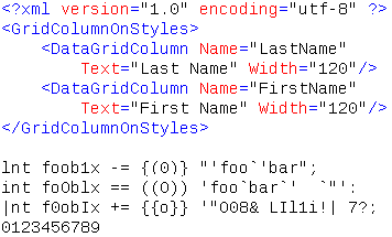
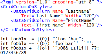
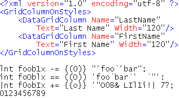
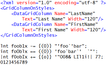
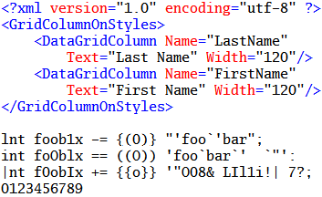
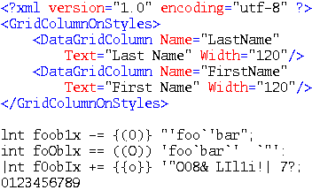
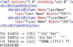
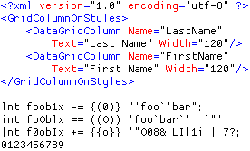
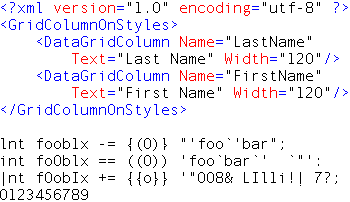
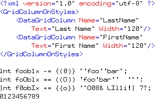
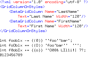
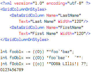
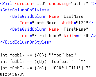
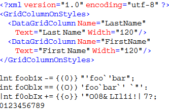
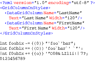
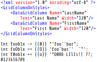
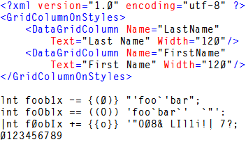
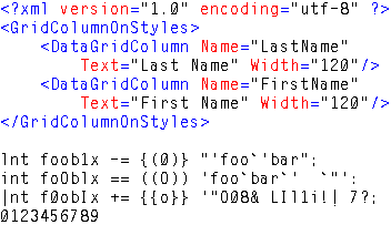
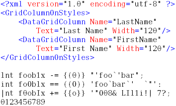
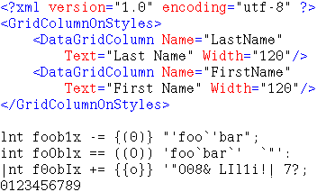
| With ClearType | Without ClearType |
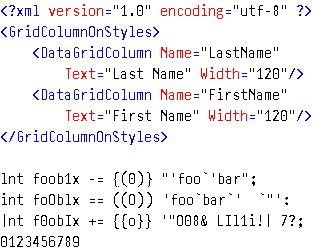
| AdaptiveCode Regular 11 point |
 |  |
|
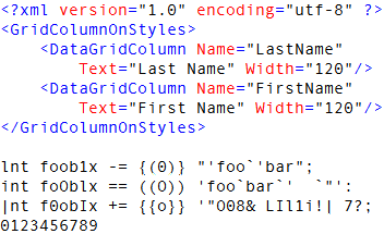
[These comments for OTF version.] AdaptiveCode Regular was originally developed
in 1999 as an OEM typeface for a
software developer. The font's "variable serif" treatment allows characters
to adapt to the 560-em square on which the face is built.
A subtle humanist
touch counterbalances the mech/tech construction, and - combined with
careful attention to the hinting - results in excellent readability.
The numerals are very nice, and the micro-serif on the exclamation point
is unique.
This is a high-quality commercial font available from
the PSY/OPS Type Foundry for $US20.
|
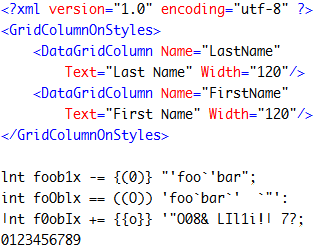
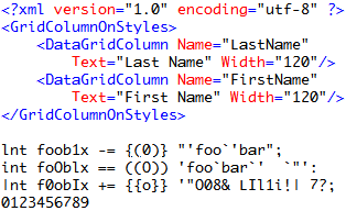
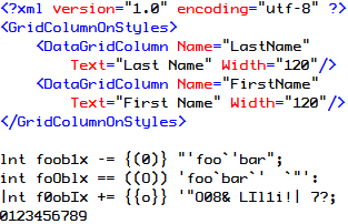
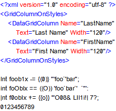
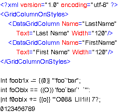
| Akkurat-Mono 11 point |
 |  |
|
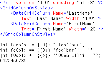
Akkurat-Mono is a commercial font designed in 2004 by Laurenz Brunner
(whose regular Akkurat font has been used in
Al Gore’s book An Inconvenient Truth, Prada’s website,
and Nike Basketball)
for the
Lineto foundry. It has more line spacing than Bitstream Vera Sans Mono.
Its double-story g is distinctive, and nicer-looking
than the curled-under g in some other sans fonts.
I would say that this font has a somewhat European style -
look at the little tail on the a, and the uppercase G,
which is more closed than Andale Mono or Consolas.
The numerals also show the distinctive Helvetica
upward curve on the bottom of the 5 and the 9.
The 1 (one) is easily distinguishable from the lowercase l,
the i is fully serifed, and there is a slashed zero. Akkurat-Mono
is possibly the most readable font in this survey.
Print Magazine
says "Brunner’s masterstroke, the sans-serif Akkurat, is the epitome
of a neutral, no-frills - and gorgeous - typeface."
This is a high-quality, attractive font that is very clear even at small sizes;
it would be comfortable to work with all day long. Its only drawback:
a price of over $US150. That is 40% higher
than the price of any other font in this survey.
Still, it is worth taking a look at this font - the quality
arguably makes the cost justifiable as a long-term investment.
|
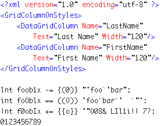
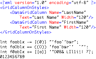
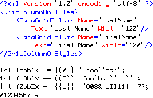
| Andale Mono 11 point |
 |  |
|
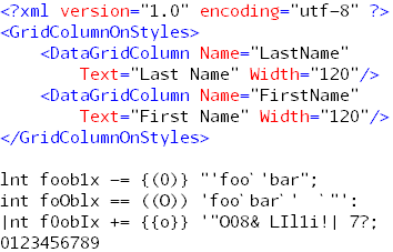
Possibly the best monospaced font that Microsoft has shipped,
Andale Mono was originally called Monotype.com and was
designed by Steven Matteson for the Apple/IBM Taligent project. Very clean, sans-serif,
lots of whitespace, with a dotted zero (which may be the only defect this font has -
at small point sizes, the dotted zero can be mistaken for an 8). Consistently rated in the top ten
in lists of the best programming fonts, including the one here at CodeProject.
See here for info
about this font.
One of Microsoft's Core Fonts for the Web. Download
here.
|
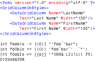
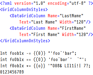
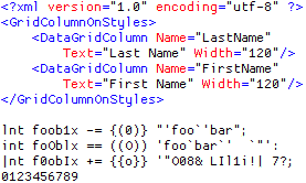
| Anonymous 10 point |
 |  |
|
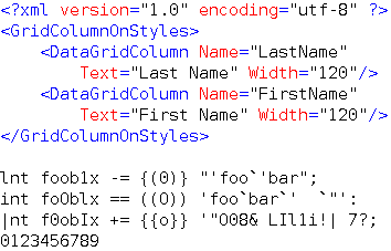
Anonymous is Mark Simonson's serifed TrueType version of Anonymous 9, a freeware Macintosh
bitmap font developed in the mid-90s by Susan Lesch and David Lamkins.
Very clear, not as compressed as Andale Mono, lots of whitespace,
with a somewhat strange slashed zero that is slashed from left
to right, instead of right to left.
Anonymous is consistently rated in the top ten
in lists of the best programming fonts. A free font, download
here.
|
| Arial Monospaced 11 point |
 |  |
|
Arial Monospaced has to be one of the most legible fonts I have ever worked
with, and is also one of the few I have ever bought. Its only drawback is the
lack of a slashed zero (the uppercase O and the zero are very similar),
which I quickly fixed with the aid of a font
editing program. This is a Monotype font,
produced using their ESQ technology,
and can be purchased online at many font sites. Typical price: $US20.
|
| Aurulent Sans Mono 11 point |
 |  |
|
Aurulent Sans Mono was designed by Stephen G. Hartke (creator of the
Verily Serif Mono font). It is a very clear, readable font,
but lacks a slashed zero (the zero is somewhat narrower than the uppercase O). It is public domain. Download
here.
|
| Bitstream Vera Sans Mono 11 point |
 |  |
|
I keep coming back to this wonderful readable font. It is certainly
a competitor to Arial Monospaced, and has two advantages: it has a dotted
zero, and it is free. It has a fully-serifed i and excellent numerals,
and a lowercase l that you can easily distinguish from a 1 (one).
Tied for No. 5 on the CodeProject list of best programming fonts.
According to the font designer, Jim Lyles, "Bitstream Vera is actually a
detuned Bitstream Prima. Gnome asked that we modify some of the characters
in the monospace, particularly for coding legibility. We added a center dot
to the zero and modified the lcase l to distinguish it from the figure one.
Although I designed Vera (Prima), it was actually Sue Zafarana who adapted
it to a mono version, at times a very challenging task."
Bitstream, Inc., has released the Vera fonts
for free use and distribution (the fonts cannot be sold by themselves).
Read more here.
See also DejaVu Sans Mono.
|
| BPMono 11 point |
 |  |
|
Similar to Bitstream Vera Sans Mono, this clean font
is easy to read, with a slashed zero, but not quite as crisp as Vera -
compare, for example, the uppercase W and the numerals.
The curly braces are exceptionally curved.
From the designer's web site:
"BPmono and BPmono Bold are manually hinted from 9px to 16px making it
appropriate for use in various advanced text and programming editors
(eg. Visual Studio)..." Download
here
or here.
|
| Century Schoolbook Mono BT 11 point |
 |  |
|
Clean serif font, no slashed zero (the zero is slightly narrower than the uppercase O).
The lowercase l is very similar to the 1 (one).
It can be purchased online at many font sites. Typical price: $US25.
|
| Consolas 11 point |
 |  |
|
Consolas is the developer font created for Microsoft by famous designer Luc(as) de Groot
and designed specifically for use with ClearType.
Many programmers like it, and it is No. 2 on the CodeProject list of best programming fonts.
Slightly condensed horizontally, it has a generous amount of vertical whitespace and a slashed
zero. The two bars of the = are closer together than other fonts, making it
harder to distinguish at smaller sizes. The uppercase I, the 1 (one), and the lowercase l
are all identically serifed - compare these to Bitstream Vera or Onuava.
The Consolas Font Pack can be downloaded
from Microsoft here.
Consolas is also included in
PowerPoint Viewer 2007.
|
| Courier 12 point |
 |  |
|
A standard Windows font, no slashed zero (the zero is squarish compared to the uppercase O).
No difference with ClearType.
Originally designed in 1956 by Howard Kettler for IBM’s revolutionary new line of
electric typewriters.
|
| Courier New 11 point |
 |  |
|
A standard Windows font, no slashed zero (the zero is somewhat narrower and taller than the uppercase O).
Redesigned from the Courier by Adrian Frutiger for Windows 3.1,
it is slightly thinner and cleaner than the original.
No. 1 on the CodeProject list of best programming fonts.
|
| Crystal 12 point |
 |  |
|
Crystal was created by Jerry Fitzpatrick and is very readable
and clean. It has a slashed zero, and is slightly more condensed
than fonts such as Bitstream Vera Sans Mono. It consistently ranks high
in lists of programming fonts. Note the easily distinguishable
uppercase I, lowercase l, and 1 (one). Instead of a grave accent (`),
this font displays a centered dot.
Download here.
|
| DejaVu Sans Mono 11 point |
 |  |
|
DejaVu Sans Mono is based on the Bitstream Vera Sans Mono font,
and has a wider range of characters than Bitstream Vera.
Here is a list
of the changes. Download DejaVu Sans Mono
here.
|
| Dina 10 point |
 |  |
|
According to its designer Jørgen Ibsen, "Dina is a monospace bitmap font, primarily aimed at
programmers. It is relatively compact to allow a lot of code on screen, while (hopefully)
clear enough to remain readable even at high resolutions. I made this font after having tried
all the free programming fonts I could find. Somehow there was some detail in each of them
that meant I couldn't work with them in the long run. The closest to perfect I found
was the Proggy font, which the author kindly allows you to modify. So I started
building this font using Proggy as the base, and with inspiration from Tobi, Fixedsys
and some old DOS fonts I used to love." Dina seems to me to be more readable
than the Proggy fonts. Like them, it has a slashed zero. The lowercase l and 1 (one)
in Dina are more easily distinguished than the same characters in Proggy Clean.
Unlike the Proggy fonts, Dina shows no difference with ClearType.
Dina is frequently mentioned in lists of favorite programming fonts.
Typical comment: "Best programming font I have used."
Download here.
|
| DPCustomMono2 10 point |
 |  |
|
The free DPCustomMono2 font from
Distributed Proofreaders
is designed with proofreaders in mind,
to maximize legibility of text.
With this goal, the emphasis is on the
distinctness of characters and clarity of punctuation.
I don't think I would use it
all the time, but it would certainly be helpful when you're tired,
and trying to read unfamiliar code. Download
here.
|
| Droid Sans Mono 11 point |
 |  |
|
My first reaction to the name was that this was a joke,
but Droid Sans Mono is actually very readable with nice numerals,
and only lacking a slashed zero (the zero is somewhat narrower than the uppercase O).
The Droid Typeface Family
was designed by
Steve Matteson of Ascender Corporation
for Google's Open Handest Alliance’s Android platform.
How to get it is a challenge, because it's included in the free
Android SDK, which is released under the Apache license.
Download the Android SDK (92Mb!)
here,
or just use the download that Damien Guard has provided
here.
|
| Envy Code R 11 point |
 |  |
|
Envy Code R is a great free font designed by Damien Guard, who recently
went to work for Microsoft on the Linq product.
Envy Code R is very readable and has a slashed zero, but falls short of
Bitstream Vera in clarity (look at the uppercase W, for example).
It does include many box-drawing, shading, and symbols for use
in command (dosbox) windows. An interesting feature of this font
is the "italics as bold" variant,
that overcomes Visual Studio's aversion to italics by marking the
italic font as bold. Choose 'Envy Code R VS' in the Font and Colors part
of Visual Studio's Options and choose bold wherever you want italics.
Tied for No. 5 on the CodeProject list of best programming fonts.
Download here.
|
| Everson Mono 11 point |
 |  |
|
The designer of Everson Mono, Michael Everson, says:
"Everson Mono is a simple, elegant, monowidth font. I started designing it in 1994
primarily to make glyphs available to support the non-Han characters in Unicode and
ISO/IEC 10646-1, though I hope that users may find it a pleasant alternative
to Courier and Monaco for general purposes, e-mail, and so forth. I have found it
quite legible at sizes as small as 4 points. It is lighter and a bit looser than Courier."
This font has a large line spacing. No slashed zero; the uppercase O is shorter and wider
than the zero.
Download here. Shareware, $US40.
|
| HelvMono 11 point |
 |  |
|
This Arial-looking font has an uppercase O that is indistinguishable from a zero,
and an uppercase I that is indistinguishable from a lowercase l.
The 6 and 9 are nearly closed, and will be hard to read at small sizes.
Download here.
|
| Inconsolata 12 point |
 |  |
|
Inconsolata is a free OpenType font from designer Raph Levien, who was greatly influenced by
Luc(as) de Groot's Consolas font. Like Consolas, Inconsolata works better with ClearType - see
the lowercase l and m.
Very clear, with a slashed zero.
It is available here.
|
| Liberation Mono 11 point |
 |  |
|
From Wikipedia:
"The fonts were developed by Steve Matteson (creator of Droid fonts and Andale Mono)
of Ascender Corp. as Ascender Sans and Ascender Serif.
A 2007 variant of this font family, with the addition of a monospaced font and
open-source license, was licensed by Red Hat, Inc. as the Liberation font family."
This font (LiberationMono-Regular.ttf) has a dotted zero, although
according to Wikipedia there is a later
2008 version with a slashed zero (I could not find it). The lowercase l is easily
distinguished from the 1 (one), and the i is fully serifed.
This is a very crisp, readable font.
Download here or
here.
|
| Lucida Console 11 point |
 |  |
|
Lucida Console is a variant of Lucida Sans Typewriter with smaller line spacing,
and a large
x-height,
making it readable at all sizes. No slashed zero, but the zero is somewhat narrower and taller
than the uppercase O.
Lucida Console is No. 3 on the CodeProject list of best programming fonts.
Lucida is an extended family of related typefaces
designed by Charles Bigelow and Kris Holmes in 1985.
|
| Lucida Sans Typewriter 11 point |
 |  |
|
Very similar to Lucida Console, but with larger line spacing. The uppercase O and zero
distinction is not as good - they are both the same height, although the zero is still somewhat
narrower.
|
| Luxi Mono 11 point |
 |  |
|
Luxi is a family of typefaces originally designed for the X Window System by Kris Holmes and
Charles Bigelow from Bigelow and Holmes Inc. Luxi is similar to Lucida (their previous font
design).
Luxi fonts are commonly found on free software operating systems, such as Linux. They are the
default fonts in Red Hat's Bluecurve theme.
Like the Lucida fonts, Luxi Mono does not have a slashed zero;
the uppercase O and zero
are both the same height, although the zero is somewhat narrower.
Unlike Lucida, there is less distinction between the lowercase l and the 1 (one);
both are fully serifed. Download
here or
here.
|
| Monaco 10 point |
 |  |
|
Monaco, originally a Mac font,
shows up frequently in lists of favorite programming fonts.
It is very clean, lots of whitespace, a slashed zero, and a micro-serifed i.
This is a font you could work with all day long.
Download
here.
|
| Monospace 821 BT 10 point |
 |  |
|
This free sans-serif TrueType font is very clean and easy to read even at 10 points,
partly due to its large line spacing.
It lacks a slashed zero (the uppercase O and the zero are nearly identical),
has a fully-serifed lowercase i, and its lowercase l is easily
distinguished from the 1 (one).
Download here.
|
| Nu Sans Mono 10 point |
 |  |
|
Nu Sans Mono was designed by Martin Pfeiffer
who says it's a "great sans-serif alternative to Courier".
I wouldn't disagree with that. It has a slashed zero, very legible numerals,
and a lowercase l
that is easily distinguishable from 1 (one). Much nicer than Courier or
Courier New and very readable even at 10 points. Selling for only $US8 for a set of four fonts.
The demo download
available on the designer's site "includes the regular (without the international characters
or other doodads.)" Definitely worth trying it out if you're a fan of Courier or Lucida.
|
| Onuava 10 point |
 |  |
|
Onuava was a late addition to my list. This beautiful font is a little more
condensed than Monaco, but still very readable, with a slashed zero,
fully serifed i, nice numerals, and a lowercase l that is easily distinguished
from a 1 (one) (although the 1 (one) in Onuava lacks the serif that
Bitstream Vera Sans Mono has).
Onuava is a very close runner-up to Bitstream Vera Sans Mono.
From the designer's web site : "It is specifically customized for screen display,
with strong lines and character forms which are more open and easier to read."
Read more here.
A demo version of the font
is available free, which contains all the standard characters.
The complete font (with international characters) sells for about $US18.
Download the demo (free for personal use)
here.
|
| Osaka Unicode 11 point |
 |  |
|
Osaka Unicode is a derivative of Apple's Osaka font.
This is an attractive, very clean font with a slashed zero,
and offers distinctive shapes
for similar letters: the lowercase l and i share the same
half-serif base, while the 1 (one) is fully-serifed.
The numerals are very nice - open and easy to read
even at small sizes. The slanted curves of the lowercase b, p, and q
give this font a somewhat cursive-like quality.
Download here or
here.
|
| Pragmata 11 point |
 |  |
|
Pragmata is a relatively new monospaced font, designed by
Fabrizio Schiavi.
It has quickly achieved almost cult status among programmers,
and most online lists rank it very high.
It is also the second-highest-priced font on my list, at $US113.
Hand-hinted for optimum legibility, it is a fairly tall
font, and looks best at 11 points and below.
It works best with ClearType - see, for example, the 8 in the sample.
You can purchase it on the designer's web site.
|
| ProFontWindows 12 point |
 |  |
|
ProFontWindows is another free font that's best used at lower point sizes.
It is fairly clean, with a slashed zero, but both the lowercase l and the
1 (one) are serifed (and hence easily mistaken),
and the
x-height
is smaller than usual. This causes
some distorted characters, like the lowercase y and lowercase s.
Download
here.
|
| Proggy Clean with Slashed Zero 12 point |
 |  |
|
Proggy Clean shows up on most lists of favorite programming fonts,
and is No. 4 on the CodeProject list of best programming fonts.
It is designed for use at small point sizes. See the download
page for other fonts designed for small sizes. Download
here.
|
| QuickType Mono 11 point |
 |  |
|
QuickType Mono shipped with early versions of TurboTax.
It is very similar to Arial Monospaced, which is not surprising since they are
both Monotype fonts. The zero is not slashed; the uppercase O is
indistinguishable from a zero. The lowercase l is distinct from a 1 (one),
but the 1 (one) does not have the slanted top that is typical of many
other monospaced fonts. In fact, the 1 (one) looks more like a lowercase l.
All the numerals are very clear.
Download here.
|
| Raize 10 point |
 |  |
|
This squarish sans-serif font from Raize Software has a fully-serifed i and a slashed zero.
Large line spacing. It is fairly clean, although the lowercase l and the 1 (one)
are similar. The small x-height makes the characters seem
squished vertically. Combined with the small inter-character spacing,
this font is less legible than others.
No difference with ClearType.
Download here.
|
| saxMono 11 point |
 |  |
|
This free sans-serif font has large line spacing but no slashed zero
(the uppercase O is squarish compared to the zero).
The lowercase i is serifed; the lowercase l is taller but otherwise
identical to the 1 (one).
Download here.
|
| Selectric 12 point |
 |  |
|
This nice clean serifed font could be used in place of
the Courier fonts. Like them, it does not have a slashed zero
(the uppercase O is squarish and somewhat shorter compared to the zero).
However, it is unusable at less than 12 points - the tops of
uppercase letters are cut off.
Download
here.
|
| Share-TechMono 11 point |
 |  |
|
This is a clean, slightly condensed font with slashed zero.
If you think that Liberation Mono has too much whitespace,
this font would be a good alternative.
Overall it is very readable,
although the horizontal compression may cause some confusion between
the uppercase S and the 5 (five). The lowercase l is easily
distinguished from the 1 (one), and the i is semi-serifed.
Download here.
|
| Slashed Zero Arial 10 point |
 |  |
|
Similar to HelvMono with a larger line spacing and a slashed zero.
Download here.
|
| Terminal 9 point |
 |  |
|
From Wikipedia: "Terminal is a family of monospace raster typefaces.
It is relatively small compared to Courier. It uses crossed zeros,
and is designed to approximate the font normally used in MS-DOS or
other text-based consoles such as on Linux. In Microsoft Windows,
it is used as the default font in the Command Prompt."
No difference with ClearType.
No sizes between 9 and 12 points.
This seems to me to be too heavy to use for normal editing,
but I have seen it recommended.
|
| Terminus 12 point |
 |  |
|
This free, slightly squarish font has a micro-serifed i and a slashed zero.
It is clean and easy to read, although some characters (see uppercase W)
could be better. The curly braces are very similar to the parentheses.
Nice numerals. The lowercase l and the 1 (one) could be
a little better distinguished. It was created by Dimitar Zhekov,
and is very good for a bitmap font. No difference with ClearType.
Download
here
or here.
|
| Ti92Pluspc 11 point |
 |  |
|
This is a clean, nice-looking font with slashed zero, that is
included with TI-Connect and TI-GraphLink software
(distributed with TI calculators).
It is highly ranked on several lists of favorite programming fonts.
Download here.
|
| Verily Serif Mono 11 point |
 |  |
|
Verily Serif Mono was designed by Stephen G. Hartke (creator of the
Aurulent Sans Mono font). It is a very clean font
and has a dotted zero. Excellent readability, and a good choice if you
prefer serif fonts. The numerals are all clear, although the
1 (one) is somewhat similar to the lowercase l.
Verily Serif Mono is derived from Bitstream Vera Serif with the same proportions as
Bitstream Vera Sans Mono. Only the primary ASCII characters have been modified.
It is public domain. Download
here.
|


 General
  News
News  Suggestion
  Question
  Bug
Bug  Answer
  Joke
Joke  Praise
  Rant
Rant  Admin
Admin 


