
Introduction
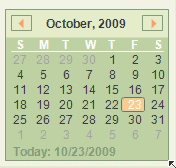
Simple to use Month Calendar control supporting
- Vista Style Navigation
- Keyboard Support
- Full Designer Support
Features
Month Calendar control has the following features
- 6 Pre-defined Themes
- Supports alpha blend image
- Full Keyboard support
- Full Design Time support
- Supports Saving/Loading of layout colors
- Supports Disabled back color
Using the Code
Control is simple and straight forward.
Use the designer to fine tune appearance.
Keyboard
- Enter Key - Select
- Left Key - Increment Day/Month/Year/Years by one.
- Right Key - Decrement Day/Month/Year/Years by one.
- Down Key - Increment Day/month/Year/Years by one column.
- Up Key - Decrement Day/month/Year/Years by one column.
- Space bar - Change View form Date to Month, Month to Year, Years to Years.
Points of Interest
MonthCalander
Properties
Appearance - MonthCalanderAppearance object containing Appearance of MonthCalendar.BackGroundImageAlpha - % of transparency of BackGroundImage.CaptionFont - Gets or sets Font Family to be used for drawing Caption.CurrentAppearance - MonthCalanderAppearance object containing current appearance.DrawFocused - Gets or sets whether focus rectangle needs to be drawn.HotAppearance - Gets or sets the control supports hover behaviour.NumberFont - Gets or sets Font Family to be used for drawing numbers.SelectedDate - Gets or sets current selected date.
Events
ValueChanged - Fired when SelectedDate is changed.ValueChanging - Fired when SelectedDate is about to be changed.
Methods
HitTest() - Performs the HitTest bool LoadTheme(string fileName) - Loads the color scheme from a xml file. fileName is location of xml file containing color scheme. Returns wether Load was successfull or not.ResetAppearance() - Reset the appearance of Calander control to default value.bool SaveTheme(string fileName) - Saves current color scheme of the Calander control to a xml file. fileName is path of xml file to which data will be written. Returns wether save was successful or not.
ThemeProperty
Properties
UseTheme - Gets or Sets wether to use predefined theme or custom colors.ColorScheme - Gets or Sets ColorScheme to be applied. Please Note : This will not be applicable when UseTheme is set as false.
Events
ThemeChanged - Fired when UseTheme or ColorScheme is changed.
Methods
bool DefaultChanged() - Returns wether ThemeProperty properties has changed or not.
MonthCalanderAppearance
Properties
ActiveTextColor - Gets or Sets color of active text.ArrowColor - Gets or Sets color of navigation arrow.ArrowHoverColor - Gets or Sets hover color of navigation arroe.ButtonBackColor - Gets or Sets back color appearance of navigation buttons.CaptionBackColor - Gets or Sets back appearance of caption background.CaptionTextColor - Gets or Sets color of caption text.ControlBackColor - Gets or Sets backcolor of control.ControlBorderColor - Gets or Sets color of borders.DateDaySaperatorColor - Gets or Sets color of date Day saperator.DayMarker - Gets or Sets color of Date Indicator(e.g. S M T).DisabledMask - Gets or Sets Mask Color when control is disabled.FocusedBorder - Gets or Sets focused border color.HoverColor - Gets or Sets hover color.InactiveTextColor - Gets or Sets inactive text color.Radius - Gets or Sets radius of Arc on hover at edge.SelectedBackColor - Gets or Sets back appearance of selected date.SelectedDateAppearance - Gets or Sets selected date border appearance.TodayBorderColor - Gets or Sets color of today border color.SelectedDateTextColor - Gets or Sets text color of selected date.TodayColor - Gets or Sets color of Today marker.
Events
AppearanceChanged - Fired when appearance property is changed.
Methods
Assign(MonthCalanderAppearance appearance) - Assigns properties of appearance to current object.bool DefaultChanged() - Returns wether ThemeProperty properties has changed or not.Reset() - Resets current appearance to default appearance.
Known Issues
History
- 23 October 2009: Initial draft of the control
This member has not yet provided a Biography. Assume it's interesting and varied, and probably something to do with programming.


 General
  News
News  Suggestion
  Question
  Bug
Bug  Answer
  Joke
Joke  Praise
  Rant
Rant  Admin
Admin 


 Submit an article or tip


