Introduction
This class introduces HyperButtonEx, an all-in-one button class. It supports bitmap transparency, custom fonts, rounded rectangles, and more! Hyperlink and Shell functionality has been built into the class.
Using the Code
The default button style is defined in the constructor found at the top of the HyperButtonEx.cpp file. The current demo code default setting creates a rather boring "normal" Windows style button with a text mouse-over effect. While you can customize your button's appearance completely through function calls at initialization, if you want the majority of your app buttons to look a certain way, you could create that default appearance by changing the constructor defaults.
Until you are familiar with the code, I suggest you make a backup copy of this source file so you can always restore it to its original state -- just in case.
If you want to use a custom mouse-over cursor instead of the Windows OEM "hand" cursor, instructions for importing and loading a custom cursor are in the second block of settings.
CHyperButtonEx::CHyperButtonEx()
{
m_bTransparent = FALSE;
m_bFlat = FALSE;
m_bRounded = TRUE;
ptRRect.x = 13;
ptRRect.y = 13;
m_crBorder = SHADOW;
nBitmapRes = 0;
nBitmapDis = 0;
m_nMouseover = 0;
m_crMouseFrom = SILVER;
m_crMouseTo = SILVER;
m_crMouseHover=SILVER;
m_idMouseImg = 0;
m_nUnderline = NEVER;
m_crNText = RGB(0,0,0);
m_crHText = RGB(0,0,255);
m_crSystem = GetSysColor(COLOR_ACTIVEBORDER);
m_crNBackground = m_crSystem;
m_crHBackground = m_crSystem;
m_bBold = FALSE;
m_nBgStyle = SOLID;
m_nPattern = SOLID;
cm.from = 0x00C0C0C0;
m_hHand = ::LoadCursor(NULL, MAKEINTRESOURCE(32649));
Now that you've defined your "default" button, it's time to implement the class.
Implementing the Class
Add the three files, HyperButtonEx.h, HyperButtonEx.cpp, and Defines.h to your project. Make sure to add #include "HyperButtonEx.h" to the header files of all classes which will have the customized buttons.
Next, delete your project's .clw file, then invoke the Class Wizard, and allow it to rebuild the Class Wizard file so that the new class is added.
Now, whenever you add a button from the Resource Editor, select the button, press CTRL_W to access Class Wizard, click the Member Variables tab, assign a variable to the button of type CONTROL, and of the class HyperButtonEx. Presto! Your button is now transformed into a "default" HyperButtonEx control.
Now, let's say your default button is a normal button with text color change on mouse-over... but, you just added a button which you want to be a hyperlink button, linking to an http:// URL. No problem. Before I show you specifically how to do this, let's look at the available public function calls listed below:
public:
    void SetCustomFont(LOGFONT &nlf);
    void SetCustomFont(LPCTSTR szName="Default",
                       int nSize=0, int nWeight=0, BOOL bItalic=FALSE);
    void SetBoldFont(BOOL bBold = TRUE);
    void IsTransparent(BOOL bTransparent = TRUE);
    void IsFlat(BOOL bFlat, int nRound=NONE, COLORREF crBorder=SHADOW);
    void SetToolTip(LPCTSTR szToolTip, COLORREF crBkColor=LTYELLOW,
                    COLORREF crTextColor=BLACK);
    void SetBitmap(UINT nNormal=0, UINT nMouseover=0, BOOL bIsTrans=TRUE,
                    COLORREF crTrans=RGB(192,192,192), UINT nDisabled=0);
    void SetBitmapEx(UINT nNormal, COLORREF crFrom, COLORREF crNormal,
                    COLORREF crHover, UINT nDisabled=0);
    void SetBGStyle(int nStyle=0, UINT nPattern=0);
    void SetBgImage(BOOL bIsImage, UINT BitmapID=0)

    void SetButtonText(LPCTSTR szText) { m_szButtonText = szText; }
    void SetUnderline(int nUnderline = HOVER) { m_nUnderline = nUnderline; }
    void SetNormalText(COLORREF crNewColor) { m_crNText = crNewColor; }
    void SetHoverText(COLORREF crNewColor) { m_crHText = crNewColor; }
    void SetNormalBackground(COLORREF crNewColor) { m_crNBackground = crNewColor; }
    void SetHoverBackground(COLORREF crNewColor) { m_crHBackground = crNewColor; }

    BOOL OpenUrl(LPCTSTR szUrl);
    BOOL Explore(LPCTSTR szPath);
    BOOL RunApp(LPCTSTR szPath);
    BOOL OpenFileDefaultApp(LPCTSTR szPath);
    BOOL PrintLocalFile(LPCTSTR szPath);
Most of these are self-explanatory. I will note that when calling IsTransparent(TRUE) or IsFlat(TRUE), you do not have to issue a separate call to set the other one to FALSE... the class will take care of this. However, if you set one of these properties to FALSE, it does not automatically make its counterpart's property TRUE (both FALSE is allowed, only one TRUE is allowed).
Now, back to our situation of wanting to make our newly added button a hyperlink button. This is very simple. You would simply override the default settings in OnInitDialog() or OnInitialUpdate(), or even in a class constructor. The code would look like this:
myUrlButton.IsTransparent();
myUrlButton.SetUnderline();
myUrlButton.SetNormalText(RGB(0,0,255));
myUrlButton.SetHoverText(RGB(0,0,255));
You could also call SetTooltip() or SetButtonText() if you wanted to customize these. Now, all that's left is to handle the button click. Add a message handler as normal.
So, what's the advantage to handling the button event rather than handling the event internally from the button class? There are a number of reasons. For example, your button event may link to an online document or a local document, based on a radio button selection. Or you may want to customize a URL before passing it to the web server. Let's say you had a search feature on a dialog bar which accessed an online help database. After the user types in the search criteria and clicks the Search button, you may want to grab the search terms from the edit box and append them to the URL to pass to your online search engine. Your message handler may look something like this:
void MyViewClass::OnSearch()
{
UpdateData();
CString szUrl = "http://www.myhelpsite.com/help?search=";
szUrl += m_szSearchTerms;
myUrlButton.OpenUrl(szUrl);
}
Not every feature is demonstrated in the demo app, but other features such as printing a file, or running an external app, work exactly like the others... you simply call the method, passing the full path/filename as a string in the function call.
Play around with the demo app a little, and you will see how quickly and easily you can radically change the appearance and behavior of your buttons using just one class and a few simple function calls.
Ideas for Future Development
The most obvious idea seems to be achieving transparency on painted gradient backgrounds without forcing the use of bitmap resources. However, the difficulty is that with so many possible gradient painting algorithms, there is no way to assure that you could reproduce an exact match 100% of the time. The only solution seems to be a companion class (a gradient painting class) that is shared by both the parent window and the control, so that both the window and the MEM DC are painted with the exact same algorithm. If anyone has any other input on this subject, or would like to tackle this project, please feel free to share. I'm a bit averse to using the GDI API calls for this because of the DLL distribution issues, but I'm open to suggestions.
Other ideas: A companion class could be created which serves as an "embedded database" of predefined enumerated LogFonts. You could then add a method in CHyperButtonEx which you could simply pass a descriptive name, for example: ChangeFont("DisorientedArialBold"). The function would refer this request to the companion class (say CLogFontColl), which would search the collection for a match, initialize the log font, and return it to the button class.
A similar task could be done with bitmaps to simplify the collection and incorporation of common (or not so common) button bitmaps.
A further improvement would be to incorporate all of this into a single DLL.
Conclusion
I hope you find the class useful and instructional. Feel free to contact me with your questions, comments, and suggestions. Good coding!
Update Info - March 24, 2006
This update contains minor tweaks/fixes, mostly related to transparency and image backgrounds (faster performance, less flicker on fast redraws).
It also fixes the GDI asserts in debug mode.
The main enhancement I've added is the capability to specify border/shadow color for flat/rounded rectangle buttons. I've simply added a COLORREF variable to the IsFlat() function protocol. You would simply call myButton.IsFlat(TRUE, 13, RGB(0,0,0)); -- it is backwards compatible, in that if you omit the colorref variable in the function call, it defaults to the system 3D shadow color.
Update Info - March 07, 2006
This update fixes an anomaly with the image background erasure method. We previously took a "snapshot" of the client area on the dialog/form before the controls were drawn. However, if your window were to open behind a topmost window, the snapshot would be taken of the topmost window rather than your hidden window. While this situation is unlikely to occur often, it can produce rather unexpected results. Since there is no way to force your window on top of other topmost windows, I opted for another solution.
I have opted to change the class to use "pixel color detection" by default, as this works in all cases except when using hyperlink or rounded style buttons on image backgrounds. Then, when you want to use a transparent hyperlink/rounded style button on an image background, you just call myButton.SetBgImage(TRUE, IDB_MYBITMAPBG); when you initialize your button. This sets a flag to use image erasure. The control's client area of the original bitmap is copied into a member bitmap variable which is held in memory until destruction. When OnEraseBkgnd() is called, it copies the bitmap back onto the client area of the parent window. This minimizes overhead by only storing the client portion of the bitmap in memory, and speeds performance by eliminating the need to load, calculate, and copy the bitmap on each call.
[Performance Enhancement - March 24 Update]
This method has the advantage that it will work flawlessly whether your window is hidden or not. It has one minor disadvantage that if you use a "gradient fill" background, you must use a "gradient bitmap" rather than a painting algorithm, or you will need to address a number of difficult issues associated with gradient painting methods and transparency -- unless you go back to using the "snapshot" method, which (we've already shown) has an Achilles heel.
Update Info - March 05, 2006
This update adds complete transparency to the button class, and adds custom text and background colors to the SetToolTip() method. It also involves some minor code revisions.
I will address transparency here. Not only are the buttons themselves transparent (when using rounded or transparent/hyperlink buttons, for example), but the button images are also fully transparent whether they are displayed on an actual button or against a dialog background (as when used with a transparent/hyperlink button). They display as transparent even when in disabled state. See image below:

I must credit an unknown coder (known only as ScoobyDownUnder) for his bitmap masking code which I have modified and adapted for this class.
There are two elements to the overall transparency features. The first happens in OnEraseBkgrnd(). There are two methods incorporated there, depending upon the state of the boolean flag, bImageBg. This all occurs on "first draw" before any controls have been drawn on the dialog window. If this flag is set to TRUE (by calling SetBgImage()) and m_background contains a bitamp resource ID (that is not zero), then OnEraseBkgnd() will load the bitmap and attach to a memory DC, then repaint the control's client portion of the image back onto the parent window. [Thanks to Ali Rafiee for his code which was the basis for this idea.]
The second erasure method (if bImageBg is FALSE, which is the default) is to use the CDC::GetPixel() method to identify the background color of the center point pixel in the control's client rect area, and store the COLORREF value in the member variable m_crSystem. Then, whenever the background needs to be erased, OnEraseBkgnd() paints the background with this color using SolidRectFill().
Again, pixel color selection is the default mode, and will work in all situations except when using transparent/hyperlink buttons on image/gradient backgrounds. In the latter case, you will need to set the image mode when you initialize your button, by calling myButton.SetBgImage(TRUE, IDB_BITMAPID).
Now, the issue of drawing a bitmap transparently on a button face is another bit of code, and has nothing to do with OnEraseBkgnd(). However, the button image may or may not be drawn transparently, depending upon the effect you want. There are two function calls which control button image display:
Below is the method you will use in most cases. Note the defaults for all settings (you can disable images by calling SetBitmap()) without any parameters.
If you want a transparent bitmap on your button without mouse-over, using the default silver pixel as the transparent color, and using 3D gray-out for the disabled image effect, you would simply call myButton.SetBitmap(IDB_MYBITMAP);.
However, you can also specify an image to use for mouse-over state, specify whether to display the image transparently or not, specify the transparent color, and specify an image to show for disabled state (instead of using 3D gray-out effect).
void SetBitmap(UINT nNormal=0, UINT nMouseover=0, BOOL bIsTrans=TRUE,
               COLORREF crTrans=RGB(192,192,192), UINT nDisabled=0);
The second method is only used if you want a colormap mouse-over effect instead of using two separate bitmaps for mouse-over. This method simply converts a specified pixel color of the original bitmap to another specified color before displaying it. Obviously, transparent drawing is disabled in this method, since the transparent bit is already being used to contain the color effect. This feature only normally looks good on solid square images such as checkboxes, etc., that don't have empty space around the borders (the "Close Window" button on the small solid color About box is an example of this button style). You would call this method with myButton.SetBitmapEx(IDB_MYBITMAP, SILVER, WHITE, YELLOW);.
Here's the function protocol:
void SetBitmapEx(UINT nBitmapID, COLORREF crTransparent, COLORREF crNormal,
                 COLORREF crMouseOver, UINT nDisabled=0);
There was some code reworking done, and a few function protocols have been redefined. I will update these in the article body below, but check the changes if you are already using an earlier version.
Update Info - Feb 25, 2006
This update adds rounded rectangle button support in Flat mode. The IsFlat(); method has been modified to accommodate this feature, as demonstrated below:
IsFlat(BOOL bFlat, int nRound=NONE, COLORREF crBorder=SHADOW);
This update also adds a tool to the demo app's main menu which allows you to select any font/size/style from the font dialog, and it will generate the LOGFONT structure code for you which you can copy/paste into your app. You would then only need to pass the variable to the button class to use this custom font for your button (ex: myButton.SetCustomFont(lf);.
One caution regarding custom fonts: if you will be distributing your app, unless you are using common fonts (Arial, Courier New, etc.), you will need to distribute/install the fonts (if your license allows it) with your application installer for the fonts to work on the target machines; so, be sure you choose fonts accordingly.
Update Info - Feb 22, 2006
I've added bitmap support (including 3D gray-out and mouse-over effects), custom font support, and brush pattern and hatch fill backgrounds. This adds four very simple methods to the original class. The code you would use to implement these features is as follows:
CHyperButtonEx m_myButton;
m_myButton.SetBitmap(IDB_MYBITMAP);
m_myButton.SetBoldFont(TRUE);
m_myButton.SetCustomFont("Verdana", 12, FW_MEDIUM, FALSE);
m_myButton.SetCustomFont();
m_myButton.SetBGStyle(SOLID, SOLID);
m_myButton.SetBGStyle(PATTERN, IDB_BITMAP_PATTERN1);
m_myButton.SetBGStyle(HATCH, HS_DIAGCROSS);
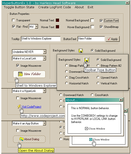
These features are quite useful when creating "toolbar" type buttons. You may want to use hatch and fill buttons (without text) for paint/fill tool buttons. If you want "toolbar" type image buttons in a dialog or rebar, where it's either not possible to add a toolbar, or not desirable because you only want a couple of image buttons, you could create small square transparent buttons without text and set your bitmap button image on them, which will create the effect of a toolbar button. You can use the image mouse-over feature to create either OEM or custom mouse-over effects on these buttons (e.g.: raised button, border, color change, etc.).
If you use your imagination and creativity, you will find this one class will suit nearly every situation where any kind of button object is needed.
History
- 13-Feb-2006
- Initial release on CodeProject.
- 16-Feb-2006
- Added bold text, bitmap images, pattern/hatch backgrounds.
- 18-Feb-2006
- 19-Feb-2006
- Fixed font init. bug.
- Fixed font alignment issues with large custom fonts and with disabled state.
- Added disabled state image support.
- Added image mouse-over demo on About dialog.
- 21-Feb-2006
- Minor fixes/improvements with mouse-down and disabled states.
- 22-Feb-2006
- Fixed
CFont assertion in Debug mode. ON_MESSAGE handler now returns LRESULT (VC7 issue).- Added 3D grayed image to disabled buttons (thanks to Koen Zagers for this code).
- Added mouse-over image support.
- 25-Feb-2006
- Added rounded rectangle buttons in Flat mode.
- Added
LOGFONT code generation tool to demo app.
- 05-Mar-2006
- Added full button/image transparency.
- Added custom text/background color to tooltip.
- Some function protocols redefined.
- 07-Mar-2006
- Fixed flicker when mouse button held down and moved out of control.
- Changed misplaced
COLORMAP cm variable from public to protected. - Fixed glitch with image background erase method when window is hidden by topmost window at redraw.
- 24-Mar-2006
- Fixed GDI asserts in debug mode.
- Improved transparency performance with image backgrounds (less flicker on fast redraws).
- Added ability to specify border/shadow color on flat/rounded buttons (see the
IsFlat() function protocol).
I have no biography, but then, I don't have an obituary yet either -- Thank God!!


 General
  News
News  Suggestion
  Question
  Bug
Bug  Answer
  Joke
Joke  Praise
  Rant
Rant  Admin
Admin 


 Submit an article or tip


