The Standard Controls
The .NET Framework contains a wide range of user interface controls, but they
offer only a basic look and feel. Today's user expects a richer experience that
you just cannot build with the out-of-the-box controls. The Magic Library (of
which the WizardControl/WizardDialog are part of) aims to solve this by
providing a set of user interface elements that add the sophistication expected
from modern Windows applications.
Downloads
The first download
WizardControl/WizardDialog Sample contains a example
application that uses shows the MenuControl from the Magic Library. This allows
you to experiment and test out the feature. The actual source code is inside
the separate second download. At nearly 1MB in size, I thought people would
prefer to download the sample before deciding if they want to install the
entire source code project!
Description
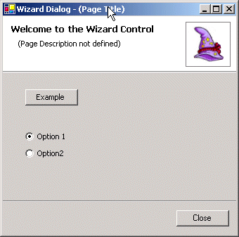
The
WizardControl should be used when you need to guide the user through
a series of steps. Simple examples include creating an installation program or
allowing the creation a new items by answering a series of questions. In most
situations you will want to use a modal dialog to host an instance of the
WizardControl.
Rather than create your own
Form the library already includes a
Form
called
WizardDialog. Download the Magic Library and see the relevant
article for more details on how to use the
WizardDialog.
Profiles
The
Profile property of the control is used to configure the appearance
and operation of the wizard. The three available options are: -
Install
As the name implies, this profile should be used to create a series of steps
that perform an installation process. In this scenario the ordering of the
wizard pages is very important and the control will make assumptions about the
purpose of pages.
The last page is always used to report the end result of the install attempt.
Therefore the last page will by default only display the Close
button as that is the only possible action. It makes no difference if your page
is reporting a success or failure result the only possible action is to close
down the installation process.
The second to last page is used to perform the actual install action and so the
only available button will be Cancel. Once the install attempt has begun
it makes no sense allowing the user to move Back to previous pages or to
move past the current page. When the install action has completed you should
manually move the wizard onto the last page using the SelectedIndex
property in order to report the outcome.
All the preceding pages are assumed to be used in gathering information from the
user and so the Next and Back buttons will be shown depending on
the appropriate availability. The Cancel
button is always shown so that the user can exit the wizard at this time.
Configure
Use this profile to gather information needed to perform a custom action that
is conducted once the user clicks the
Finish button. A good example
would be adding a new item to your project. Every page has the
Cancel,
Next,
Back and
Finish buttons displayed with the
Next and
Back
only enabled when appropriate for the selected page. The user can use the
Finish
button at any time to accept all the default values and have the custom action
performed immediately. Alternatively they can move through the series of pages
and customize the values.
If you need to enfore some mandatory fields before the Finish button is
enabled then change the EnableFinishButton property to Status.No when
the control is created. Once you notice that all mandatory fields have been
supplied change the property to Status.Yes to allow the user to select
the Finish
button.
Controller
Unlike the previous profiles this one does not show the heading portion at the
top of the control and does show the individual tab headers. This allows the
user to click between pages in a random order to select and modify the contents
as required. There are only two buttons presented by default,
Update and
Cancel.
Use this profile when the user needs to see and modify a group of related
settings. They can use the
Update button to apply the changes in an
appropriate way or use the
Cancel
button to discard any changes made.
Customization
If none of the above profiles does exactly what you need then you have scope to
customize the the profile that comes closest. Each button has a set of three
properties used to control when the button is displayed, when the button is
enabled and the text shown on the button. For example, the properties for the
Update
button are called
ShowUpdateButton,
EnableUpdateButton and
ButtonUpdateText
respectively.
Imagine you are using the Controller profile to present a dialog box of
project settings to the user. The user can move between pages and change the
settings as desired. When they press the Update button you apply those
changes immediately. However, you might prefer to have the button called Apply
rather than Update. Simply set the ButtonUpdateText property to
the required string to change the button text. But you must remember that the
event generated when the button is pressed is still called UpdateClick
.
In another situation you might have a Cofigure profile used to setup a
new item within your project. But you do not want the Cancel button
availale to the user, instead you want to force your user to move through the
whole process and use the Finish button. In this case you would set the ShowFinishButton
property to Status.No which prevents the button from being displayed on
any page. If you need a button displayed all the time then assign the Status.Yes
value to the appropriate button show property. By default each buttons show and
enable properties has the Status.Default value that indicates the
control should calculate the correct state depending on the currently seleted Profile
and page index.
Often you will want to change the displayed/enabled state of buttons on a
per-page basis. In this case you need to hook into the WizardPageEnter and
WizardPageLeaveevents and set the appropriate values depending on the
page selected.
Default Buttons
By default the
AssignDefaultButton property is defined as
False and
so the control will not make any attempt to assign a default button for the
Form
the control is contained inside. If you decide to enable this property the
following logic is used to determine which button should become the default.
Install Profile
On the last page the only button displayed by default is
Close and so
this will be used as the default. On the second to last page the only button is
Cancel
which is therefore the default. All other pages assign the
Next
button as the default.
Configure Profile
The last page will use the
Finish button as the default and all other
pages the
Next
button.
Controller Profile
The
Update button is always designated the default in this profile.
Revision History
30 Sept 2002 - Initial Revision
I am a big fan of .NET and have been working on developing a free user interface library to enhance the very basic controls that come out-of-the-box. Download the free source code project from http://www.dotnetmagic.com. I often carry out bespoke development work for companies, so feel free to email me for a quote on your .NET needs!


 General
  News
News  Suggestion
  Question
  Bug
Bug  Answer
  Joke
Joke  Praise
  Rant
Rant  Admin
Admin 


 Submit an article or tip


