Introduction
Pickers Library is a .NET Windows Control Library that aids in creating Picker-style controls.
Background
What is a 'Picker' Control?
A 'picker' control can be thought of as a control, which allows you to select a value from rich, drop-down UI instead of a plain list. For example, we have the DateTimePicker control. Similarly, the color selector in Microsoft® Word is an example of a picker.

The .NET Windows Forms PropertyGrid control uses many different kinds of rich drop-downs for presenting value options for a property. For example:
The interface for choosing the date and time is common and available to us outside the PropertyGrid as DateTimePicker control (as mentioned earlier). But what if we want some other interface out of the PropertyGrid?
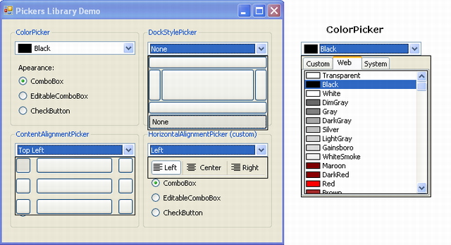
The ColorPicker Article
Palo Mraz gives a magical answer to the above question in his ColorPicker and ColorPicker Revisited articles. He describes how to emulate the behavior of the PropertyGrid by leveraging the Windows Forms design-time infrastructure to host the color-choosing interface inside a normal control. Please read the original ColorPicker article before proceeding. The technique discussed by Palo Mraz can be applied to host any other UITypeEditor inside our control. The code for invoking the drop-down selection UI out of the UITypeEditor is more or less the same for every UITypeEditor.
Custom-built Drop-down UIs
Sometimes, we may not find a cool drop-down UI for a specific type of value in the PropertyGrid. In such a case, we can build our own UI and display it without using a UITypeEditor descendant.
Palo Mraz discussed the right method for keep the drop-down UI "holder" form on screen, and his ColorPicker implementation contains the code for positioning the drop-down holder on the screen correctly. This code can also be used to display a custom-built UI.
Generalization
I have generalized this code using generics. The code for managing the appearance and behavior of the control has been put at one place. So, to create a picker we only need to create a drop-down ourself or find a UITypeEditor that provides one for us.
Inside the Code
IDropDownUI & ISyncDropDownUI Interface
These interfaces defines the basic methods that are used by PickerBase class to display the drop-down and retrieve the selected value from it. The ISyncDropDownUI interface adds the UpdatePicker event to update the value in the picker control without having to control the display.
PickerBase Class
public abstract class PickerBase<T, U>
    : Control where U : Control, IDropDownUI, new()
This is the ultimate base class for a picker control. T specifies the .NET Type for picker's value (the selection from the drop-down UI). U specifies the .NET Type of the Control that presents the drop-down selection UI. It must implement the IDropDownUI interface, which requires it to implement the methods GetSelectedValue and SetSeletedValue, so that the picker can drop-down the UI with correct defaults. It also implements the event CloseDropDown, which is a signal that the user has selected the value and drop-down must be closed. Optionally it can also implement the ISyncDropDownUI interface to add the UpdatePicker event.
Storing the Selected Value
A private member of type T named _value, stores picker's value. It is accessed programmatically through the Value property. The SetValueCore method does the task of storing the value and setting the control behavior and display according to the value. When this value changes either by user selection or programmatically, the ValueChanged event is raised. There is an abstract GetDefaultValue method, which must be overridden to provide a dynamic default value for the control for proper design time behavior.
Appearance
The appearance of the picker is managed using the Adapter model, as done by Palo Mraz in ColorPicker Revisited. The IPickerDisplayAdapter interface is used to create a display adapter that provides any Control as the appearance for the picker. It interacts with the display control and tells the picker when to display drop-down using the DropDown event. It also allows the picker to do some custom rendering using the OwnerDrawText and DrawIcon events. The picker displays this control with dock set to DockStyle.Full. An abstract base class called PickerDisplayAdapter has been provided to allow easy implementation. Two read-made adapters ComboBoxDisplayAdapter (provides ComboBox and EditableComboBox appearances) and CheckButtonDisplayAdapter (provides CheckButton appearance) are provided by default. For more information, see the source code.
NOTE: The code for EditableComboBox appearance is mainly Palo Mraz's implementation, with a little fibbing to keep up with my "generic implementation".
Displaying the Drop-down
A protected member DropDownHolder is a reference to the form window that hosts the drop-down UI. It is of type DropDownForm, which is a Form designed for hosting the custom-built drop-down UI or the UI provided by a UITypeEditor. (Both are in the form of a control.) When the display adapter raises the DropDown event, the picker calls the ShowDropDown method, which creates an instance of the drop-down UI control (U), calls a virtual method InitializeDropDownControl(U control) to let subclasses perform custom initialization, and shows it on screen using DoDropDown method. When the user selects a value, the drop-down UI raises the CloseDropDown event, and the picker forces the DropDownHolder to be closed down. If the user cancels the selection, the DropDownHolder closes itself and tells the picker that the selection was cancelled.
SvcPickerBase Class
public abstract class SvcPickerBase<T, E>
    : PickerBase<T, SvcPickerBaseUI> where E : UITypeEditor, new()
SvcPickerBase class is used to host the selection UIs from UITypeEditors. Just specify the .NET type of the UITypeEditor descendant in the E type parameter and see the magic!
As SvcPickerBase no longer needs a custom built UI, this functionality is hidden using a dummy SvcPickerBaseUI class.
SvcPickerBase.PickerEditorService Class
private class PickerEditorService<ST, SE>
    : IWindowsFormsEditorService, IServiceProvider where SE :
    UITypeEditor, new()
This class provides the service for hosting the UITypeEditor inside SvcPickerBase, by implementing the IWindowsFormsEditorService interface and IServiceProvider interface. The valueEditorService private member in SvcPickerBase holds an instance of this class, so that it can be used for displaying the drop-down. For details, see Palo Mraz's ColorPicker.
ShowDropDown() in SvcPickerBase
This is a carry over from Palo Mraz's ColorPicker code. It overrides the process of displaying a custom-build UI and replaces it with the method of displaying the UI provided by UITypeEditor. It calls the EditValue of the UITypeEditor descendant passing it an instance of the PickerEditorService class (valueEditorService) and the current value. The method uses the instance to display drop-down selection UI. When the user selects a value, it signals PickerEditorService to close the drop-down, which in turn asks the picker to close the drop-down form. If the selection is cancelled, the DropDownHolder closes itself, and tells PickerEditorService object (and thus the picker) that the selection was cancelled.
Using the Code
Using the PickerBase Class
The PickerBase class can be used to create a picker control with minimum amount of code. Just follow the following steps:
- Create a control that serves as the drop-down UI. It is better to design it such that the user can select the value with a single-click
- Add implementation declaration for the
IDropDownUI interface to your drop-down UI control class - Add a
RaiseCloseDropDown() method and selected value member, for your ease:
private TypeName selectedValue;

private void RaiseCloseDropDown()
{
    if (CloseDropDownHolder != null)
        CloseDropDownHolder(this, EventArgs.Empty);
}
- Implement the
GetSelectedValue() and the SetSelectedValue(value) methods:
object IDropDownUI.GetSelectedValue()
{
return selectedValue;
}
void IDropDownUI.SetSelectedValue(object value)
{
selectedValue = (TypeName)value;
}
- Make sure that your UI updates the
selectedValue variable as the user selection changes and call RaiseCloseDropDown() at the right time.
Note: Please see the example HorizontalAlignmentUI in PickersDemo app.
- Create the main picker control class by extending the
PickerBase class. As PickerBase is a generic class, give the types of picker's value and your UI control to it as type parameters and see the magic. For example, you want to create a picker for values of type TypeName and your UI is called TypeNameUI then:
public class TypeNamePicker : PickerBase<TypeName, TypeNameUI>
{
    protected override TypeName GetDefaultValue()
    {
        return some_default_value;
    }
}
Note: You must override the GetDefaultValue method, without it your code won't compile and your picker control will not behave properly in the designer. If you want to add additional functionality, you can override other methods (see source code for more information).
- If you implement the
ISyncDropDownUI interface, then you need to add the UpdatePicker event to your implementation. The picker uses this event to update its value with closing your control first. So you can raise this event when the selection in your control changes.
Using SvcPickerBase
Using SvcPickerBase is much easier, as it aids you in using a UI from the PropertyGrid. Figure out the class name of the type editor of the Type of the value you want the picker for. Then just inherit SvcPickerBase as shown below:
Suppose you want to create a picker for values of type TypeName and the UITypeEditor descendant, you're using to provide drop-down UI is called TypeNameEditor then:
public class TypeNamePicker : SvcPickerBase<TypeName, TypeNameEditor>
{
protected override int HeightCorrection
{
get
{
return 0;
}
}
protected override TypeName GetDefaultValue()
{
return some_default_value;
}
protected override string FormatValue(TypeName value)
{
return InsertSpaces(base.FormatValue(value));
}
}
Points of Interest
Some example pickers have been provided. Please do see them.
Please report any bugs, errors, suggestions about code/article, new features here at the article at CodeProject.
History
- v 2.1.0.0 (Oct 15, 2007) - Implemented the
EditableComboBoxDisplay class. Added the ISyncDropDownUI interface (to add the UpdatePicker feature). Added the InitializeDropDownControl and ValueFromString methods to the PickerBase class. Updated the article to reflect all these changes. - v 2.0.0.0 - Rewrote the article to be more descriptive. Added display adapter support, which adds the combo-box, editable combo-box and check-box button look. (This required more refactoring that coding.)
- v 1.0.0.0 - First version (with basic support for creating pickers and no adapter model, only combobox look)
Nobody is perfect. I AM NOBODY!


 General
  News
News  Suggestion
  Question
  Bug
Bug  Answer
  Joke
Joke  Praise
  Rant
Rant  Admin
Admin 


 Submit an article or tip


 At least, that's the only way I know.