
Learn SVG: The Web Graphics Standard
4.95/5 (35 votes)
Nov 21, 2003
18 min read
250959
Learn SVG: The Web Graphics Standard - Chapter 7
 |
|
Contents
- Opacity
- 1-1. Fill opacity and stroke opacity
- 1-2. Gradient stop opacity
- 1-3. Object/group opacity
- Gradients
- 2-1. Colors in gradients or gradients stop elements
- 2-2. Rendering properties
- 2-3. Common attributes for linear and radial gradients
- 2-4. How apply gradient to shape ?
- 2-5. Linear Gradients
- 2-6. Radial Gradients
- 2-7. Gradients and filters
- 2-8. How create gradients ?
- Patterns
- 3-1. 'pattern' element
- 3-2. How apply pattern to shape ?
- 3-3. How create patterns ?
- 3-4. Use filter on pattern
- 3-5. To go further with patterns
- Clipping paths
- 4-1. How define clipping path ?
- 4-2. How apply clipping path?
- 4-3. Using clipping path for puzzle
- Masks
- What are differences between clipPath and mask ?
1. Opacity
Extract of SVG specifications :-
"There are several opacity properties within SVG:
- Fill opacity
- Stroke opacity
- Gradient stop opacity
- Object/group opacity (described here)
Except for object/group opacity, all other opacity properties are involved in intermediate rendering operations. Object/group opacity can be thought of conceptually as a post processing operation. Conceptually, after the object/group is rendered into an RGBA off-screen image, the object/group opacity setting specifies how to blend the off-screen image into the current background."
Any values outside the range 0.0 (fully transparent) to 1.0 (fully opaque) will be clamped to this range.
1-1. Fill opacity and stroke opacity
We can affect opacity for filling or stroking any element as shape, text ...
'fill-opacity'
Value:          <opacity-value> | inherit
Initial:          1
Applies to:      shapes and text content elements
Inherited:      yes
Percentages:      N/A
Media:          visual
Animatable:      yes
'stroke-opacity'
Value: <opacity-value> | inherit
Initial: 1
Applies to: shapes and text content elements
Inherited: yes
Percentages: N/A
Media: visual
Animatable: yes
We can use
<rect x="0" y="0" width="200" height="200" fill-opacity="0.5" fill="red"/>
or
<rect x="0" y="0" width="200" height="200" style="fill-opacity:0.5;fill:red"/>
For opacity less than 1, result depends on background color. We create background with strips of color, we can see result of fill-opacity="0.5" for a rectangle in Figure 7-1.
Source of SVG file ( Example 7-1 ) :
<svg width="600" height="110" viewBox="-25 -30 600 110">
  <rect x="0" y="0" width="50" height="50" style="fill:black;fill-opacity:1"/>
  <rect x="50" y="0" width="50" height="50"
     style="fill:black;fill-opacity:0.9"/>
  <rect x="100" y="0" width="50" height="50"
     style="fill:black;fill-opacity:0.8"/>
  <rect x="150" y="0" width="50" height="50"
     style="fill:black;fill-opacity:0.7"/>
  <rect x="200" y="0" width="50" height="50"
     style="fill:black;fill-opacity:0.6"/>
  <rect x="250" y="0" width="50" height="50"
     style="fill:black;fill-opacity:0.5"/>
  <rect x="300" y="0" width="50" height="50"
     style="fill:black;fill-opacity:0.4"/>
  <rect x="350" y="0" width="50" height="50"
     style="fill:black;fill-opacity:0.3"/>
  <rect x="400" y="0" width="50" height="50"
     style="fill:black;fill-opacity:0.2"/>
  <rect x="450" y="0" width="50" height="50"
     style="fill:black;fill-opacity:0.1"/>
  <rect x="500" y="0" width="50" height="50"
     style="fill:black;fill-opacity:0"/>
  <rect x="20" y="10" width="510" height="30"
     style="fill:yellow;fill-opacity:0.5"/>
</svg>

Figure 7-1. Rectangle with 0.5 as fill-opacity on strips
1-2. Gradient stop opacity
See below about gradients
1-3. Object/group opacity
'opacity'
Value:          <alphavalue> | inherit
Initial:          1
Applies to:      container elements and graphics elements
Inherited:      no
Percentages:      N/A
Media:      visual
Animatable:      yes
Figure 7-2 shows that if opacity of 0.5 apply to group, yellow circle covers red circle and then opacity of group apply to rendered raster. If opacity apply to each circle, we get common part of circles in orange.
Source for SVG file (Example 7-2 ) :
<svg width="450" height="250" viewBox="-25 -25 450 250">
  <g opacity="0.5">
    <circle cx="75" cy="100" r="50" fill="red" fill-opacity="1"/>
    <circle cx="125" cy="100" r="50" fill="yellow" fill-opacity="1"/>
  </g>
  <g>
    <circle cx="275" cy="100" r="50" fill="red" fill-opacity="0.5"/>
    <circle cx="325" cy="100" r="50" fill="yellow" fill-opacity="0.5"/>
  </g>
  <text x="100" y="180" style="text-anchor:middle">opacity on group</text>
  <text x="300" y="180" style="text-anchor:middle">opacity on elements</text>
</svg>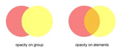
Figure 7-2. Opacity on group or on elements
2. Gradients
Gradients are used to fill or stroke basic shapes, paths or text elements, using many colors with color transitions from one to other.
2-1. Colors in gradients or gradients stop elements
This is the syntax for the 'stop' element :
<stop id="name"
    offset="NumberOrPercentage"
    stop-color="Color"
    stop-opacity="Opacity-value" />

Diagram 7-1. Chart for 'stop' syntax
Values for offset are from 0% to 100% or from 0 to 1. For each stop element, offset must be equal to or greater than the previous stop's offset value. Gradient offset values less than 0 (or less than 0%) are rounded up to 0%. Gradient offset values greater than 1 (or greater than 100%) are rounded down to 100%.
How to understand offset attribute ?
To begin, we create linear gradient with two colors only. Colors are defined in stop elements.
<defs>
   <linearGradient id="MyGradient">
        <stop offset="30%" stop-color="red"/>
        <stop offset="70%" stop-color="yellow"/>
   </linearGradient>
</defs>
We create also radial gradient with same 'stop' elements :
<defs>
   <radialGradient id="MyGradient">
        <stop offset="30%" stop-color="red"/>
        <stop offset="70%" stop-color="yellow"/>
   </linearGradient>
</defs>
For linear gradients, the offset attribute represents a location along the gradient vector. For radial gradients, it represents a percentage distance from (fx,fy) to the edge of the outermost/largest circle.
We can see result in Figure 7-3.

Figure 7-3. How work offset for stop element
In linear gradient, to fill shape, red is used from begin to 30% of total length, yellow is used from 70% to end. From 30% to 70%, color goes smoothly from red to yellow. We go from red ( rgb(255,0,0) ) to yellow ( rgb(255,255,0) ), so colors at x% of gradient vector is rgb(255,y,0) with y = 255 * (x – 30 ) / 40.
Figure 7-4 show some values for offset in linear gradient. For 0 and 100, all rectangle is filled with continuously smooth color transitions from red to yellow. For 50 and 50, we get only red for left part and yellow for right part.
Source of SVG file ( Example 7-4 ) :
<svg width="640" height="220" viewBox="-20 -20 640 220">
  <defs>
    <linearGradient id="MyGradient1">
      <stop offset="0%" stop-color="red"/>
      <stop offset="100%" stop-color="yellow"/>
    </linearGradient>
    <linearGradient id="MyGradient2">
      <stop offset="20%" stop-color="red"/>
      <stop offset="80%" stop-color="yellow"/>
    </linearGradient>
    <linearGradient id="MyGradient3">
      <stop offset="30%" stop-color="red"/>
      <stop offset="70%" stop-color="yellow"/>
    </linearGradient>
    <linearGradient id="MyGradient4">
      <stop offset="50%" stop-color="red"/>
      <stop offset="50%" stop-color="yellow"/>
    </linearGradient>
  </defs>
  <rect x="0" y="0" width="150" height="150" style="fill:url(#MyGradient1)"/>
  <rect x="150" y="0" width="150" height="150" style="fill:url(#MyGradient2)"/>
  <rect x="300" y="0" width="150" height="150" style="fill:url(#MyGradient3)"/>
  <rect x="450" y="0" width="150" height="150" style="fill:url(#MyGradient4)"/>
  <text x="75" y="175" style="text-anchor:middle">Offset 0 and 100</text>
  <text x="225" y="175" style="text-anchor:middle">Offset 20 and 80</text>
  <text x="375" y="175" style="text-anchor:middle">Offset 30 and 70</text>
  <text x="525" y="175" style="text-anchor:middle">Offset 50 and 50</text>
  <g style="stroke-dasharray:2 2;stroke:black">
    <path d="M180 0l0 150"/>
    <path d="M270 0l0 150"/>
    <path d="M0 0l0 150"/>
    <path d="M150 0l0 150"/>
    <path d="M345 0l0 150"/>
    <path d="M405 0l0 150"/>
    <path d="M525 0l0 150"/>
    <path d="M525 0l0 150"/>
  </g>
</svg>

Figure 7-4. Some values for offset in linearGradient element
For radial gradient 'offset' apply to radius of circles ( we can choose center of circles see after ) To fill shape, red is used for circle with radius of 30% of area's radius , yellow is used from 70% to end. From 30% to 70%, color goes smoothly from red to yellow.
We get this effects with radial gradient in Figure 7-5 for different values of offset attributes.
Source of SVG file ( Example 7-4 ) :
<svg width="640" height="220" viewBox="-20 -20 640 220">
  <defs>
    <radialGradient id="MyGradient1">
      <stop offset="0%" stop-color="red"/>
      <stop offset="100%" stop-color="yellow"/>
    </radialGradient>
    <radialGradient id="MyGradient2">
      <stop offset="20%" stop-color="red"/>
      <stop offset="80%" stop-color="yellow"/>
    </radialGradient>
    <radialGradient id="MyGradient3">
      <stop offset="30%" stop-color="red"/>
      <stop offset="70%" stop-color="yellow"/>
    </radialGradient>
    <radialGradient id="MyGradient4">
      <stop offset="50%" stop-color="red"/>
      <stop offset="50%" stop-color="yellow"/>
    </radialGradient>
  </defs>
  <rect x="0" y="0" width="150" height="150" style="fill:url(#MyGradient1)"/>
  <rect x="150" y="0" width="150" height="150" style="fill:url(#MyGradient2)"/>
  <rect x="300" y="0" width="150" height="150" style="fill:url(#MyGradient3)"/>
  <rect x="450" y="0" width="150" height="150" style="fill:url(#MyGradient4)"/>
  <text x="75" y="175" style="text-anchor:middle">Offset 0 and 100</text>
  <text x="225" y="175" style="text-anchor:middle">Offset 20 and 80</text>
  <text x="375" y="175" style="text-anchor:middle">Offset 30 and 70</text>
  <text x="525" y="175" style="text-anchor:middle">Offset 50 and 50</text>
  <g style="stroke-dasharray:2 2;stroke:black;fill:none">
    <circle cx="75" cy="75" r="0"/>
    <circle cx="75" cy="75" r="75"/>
    <circle cx="225" cy="75" r="15"/>
    <circle cx="225" cy="75" r="60"/>
    <circle cx="375" cy="75" r="22"/>
    <circle cx="375" cy="75" r="52"/>
    <circle cx="525" cy="75" r="37.5"/>
    <circle cx="525" cy="75" r="37.5"/>
  </g>
</svg>

Figure 7-5. Some values for offset in radialGradient element
Other attributes
With stop-color we choose color used ( name, RGB or hexadecimal value ). It's not possible to choose "none", but with any color and stop-opacity="0" we get same result. We can use this to get transparency effect or 3D lighting with filters on gradient.
'stop-color' property
Value:          currentColor |<color> [icc-color(<name>
                       [,<icccolorvalue>]*)] |inherit
Initial:          blackk
Applies to:      'stop' elements
Inherited:      no
Percentages:      N/A
Media:      visual
Animatable:      yes
WWith stop-opacity we choose opacity for color from 0 to 1.
'stop-opacity' property
Value:          <alphavalue> | inherit
Initial:          1
Applies to:      'stop' elements
Inherited:      no
Percentages:      N/A
Media:      visual
Animatable:      yes
2-2. Rendering properties
For gradients, one property is important : 'color-interpolation'. By default, 'color-interpolation' has value 'sRGB'
'color-interpolation' property
Value:          auto | sRGB | linearRGB | inherit
Initial:          sRGB
Applies to:      container elements, graphics elements and 'animateColor'
Inherited:      yes
Percentages:      N/A
Media:          visual
Animatable:      yes
'auto' means that author doesn't require that color interpolation occur in a particular color space .
We can see on this example ( Figure 7-6 ) that to go from red to yellow, repartition of colors is not the same with 'sRGB' and 'linearRGB'.

Figure 7-6. 'color-interpolation' property value
2-3. Common attributes for linear and radial gradients
gradientUnits attribute can be "userSpaceOnUse" or "objectBoundingBox", it defines the coordinate system for attributes x1 y1 x2 y2 for linearGradient and cx cy r fx fy for radialGradient. With "userSpaceOnUse", values are defined in current user coordinate system. With "objectBoundingBox", default value, values are defined in coordinate system using the bounding box of the element to which the gradient is applied. In this case, it's more easy to use percentages for attributes.
You can see after for linearGradient that this choice give different results on a square and a rectangle by example.
gradientTransform allow to add transform to coordinate system. We can use translate(tx,ty) rotate(angle,cx,cy) skewX(angle) skewY(angle) scale(sx,sy) or matrix(a b c d e f).
Figure 7-7 show three transforms applied to linearGradient element.
Source of SVG file ( Example 7-7 ) :
<svg width="640" height="220" viewBox="-20 -20 640 220">
  <defs>
    <linearGradient id="MyGradient1">
      <stop offset="30%" stop-color="red"/>
      <stop offset="70%" stop-color="yellow"/>
    </linearGradient>
    <linearGradient id="MyGradient2" gradientTransform="rotate(45)">
      <stop offset="30%" stop-color="red"/>
      <stop offset="70%" stop-color="yellow"/>
    </linearGradient>
    <linearGradient id="MyGradient3" gradientTransform="scale(0.5)">
      <stop offset="30%" stop-color="red"/>
      <stop offset="70%" stop-color="yellow"/>
    </linearGradient>
    <linearGradient id="MyGradient4" gradientTransform="skewX(45)">
      <stop offset="30%" stop-color="red"/>
      <stop offset="70%" stop-color="yellow"/>
    </linearGradient>
  </defs>
  <rect x="0" y="0" width="150" height="150"
        style="fill:url(#MyGradient1)"/>
  <rect x="150" y="0" width="150" height="150"
        style="fill:url(#MyGradient2)"/>
  <rect x="300" y="0" width="150" height="150"
        style="fill:url(#MyGradient3)"/>
  <rect x="450" y="0" width="150" height="150"
        style="fill:url(#MyGradient4)"/>
  <text x="75" y="175" style="text-anchor:middle">identity</text>
  <text x="225" y="175" style="text-anchor:middle">rotate(45)</text>
  <text x="375" y="175" style="text-anchor:middle">scale(0.5)</text>
  <text x="525" y="175" style="text-anchor:middle">skewX(45)</text>
</svg>

Figure 7-7. Three transforms applied to linearGradient element
spreadMethod attribute can be pad, reflect or repeat. This attribute indicates what happens if the gradient starts or ends inside the bounds of the target rectangle. With pad, default value, first or last color is used to complete before beginning or after end of gradient. With reflect, gradient is used start to end, then end to start , start to end ... to fill the rectangle. With repeat, gradient is used start to end, start to end ... to fill the rectangle. To see effect of this attribute, we define this linear gradient:
    <defs>
      <linearGradient id="MyGradient" x1="20%" y1="0%" x2="50%" y2="0%">
        <stop offset="30%" stop-color="red"/>
        <stop offset="70%" stop-color="yellow"/>
      </linearGradient>
    </defs>
With this values for x1 y1 x2 and y2, gradient start at 20% of shape and end at 50%. Figure 7-8 show effect of spreadMethod attribute, by default or with "pad" value, red is used from 0% to 20% and yellow from 50% to 100%. With reflect and repeat, we can see how gradient is used to fill the rectangle.
Source of SVG file ( Example 7-8 ) :
<svg width="640" height="220" viewBox="-20 -20 640 220">
  <defs>
    <linearGradient id="MyGradient1" x1="20%" y1="0%" x2="50%" y2="0%">
      <stop offset="30%" stop-color="red"/>
      <stop offset="70%" stop-color="yellow"/>
    </linearGradient>
    <linearGradient id="MyGradient2" spreadMethod="pad"
             x1="20%" y1="0%" x2="50%" y2="0%">
      <stop offset="30%" stop-color="red"/>
      <stop offset="70%" stop-color="yellow"/>
    </linearGradient>
    <linearGradient id="MyGradient3" spreadMethod="reflect"
             x1="20%" y1="0%" x2="50%" y2="0%">
      <stop offset="30%" stop-color="red"/>
      <stop offset="70%" stop-color="yellow"/>
    </linearGradient>
    <linearGradient id="MyGradient4" spreadMethod="repeat"
             x1="20%" y1="0%" x2="50%" y2="0%">
      <stop offset="30%" stop-color="red"/>
      <stop offset="70%" stop-color="yellow"/>
    </linearGradient>
  </defs>
  <rect x="0" y="0" width="150" height="150"
        style="fill:url(#MyGradient1)"/>
  <rect x="150" y="0" width="150" height="150"
        style="fill:url(#MyGradient2)"/>
  <rect x="300" y="0" width="150" height="150"
        style="fill:url(#MyGradient3)"/>
  <rect x="450" y="0" width="150" height="150"
        style="fill:url(#MyGradient4)"/>
  <text x="75" y="175" style="text-anchor:middle">default</text>
  <text x="225" y="175" style="text-anchor:middle">pad</text>
  <text x="375" y="175" style="text-anchor:middle">reflect</text>
  <text x="525" y="175" style="text-anchor:middle">repeat</text>
</svg>

Figure 7-8. Different values for spreadMethod attribute
2-4. How apply gradient to shape ?
We define gradient in <defs> section and give id, here "MyGradient" to linearGradient element.
    <defs>
        <linearGradient id="MyGradient" x1="20%" y1="0%" x2="50%" y2="0%">
            <stop offset="10%" stop-color="red"/>
            <stop offset="90%" stop-color="yellow"/>
        </linearGradient>
    </defs>
We can use this gradient to fill or stroke any element, as basic shape, path, text. This rectangle will be filled with linear gradient :
<rect x='0' y='0' width='200' height='200' fill='url(#MyGradient)'/>
We can also use style attribute :
<rect x='0' y='0' width='200' height='200'
    style='stroke:black;fill:url(#MyGradient)'/>
Figure 7-9 show some examples for using linear gradient to fill or stroke SVG elements.
Source of SVG file ( Example 7-9 ) :
<svg width="640" height="220" viewBox="-20 -20 640 220">
  <defs>
    <linearGradient id="MyGradient1" x2="5%" spreadMethod="reflect">
      <stop offset="10%" stop-color="red"/>
      <stop offset="90%" stop-color="yellow"/>
    </linearGradient>
  </defs>
  <rect x="0" y="0" width="150" height="150"
    style="stroke:black;fill:url(#MyGradient1)"/>
  <circle cx="225" cy="75" r="60"
    style="fill:none;stroke-width:10;stroke:url(#MyGradient1)"/>
  <path d="M320 20l 70 0 0 60 20 50 -100 0z"
    style="stroke:black;fill:url(#MyGradient1)"/>
  <text x="525" y="100"
    style="stroke:black;fill:url(#MyGradient1);font-family:Balloon;
               text-anchor:middle;font-size:100">SVG</text>
  <text x="75" y="175" style="text-anchor:middle">fill rectangle</text>
  <text x="225" y="175" style="text-anchor:middle">stroke circle</text>
  <text x="375" y="175" style="text-anchor:middle">fill path</text>
  <text x="525" y="175" style="text-anchor:middle">fill text</text>
</svg>

Figure 7-9. Examples using gradient
2-5. Linear Gradients
This is the syntax for the 'linearGradient' element :
<linearGradient id="name"
            gradientUnits="userSpaceOnUse|objectBoundingBox"
            gradientTransform="transform-list"
            spreadMethod="pad|repeat|reflect"
            x1="NumberOrPercentage"
            y1="NumberOrPercentage"
            x2="NumberOrPercentage"
            y2="NumberOrPercentage">
  <!--   stop elements   -->
</linearGradient>

Diagram 7-2. Chart for 'linearGradient' syntax
Figure 7-10 show results for three values of attribute "spreadMethod". In this example, x1="10%" and x2="40%".

Figure 7-10. Attributes for linearGradient
x1 y1 x2 y2 attributes define vector for linear gradient. This vector
provides starting and ending points onto which the gradient stops are mapped.
Colored strips are perpendicular to this vector. Default values are 0% 0%
100% 0%
Figure 7-11 show four examples :
- vertical strips with default values 0 0 100 0, 0 x 100 x will give same result
- diagonally strips with 0 0 100 100 from upper left corner to lower right corner
- diagonally strips with 0 100 100 0 from lower left corner to upper right corner
- horizontal strips with 0 0 0 100, x 0 x 100 will give same result.
Source of SVG file ( Example 7-11 ) :
<svg width="640" height="220" viewBox="-20 -20 640 220">
  <defs>
    <linearGradient id="MyGradient1" x1="0%" y1="0%" x2="100%" y2="0%">
      <stop offset="0%" stop-color="red"/>
      <stop offset="100%" stop-color="yellow"/>
    </linearGradient>
    <linearGradient id="MyGradient2" x1="0%" y1="0%" x2="100%" y2="100%">
      <stop offset="0%" stop-color="red"/>
      <stop offset="100%" stop-color="yellow"/>
    </linearGradient>
    <linearGradient id="MyGradient3" x1="0%" y1="100%" x2="100%" y2="0%">
      <stop offset="0%" stop-color="red"/>
      <stop offset="100%" stop-color="yellow"/>
    </linearGradient>
    <linearGradient id="MyGradient4" x1="0%" y1="0%" x2="0%" y2="100%">
      <stop offset="0%" stop-color="red"/>
      <stop offset="100%" stop-color="yellow"/>
    </linearGradient>
  </defs>
  <rect x="0" y="0" width="150" height="150" style="fill:url(#MyGradient1)"/>
  <rect x="150" y="0" width="150" height="150" style="fill:url(#MyGradient2)"/>
  <rect x="300" y="0" width="150" height="150" style="fill:url(#MyGradient3)"/>
  <rect x="450" y="0" width="150" height="150" style="fill:url(#MyGradient4)"/>
  <text x="75" y="175" style="text-anchor:middle">0 0 100 0</text>
  <text x="225" y="175" style="text-anchor:middle">0 0 100 100</text>
  <text x="375" y="175" style="text-anchor:middle">0 100 100 0</text>
  <text x="525" y="175" style="text-anchor:middle">0 0 0 100</text>
</svg>
Figure 7-11. Different values for x1 y1 x2 y2
Effect of x1, y1, x2 and y2 with gradientUnits="objectBoundingBox" depend of
filled object. Result is not the same on a square and a rectangle.
For a
rectangle, coordinate system is not orthogonal and strips of color are
perpendicular to gradient vector in calculus in this system, but not in common
sense.

Figure 7-12. gradientUnits and shapes
By example, in Figure 7-12, we use same gradient for gradientUnits =
"objectBoundingBox" with x1="0%" y1="0%" x2="100%" and y2="100%".
Stop
elements offset are 20% and 80%, we draw limits of colors. If we want same
orientation on the two shapes, we must use gradientUnits = "userSpaceOnUse" and
define a gradient for each shape with different values for x1, y1, x2 and
y2..
We have same problem using gradientTransform.
Figure 7-13 allow comparison using x1 y1 x2 y2 or gradientTransform :
Source of SVG file ( Example 7-13 ) :
<svg width="640" height="220" viewBox="-20 -20 640 220">
  <defs>
    <linearGradient id="MyGradient1" x1="0%" y1="0%" x2="100%" y2="100%">
      <stop offset="0%" stop-color="red"/>
      <stop offset="100%" stop-color="yellow"/>
    </linearGradient>
    <linearGradient id="MyGradient2" gradientTransform="rotate(45)">
      <stop offset="0%" stop-color="red"/>
      <stop offset="100%" stop-color="yellow"/>
    </linearGradient>
    <linearGradient id="MyGradient3" x1="0%" y1="100%" x2="100%" y2="0%">
      <stop offset="0%" stop-color="red"/>
      <stop offset="100%" stop-color="yellow"/>
    </linearGradient>
    <linearGradient gradientUnits="userSpaceOnUse" id="MyGradient4"
      x1="450" y1="150" x2="600" y2="150"
      gradientTransform="rotate(-45,450,150)">
      <stop offset="0%" stop-color="red"/>
      <stop offset="100%" stop-color="yellow"/>
    </linearGradient>
  </defs>
  <rect x="0" y="0" width="150" height="150" style="fill:url(#MyGradient1)"/>
  <rect x="150" y="0" width="150" height="150" style="fill:url(#MyGradient2)"/>
  <rect x="300" y="0" width="150" height="150" style="fill:url(#MyGradient3)"/>
  <rect x="450" y="0" width="150" height="150" style="fill:url(#MyGradient4)"/>
  <text x="75" y="175" style="text-anchor:middle">0 0 100 100</text>
  <text x="225" y="175" style="text-anchor:middle">rotate(45)</text>
  <text x="375" y="175" style="text-anchor:middle">0 100 100 0</text>
  <text x="525" y="175" style="text-anchor:middle">rotate(-45)</text>
</svg>
We can see that gradientTransform="rotate(45)" give not same result that 0 100 100 0, reason come from length of gradient vector, in rotate, vector keep same length and cover only a part of rectangle. gradientTransform="rotate(-45,-450,150)" apply to 0 100 100 100 and 0 100 100 0 are different for same reason, and here we can not use percentages to give center of rotation. We cannot define such gradient for many objects.

Figure 7-13. Play with x1 y1 x2 y2 and gradientTransform
2-6. Radial Gradients
This is the syntax for the 'radialGradient' element :
<radialGradient id="name"
            gradientUnits="userSpaceOnUse|objectBoundingBox"
            gradientTransform="transform-list"
            spreadMethod="pad|repeat|reflect"
           cx="NumberOrPercentage"
           cy="NumberOrPercentage"
           r="NumberOrPercentage"
           fx="NumberOrPercentage"
           fy="NumberOrPercentage">
  <!--    stop elements    -->
</radialGradient>

Diagram 7-3. Chart for 'radialGradient' syntax

Figure 7-14. Attributes for radialGradient element
cx, cy, r define the largest circle for the radial gradient. Default values
are 50%. fx, fy define the focal point for the radial gradient.
The gradient
will be drawn such that the 0% gradient stop is mapped to (fx, fy). If values
are not specified for fx and fy, focal point is in cx,cy. Figure 7-14 show
example with cx="50%" cy="50%" r="50%" fx="20%" fy="20%" and offset="0%" for
black and offset="100%" for white.
We can play with focal point distinct from center and spreadMethod to fill rectangle. Figure 7-15 show two examples where focal point is in center with reflect and repeat values for spreadMethod. For two others, focal point is distinct from center.
Source of SVG file ( Example 7-15 ) :
<svg width="640" height="220" viewBox="-20 -20 640 220">
  <defs>
    <radialGradient id='MyGradient1' spreadMethod='reflect'
              cx='50%' cy='50%' r='5%' fx='50%' fy='50%'>
      <stop id='c1' offset='5%' stop-color='red' stop-opacity='1'/>
      <stop id='c2' offset='95%' stop-color='yellow' stop-opacity='1'/>
    </radialGradient>
    <radialGradient id='MyGradient2' spreadMethod='repeat'
              cx='50%' cy='50%' r='5%' fx='50%' fy='50%'>
      <stop id='c1' offset='5%' stop-color='red' stop-opacity='1'/>
      <stop id='c2' offset='95%' stop-color='yellow' stop-opacity='1'/>
    </radialGradient>
    <radialGradient id='MyGradient3' spreadMethod='reflect'
              cx='50%' cy='50%' r='5%' fx='25%' fy='25%'>
      <stop id='c1' offset='5%' stop-color='red' stop-opacity='1'/>
      <stop id='c2' offset='95%' stop-color='yellow' stop-opacity='1'/>
    </radialGradient>
    <radialGradient id='MyGradient4' spreadMethod='repeat'
              cx='50%' cy='50%' r='35%' fx='5%' fy='5%'>
      <stop id='c1' offset='5%' stop-color='red' stop-opacity='1'/>
      <stop id='c2' offset='95%' stop-color='yellow' stop-opacity='1'/>
    </radialGradient>
  </defs>
  <rect x="0" y="0" width="150" height="150" style="fill:url(#MyGradient1)"/>
  <rect x="150" y="0" width="150" height="150" style="fill:url(#MyGradient2)"/>
  <rect x="300" y="0" width="150" height="150" style="fill:url(#MyGradient3)"/>
  <rect x="450" y="0" width="150" height="150" style="fill:url(#MyGradient4)"/>
  <text x="75" y="175" style="text-anchor:middle">
    reflect 50 50 5 50 50
  </text>
  <text x="225" y="175" style="text-anchor:middle">repeat 50 50 5 50 50</text>
  <text x="375" y="175" style="text-anchor:middle">reflect 50 50 5 25 25</text>
  <text x="525" y="175" style="text-anchor:middle">repeat 50 50 35 5 5</text>
</svg>

Figure 7-15. spreadMethod and focal point
2-7. Gradients and filters
We can apply filters to gradients. To get 3D lighting effect, we can use stop-opacity="0" for some stop elements. Figure 7-16 show radial gradient, lighting and composite of the two.
Source of SVG file ( Example 7-16 ) :
<svg width="660" height="300" viewBox="-30 -30 660 300">
  <defs>
    <radialGradient id='gradient' spreadMethod='repeat'
             cx='50%' cy='50%' r='10%' fx='50%' fy='50%'>
      <stop id='c1' offset='5%' stop-color='red' stop-opacity='1'/>
      <stop id='c2' offset='95%' stop-color='yellow' stop-opacity='0'/>
    </radialGradient>
    <filter id='Filter0' filterUnits='objectBoundingBox'
      x='0%' y='0%' width='100%' height='100%'>
      <feImage result="pict0" xlink:href="#Image2"/>
      <feDiffuseLighting result='pict1' in='pict0'
            lighting-color='white' diffuseConstant='1'
            kernelUnitLength='1,1' surfaceScale='4.2'>
        <feDistantLight azimuth='60' elevation='25'/>
      </feDiffuseLighting>
      <feComposite in2='pict1' in='pict0' operator='xor'/>
    </filter>
    <filter id='Filter1' filterUnits='objectBoundingBox'
      x='0%' y='0%' width='100%' height='100%'>
      <feImage result="pict0" xlink:href="#Image1"/>
      <feDiffuseLighting result='pict1' in='pict0'
            lighting-color='white' diffuseConstant='1'
            kernelUnitLength='1,1' surfaceScale='4.2'>
        <feDistantLight azimuth='60' elevation='25'/>
      </feDiffuseLighting>
    </filter>
    <rect id="Image1" x="200" y="0" width='200' height='200'
          fill='url(#gradient)'/>
    <rect id="Image2" x="400" y="0" width='200' height='200'
          fill='url(#gradient)'/>
  </defs>
  <rect x='0' y='0' width='200' height='200' fill='url(#gradient)'/>
  <rect x="200" y="0" width='200' height='200' filter='url(#Filter1)'/>
  <rect x="400" y="0" width='200' height='200' filter='url(#Filter0)'/>
  <text x="100" y="225" style="text-anchor:middle">radial gradient</text>
  <text x="300" y="225" style="text-anchor:middle">lighting gradient</text>
  <text x="500" y="225" style="text-anchor:middle"> composite pictures</text>
</svg>

Figure 7-16. Composite radial gradient with lighting
2-8. How create gradients ?
In design tools, we can choose gradient, but you cannot try all parameters, so you can find online ( at pilat.free.fr ) or on companion cd a tool to create gradient, test all parameters and get code for gradient ( using PHP ) Figure 7-17 is screenshot of tool to create radial gradient. This tool exist also as reusable component that you can add at your application.

Figure 7-17. Tool to create radial gradient
3. Patterns
3-1. 'pattern' element
"A pattern is used to fill or stroke an object using a pre-defined graphic object which can be replicated ("tiled") at fixed intervals in x and y to cover the areas to be painted."
This is syntax for "pattern" element :
<pattern  id="name"
         patternUnits=" userSpaceOnUse|objectBoundingBox"
         patternContentUnits=" userSpaceOnUse|objectBoundingBox"
         patternTransform="transform-list"
         viewBox="min-x min-y width height"
         x="NumberOrPercentage"
         y="NumberOrPercentage"
         width="NumberOrPercentage"
         height="NumberOrPercentage">
   <!--  some objects as pattern content  -->
</pattern>

Diagram 7-4. Chart for 'pattern' syntax
In previous chapters, you see pictures with grid background using pattern :
<pattern id="Pat01" width="10" height="10" patternUnits="userSpaceOnUse">
  <rect width="10" height="10" fill="#FFFFFF" stroke="#000000"
  stroke-width="0.1"/>
</pattern>
We define pattern element, give attributes for rectangular tile, x ( 0 by default ), y ( 0 by default ), width ( 0 by default ) and height ( 0 by default ).
patternUnits attribute can be "userSpaceOnUse" or "objectBoundingBox", it defines the coordinate system for attributes x y width and height for pattern tile. With "userSpaceOnUse", values are defined in current user coordinate system. With "objectBoundingBox", default value, values are defined in coordinate system using the bounding box of the element to which the pattern is applied. In this case, it's more easy to use percentages for attributes.
- x attribute give x-coordinate for left upper corner for tile ( 0 by default )
- y attribute give y-coordinate for left upper corner for tile ( 0 by default )
- width attribute give width for tile ( 0 by default )
- height attribute give height for tile ( 0 by default )
patternContentUnits attribute can be "userSpaceOnUse" or "objectBoundingBox", it defines the coordinate system for the contents of the 'pattern' element. Here, "userSpaceOnUse" is the default value.
viewBox attribute apply for pattern contents. If we define viewBox attribute, patternContentUnits attribute has no effect.
patternTransform attribute allow to add transform to coordinate system. We can use translate(tx,ty) rotate(angle,cx,cy) skewX(angle) skewY(angle) scale(sx,sy) or matrix(a b c d e f).
Figure 7-18 show effect of patternTransform attribute :
Source of SVG file ( Example 7-18 ) :
<svg width="640" height="220" viewBox="-20 -20 640 220">
  <defs>
    <pattern id="Pat01" width="10" height="10" patternUnits="userSpaceOnUse">
      <rect width="10" height="10" fill="#FFFFFF" stroke="#000000"
            stroke-width="0.1"/>
    </pattern>
    <pattern id="Pat02" width="10" height="10"
      patternUnits="userSpaceOnUse" patternTransform="rotate(45)">
      <rect width="10" height="10" fill="#FFFFFF" stroke="#000000"
            stroke-width="0.1"/>
    </pattern>
    <pattern id="Pat03" width="10" height="10"
      patternUnits="userSpaceOnUse" patternTransform="scale(2)">
      <rect width="10" height="10" fill="#FFFFFF" stroke="#000000"
            stroke-width="0.1"/>
    </pattern>
    <pattern id="Pat04" width="10" height="10"
      patternUnits="userSpaceOnUse" patternTransform="skewX(45)">
      <rect width="10" height="10" fill="#FFFFFF" stroke="#000000"
            stroke-width="0.1"/>
    </pattern>
  </defs>
  <rect x="0" y="0" width="150" height="150"
     style="stroke:black;fill:url(#Pat01)"/>
  <rect x="150" y="0" width="150" height="150"
     style="stroke:black;fill:url(#Pat02)"/>
  <rect x="300" y="0" width="150" height="150"
     style="stroke:black;fill:url(#Pat03)"/>
  <rect x="450" y="0" width="150" height="150"
     style="stroke:black;fill:url(#Pat04)"/>
  <text x="75" y="175" style="text-anchor:middle">identity</text>
  <text x="225" y="175" style="text-anchor:middle">rotate(45)</text>
  <text x="375" y="175" style="text-anchor:middle">scale(2)</text>
  <text x="525" y="175" style="text-anchor:middle">skewX(45)</text>
</svg>

Figure 7-18. Some values for patternTransform attribute
Pattern contents are childs of pattern element, they can be any SVG object - basic shape, path, text, gradient, filter, mask, symbol, marker ....... For our example, one rectangle is the only content.
3-2. How apply pattern to shape ?
We define pattern in <defs> section and give id, here "MyPattern" to pattern element.
<pattern id="MyPattern" width="10" height="10"
    patternUnits="userSpaceOnUse">
  <rect width="10" height="10" fill="#FFFFFF" stroke="#000000"
      stroke-width="0.1"/>
</pattern>
We can use this pattern to fill or stroke any element, as basic shape, path, text. This rectangle will be filled with pattern :
<rect x='0' y='0' width='200' height='200' fill='url(#MyPattern)'/>
We can also use style attribute :
<rect x='0' y='0' width='200' height='200'
    style='stroke:black;fill:url(#MyPattern)'/>
Figure 7-19 show some examples of filling and stroking with pattern.
Source for SVG file ( Example 7-19 ) :
<svg width="640" height="220" viewBox="-20 -20 640 220">
  <defs>
    <pattern id="MyPattern" width="10" height="10"
             patternUnits="userSpaceOnUse">
      <rect width="10" height="10" fill="#FFFFFF" stroke="#000000"
            stroke-width="0.1"/>
    </pattern>
  </defs>
  <rect x="0" y="0" width="150" height="150"
        style="stroke:black;fill:url(#MyPattern)"/>
  <circle cx="225" cy="75" r="60"
    style="fill:none;stroke-width:10;stroke:url(#MyPattern)"/>
  <path d="M320 20l 70 0 0 60 20 50 -100 0z"
         style="stroke:black;fill:url(#MyPattern)"/>
  <text x="525" y="100" style="stroke:black;fill:url(#MyPattern);
            font-family:Balloon;text-anchor:middle;font-size:100">SVG</text>
  <text x="75" y="175" style="text-anchor:middle">fill rectangle</text>
  <text x="225" y="175" style="text-anchor:middle">stroke circle</text>
  <text x="375" y="175" style="text-anchor:middle">fill path</text>
  <text x="525" y="175" style="text-anchor:middle">fill text</text>
</svg>

Figure 7-19. Fill and stroke with pattern
Figure 7-20 show classical examples of pattern used in statistical charts or maps.

Figure 7-20. Some classical examples of pattern
3-3. How create patterns ?
In design tools, we can choose pattern, but you cannot create our own pattern, so you can find online ( at pilat.free.fr ) a tool to create pattern content using rectangle, ellipse, polygon, line and path elements and get code for pattern ( using HTML form ).
Figure 7-21 is screenshot of this tool to create pattern content. To fill shapes, you can create your gradient with previous tool as reusable component.

Figure 7-21. Screenshot of tool to create pattern content
3-4. Use filter on pattern
We can add filter to create effect on pattern
Figure 7-22 show two effects on very simple pattern. We use lighting filter on pattern and composite it with pattern.
Source for SVG file ( Example 7-22 ) :
<svg width="650" height="270" viewBox="-30 -30 650 270">
  <defs>
    <pattern id='motif' x='0' y='0' width='20' height='20'
            patternUnits="userSpaceOnUse">
      <circle cx='5' cy='5' r='5'
         style='stroke:black;stroke-width:1;fill:red'/>
      <circle cx='15' cy='15' r='5'
         style='stroke:black;stroke-width:1;fill:red'/>
    </pattern>
    <filter id='Filter0' x="0%" y="0%" width="100%" height="100%">
      <feImage result='pict0' xlink:href='#Image1'/>
      <feDiffuseLighting result='pict1' in='pict0'
          lighting-color='white' diffuseConstant='1'
            kernelUnitLength='1,1' surfaceScale='1'>
        <feDistantLight azimuth='45' elevation='45'/>
      </feDiffuseLighting>
      <feComposite result='pict2' in2='pict0' in='pict1' operator='over'/>
    </filter>
    <rect id='Image1' x="200" y="0" width='200' height='200'
   fill="url(#motif)"/>
    <rect id='Image2' x="400" y="0" width='200' height='200'
         fill="url(#motif)"/>
    <filter id='Filter1' x="0%" y="0%" width="100%" height="100%">
      <feImage result='pict0' xlink:href='#Image2'/>
      <feDiffuseLighting result='pict1' in='pict0'
         lighting-color='white' diffuseConstant='1'
            kernelUnitLength='1,1' surfaceScale='1'>
        <feDistantLight azimuth='95' elevation='35'/>
      </feDiffuseLighting>
      <feComposite result='pict2' in2='pict0' in='pict1' operator='in'/>
    </filter>
  </defs>
  <rect x="0" y="0" width="200" height="200" fill="url(#motif)"/>
  <rect x='200' y='0' width='200' height='200' filter='url(#Filter0)'/>
  <rect x='400' y='0' width='200' height='200' filter='url(#Filter1)'/>
  <text x="100" y="225" style="text-anchor:middle">pattern</text>
  <text x="300" y="225" style="text-anchor:middle">lighting</text>
  <text x="500" y="225" style="text-anchor:middle">other composite</text>
</svg>

Figure 7-22. Example of effects on pattern with filters
With figure 7-23, we have Europa map as lego pieces using pattern with filters. Only color of lighting change for the two patterns.
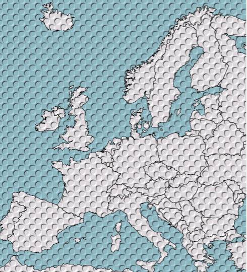
Figure 7-23. Using pattern and filters for Europa map
3-5. To go further with patterns
Pattern create tile to fill shape or other element, but tiling use only translation of same tile. Why not try to create tilings of plane in the same way as M.C. Escher ? At same URL (pilat.free.fr), you can find tool to choose type of tiling and create your tile with basic shapes. Figure 7-24 show example of tiling of plane create with some Bezier curves and lighting effect

Figure 7-24. Example of tiling of plane and lighting effect
4. Clipping paths
"The clipping path restricts the region to which paint can be applied. Conceptually, any parts of the drawing that lie outside of the region bounded by the currently active clipping path are not drawn."
4-1. How define clipping path ?
We use "clipPath" element :
The syntax is
<clipPath  id="name" clipPathUnits = "userSpaceOnUse | objectBoundingBox">
  <!-- shapes paths text use ... elements as children   -->
</clipPath>

Diagram 7-5. Chart for 'clipPath' syntax
clipPathUnits defines the coordinate system for the contents of the 'clipPath' element. With "userSpaceOnUse", values are defined in current user coordinate system. With "objectBoundingBox", default value, values are defined in coordinate system using the bounding box of the element to which the clipping path is applied.
4-2. How apply clipping path?
For complex shapes, to define which points are inside shape, we can choose value for clip-rule attribute, nonzero or evenodd.
'clip-rule'
Value:          nonzero | evenodd | inherit
Initial:          nonzero
Applies to:      graphics elements within a 'clipPath' element
Inherited:      yes
Percentages:      N/A
Media:          visual
Animatable:      yes
nonzero
This rule determines the "insideness" of a point on the canvas by drawing a ray from that point to infinity in any direction and then examining the places where a segment of the shape crosses the ray. Starting with a count of zero, add one each time a path segment crosses the ray from left to right and subtract one each time a path segment crosses the ray from right to left. After counting the crossings, if the result is zero then the point is outside the path. Otherwise, it is inside..
evenodd
This rule determines the "insideness" of a point on the canvas by drawing a ray from that point to infinity in any direction and counting the number of path segments from the given shape that the ray crosses. If this number is odd, the point is inside; if even, the point is outside.
We use clip-path property :
'clip-path'
Value:          <ri> | none | inherit
Initial:          nonee
Applies to:      container elements and graphics elements
Inherited:      no
Percentages:      N/A
Media:          visual
Animatable:      yes
Figure 7-25 show a circle on a text, and text color change inside circle. For that we define in <defs> section :
- text in black
- clipPath define by a circle
We draw black rectangle, white text and use element with circle as clip-path and black text as xlink:href value.
We can animate the spot by moving circle, cx of circle going from 50 to 450 ...
Source code for SVG example ( Example 7-25 ) :
<svg width="550" height="130"  viewBox="-50 -30 550 130">
  <defs>
    <g id="new_text">
      <rect x="0" y="0" width="500" height="100" fill="white"/>
      <text x="250" y="60" style="text-anchor:middle;font-size:35;
            font-family:Arial;fill:black">Scalable Vector Graphics</text>
    </g>
    <clipPath id="spot">
      <circle cx="200" cy="50" r="50"/>
    </clipPath>
  </defs>
  <rect x="0" y="0" width="500" height="100" fill="black"/>
  <text x="250" y="60" style="text-anchor:middle;font-size:35;
        font-family:Arial;fill:white;fill-opacity:1">
    Scalable Vector Graphics
  </text>
  <use clip-path="url(#spot)" xlink:href="#new_text"/>
</svg>

Figure 7-25. ClipPath with circle on text
We can use clipPath element for drop-down list with scrolling :

Figure 7-26. Drop-down selection list with scrolling
Figure 7-26 is a screenshot of a drop-down selection list with scrolling. This reusable SVG component use a script file and a SVG file for design of window. Values of the list are passed as parameters and put in <defs> section:
<defs>
  <g id="scroll_textes" transform="translate(0,90)"
     style="text-anchor:left;font-size:12;font-family:Arial;fill:black">
    <text x="10" y="15" startOffset="0">red</text>
    <text x="10" y="35" startOffset="0">yellow</text>
    <!--   other text elements -->
   </g>
   <clipPath id="txt_spot">
     <rect id="txt_list" x="0" y="90" width="260" height="120"/>
   </clipPath>
</defs>
ClipPath element define part of list to be show. When user click on scroll buttons or slide cursor, script change value of y in rectangle "txt_list" content of clipPath. We can use clipPath and animation to simulate one-armed bandit.
Figure 7-27 show animation to choose number between 0 and 999. Script is only used to change numbers for begining. We get random number ...
We use two animations :
- first apply to clipPath content to change selected numbers.
- second apply to group using clipPath to put always in same place numbers.
Source code for this example ( Example 7-27) :
<svg width='200' height='200'>
  <script type="text/ecmascript">
    <![CDATA[
      function alea(evt)
      {
        svgdoc=evt.getTarget().ownerDocument();
        for (i=1;i<=3;i++)
  {
  n=Math.floor(10*Math.random())-1;
  node=svgdoc.getElementById("move_"+i.toString());
  node.setAttribute("from",20+40*n);
  node.setAttribute("to",40*n+380);
  node=svgdoc.getElementById("number_"+i.toString());
  node.setAttribute("from",20+50*(i-1)+","+(-40*n));
  node.setAttribute("to",20+50*(i-1)+","+(-360-40*n));
  }
      }
    ]]>
  </script>
  <defs>
    <style type="text/css">
      <![CDATA[
        .lettre {text-anchor:middle;font-family:Verdana;font-weight:bold;
           font-size:30;stroke:black}
      ]]>
    </style>
    <text id="ico1" class="lettre" x="25" y="30">1</text>
    <text id="ico2" class="lettre" x="25" y="30">2</text>
    <text id="ico3" class="lettre" x="25" y="30">3</text>
    <text id="ico4" class="lettre" x="25" y="30">4</text>
    <text id="ico5" class="lettre" x="25" y="30">5</text>
    <text id="ico6" class="lettre" x="25" y="30">6</text>
    <text id="ico7" class="lettre" x="25" y="30">7</text>
    <text id="ico8" class="lettre" x="25" y="30">8</text>
    <text id="ico9" class="lettre" x="25" y="30">9</text>
    <text id="ico0" class="lettre" x="25" y="30">0</text>
    <g id="rolling_numbers">
      <use x="0" y="0" xlink:href="#ico1"/>
      <use x="0" y="40" xlink:href="#ico2"/>
      <use x="0" y="80" xlink:href="#ico3"/>
      <use x="0" y="120" xlink:href="#ico4"/>
      <use x="0" y="160" xlink:href="#ico5"/>
      <use x="0" y="200" xlink:href="#ico6"/>
      <use x="0" y="240" xlink:href="#ico7"/>
      <use x="0" y="280" xlink:href="#ico8"/>
      <use x="0" y="320" xlink:href="#ico9"/>
      <use x="0" y="360" xlink:href="#ico0"/>
      <use x="0" y="400" xlink:href="#ico1"/>
      <use x="0" y="440" xlink:href="#ico2"/>
      <use x="0" y="480" xlink:href="#ico3"/>
      <use x="0" y="520" xlink:href="#ico4"/>
      <use x="0" y="560" xlink:href="#ico5"/>
      <use x="0" y="600" xlink:href="#ico6"/>
      <use x="0" y="640" xlink:href="#ico7"/>
      <use x="0" y="680" xlink:href="#ico8"/>
      <use x="0" y="720" xlink:href="#ico9"/>
      <use x="0" y="760" xlink:href="#ico0"/>
      <use x="0" y="800" xlink:href="#ico1"/>
      <use x="0" y="840" xlink:href="#ico2"/>
      <use x="0" y="880" xlink:href="#ico3"/>
    </g>
  </defs>
  <rect x='0' y='0' width='200' height='200'
       style='stroke:green;fill:yellow'/>
  <rect x="20" y="20" width="150" height="80" fill="white"/>
  <path d="M70 20l0 80 M120 20l0 80" stroke="black"/>
  <clipPath id="spot1">
    <rect x="0" y="20" width="50" height="80">
      <animate id="move_1" attributeName="y" dur="4s" repeatCount="2"
                   fill="freeze" from="0" to="240" begin="go.click"/>
    </rect>
  </clipPath>
  <clipPath id="spot2">
    <rect x="0" y="60" width="50" height="80">
      <animate id="move_2" attributeName="y" dur="3s" repeatCount="3"
                   fill="freeze" from="40" to="280" begin="go.click"/>
    </rect>
  </clipPath>
  <clipPath id="spot3">
    <rect x="0" y="100" width="50" height="80">
      <animate id="move_3" attributeName="y" dur="2s" repeatCount="4"
                   fill="freeze" from="80" to="320"  begin="go.click"/>
    </rect>
  </clipPath>
  <g transform="translate(20,0)" clip-path="url(#spot1)">
    <use xlink:href="#rolling_numbers"/>
      <animateTransform id="number_1" attributeName="transform"
                        type="translate"
                        from="20,20" to="20,-220" fill="freeze" dur="4s"
                        repeatCount="2" begin="go.click"/>
  </g>
  <g transform="translate(70,-40)" clip-path="url(#spot2)">
    <use xlink:href="#rolling_numbers"/>
      <animateTransform id="number_2" attributeName="transform"
                        type="translate"
                        from="70,-20" to="70,-260" fill="freeze" dur="3s"
                        repeatCount="3" begin="go.click"/>
  </g>
  <g transform="translate(120,-80)" clip-path="url(#spot3)">
    <use xlink:href="#rolling_numbers"/>
      <animateTransform id="number_3" attributeName="transform"
                     type="translate"
                     from="120,-60" to="120,-300" fill="freeze" dur="2s"
                     repeatCount="4" begin="go.click"/>
  </g>
  <rect x="10" y="180" width="50" height="18" fill="black"/>
  <text x="35" y="195"
      style="text-anchor:middle;font-weight:bold;font-size:15;
        font-family:Arial;fill:white;stroke:black">GO</text>
  <rect id="go" x="10" y="180" width="50" height="18"
      opacity="0.1" onclick="alea(evt)"/>
</svg>

Figure 7-27. Screenshot of one-armed bandit
4-3. Using clipping path for puzzle
We can create puzzle game with some scripts. In this example, user can change picture used for pieces, number of pieces, paths for clipping.
When SVG is loaded, clipPath elements are created in <defs> section in group "clips", paths used are defined in file "clip_paths.js". Init function create also pieces for puzzle in group "pieces".
Source code for this game ( Example 7-28 ) :
<svg width="800" height="450" onload="init(evt)">
  <defs>
    <g id="picture">
      <image id="source" x="0" y="0" width="400" height="400"
          xlink:href="puzzle.jpg"/>
    </g>
    <g id="clips">
    </g>
  </defs>
// Load paths for clipPath elements: <script type="text/ecmascript" xlink:href="clip_paths.js" /> <script type="text/ecmascript">
<![CDATA[
// Some variables used in script var svgdoc="",xd1,xd2,yd1,yd2,num;
var click_piece=false,cible="", nb_trials=0;
var played=new Array();// Variables which can be changed by user to get more or less pieces var size=5,nb_pieces=25,large=80, // Function init, on loading SVG, define svgdoc,
// values for large and nb_pieces.
// Call create_pieces to create pieces and distribution
// to arrange pieces before
// starting game
    function init(evt)
      {
      svgdoc=evt.getTarget().ownerDocument();
      large=Math.round(400/size);nb_pieces=size*size;
      create_pieces(evt);
      distribution(evt);
      }
// Function create pieces, first clipPath elements,
// then pieces as use elements function create_pieces(evt)
{
contents = svgdoc.getElementById ('clips');
contents2 = svgdoc.getElementById ('pieces');
k=-1;
for (i=0;i<size;i++)
{
for (j=0;j<size;j++)
{
k+=1;
node=svgdoc.createElement("clipPath");
name="clip_path"+(1+i+size*j).toString();
node.setAttribute("id",name);
contents.appendChild(node);
node2=svgdoc.createElement("path");
node2.setAttribute("d",chemin[k]);
node.appendChild(node2);
node=svgdoc.createElement("use");
node.setAttribute("id","tile"+(1+i+size*j).toString());
node.setAttribute("transform","translate(400,0)");
name="url(#clip_path"+(1+i+size*j).toString()+")";
node.setAttribute("clip-path",name);
node.setAttributeNS('http://www.w3.org/2000/xlink/namespace/',
"xlink:href","#picture");
contents2.appendChild(node);
}
}
}// Function put pieces in random order beside picture
// to complete and initialise
// values function distribution(evt)
{
var place_allowed=new Array();
for (i=0;i<size;i++)
{
for (j=0;j<size;j++)
{
place_allowed[i+size*j]=0
}
};
for (i=1;i<=nb_pieces;i++)
{
played[i]=0
};
for (i=0;i<size;i++)
{
for (j=0;j<size;j++)
{
while (place_allowed[i+size*j]==0)
{
k=1+Math.floor(nb_pieces*Math.random());
if (played[k]<1)
{
played[k]=played[k]+1;
place_allowed[i+size*j]=k
}
};
line=Math.floor((k-1)/size);
row=k-1-size*line;
dx=400-large*(line-i);
dy=large*(j-row);
transfo="translate("+dx.toString()+","+dy.toString()+")";
node = svgdoc.getElementById("tile"+k.toString());
node.setAttribute("transform",transfo);
}
}
for (i=1;i<=nb_pieces;i++)
{
played[i]=0
};
nb_trials=0;
node=svgdoc.getElementById("trials");
child=node.firstChild;
child.setData(nb_trials)
}
// Functions to move pieces
// On mouseup, piece is no more actived
function mouse_up(evt)
{
click_piece=false
}// On click, piece is actived, nb_trials incremented, new value writed,
// We get position of piece on click (xd1,yd1) and pointer position (xd2,yd2)
    function mouse_down(evt)
      {
      if (click_piece==false)
        {
        cible=evt.getTarget().getAttribute("id");
        click_piece=true;
        nb_trials+=1;
        node=svgdoc.getElementById("trials");
        child=node.firstChild;
        child.setData(nb_trials);
        xm=evt.getClientX();
        ym=evt.getClientY();
        num=parseInt(cible.substring(4,cible.length));
        objet=svgdoc.getElementById("tile"+num.toString());
        transfo=new String(objet.getAttribute("transform"));
        posi2=transfo.lastIndexOf(",");
        tranx=transfo.substring(10,posi2);
        xd1=parseInt(tranx,10);
        longueur=transfo.length-1;
        trany=transfo.substring(posi2+1,longueur);
        yd1=parseInt(trany,10);
        xd2=xm;yd2=ym
        }
      }
// On mousemove piece is moved of (x_pointer+xd1-xd2,y_pointer+yd1-yd2)
// If piece is nearest good position ( less than 5 pixels
// in x and y ), piece is
// in place and played[piece_number] get value of 1.
    function mouse_move(evt)
      {
      xm=evt.getClientX();
      ym=evt.getClientY();
      if (click_piece==true)
        {
        depx=xm+xd1-xd2;
        depy=ym+yd1-yd2;
        if ((Math.abs(depx)<5)&&(Math.abs(depy)<5))
          {
          depx=0;
          depy=0;
          played[num]=1
          }
          else
          {
          played[num]=0
          };
        transfo="translate("+depx+","+depy+")";
        node = svgdoc.getElementById("tile"+num.toString());
        node.setAttribute("transform",transfo)
        }
      }
// Function to put pieces in place on user request function solution(evt)
{
for (i=1;i<=nb_pieces;i++)
{
node = svgdoc.getElementById("tile"+i.toString());
node.setAttribute("transform","translate(0,0)");
}
}// Function to give result of game function bilan(evt)
{
var win_game=true;
for (i=1;i<=nb_pieces;i++)
{
if (played[i]==0)
{
win_game=false
}
};
if (win_game==true)
{
alert("You win in "+nb_trials+" trials")
}
else
{
alert("It's not finished!")
}
} ]]>
</script> <rect x="0" y="0" width="800" height="450" fill="green" opacity="0.3"/>
<rect x="10" y="410" width="100" height="20" style="fill:white"/>
<text x="60" y="425" style="text-anchor:middle;font-size:15;
font-family:Arial;fill:red">Result</text>
<rect x="10" y="410" onclick="bilan(evt)" width="100" height="20"
style="fill:green;fill-opacity:0"/>
<rect x="120" y="410" width="120" height="20" style="fill:white"/>
<text x="180" y="425" style="text-anchor:middle;font-size:15;
font-family:Arial;fill:red">New game</text>
<rect x="120" y="410" onclick="distribution(evt)" width="120" height="20"
style="fill:green;fill-opacity:0"/>
<rect x="250" y="410" width="120" height="20" style="fill:white"/>
<text x="310" y="425" style="text-anchor:middle;font-size:15;
font-family:Arial;fill:red">Solution</text>
<rect x="250" y="410" onclick="solution(evt)" width="120" height="20"
style="fill:green;fill-opacity:0"/>
<text x="450" y="425" style="text-anchor:left;font-size:15;
font-family:Arial;fill:black">Trials: </text>
<text id="trials" x="580" y="425" style="text-anchor:right;font-size:15;
font-family:Arial;fill:black">0</text>
<g onmouseup="mouse_up(evt)">
<use opacity="0.3" xlink:href="#picture"/>
<g id="pieces" onmousemove="mouse_move(evt)"
onmousedown="mouse_down(evt)">
</g>
</g>
</svg>
When SVG is loaded, we get for SVG elements:
In <defs> section :
<g id="clips">
  <clipPath id="clip_path1">
    <path d="M0 0 l80 0 c-10,10 -10,25 0,40 c10,10 10,30 0,40 c-5,-10
            -25,-10 -30,0 a10,10 0 1,1 -10,0 c-5,-5 -35,-5 -40,0 l0 -80z"/>
  </clipPath>
  <clipPath id="clip_path6">
    <path d="M80 0 c-10,10 -10,25 0,40 c10,10 10,30 0,40 c5,10 25,
            10 30,0 a10,10 0 1,1 10,0 c5,5 35,5 40,0 l-5 -35 a10,10 0 1,0
            0,-10 l5 -35z"/>
  </clipPath>
  <!--  other clipPath elements     -->
</g>
In group "pieces" :
<g id="pieces" onmousemove="mouse_move(evt)" onmousedown="mouse_down(evt)">
  <use id="tile1" transform="translate(400,80)"
 clip-path="url(#clip_path1)" xlink:href="#picture"/>
  <use id="tile6" transform="translate(320,160)"
 clip-path="url(#clip_path6)" xlink:href="#picture"/>
  <!--  other pieces for puzzle  -->
</g>
Using HTML form, user can choose local file for picture. We can add choice for clipping paths, number of pieces .....

Figure 7-28. Sceenshot of puzzle game
5. Masks
"A pattern is used to fill or stroke an object using a pre-defined graphic object which can be replicated ("tiled") at fixed intervals in x and y to cover the areas to be painted."
This is syntax for "mask" element :
<mask  id="name"
       maskUnits=" userSpaceOnUse|objectBoundingBox"
       maskContentUnits=" userSpaceOnUse|objectBoundingBox"
       x="NumberOrPercentage"
       y="NumberOrPercentage"
       width="NumberOrPercentage"
       height="NumberOrPercentage">
  <!--    some objects as mask content   -->
</mask>

Diagram 7-6. Chart for 'mask' syntax
maskUnits attribute can be "userSpaceOnUse" or "objectBoundingBox", it defines the coordinate system for attributes x y width and height for largest possible offscreen buffer. With "userSpaceOnUse", values are defined in current user coordinate system. With "objectBoundingBox", default value, values are defined in coordinate system using the bounding box of the element to which the pattern is applied. In this case, it's more easy to use percentages for attributes.
- x attribute give x-coordinate for left upper corner for tile ( -10% by default )
- y attribute give y-coordinate for left upper corner for tile ( -10% by default )
- width attribute give width for tile ( 120% by default )
- height attribute give height for tile ( 120% by default )
maskContentUnits attribute can be "userSpaceOnUse" or "objectBoundingBox", it defines the coordinate system for the contents of the 'pattern' element. Here, "userSpaceOnUse" is the default value.
To use mask for object, we use 'mask' property :
'mask'
Value:          <uri> | none | inherit
Initial:          none
Applies to:      container elements and graphics elements
Inherited:      no
Percentages:      N/A
Media:          visual
Animatable:      yes
We can get same result as Figure 7-25 with this code ( Example 7-25 ) :
<svg width="550" height="130"  viewBox="-50 -30 550 130">
  <defs>
    <g id="new_text">
      <rect x="0" y="0" width="500" height="100" fill="white"/>
      <text x="250" y="60" style="text-anchor:middle;font-size:35;
                 font-family:Arial;fill:black">Scalable Vector Graphics</text>
    </g>
    <mask id="spot" maskUnits="userSpaceOnUse" x="0" y="0"
         width="500" height="100">
      <circle cx="200" cy="50" r="50" fill="white"/>
    </mask>
  </defs>
  <rect x="0" y="0" width="500" height="100" fill="black" fill-opacity="1"/>
  <text x="250" y="60"
     style="text-anchor:middle;font-size:35;font-family:Arial;
          fill:white;fill-opacity:1">
    Scalable Vector Graphics
  </text>
  <use mask="url(#spot)" xlink:href="#new_text"/>
</svg>

6. What are differences between clipPath and mask ?
"The clipping path restricts the region to which paint can be applied...." To get picture, only geometry of clipPath element modify drawing. If you choose filling or stroking for clipPath content, drawing keep the same.
"You can specify that any other graphics object or 'g' element can be used as an alpha mask for compositing the current object into the background ..." Here, geometry give boundaries of drawing and filling for mask content change drawing :
Figure 7-29 show result with
<mask id="spot" maskUnits="userSpaceOnUse" x="0" y="0"
     width="500" height="100">
  <circle cx="200" cy="50" r="50" fill="white"/>
</mask>
for upper drawing and with
<mask id="spot" maskUnits="userSpaceOnUse" x="0" y="0"
      width="500" height="100">
  <circle cx="200" cy="50" r="50" fill="green"/>
</mask>
for other

Figure 7-29. Only filling color of mask content change ...