In WPF, basic controls such as Buttons and ToggleButtons are structurally and logically simple, designed to be fully implemented with XAML without needing code-behind. In contrast, more complex controls like TextBoxes, ComboBoxes, and Sliders require intricate C# code alongside XAML for their functionalities. Understanding and applying the intricate configurations of WPF controls can lead to more elegant and flexible CustomControl designs and developments. Being adept with these fundamental components allows for addressing gaps in the MVVM development pattern, leading towards the creation of high-quality WPF applications.
Introduction
In WPF, basic controls such as Buttons and ToggleButtons are structurally and logically simple, designed to be fully implemented with XAML without needing code-behind. In contrast, more complex controls like TextBoxes, ComboBoxes, and Sliders require intricate C# code alongside XAML for their functionalities.
Understanding and applying the intricate configurations of WPF controls can lead to more elegant and flexible CustomControl designs and developments. Being adept with these fundamental components allows for addressing gaps in the MVVM development pattern, leading towards the creation of high-quality WPF applications.
This exploration into the WPF Slider control aims to provide a deep understanding of how WPF designs its controls and their internal mechanisms. While it's nearly impossible to delve into every WPF control's internals due to the vast source code, there's no urgent need to worry or complain.
The entire source code of WPF is openly available and managed on GitHub. This accessibility means that specific controls can be found and analyzed as needed without any rush. Despite the potential for exhaustion, there's no need for complaints.
Beyond the Slider control, there are plans to dissect and analyze even more complex and varied controls. Support, interest, and backing for future tutorials provided via our GitHub repository, CodeProject, and tutorial videos on YouTube and BiliBili are greatly appreciated.
Contents
- WPF Tutorial Series
- Specification
- Creating an Application Project
- Analyzing the Main Features of Slider
- Extracting the Original Style Process
- Analysis of Extracted Source Code
- Checking Code Behind (GitHub Open Source)
- OnApplyTemplate in Cross-Platform
- Concluding the Slider Analysis
- Creating a Riot-Style Slider (CustomControl) Control
- Project Creation and Preparation for Start
- TextBlock (Hi Slider)
- Adding References and Testing Execution
- Setting the Size of Riot Slider
- PART_Track
- Adding the Slider Bar
- Aligning the Gap Between Slider Bar and Track
- PART_SelectionRange
- Adding Riot-Style Design Elements
- Implementing a Riot-Style Thumb
- Declaring Thumb Resources
- Completing the RiotSlider Template (Finishing Touches)
- Final Remarks
1. WPF Tutorial Series
To date, four tutorial series have been released on YouTube and BiliBili. These videos are available in English and Chinese, with Korean subtitles on YouTube. We hope these videos, through sophisticated source code and detailed expert explanations, will enhance your understanding of WPF.
-
Theme Switch: Youtube, BiliBili, CodeProject, GitHub
-
Riot PlayButton: Youtube, BiliBili, CodeProject, GitHub
-
Magic Navigation Bar: Youtube, BiliBili, CodeProject, GitHub
-
Riot Slider: Youtube BiliBili, CodeProject, GitHub
Yutube:WPF Tutorial | 🎮Crafting a League of Legends-Styled RiotSlider | In-Depth Analysis of Slider Control - YouTube
2. Specifications
This project is based on .NET Core but is designated for Windows only due to the use of WPF. It is executable through VS2022, which is mandatory for running NET 8.0. Alternatively, JetBrains' Rider can also be used.
- OS: Microsoft Windows 11
- IDE: Microsoft Visual Studio 2022
- Version: C# / NET 8.0 / WPF / windows target only
- NuGet: Jamesnet.Wpf
Using the latest version of Windows as your operating system is recommended. However, if you are considering platform expansion to Avalonia UI, Uno Platform, MAUI, etc., it's also worth considering MacOS as a sub-device. We are using Thinkpad/Macbooks as well. Note that Visual Studio is not available on MacOS or Linux-based systems, so Rider is the only alternative. vscode
3. Creating an Application Project
To get started, you first need to create a WPF Application project.
- Project Type: WPF Application
- Project Name: DemoApp
- Project Version: .NET 8.0
4. Analyzing the Main Features of Slider
The WPF Slider control, unlike simpler controls such as Button, has a variety of properties. These properties play crucial functional roles in the control, and some operate in unique ways, making them particularly worthy of attention.
Orientation
Controls in WPF often have a versatile nature, and the Orientation property of the Slider control is a prime example. This property allows for specifying the direction as either horizontal or vertical.
The Orientation property can also be found in the StackPanel control. While the default value of Orientation in StackPanel is Vertical, the default for Slider's Orientation is Horizontal. Thus, it is common to use the Slider in a Horizontal format, which might be why the Orientation feature is not widely known.
Let's take a closer look at a simplified part of the Slider to better understand Orientation:
<Style TargetType="{x:Type Slider}">
    <Setter Property="Template" Value="{StaticResource SliderHorizontal}"/>
    <Style.Triggers>
        <Trigger Property="Orientation" Value="Vertical">
            <Setter Property="Template" Value="{StaticResource SliderVertical}"/>
        </Trigger>
    </Style.Triggers>
</Style>
You can see that the (ControlTemplate) template switches based on the Orientation property in the trigger. Thus, a closer look at the actual configuration of this control can easily illustrate the significant role of the Orientation property.
It's an interesting part. Could you have imagined or applied the concept of switching templates through Orientation before seeing the original source? Open source can inspire in such ways. And let's note that the optimal timing for switching templates is indeed through the "Style.Trigger".
For this tutorial video, we will only implement the Horizontal direction, so we will not perform any branch switching through Orientation. However, you are encouraged to try creating a Vertical version and submit a Pull Request via Fork. Consider it a mission.
Let's also take a look at how the Horizontal/Vertical properties are applied:
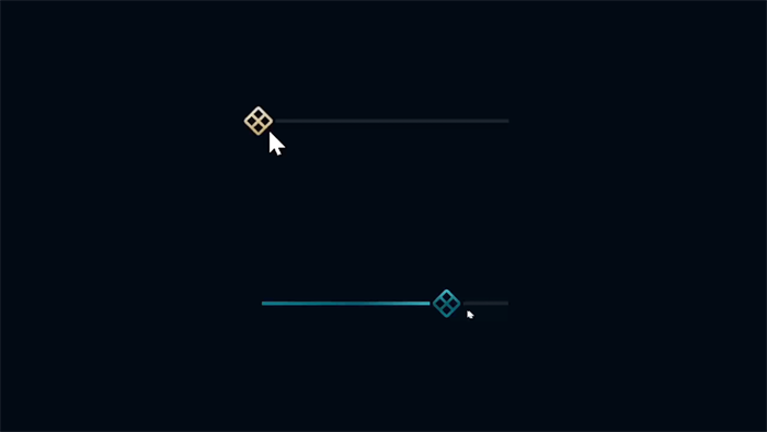
- Orientation: Horizontal

The SelectionRange (blue) area that will be discussed below is also visible.
- Orientation: Vertical
Similarly, you will find quite a few controls that switch the (ControlTemplate) template itself in a similar manner (e.g., ScrollViewer).
Minimum, Maximum, and Value
These are double type properties that represent the minimum range, maximum range, and value, respectively. Internally, the control's size and ratio calculate the position of the Range and Value automatically based on these values.
Since all these properties are DependencyProperty, dynamic interactions through binding are possible. For example, in an MVVM structure, leveraging these three values allows for dynamic changes to the Range according to specific scenarios or enables interesting implementations through various applications.
SelectionStart, SelectionEnd, and IsSelectionRangeEnabled
These two properties (SelectionStart/SelectionEnd) serve to set a specific area. In reality, this area doesn't include any special functionality; it's merely for designating a segment and visually highlighting it. IsSelectionRangeEnabled is a property that indicates whether this area is active, and depending on its activation status, the area's Visibility property value switches through a trigger (Visible/Collapsed).
Upon examination, these features might seem merely for area marking, leading to questions about their necessity. However, given their versatile use across designs and fields, understanding and anticipating their necessity is possible. Respecting style preferences from 20 years ago
Interestingly, applying these with the Value can produce a fascinating effect as shown below:
<Slider Orientation="Horizontal"
        Minimum="0"
        Maximum="100"
        Value="30"
        SelectionStart="0"
        SelectionEnd="{Binding Value, RelativeSource={RelativeSource Self}}"
        IsSelectionRangeEnabled="True"/>
Surprisingly, linking the Value to SelectionEnd through Binding allows for a dynamic change in the Selection (Range) as the value changes. Was this intended by the WPF developers? It's impressive, and the clean implementation method is quite satisfying.
This will play a crucial role in the implementation of the Riot-style Slider (CustomControl) discussed later in the article, so keep it in mind.
As mentioned earlier, since WPF is managed as open-source through the GitHub repository, it's possible to examine the source code of all controls. However, given that the repository contains solutions, all projects, and files, extracting content for a specific control part is a task close to impossible.
Fortunately, Visual Studio provides a GUI feature for extracting the default style (Template) of a specific control. Thus, without the need to sift through open-source, you can easily and simply extract the relevant code.
It's okay to think of this similar to Identity scaffolding in Blazor. (Though the nature is slightly different, it helps in understanding)
Moreover, extracting the original style through Visual Studio links you to an actual modifiable resource form, allowing for immediate customization of design and functionality. Therefore, since the original style and template extraction is possible not only for Slider but for all controls, this is a highly valuable element in WPF research/learning.
If you look at commercial components like Infragistics, Syncfusion, ArticPro, not all provide this extraction feature. Each company has its disclosure scope and policy, and most prefer to modularize via DataTemplate for customization rather than exposing the ControlTemplate. It's interesting to take a look at the components you are using.
Extraction Method and Procedure: Visual Studio
- Extracting the default control (
Slider) style (Edit a Copy...) - Extract to the current file (This document)
- Extract to the App.xaml file (Application)
- Create a new ResourceDictionary file for extraction (Resource Dictionary)
Note, the extraction process can only proceed in the design area of a Partial UserControl, by selecting the control and right-clicking to proceed. This step involves choosing the "specify style name/define copy location of the extracted style" option.
Try looking up the method in VScode or Rider, do they offer it?
Let's take a closer look at the process.
- Style extraction command: Slider > Right click > Edit Template > Edit a Copy...
If no extractable style is provided, this item will not be activated.
- Style Extraction Options Window: Create
ControlTemplate Resource (Window)
Select Name (Key) and Define in options,
Typically, specifying a Name is the right choice for testing and management perspectives. If you choose "Apply to all" without specifying a name, the style created based on the Define location will be applied globally. Therefore, understand this point well and proceed with the extraction carefully.
In the video, the name is set, and the Define location is specified as Application. Thus, the extracted resource is included in the Resources area of the App.xaml file (if the file exists).
Personally, when performing such extraction work, it's recommended to proceed in a test nature in a new project. Actually, conducting this process in a live project may result in minor mistakes and problems, so it's a good choice also from the perspective of preventing such side effects.
As demonstrated in the tutorial video, the Slider control style has been successfully extracted. Let's take a look at the related resources within the App.xaml file and examine the elements that are important to note one by one.
Checking Orientation Branch
As briefly mentioned when explaining the Orientation property earlier, it's time to check the actual source code implemented.
The style below is the original WPF default style containing the extracted SliderStyle1 template. (It works without errors upon immediate application.)
<Style x:Key="SliderStyle1" TargetType="{x:Type Slider}">
    <Setter Property="Stylus.IsPressAndHoldEnabled" Value="false"/>
    <Setter Property="Background" Value="Transparent"/>
    <Setter Property="BorderBrush" Value="Transparent"/>
    <Setter Property="Foreground" Value="{StaticResource SliderThumb.Static.Foreground}"/>
    <Setter Property="Template" Value="{StaticResource SliderHorizontal}"/>
    <Style.Triggers>
        <Trigger Property="Orientation" Value="Vertical">
            <Setter Property="Template" Value="{StaticResource SliderVertical}"/>
        </Trigger>
    </Style.Triggers>
</Style>
From this, we can see that the default Template is set to the SliderHorizontal (ControlTemplate) template, and through a trigger, it switches to the SliderVertical (ControlTemplate) template when the Orientation property value is Vertical.
By modularizing the (ControlTemplate) template like this, you gain the advantage of being able to see the actual style at a glance, which is a management structure worth trying even in non-switching situations. I do it often. You can also get inspiration from these aspects.
Thus, the Slider control's functionalities are essentially implemented within both the SliderHorizontal and SliderVertical (ControlTemplate) areas.
Let's now check the default SliderHorizontal (ControlTemplate) template.
Checking ControlTemplate
Let's examine each of the Horizontal/Vertical specific templates, which can be found continuously within the App.xaml file.
- Check
Horizontal specific template - Check
Vertical specific template
ControlTemplate: SliderHorizontal
<ControlTemplate x:Key="SliderHorizontal" TargetType="{x:Type Slider}">
    <Border ...>
        ...
    </Border>
    <ControlTemplate.Triggers>
        ...
    </ControlTemplate.Triggers>
</ControlTemplate>
ControlTemplate: SliderVertical
<ControlTemplate x:Key="SliderVertical" TargetType="{x:Type Slider}">
    <Border ...>
		...
    </Border>
    <ControlTemplate.Triggers>
		...
    </ControlTemplate.Triggers>
</ControlTemplate>
As seen, both the Horizontal/Vertical source codes are branched and implemented separately. Therefore, the implemented content is the same for both, differing only in design orientation.
Let's verify this precisely. The common elements included are as follows:
- Name:
TopTick - Name:
BottomTick - Name:
TrackBackground - Name:
PART_SelectionRange - Name:
PART_Track - Name:
Thumb - Trigger:
TickPlacement - Trigger:
IsSelectionRangeEnabled - Trigger:
IsKeyboardFocused
We can see that the common elements are included in both ControlTemplates, confirming that both have the same composition. Now, let's focus on and examine only the SliderHorizontal part.
Naming rule: PART_
In the structure of (CustomControl) controls, maintaining a tight connection between XAML and Code-behind is crucial. However, connecting them through the GetTemplateChild method to find control names can be visually unappealing. To mitigate this development approach and manage it systematically, the PART_ naming rule is used.
This rule prefixes all control names found through GetTemplateChild with PART_, allowing you to guess the function in XAML. Thus, when analyzing (ControlTemplate) controls, discovering a control named starting with PART_ suggests it's likely an essential element, and you can anticipate the side effects that might occur if it's removed.
Ultimately, this is immensely helpful in implementing CustomControls. Moreover, this rule is common not only in WPF but also in other cross-platforms sharing XAML, emphasizing its importance.
Slider contains two PART_ controls:
PART_TrackPART_SelectionRange
Consequently, aside from these two PART_ controls, the rest are not used in Code-behind, ensured by this naming rule. Therefore, adhering strictly to this rule in CustomControl development is crucial.
Test: Check the impact after intentionally changing the name of PART_Track
Let's intentionally change the name of the PART_Track control.
<Track x:Name="PART_Track1" Grid.Row="1">
    ...
</Track>
Ensure you're in the correct Sliderhorizontal area.
Now, when you run the application, dragging the Track's Thumb will no longer move it left or right, as seen in the tutorial video. The reason the Thumb no longer moves is that the intentional name change prevents Code-behind from finding the PART_Track control through GetTemplateChild.
Since the PART_Track control cannot be found, there's no target for the mouse drag to move. Reverting the name to PART_Track1 will restore functionality.
This phenomenon can be observed in many other standard controls, notably the TextBox’s PART_ContentHost.
Test: Check the impact after intentionally changing the name of PART_SelectionRange
Next, let's intentionally change the name of the PART_SelectionRange control.
<Rectangle x:Name="PART_SelectionRange1" .../>
Ensure you're in the correct Sliderhorizontal area (x2).
And if you look at the trigger section, there are more parts using PART_SelectionRange, so this part should be changed as well.
<Trigger Property="IsSelectionRangeEnabled" Value="true">
    <Setter Property="Visibility" TargetName="PART_SelectionRange1" Value="Visible"/>
</Trigger>
Ensure you're in the correct Sliderhorizontal area (x3).
Also, in Slider, ensure all properties are set to activate the PART_SelectionRange.
<Slider Style="{DynamicResource SliderStyle1}"
        Minimum="0" Maximum="100"
        SelectionStart="0" SelectionEnd="50"
        IsSelectionRangeEnabled="True"/>
You need to set Minimum/Maximum, SelectionStart/SelectionEnd, and IsSelectionRange to activate the Range area.
- Before name change:
PART_SelectionRange
Before the change, you can see the Range area appearing normally.
- After name change:
PART_SelectionRange1
Now, the Range area no longer appears.
Similarly, because the PART_SelectionRange control cannot be internally found, there's no target for calculating the Range area.
Thus, WPF controls are implemented more loosely than expected while forming a modular structure. Taking advantage of these characteristics allows for efficient use of already implemented functionalities or excluding unnecessary ones.
7. Checking Code Behind (GitHub Open Source)
After a detailed look at the PART_ control naming rule and its impact, it's time to explore how these controls are utilized in actual classes.
The Code behind (class) area cannot be further examined through extraction. Therefore, it's necessary to review the Official source code through the WPF repository. For a more detailed examination, watching tutorial videos is recommended.
In the actual source code, the names of each PART_ control are agreed upon as strings like below:
private const string TrackName = "PART_Track";
private const string SelectionRangeElementName = "PART_SelectionRange";
The names are defined fixedly, emphasizing the importance of adhering to this naming rule.
WPF: OnApplyTemplate
Let's examine the part where Track and SelectionRange are retrieved from the (ControlTemplate) template.
public override void OnApplyTemplate()
{
    base.OnApplyTemplate();

    SelectionRangeElement = GetTemplateChild(SelectionRangeElementName) as FrameworkElement;
    Track = GetTemplateChild(TrackName) as Track;

    if (_autoToolTip != null)
    {
        _autoToolTip.PlacementTarget = Track != null ? Track.Thumb : null;
    }
}
The (Override) OnApplyTemplate method is called after the class and style are connected, making it the optimal time to use GetTemplateChild.
Upon reviewing the original source code, they are defined as FrameworkElement and Track, respectively.
PART_SelectionRange: SelectionRangeElement (FrameworkElement)PART_Track: TrackName (Track)
It's noteworthy that while Track is the same type as in XAML, SelectionRange is defined as a FrameworkElement, different from the original Rectangle. This implies that the Range area can use any control, not just a Rectangle, indicating the type definition is intentionally flexible.
Therefore, it's reasonable to assume that (defined as a FrameworkElement type) SelectionRangeElement will handle only the basic functionalities available to this type.
Next, let's look at how the SelectionRangeElement is managed.
private void UpdateSelectionRangeElementPositionAndSize()
{
Size trackSize = new Size(0d, 0d);
Size thumbSize = new Size(0d, 0d);
if (Track == null || DoubleUtil.LessThan(SelectionEnd,SelectionStart))
{
return;
}
trackSize = Track.RenderSize;
thumbSize = (Track.Thumb != null) ? Track.Thumb.RenderSize : new Size(0d, 0d);
double range = Maximum - Minimum;
double valueToSize;
FrameworkElement rangeElement = this.SelectionRangeElement as FrameworkElement;
if (rangeElement == null)
{
return;
}
if (Orientation == Orientation.Horizontal)
{
if (DoubleUtil.AreClose(range, 0d) ||
(DoubleUtil.AreClose(trackSize.Width, thumbSize.Width)))
{
valueToSize = 0d;
}
else
{
valueToSize = Math.Max(0.0, (trackSize.Width - thumbSize.Width) / range);
}
rangeElement.Width = ((SelectionEnd - SelectionStart) * valueToSize);
if (IsDirectionReversed)
{
Canvas.SetLeft(rangeElement, (thumbSize.Width * 0.5) +
Math.Max(Maximum - SelectionEnd, 0) * valueToSize);
}
else
{
Canvas.SetLeft(rangeElement, (thumbSize.Width * 0.5) +
Math.Max(SelectionStart - Minimum, 0) * valueToSize);
}
}
else
{
if (DoubleUtil.AreClose(range, 0d) ||
(DoubleUtil.AreClose(trackSize.Height, thumbSize.Height)))
{
valueToSize = 0d;
}
else
{
valueToSize = Math.Max(0.0, (trackSize.Height - thumbSize.Height) / range);
}
rangeElement.Height = ((SelectionEnd - SelectionStart) * valueToSize);
if (IsDirectionReversed)
{
Canvas.SetTop(rangeElement, (thumbSize.Height * 0.5) +
Math.Max(SelectionStart - Minimum, 0) * valueToSize);
}
else
{
Canvas.SetTop(rangeElement, (thumbSize.Height * 0.5) +
Math.Max(Maximum - SelectionEnd,0) * valueToSize);
}
}
}
The logic for branching Orientation (Horizontal/Vertical) is essentially the same, so we only need to examine it based on Horizontal.
The (UpdateSelectionRangeElementPositionAndSize) method determines the size and position of the SelectionRange. Although the amount of source code might seem daunting, considering the duplicated source code for branching Orientation, it's easy to see that the handling of the SelectionRange is done succinctly.
This way, by extracting (CustomControl) controls and examining how PART_ controls are internally processed, it's possible to reverse-engineer and analyze them.
Cross-platforms, which retain many aspects of WPF's design, follow a similar flow. Let's take a look at how OnApplyTemplate is utilized in other platforms, based on our analysis.
List of platforms sharing the OnApplyTemplate design:
- AvaloniaUI
- Uno Platform
- OpenSilver
- MAUI
- Xamarin
- UWP
- WinUI 3
- Silverlight
Among these, let's examine the actual source code for AvaloniaUI, Uno Platform, OpenSilver, MAUI, and Xamarin, which are checked.
Note that except for Silverlight, all are managed through GitHub's official Dotnet or Xamarin Microsoft Organization, making it easy to find the repositories on GitHub.
AvaloniaUI: OnApplyTemplate
Below is a part of the Slider control's OnApplyTemplate in AvaloniaUI:
protected override void OnApplyTemplate(TemplateAppliedEventArgs e)
{
    ...
    base.OnApplyTemplate(e);
    _decreaseButton = e.NameScope.Find<Button>("PART_DecreaseButton");
    _track = e.NameScope.Find<Track>("PART_Track");
    _increaseButton = e.NameScope.Find<Button>("PART_IncreaseButton");
    ...
}
AvaloniaUI, being open-source like WPF, allows for a detailed examination of all source code. It's also very similar to WPF in approach.
Uno Platform: OnApplyTemplate
protected override void OnApplyTemplate()
{
...
base.OnApplyTemplate(e);
var spElementHorizontalTemplateAsDO = GetTemplateChild("HorizontalTemplate");
_tpElementHorizontalTemplate = spElementHorizontalTemplateAsDO as FrameworkElement;
var spElementTopTickBarAsDO = GetTemplateChild("TopTickBar");
...
}
In Uno, it follows a similar approach to WPF.
However, it is somewhat surprising that Uno does not adhere to the PART_ naming convention. It seems that they have made a rule not to use such conventions from the beginning.
You can find similar source code in MAUI, OpenSilver, and Xamarin as well.
MAUI: OnApplyTemplate
protected override void OnApplyTemplate()
{
    base.OnApplyTemplate();
    _thumb = (Thumb)GetTemplateChild("HorizontalThumb");
    _originalThumbStyle = _thumb.Style;

    UpdateThumbStyle();
}
Unlike WPF, which declares variable names following the track, MAUI prefixes them with an underscore. Comparing the naming conventions and development patterns across different platforms is one of the small joys in analyzing open-source projects.
OpenSilver: OnApplyTemplate
public override void OnApplyTemplate()
{
base.OnApplyTemplate();
...
ElementVerticalThumb = GetTemplateChild(ElementVerticalThumbName) as Thumb;
...
}
Uses a commenting style similar to Uno.
Xamarin: OnApplyTemplate
public override void OnApplyTemplate()
{
    base.OnApplyTemplate();
    FormsContentControl = Template.FindName("PART_Multi_Content", this)
    	as FormsTransitioningContentControl;
}
Though there are slight differences, all share a design similar to WPF.
9. Concluding the Slider Analysis
We've taken a close look at the WPF Slider control, confirming that WPF (CustomControl) controls are intricately and well-designed. These principles apply equally to other controls and serve as a crucial foundation when designing new ones.
Some say WPF is dead. However, WPF is still very much alive and continues to hold its ground. Delving into WPF opens up endless possibilities and excitement.
If dreaming of developing everything with WPF was once just a fantasy, the advent of Xamarin and .NET Core, followed by various other platforms, has turned it into reality. This is the result of the wishes and contributions of many developers who love WPF.
We've looked in detail at why analyzing basic controls is essential. It is recommended to review the tutorial videos to reinforce and learn from the explanations.
Next, we will create a new Riot-style (CustomControl) Slider based on this analysis.
10. Creating a Riot-Style Slider (CustomControl) Control
Now, we will leverage the analysis of the Slider to minimally design and implement a control that captures its essence. The project's core is to complete the control without using any code by utilizing the PART_ sections.
Focus on understanding the content by closely following the implementation process and sequence. If you wish to deepen your understanding of CustomControl, it is recommended to study in depth through the book WPF Inside Out.
Motivation
It's unlikely that anyone would use the basic Slider as is. Needing inspiration, I chose to design a Slider based on the design concept seen in Riot Games' League of Legends, an experience I've had in creating such controls.
In fact, this design started a few years ago out of curiosity to implement a high-level game client in WPF for "League of Legends." If you're interested in seeing how this Slider control actually works, check out this repository. Furthermore, anyone can contribute through Fork, which has already seen over 80 forks.
11. Project Creation and Preparation
Following the creation of our DemoApp (WPF Application) project, it's time to create a CustomControl library project. If you prefer to continue with the DemoApp project, you can skip this project creation step.
Project Creation:
- Project Name:
SliderControl - Project Type: WPF
CustomControl Library - Project Version: .NET 8.0
Deleting Default Files
- AssemblyInfo.cs
- Themes/Generic.xaml
- CustomControl1.cs
All files being deleted are actually essential for configuring the (CustomControl) control but are removed for reconfiguring the location or project setup.
Elements that were deleted in the process of recreating the control will be automatically regenerated, so there is no need to worry about file deletion.
(CustomControl) File Creation
- Create Class: RiotSlider.cs (
CustomControl class)
Only when creating the file as a CustomControl class type will the related DefaultStyleKeyProperty syntax be included with the static constructor. Carefully selecting the correct type during creation is crucial to avoid missing CustomControl code syntax, which would otherwise need to be manually entered.
public class RiotSlider : Slider
{
    static RiotSlider()
    {
        DefaultStyleKeyProperty.OverrideMetadata(typeof(RiotSlider),
                    new FrameworkPropertyMetadata(typeof(RiotSlider)));
    }
}
Checking Auto-generated Files
- Properties/AssemblyInfo.cs
- Themes/Generic.xaml
Note that if the file is not created as a CustomControl class type, these files will not be auto-generated. This is an important consideration.
12. TextBlock (Hi Slider)
This step is a test to ensure the Slider control is properly configured as a CustomControl.
Creating a (CustomControl) Slider control for the first time results in an empty ControlTemplate. To visually verify it, adding design elements is a common method. Thus, let's add a temporary TextBlock with text.
Adding Temporary TextBlock
Add "Hi Slider" text along with a TextBlock inside the empty ControlTemplate Border. Optionally, changing the font color can also be a good touch. Feel free to experiment with different methods.
13. Adding References and Testing Execution
With the TextBlock prepared for testing, it's now time to run the DemoApp application to verify if the RiotSlider control loads correctly.
Adding References in the DemoApp Project
- Add Reference:
RiotSliderControl Project
Declaring xmlns and Adding Control in MainWindow.xaml
- Declare xmlns:
xmlns:riots - Insert Control:
riots:RiotSlider
<Window x:Class="DemoApp.MainWindow"
        xmlns="http://schemas.microsoft.com/winfx/2006/xaml/presentation"
        xmlns:x="http://schemas.microsoft.com/winfx/2006/xaml"
        xmlns:d="http://schemas.microsoft.com/expression/blend/2008"
        xmlns:mc="http://schemas.openxmlformats.org/markup-compatibility/2006"
        xmlns:riots="clr-namespace:SliderControl;assembly=SliderControl"
        mc:ignorable="d"
        Title="MainWindow" Width="800" Height="450">
    <Grid>
        <riots:RiotSlider/>
    </Grid>
</Window>
Checking Execution Results
With this, we have completed setting up and verifying the execution of the (CustomControl) RiotSlider control.
CustomControl is more complex than UserControl, so it may be challenging until you become accustomed to the process like this. Thus, overcoming this requires repetitive training.
This RiotSlider is now modularly managed as a CustomControl. You can manage this control on a GitHub repository or upload and distribute it through the NuGet package store. Modularization of CustomControls in WPF can have many management advantages, so it's good to consider this when designing projects.
And, this project has already been distributed through the NuGet Package Store. Interesting, right?
14. Setting Riot Slider Size
Next, it's time to set the control size.
WPF allows for a powerful and flexible (Responsive) responsive layout. Thus, when specifying the size of a control, designing it to be responsive is typical. However, there are exceptions. In cases where design elements like Sliders are heavily involved, you may need to set a fixed height or width to maintain a natural design, necessitating the specification of absolute sizes. Therefore, it's important to flexibly adapt according to the characteristics of the control.
This control will be designed with a height (Thumb) of 50 as the standard. Thus, we will pre-specify the height of the RiotSlider. The width, while being responsive as the path for the Track's movement, will be limited to 200 for convenience during the development stage.
Control Size and Color Adjustment
Width: 200Height: 50Background: "#EEEEEE"
<Window x:Class="DemoApp.MainWindow"
        xmlns="http://schemas.microsoft.com/winfx/2006/xaml/presentation"
        xmlns:x="http://schemas.microsoft.com/winfx/2006/xaml"
        xmlns:d="http://schemas.microsoft.com/expression/blend/2008"
        xmlns:mc="http://schemas.openxmlformats.org/markup-compatibility/2006"
        xmlns:riots="clr-namespace:SliderControl;assembly=SliderControl"
        mc:ignorable="d"
        Title="MainWindow" Width="800" Height="450">
    <Grid>
        <riots:RiotSlider Width="200" Height="50" Background="#EEEEEE"/>
    </Grid>
</Window>
Temporarily changing the Background color along with adjusting the control size makes it easier to identify the control. It's a useful tip.
Checking Execution Results
- Control Size:
Width/Height - Control Color:
Background
Once the execution results are verified with no issues, let's remove the Background color.
15. PART_Track
The Track, including the Thumb, is a core control element of the Slider. Through analysis, we've seen that the Slider control handles all these functionalities with the declaration of PART_Track. Thus, incorporating this essential element appropriately becomes a critical and central moment in this implementation.
Let's examine this carefully.
Adding Track
- Insert
PART_Track control element:
<Style TargetType="{x:Type local:RiotSlider}">
    <Setter Property="Background" Value="Transparent"/>
    <Setter Property="SelectionStart" Value="0"/>
    <Setter Property="SelectionEnd"
     Value="{Binding RelativeSource={RelativeSource Self}, Path=Value}"/>
    <Setter Property="Minimum" Value="0"/>
    <Setter Property="Maximum" Value="100"/>
    <Setter Property="Template">
        <Setter.Value>
            <ControlTemplate TargetType="{x:Type local:RiotSlider}">
                <Border Background="{TemplateBinding Background}"
                        BorderBrush="{TemplateBinding BorderBrush}"
                        BorderThickness="{TemplateBinding BorderThickness}">
                    <Track x:Name="PART_Track"/>
                </Border>
            </ControlTemplate>
        </Setter.Value>
    </Setter>
</Style>
The Track is one of the few controls that directly inherit from FrameworkElement, bypassing Control. This means it is not entitled to layout design like a Template. Therefore, it internally includes a Thumb, allowing you to focus solely on the Thumb for layout design.
Defining Thumb
Next, it's time to define the Thumb that will move within the Track.
- Extend and define
Thumb template - Implement
Ellipse
<Style TargetType="{x:Type local:RiotSlider}">
    <Setter Property="Background" Value="Transparent"/>
    <Setter Property="SelectionStart" Value="0"/>
    <Setter Property="SelectionEnd"
     Value="{Binding RelativeSource={RelativeSource Self}, Path=Value}"/>
    <Setter Property="Minimum" Value="0"/>
    <Setter Property="Maximum" Value="100"/>
    <Setter Property="Template">
        <Setter.Value>
            <ControlTemplate TargetType="{x:Type local:RiotSlider}">
                <Border Background="{TemplateBinding Background}"
                        BorderBrush="{TemplateBinding BorderBrush}"
                        BorderThickness="{TemplateBinding BorderThickness}">
                    <Track x:Name="PART_Track">
                        <Track.Thumb>
                            <Thumb>
                                <Thumb.Template>
                                    <ControlTemplate>
                                        <Ellipse Width="50" Height="50"
                                         Fill="#000000"/>
                                    </ControlTemplate>
                                </Thumb.Template>
                            </Thumb>
                        </Track.Thumb>
                    </Track>
                </Border>
            </ControlTemplate>
        </Setter.Value>
    </Setter>
</Style>
This illustrates the Thumb being directly extended and implemented within the Track. The syntax might be challenging to understand, but it's visually detailed in the tutorial video, so watching it is recommended.
Unlike the Track, the Thumb allows control definition through a template, meaning the Thumb inherits from Control, not FrameworkElement. Thus, the Thumb's ControlTemplate enables flexible control design.
Checking Execution Results
Thumb (Ellipse) Design- Track Movement Functionality
Because the Thumb is designed as an Ellipse, this sizable (50x50) ellipse will move within the Track area. However, if you change the name of the Track from PART_Track to something else, the movement of the Thumb will immediately be lost.
Try changing the name to understand this relationship once again.
16. Adding the Slider Bar
Next, we will add the slider bar. This step involves adding purely design-related elements that don't affect functionality. Thus, it can be skipped without impacting functionality, but considering the next step involves combining design elements with the SelectionRange, this task also requires careful attention.
Layout Change
So far, the layout only contained the Track element within a Border. However, adding a slider bar necessitates changing the existing layout. Moreover, since the slider bar and Track need to overlap, using a Grid is the best approach. Therefore, the first step is to wrap the Track in a Grid.
- Change
Layout to Grid:
<Style TargetType="{x:Type local:RiotSlider}">
    <Setter Property="Background" Value="Transparent"/>
    <Setter Property="SelectionStart" Value="0"/>
    <Setter Property="SelectionEnd"
     Value="{Binding RelativeSource={RelativeSource Self}, Path=Value}"/>
    <Setter Property="Minimum" Value="0"/>
    <Setter Property="Maximum" Value="100"/>
    <Setter Property="Template">
        <Setter.Value>
            <ControlTemplate TargetType="{x:Type local:RiotSlider}">
                <Border Background="{TemplateBinding Background}"
                        BorderBrush="{TemplateBinding BorderBrush}"
                        BorderThickness="{TemplateBinding BorderThickness}">
                    <Grid>
                        <Track x:Name="PART_Track">
                            <Track.Thumb>
                                <Thumb>
                                    <Thumb.Template>
                                        <ControlTemplate>
                                            <Ellipse Width="50" Height="50"
                                             Fill="#000000"/>
                                        </ControlTemplate>
                                    </Thumb.Template>
                                </Thumb>
                            </Track.Thumb>
                        </Track>
                    </Grid>
                </Border>
            </ControlTemplate>
        </Setter.Value>
    </Setter>
</Style>
No need for RowDefinitions or ColumnDefinitions in the Grid, as we only require a simple overlay effect.
Adding the Slider Bar to Overlap with the Track
While the slider bar should be placed to overlap with the Track, it's essential to logically consider which element should be in front. The Track's Thumb control should cover the slider bar area, so it's crucial to add and declare the slider bar before the Track.
- Add (Border) slider bar
- Height: 2.5
- Background: #CCCCCC
<Style TargetType="{x:Type local:RiotSlider}">
    <Setter Property="Background" Value="Transparent"/>
    <Setter Property="SelectionStart" Value="0"/>
    <Setter Property="SelectionEnd"
     Value="{Binding RelativeSource={RelativeSource Self}, Path=Value}"/>
    <Setter Property="Minimum" Value="0"/>
    <Setter Property="Maximum" Value="100"/>
    <Setter Property="Template">
        <Setter.Value>
            <ControlTemplate TargetType="{x:Type local:RiotSlider}">
                <Border Background="{TemplateBinding Background}"
                        BorderBrush="{TemplateBinding BorderBrush}"
                        BorderThickness="{TemplateBinding BorderThickness}">
                    <Grid>
                        <Border Background="#CCCCCC" Height="2.5"/>
                        <Track x:Name="PART_Track">
                            <Track.Thumb>
                                <Thumb>
                                    <Thumb.Template>
                                        <ControlTemplate>
                                            <Ellipse Width="50" Height="50"
                                             Fill="#000000"/>
                                        </ControlTemplate>
                                    </Thumb.Template>
                                </Thumb>
                            </Track.Thumb>
                        </Track>
                    </Grid>
                </Border>
            </ControlTemplate>
        </Setter.Value>
    </Setter>
</Style>
Using a layout element like a Border is effective for visually representing the length of the Track. Especially, the Border's CornerRadius attribute allows for rounded corners, offering a design advantage over other controls.
Checking Execution Results
- Movement of
Thumb (Ellipse) - Design of the slider bar (
Border)
The key point of this step is to arrange the slider bar's design and position harmoniously with the Track's movement path and the Thumb's movement.
17. Adjusting the Gap Between the Slider Bar and Track
Although the slider bar's design and placement seem appropriately arranged, in reality, the Track's movement range is limited by the radius of the Thumb at both the start and end. Upon examining the original WPF source code, you can find code like this:
Canvas.SetLeft(rangeElement, (thumbSize.Width * 0.5) +
               Math.Max(Maximum - SelectionEnd, 0) * valueToSize);
The above source code is based on an Orientation of "Horizontal". Therefore, if the orientation is changed to "Vertical", it will change to Height. Can you check if this is correct?
As seen in the code above, it can be inferred that the actual movement range of the Track is also internally limited by the radius of the ThumbSize to both sides. Therefore, the slider bar we added earlier is not a PART_ element managed within the Slider control, so we must apply this rule directly. While there are ways to handle this dynamically, in this work, we will precisely align the margin between the slider bar and the Track movement range through the Margin property.
Thumb Ellipse Opacity Setting
To make the work more comfortable, we specify the opacity of the Ellipse control.
In WPF, specifying the opacity of an element is commonly done using the Opacity property. However, using the alpha value of a color to apply transparency to that specific color can be much more useful. It's one of the handy tips in WPF, so make good use of it.
Applying Margin equal to the Thumb radius on the slider bar
Since the current Ellipse's Width is 50, we apply a Margin of 25 on each side.
Margin="25 0 25 0"
<Style TargetType="{x:Type local:RiotSlider}">
    <Setter Property="Background" Value="Transparent"/>
    <Setter Property="SelectionStart" Value="0"/>
    <Setter Property="SelectionEnd"
     Value="{Binding RelativeSource={RelativeSource Self}, Path=Value}"/>
    <Setter Property="Minimum" Value="0"/>
    <Setter Property="Maximum" Value="100"/>
    <Setter Property="Template">
        <Setter.Value>
            <ControlTemplate TargetType="{x:Type local:RiotSlider}">
                <Border Background="{TemplateBinding Background}"
                        BorderBrush="{TemplateBinding BorderBrush}"
                        BorderThickness="{TemplateBinding BorderThickness}">
                    <Grid>
                        <Border Background="#CCCCCC" Height="2.5" Margin="25 0 25 0"/>
                        <Track x:Name="PART_Track">
                            <Track.Thumb>
                                <Thumb>
                                    <Thumb.Template>
                                        <ControlTemplate>
                                            <Ellipse Width="50" Height="50"
                                             Fill="#55000000"/>
                                        </ControlTemplate>
                                    </Thumb.Template>
                                </Thumb>
                            </Track.Thumb>
                        </Track>
                    </Grid>
                </Border>
            </ControlTemplate>
        </Setter.Value>
    </Setter>
</Style>
Result Verification
- Margin gap equal to the
Thumb radius confirmed
As a result, it's confirmed that the maximum movement range of the Track and the design size of the slider bar precisely match.
Additionally, it's worth exploring ideas for dynamically handling this Sync task. One immediate thought is to designate this slider bar control as a PART_ and then handle it within the CodeBehind. There are various methods to consider, so take some time to think about it.
18. PART_SelectionRange
The SelectionRange is an element that specifies a certain range, as analyzed earlier in the Slider.
This control, like the Track, is a PART_ element and is fully managed within the Slider control, so it only needs to be placed with the promised name. The design should be specified with the same height as the slider bar added earlier for a consistent appearance.
Adding SelectionRange Border area
Name: PART_SelectionRangeHeight: 2.5Background: #000000Margin: 25 0 25 0
<Border x:Name="PART_SelectionRange"
        Background="#000000"
        Height="2.5"
        Margin="25 0 25 0"/>
Specifying Range
For SelectionEnd, synchronize the range with the Value through RelativeSource Binding.
SelectionStart: 0SelectionEnd: {Binding RelativeSource {RelativeSource Self}, Path=Value}
<Setter Property="SelectionStart" Value="0"/>
<Setter Property="SelectionEnd"
 Value="{Binding RelativeSource={RelativeSource Self}, Path=Value}"/>
By synchronizing the value of SelectionEnd with Value, you can dynamically represent the range. The Slider control in the actual League of Legends client application is implemented in the same way.
Enabling IsSelectionRangeEnabled
Considering the concept of the Riot Slider control, this process might not be necessary. However, since it can be easily handled through a trigger, let's proceed for learning purposes.
This part is not covered in the tutorial video.
The default value of the IsSelectionRangeEnabled property is set to True.
The default Visibility value of SelectionRange is set to Collapsed.
The default visibility of SelectionRange is set to Collapsed, but when the IsSelectionRangeEnabled property value is True, the Visibility value is changed to Visible through a trigger. Although the reverse could also be applied, checking the True value of a Boolean property in a trigger is a more straightforward and common coding convention.
Source Code and Execution Result
- Setter Applied
SelectionRange (Default) Collapsed- Trigger Applied for
IsSelectionRangeEnabled
<Style TargetType="{x:Type local:RiotSlider}">
    <Setter Property="Background" Value="Transparent"/>
    <Setter Property="SelectionStart" Value="0"/>
    <Setter Property="SelectionEnd"
     Value="{Binding RelativeSource={RelativeSource Self}, Path=Value}"/>
    <Setter Property="Minimum" Value="0"/>
    <Setter Property="Maximum" Value="100"/>
    <Setter Property="IsSelectionRangeEnabled" Value="True"/>
    <Setter Property="Template">
        <Setter.Value>
            <ControlTemplate TargetType="{x:Type local:RiotSlider}">
                <Border Background="{TemplateBinding Background}"
                        BorderBrush="{TemplateBinding BorderBrush}"
                        BorderThickness="{TemplateBinding BorderThickness}">
                    <Grid>
                        <Border Background="#CCCCCC" Height="2.5" Margin="25 0 25 0"/>
                        <Border x:Name="PART_SelectionRange"
                                Background="#000000"
                                Height="2.5"
                                Margin="25 0 25 0"
                                HorizontalAlignment="Left"
                                Visibility="Collapsed"/>
                        <Track x:Name="PART_Track">
                            <Track.Thumb>
                                <Thumb>
                                    <Thumb.Template>
                                        <ControlTemplate>
                                            <Ellipse Width="50" Height="50"
                                             Fill="#55000000"/>
                                        </ControlTemplate>
                                    </Thumb.Template>
                                </Thumb>
                            </Track.Thumb>
                        </Track>
                    </Grid>
                </Border>
                <ControlTemplate.Trigger>
                    <Trigger Property="IsSelectionRangeEnabled" Value="true">
                           <Setter TargetName="PART_SelectionRange"
                            Property="Visibility" Value="Visible"/>
                    </Trigger>
                </ControlTemplate.Trigger>
            </ControlTemplate>
        </Setter.Value>
    </Setter>
</Style>
Now that we have added all the functional elements to the Slider, let's finish this step by re-examining the functions of the PART_ control elements before moving on to the next phase.
Re-checking the operation of PART_ control functions
PART_TrackPART_SelectionRange
19. Adding Riot Style Design Elements
Next, it's time to add the design elements required for the Riot Slider.
Adding Geometry Design Resources
The reason for using a Geometry Path element instead of an image file for the Thumb icon, as discussed in previous conferences and videos, is the flexibility in changing colors through color triggers and maintaining high quality with vector-based advantages.
For simple icons like this one, even non-designers can create them using Visual Studio Blend, Figma, Illustrator, etc. It's not difficult, so definitely give it a try.
When requesting vector-based icons from colleagues, it's best to ask for them in SVG type and, for monochrome designs, in a combined form. Additionally, many icons are freely available from the open-source community. Notably, the Pictogrammers open-source team offers over 8,000 monochrome design icons in .SVG, .PNG, and even .XAML formats. An interesting aspect is that they are managed as open-source through GitHub, allowing you to check major contributors or even participate in the open-source project.
Next, we will add the primary color resources.
Adding LinearGradientBrush Design Resources
LinearGradientBrush: ThumbColorLinearGradientBrush: ThumbOverLinearGradientBrush: ThumbDragSolidColorBrush: SliderColorLinearGradientBrush: RangeColorLinearGradientBrush: SliderOverLinearGradientBrush: SliderDrag
<LinearGradientBrush x:Key="ThumbColor" StartPoint="0.5,0" EndPoint="0.5,1">
<GradientStop Color="#B79248" Offset="0"/>
<GradientStop Color="#997530" Offset="0.5"/>
<GradientStop Color="#74592B" Offset="1"/>
</LinearGradientBrush>
<LinearGradientBrush x:Key="ThumbOver" StartPoint="0.5,0" EndPoint="0.5,1">
<GradientStop Color="#EDE1C8" Offset="0"/>
<GradientStop Color="#DCC088" Offset="0.5"/>
<GradientStop Color="#CBA14A" Offset="1"/>
</LinearGradientBrush>
<LinearGradientBrush x:Key="ThumbDrag" StartPoint="0.5,0" EndPoint="0.5,1">
<GradientStop Color="#473814" Offset="0"/>
<GradientStop Color="#57421B" Offset="0.5"/>
<GradientStop Color="#684E23" Offset="1"/>
</LinearGradientBrush>
<SolidColorBrush x:Key="SliderColor" Color="#1E2328"/>
<LinearGradientBrush x:Key="RangeColor" StartPoint="0,0.5" EndPoint="1,0.5">
<GradientStop Color="#463714" Offset="0"/>
<GradientStop Color="#58471D" Offset="0.5"/>
<GradientStop Color="#695625" Offset="1"/>
</LinearGradientBrush>
<LinearGradientBrush x:Key="SliderOver" StartPoint="0,0.5" EndPoint="1,0.5">
<GradientStop Color="#795B28" Offset="0"/>
<GradientStop Color="#C1963B" Offset="0.5"/>
<GradientStop Color="#C8AA6D" Offset="1"/>
</LinearGradientBrush>
<LinearGradientBrush x:Key="SliderDrag" StartPoint="0,0.5" EndPoint="1,0.5">
<GradientStop Color="#685524" Offset="0"/>
<GradientStop Color="#55441B" Offset="0.5"/>
<GradientStop Color="#463714" Offset="1"/>
</LinearGradientBrush>
Design resources like colors often have x:Key naming conventions that include using uppercase or camel case, and sometimes mirroring namespace syntax with dots (.). Personally, my opinion on these rules changes like the wind each year, making me hesitant to express a definitive stance. Currently, I prefer to keep them as short as possible. Please take this lightly.
Observing the design style of League of Legends, it's easy to notice the extensive use of gradients. One way to extract these colors is by using Photoshop or any application that includes a dropper tool for color extraction.
For colors suspected to be part of a gradient, try dividing the area visually and use the dropper tool to extract colors multiple times. With practice, your ability to discern colors sharpens.
20. Implementing a Riot Style Thumb
It's time to use the prepared Geometry and design elements to create a proper League of Legends style Thumb control.
Before we start, we need to dispose of the temporary Ellipse used in defining the Thumb template earlier. Therefore, we'll remove all parts of the Thumb defined with an Ellipse.
Disposing of the Existing Thumb
Remove the Thumb and template defined directly within the Track, leaving only the Track.
Now, it's time to create a new Riot style Thumb.
The Thumb we just removed was temporarily defined by directly extending the template through Track. This time, however, we will implement it in a cleaner manner using StaticResource.
Defining a New Thumb Template
Managing XAML resources in a CustomControl is surprisingly straightforward. Resources are physically separated through Generic.xaml, so continue to manage detailed elements through x:Key for further granularity. This is why Geometry and LinearGradientBrush were also separated. These resources only need to be included in the same .XAML file as the RiotSlider control's style.
Thumb, being a control inherited from Control, allows for design through templates (ControlTemplate), enabling the creation of another control with detailed triggers implemented. For even more detailed control creation, Thumb can be further refined using the CustomControl approach, which is quite common in WPF's default controls.
Exploring further, we find controls like ToolBarOverflowPanel, which may sound unfamiliar but are numerous. These are more specialized controls created under the CustomControl umbrella, typically grouped under the Primitives namespace.
Thus, controls under this namespace are often embedded within other (CustomControl) controls. For example, the ToggleButton, which serves as the parent for CheckBox/RadioButton but is also used within the template of controls like ComboBox for switching items.
Interesting, right? These architectural concepts apply across all platforms sharing XAML, making them useful in environments like AvaloniaUI, Uno, MAUI, etc.
However, not all controls bundled under the Primitives namespace necessarily follow the
CustomControl approach indicated by DefaultStyleKey. Many are simply wrapped classes.
21. Declaring Thumb Resources
Lastly, declare the Thumb as a resource so it can be referenced as a StaticResource within the Track.
Adding Thumb Resources
This part is detailed in the tutorial video as well, so if the syntax feels awkward, it's recommended to check it out for clarity.
Now, the Thumb resource can be used within the Track.
Concisely Defining Thumb in Track
Using the Thumb as a resource allows for a significant reduction in the amount of source code when applying the Thumb to the Track. It also aids in understanding the overall resources at a glance, making this method of resource management crucial for maintaining consistent code quality. Pay close attention to mastering this approach.
22. Completing the RiotSlider Template (Finalization)
This concludes the implementation of the RiotSlider control template. Additionally, the Jamesnet.WPF library is included for using JamesGrid, but it can be replaced with a standard Grid if preferred.
(CustomControl) RiotSlider
- Check the complete source code in Generic.xaml:
<ResourceDictionary
xmlns="http://schemas.microsoft.com/winfx/2006/xaml/presentation"
xmlns:x="http://schemas.microsoft.com/winfx/2006/xaml"
xmlns:james="https://jamesnet.dev/xaml/presentation"
xmlns:local="clr-namespace:SliderControl">
<Geometry x:Key="ThumbData">
    M12 2C11.5 2 11 2.19 10.59 2.59L2.59 10.59C1.8 11.37 1.8 12.63 2.59 13.41L10.59
    21.41C11.37 22.2 12.63 22.2 13.41 21.41L21.41 13.41C22.2 12.63 22.2 11.37 21.41
    10.59L13.41 2.59C13 2.19 12.5 2 12 2M12 4L15.29 7.29L12 10.59L8.71 7.29L12 4M7.29
    8.71L10.59 12L7.29 15.29L4 12L7.29 8.71M16.71 8.71L20 12L16.71 15.29L13.41 12L16.71
    8.71M12 13.41L15.29 16.71L12 20L8.71 16.71L12 13.41Z
</Geometry>
<LinearGradientBrush x:Key="ThumbColor" StartPoint="0.5,0" EndPoint="0.5,1">
<GradientStop Color="#B79248" Offset="0"/>
<GradientStop Color="#997530" Offset="0.5"/>
<GradientStop Color="#74592B" Offset="1"/>
</LinearGradientBrush>
<LinearGradientBrush x:Key="ThumbOver" StartPoint="0.5,0" EndPoint="0.5,1">
<GradientStop Color="#EDE1C8" Offset="0"/>
<GradientStop Color="#DCC088" Offset="0.5"/>
<GradientStop Color="#CBA14A" Offset="1"/>
</LinearGradientBrush>
<LinearGradientBrush x:Key="ThumbDrag" StartPoint="0.5,0" EndPoint="0.5,1">
<GradientStop Color="#473814" Offset="0"/>
<GradientStop Color="#57421B" Offset="0.5"/>
<GradientStop Color="#684E23" Offset="1"/>
</LinearGradientBrush>
<Style TargetType="{x:Type Thumb}" x:Key="ThumbStyle">
    <Setter Property="Background" Value="#010A13"/>
    <Setter Property="Width" Value="24"/>
    <Setter Property="Height" Value="24"/>
    <Setter Property="Template">
        <Setter.Value>
            <ControlTemplate TargetType="{x:Type Thumb}">
                <Grid Background="{TemplateBinding Background}">
                    <Path x:Name="path" Data="{StaticResource ThumbData}"
                     Fill="{StaticResource ThumbColor}"/>
                </Grid>
                <ControlTemplate.Triggers>
                    <Trigger Property="IsMouseOver" Value="True">
                        <Setter TargetName="path" Property="Fill"
                         Value="{StaticResource ThumbOver}"/>
                    </Trigger>
                    <Trigger Property="IsDragging" Value="True">
                        <Setter TargetName="path" Property="Fill"
                         Value="{StaticResource ThumbDrag}"/>
                    </Trigger>
                </ControlTemplate.Triggers>
            </ControlTemplate>
        </Setter.Value>
    </Setter>
</Style>
<Thumb x:Key="SliderThumb" Style="{StaticResource ThumbStyle}"/>
<SolidColorBrush x:Key="SliderColor" Color="#1E2328"/>
<LinearGradientBrush x:Key="RangeColor" StartPoint="0,0.5" EndPoint="1,0.5">
<GradientStop Color="#463714" Offset="0"/>
<GradientStop Color="#58471D" Offset="0.5"/>
<GradientStop Color="#695625" Offset="1"/>
</LinearGradientBrush>
<LinearGradientBrush x:Key="SliderOver" StartPoint="0,0.5" EndPoint="1,0.5">
<GradientStop Color="#795B28" Offset="0"/>
<GradientStop Color="#C1963B" Offset="0.5"/>
<GradientStop Color="#C8AA6D" Offset="1"/>
</LinearGradientBrush>
<LinearGradientBrush x:Key="SliderDrag" StartPoint="0,0.5" EndPoint="1,0.5">
<GradientStop Color="#685524" Offset="0"/>
<GradientStop Color="#55441B" Offset="0.5"/>
<GradientStop Color="#463714" Offset="1"/>
</LinearGradientBrush>
<Style TargetType="{x:Type local:RiotSlider}">
<Setter Property="Minimum" Value="0"/>
<Setter Property="Maximum" Value="100"/>
<Setter Property="SelectionStart" Value="0"/>
<Setter Property="SelectionEnd"
Value="{Binding RelativeSource={RelativeSource Self},Path=Value}"/>
<Setter Property="Background" Value="Transparent"/>
<Setter Property="Template">
<Setter.Value>
<ControlTemplate TargetType="{x:Type local:RiotSlider}">
<Grid Background="{TemplateBinding Background}">
<james:JamesGrid Rows="*" Columns="Auto,*"
Height="2.5" Margin="12 0 12 0">
<Border Background="{StaticResource RangeColor}"
x:Name="PART_SelectionRange"/>
<Border Background="{StaticResource SliderColor}"/>
</james:JamesGrid>
<Track x:Name="PART_Track" Thumb="{StaticResource SliderThumb}"/>
</Grid>
<ControlTemplate.Triggers>
<DataTrigger Binding="{Binding ElementName=PART_Track,
Path=Thumb.IsMouseOver}" Value="True">
<Setter TargetName="PART_SelectionRange"
Property="Background" Value="{StaticResource SliderOver}"/>
</DataTrigger>
<DataTrigger Binding="{Binding ElementName=PART_Track,
Path=Thumb.IsDragging}" Value="True">
<Setter TargetName="PART_SelectionRange"
Property="Background" Value="{StaticResource SliderDrag}"/>
</DataTrigger>
</ControlTemplate.Triggers>
</ControlTemplate>
</Setter.Value>
</Setter>
</Style>
</ResourceDictionary>
Furthermore, two more triggers have been added, and the feature of this project is to manage all elements as resources, finely segregated for easy comprehension of the RiotSlider control's (ControlTemplate) template area.
Since the Slider control is implemented based on (CustomControl), it becomes easier to manage related resources like a resource pack.
Final Result Verification
- Test functions related to
PART_Track - Test functions related to
PART_SelectionRange - Verify the application of design elements
While the functional aspects have been explored through various stages from analysis to implementation, it's advisable to once again check the functionality based on the PART_ controls.
This concludes the development process and tutorial video review for analyzing the basic Slider control and implementing the League of Legends style RiotSlider control based on (CustomControl).
There may be differences between the video and this content, or there could be errors in the source code. Please feel free to point out any significant issues.
We delved deeply into the architectural aspects of creating a seemingly simple WPF Slider control. The fact that there's so much to discuss about something so seemingly trivial suggests that there's a lot to learn from WPF's design aspects. Be sure to check out the tutorial video as well. Vicky's interpretation through the video is also intriguing.
WPF is an older platform, and as such, a variety of development methodologies, frameworks, and open-source libraries have evolved and changed over the years. Over time, mainstream evaluations and interpretations will continue to vary. Therefore, the historical journeys we've taken can all serve as the groundwork for our technology. Flexibly judging and evaluating these can lead to finding richer and higher-quality references. The mainstream isn't always the only answer.
This review, not quite a review, was written with the hope of reaching many.
Wishing everyone a happy holiday season! Thank you.
History
- 14th February, 2024: Initial version
Hello! I am Vicky, a Chinese WPF developer and YouTube content creator currently active in South Korea.


 General
  News
News  Suggestion
  Question
  Bug
Bug  Answer
  Joke
Joke  Praise
  Rant
Rant  Admin
Admin 


 Submit an article or tip

