
Square, Circle, Ring ..., Oh and That Smiley
Make some shapes, have some CSS fun
Introduction
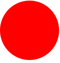
Do you know how to make a red square using CSS? Sure you know!
How about a circle? Piece of cake!
An oval? Hmm, I see you squint; your eyes dimmed a bit and then that light bulb in you flash. Yes, you got it.
How about cut your round cake into 4 quarters? How about we try to make it a donut?
How about we have a bit more fun, throw in a stupefied smiley face and make it go round and round and round? Why? I do not know, I saw someone do it in five lines of code, I think it is cool and deserves a smiley.
Ah, the fabulous world of CSS3! Yep, no more plain, boring old-fashioned CSS that your grandpa used to see in that ancient dial-up AOL age.
I feel like one day maybe I can just order up some CSS-3 to give myself a nice hair-do.
Ok, let’s roll out some CSS.
(Please note, unless specified, all of the following shapes uses the base shape CSS class.)
Check out the jsfiddle here (http://jsfiddle.net/dshun/k5b4sb7z/) for the following CSS shapes.
Square

        .shape {
            width: 200px;
            height: 200px;
            background-color: red;
            margin: 5px;
            float: left;
        }
<div class="shape"></div>
Circle
        .circle {
            border-radius: 50%;
        }
<div class="shape circle"></div>
Oval

        .oval {
            border-radius: 50%;
            height:100px;
        }
<div class="shape oval"></div>
Target (multi-circles)

        .circle.outer {
            position: relative;
        }

        .circle.inner {
            position: absolute;
            top: 24%;
            left: 24%;
            display: block;
            border: 3px solid #fff;
        }

        #circle2 {
            width: 100px;
            height: 100px;
        }

        #circle3 {
            width: 50px;
            height: 50px;
            left: 20%;
        }

        #circle4 {
            width: 25px;
            height: 25px;
            left: 16%;
        }
    <div class="shape circle outer">
            <div class="shape circle inner" id="circle2">
                <div class="shape circle  inner" id="circle3">
                    <div class="shape circle  inner" id="circle4">
                    </div>
                </div>
            </div>
        </div>
Quarter (A Circle With 4 Quarter Pieces)
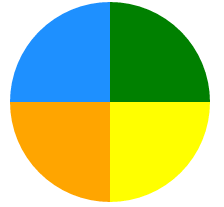
        .quarter-tile {
            position: relative;
            width: 200px;
            height: 200px;
            margin: 5px;
        }

        .tile {
            position: absolute;
            border-radius: 50%;
            width: 200px;
            height: 200px;
        }

        .tile.green {
            background: green;
            clip: rect(0px, 200px, 100px, 100px);
            width: 200px;
        }

        .tile.blue {
            background: dodgerblue;
            clip: rect(0px, 100px, 100px, 0px);
            width: 200px;
        }

        .tile.orange {
            background: orange;
            clip: rect(100px, 100px, 200px, 0px);
            width: 200px;
        }

        .tile.yellow {
            background: yellow;
            clip: rect(100px,200px, 200px, 100px);
            width: 200px;
        }
 <div class="quarter-tile">
        <div class="tile green"></div>
        <div class="tile blue"></div>
        <div class="tile yellow"></div>
        <div class="tile orange"></div>
    </div>
Donut Ring (A Multi-Colored Circle with its Center Hollowed Out)
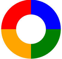
        /**********************donut ring*/
        .donut-ring {
            position: relative;
            width: 200px;
            height: 200px;
        }

        .ring {
            position: absolute;
            width: 50%;
            height: 50%;
        }

        .ring.red {
            top: 0;
            left: 0;
            background-color: red;
            border-radius: 100% 0 0 0;
        }

        .ring.blue {
            top: 0;
            right: 0;
            background-color: blue;
            border-radius: 0 100% 0 0;
        }

        .ring.orange {
            bottom: 0;
            left: 0;
            background-color: orange;
            border-radius: 0 0 0 100%;
        }

        .ring.green {
            bottom: 0;
            right: 0;
            background-color: green;
            border-radius: 0 0 100% 0;
        }

        .cutout {
            width: 50%;
            height: 50%;
            background-color: white;
            position: absolute;
            top: 25%;
            left: 25%;
            border-radius: 50%;
            pointer-events: none;
        }
    <div class="donut-ring">
        <div class="ring red"></div>
        <div class="ring blue"></div>
        <div class="ring orange"></div>
        <div class="ring green"></div>
        <div class="cutout"></div>
    </div>
Finally, A Rotating Smiley (Just to Make You Happy!)
(Please check out here to see your friendly smiley rotating.)

       /* Move in a circle without wrapper elements
         * Idea by Aryeh Gregor, simplified by Lea Verou
        */

        @keyframes rot {
	        from {
		        transform: rotate(0deg)
		                   translate(-100px)
		                   rotate(0deg);
	        }
	        to {
		        transform: rotate(360deg)
		                   translate(-100px)
		                   rotate(-360deg);
	        }
        }

        .smile {
	        width: 40px;
	        height: 40px;
	        position: absolute;
            color:yellow;
	        top: 300px;
	        left: 50%;
	        margin: -20px;
	        font-size: 100px;
	        animation: rot 5s infinite linear;
        }
<div class="smile">?</div>
Credits / References
Sure, I did not pull out the rabbits out of my own hat. I pull them out from other people's magic hats (with modifications). I also have forgotten some of the places from where I learned my tricks, so please send me an angry face when you find out. Thanks!
JsFiddle
JsFiddle is available at http://jsfiddle.net/dshun/k5b4sb7z/.