
ColorPicker - a jQuery UI Widget
4.97/5 (51 votes)
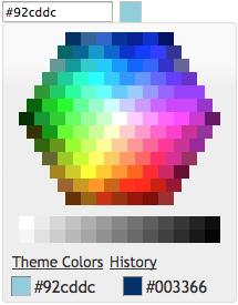
A web color picker which looks like the one in Microsoft Office 2010
Introduction
This project is a web color picker which looks like the one in Microsoft Office 2010. It can be used inline or as a popup binded to a text box. It is a full jQuery UI widget, supporting various configurations and themes.


The project and a live demo are hosted on GitHub.
Using the Code
First, load jQuery (v1.7 or greater), jQuery UI (v1.8 or greater), and the widget code:
<script src="https://ajax.googleapis.com/ajax/libs/jquery/3.5.1/jquery.min.js"
 type="text/javascript" charset="utf-8"></script>
<script src="https://ajax.googleapis.com/ajax/libs/jqueryui/1.12.1/jquery-ui.min.js"
 type="text/javascript" charset="utf-8"></script>
<script src="js/evol.colorpicker.min.js" type="text/javascript" charset="utf-8"></script>
The widget requires a jQuery UI theme to be present, as well as its own included base CSS file "evol.colorpicker.css". Here, we use the "ui-lightness" theme as an example:
<link rel="stylesheet" type="text/css"
 href="http://ajax.googleapis.com/ajax/libs/jqueryui/1.12.1/themes/ui-lightness/jquery-ui.css" />
<link href="css/evol.colorpicker.css" rel="stylesheet" type="text/css" />
Now, let's attach it to an existing <input> tag:
<script type="text/javascript">
   $(document).ready(function() {
       $("#mycolor").colorpicker();
   });
</script>

<input style="width:100px;" id="mycolor" />
This will wrap it into a "holder" <div> and add another <div> beside it for the color box:
<div style="width:128px;">
   <input style="width:100px;" id="mycolor" class="colorPicker evo-cp0" />
   <div class="evo-colorind" style="background-color:#8db3e2"></div>
</div>
Using the same syntax, the widget can also be instantiated on a <div> or a <span> tag to show inline. In that case, the generated HTML is the full palette.
Options
evol.colorpicker provides options to customize its behavior:
color (String)
Used to set the default color value.
    $("#mycolor").colorpicker({
        color: "#ffffff"
    });
Defaults to null.
defaultPalette (String)
Used to set the default color palette. Possible values are "theme" or "web".
    $("#mycolor").colorpicker({
        defaultPalette: 'web'
    });
Defaults to theme.
displayIndicator (Boolean)
Used to show color value on hover and click inside the palette.
    $("#mycolor").colorpicker({
        displayIndicator: false
    });
Defaults to true.
hideButton (Boolean)
Prevent a color button from being added to the textbox the colorpicker is bound to.
    $("#mycolor").colorpicker({
        hideButton: true
    });
Defaults to false.
history (Boolean)
Used to track selection history (shared among all instances of the colorpicker).
    $("#mycolor").colorpicker({
        history: false
    });
Defaults to true.
initialHistory (Array of strings)
Used to provide a color selection history. Colors are provided as strings of hexadecimal color values.
    $("#mycolor").colorpicker({
        initialHistory: ["#ff0000", "#00ff00", "#0000ff"]
    });
Defaults to null.
showOn (String)
Have the colorpicker appear automatically when the field receives focus ("focus"), appear only when a button is clicked ("button"), or appear when either event takes place ("both").
This option only takes effect when the color picker is instantiated on a textbox.
    $("#mycolor").colorpicker({
        showOn: "button"
    });
Defaults to "both".
strings (String)
Used to translate the widget. It is a comma separated list of all labels used in the UI.
    $("#mycolor").colorpicker({
        strings: "Couleurs de themes,Couleurs de base,Plus de couleurs,Moins de couleurs"
    });
Defaults to "Theme Colors,Standard Colors,Web Colors,Theme Colors".
transparentColor (Boolean)
Allow for selection of the "transparent color". The hexadecimal value for it is "#0000ffff".
    $("#mycolor").colorpicker({
        transparentColor: true
    });
Defaults to false.
Events
change.color
This event is triggered when a color is selected.
    $("#mycolor").on("change.color", function(event, color){
        $("#title").attr("style", "background-color:" + color);
    })
mouseover.color
This event is triggered when the mouse moves over a color box on the palette.
    $("#mycolor").on("mouseover.color", function(event, color){
        $('#title').attr("style", "background-color:" + color);
    })
Methods
clear()
Clears the color value (and close the popup palette if opened).
$("#mycolor").colorpicker("clear");
enable()
Get the currently selected color value (returned as a string).
$("#mycolor").colorpicker("enable");
disable()
Get the currently selected color value (returned as a string).
$("#mycolor").colorpicker("disable");
isDisabled()
Get the currently selected color value (returned as a string).
var disabled = $("#mycolor").colorpicker("isDisabled");
val([color])
Get or set the currently selected color value (as a string, i.e., "#d0d0d0").
    var color = $("#mycolor").colorpicker("val");

    $("#mycolor").colorpicker("val", "#d0d0d0");
showPalette()
Show the palette (when using the widget as a popup).
$("#mycolor").colorpicker("showPalette");
hidePalette()
Hide the palette (when using the widget as a popup).
$("#mycolor").colorpicker("hidePalette");
Theming
evol.colorpicker is as easily themeable as any jQuery UI widget, using one of the jQuery UI themes or your own custom theme made with Themeroller.
ui-lightness | ui-darkness | le-frog |
Installation
Colorpicker can be downloaded or forked at GitHub.
It can also be installed from the command line using NPM.
npm install evol-colorpicker
or using Bower.
bower install evol-colorpicker
Browser Support
evol.colorpicker.js has been tested for the following browsers:
- Internet Explorer 7+
- Firefox 9+
- Chrome 21+
- Safari 5+
History
The latest code and a live demo are available at GitHub.
- Original post on 09/03/2012
- Version 2.0 on 01/01/2013: Added options "displayIndicator" and "history" + some bug fixes
- Version 2.1 on 02/17/2013: Not using
$.browseranymore as it is not part of jQuery 1.9 - Version 2.2.1 on 09/07/2014: Compatibility w/ jQuery 2.x and bug fixes
- Version 2.2.2 on 09/20/2014: Small fixes
- Version 3.0.0 on 11/30/2014: Added option for transparent color
- Version 3.1.0 on 12/12/2014: Added option for default color palette
- Version 3.2.0 on 02/28/2015: Added option for color button near
textbox - Version 3.2.2 on 08/09/2015: Added method "
clear" and option "initialHistory". Also, escape key now closes the pop-up palette - Version 3.2.3 on 11/22/2015: Minor bug fixes
- Version 3.4.2 on 5/12/2020: Custom Themes (contributed by Zykino) & dependencies upgrade
- 2.3.