
Responsive Web Design with jQuery Mobile
4.92/5 (5 votes)
This article discusses about how to develop a responsive web site using jQuery Mobile.
Responsive Web Design (RWD)
Over the last few years the devices used to access web applications have grown like anything. We now have mobiles, tablets, desktops, laptops, TV etc. that can be used to access a web site. These all devices vary a lot in sizes. Writing individual applications to cater to all of these different sized and variety of devices is nearly impossible. So we need to design web sites in way that they adjust to the screen size on which they are displayed. The technique developed to solve this problem is Responsive Web Design.
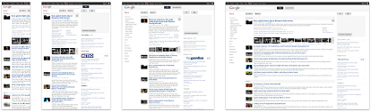
Responsive web design is a series of techniques and technologies that are combined to make delivering a single application across a range of devices as practical as possible. Below is an example of how Google news site looks on different devices.
Pillars of Responsive Design
Fluid Grids
A grid is a way to manage space in a layout in the web world. Fluid grids refer to flexible grid-based layouts that use relative sizing. Traditionally the grids were specified with fixed width columns with widths specified in pixels. But for responsive web design the grid columns widths should be relative to their containers. This helps the responsive web applications to adapt to different screen sizes. In responsive web design the widths are expressed in percentage most of the time.
Media Queries
Media queries assess the capabilities of device browser and apply styles based on the capabilities that match the query criteria. Media queries enable the web application to adjust itself for optimal viewing based on the browser capabilities.
Flexible Images and Media
This feature enables the images and other media to adapt according to the different device sizes and display resolutions. The most basic technique to adapt images and media is by using scaling or CSS overflow property. Though these techniques adapt the image according to the device size but the image download still take up the user’s mobile bandwidth. For better user experience one can use different set of images and media for different devices.
jQuery Mobile Framework
The jQuery Mobile Framework is an open source cross-platform UI framework. It is built using HTML5, CSS3, and the very popular jQuery JavaScript library, and it follows Open Web standards. It provides touch-friendly UI widgets that are specially styled for mobile devices. It has a powerful theming framework to style your applications. It supports AJAX for various tasks, such as page navigation and transitions.
How jQuery Mobile supports RWD?
Unified UI
jQuery Mobile delivers unified user experience by designing to HTML5 and CSS3. A single jQuery codebase will render consistently across all supported platforms without needing any customizations.
Progressive Enhancement
Progressive enhancement defines layers of compatibility that allow any user to access the basic content, services, and functionality of a website, while providing an enhanced experience for browsers with better support of standards. jQuery Mobile is totally built using this technique. Below is an example of how a page built using jQuery Mobile will look on a basic phone as well as feature rich phone.
CSS Selector
jQuery Mobile has predefined set of CSS classes that it applies to the HTML elements depending on the current orientation or size of the device.
Orientation Classes
If the device is in landscape mode, jQuery Mobile will apply .landscape class to the HTML elements. Similarly if the device is in portrait mode, .portrait class is applied by jQuery Mobile to the HTML elements. One can override these orientation selectors in application CSS to define new styles for application on device orientation. For example if we want to have an image background in portrait orientation, we can have following CSS rule:
.portrait section {
       background-image: url(images/portrait-background.png);
}
The above rule will set the background image if the device is in portrait mode. In the landscape mode the application will have the default background.
Breakpoint Classes
In addition to orientation changes, jQuery Mobile provides CSS Selectors for handling different screen sizes. jQuery Mobile refers to these as breakpoint classes. jQuery Mobile has defined screen size breakpoints at 320 pixels, 480 pixels, 1024 pixels etc. Corresponding to these sizes, min-width and max-width CSS classes are defined in jQuery Mobile like min-width-320px, min-width-480px, max-width-1024px etc.
As with orientation classes, jQuery Mobile applies these breakpoint classes to the HTML elements depending on the screen size. These can be defined in the application CSS to override the default behavior. For example if we wanted to have different background images depending on the screen size, the following CSS could be used:
.min-width-320px section, .max-width-480px section {
    background-image: url(images/login-bg-320.jpg);
}

.min-width-480px section, .max-width-768px section {
    background-image: url(images/login-bg-480.jpg);
}
The above CSS will load login-bg-320.jpg if the size is between 320 and 480 pixels wide and login-bg-480.jpg if the size is between 480 and 768 pixels.
Flexible Layout
In jQuery Mobile most of the components and form elements are designed to be of flexible width so that they comfortably fit the width of any device. Additionally form elements and labels are represented differently based on the screen size. On smaller screens, labels are stacked on the top of form element while on wider screens, labels and elements are styled to be on the same line in 2 column grid layout.


Grid Layout
jQuery Mobile has built in flexible grid layout. The grids are 100% in width, completely invisible and do not have padding or margins. Hence they did not interfere with the styling of components placed inside them. jQuery Mobile grid layout can be used to create layout with two to five columns. The columns widths are adjusted according to the screen width and number of columns. There are predefined layouts defined for creating grid. These are named as ui-grid-a (2 columns grid), ui-grid-b (3 columns grid), ui-grid-c (4 columns grid) and ui-grid-d (5 columns grid). Within the grid container, child elements are assigned ui-block-a/b/c/d/e in a sequential manner which makes each "block" element float side-by-side, forming the grid.
The default behavior of grids in jQuery Mobile is to lay the columns side by side. But for the application to respond to screen sizes we require the columns to be stacked on smaller screens. jQuery Mobile provides a CSS style to make this happen. The style name is ui-responsive. When this style is added to the grid container the grid columns would be stacked if the screen width is below 560px and on bigger screens the grid would be represented in multi-column layout.

Responsive Tables
This is a newly added feature to jQuery Mobile. This allows us to display large amount of tabular data in a way that looks good on both mobiles and desktops. There are two modes of responsive tables:
Reflow: This mode vertically stacks the cells in rows by default so that the data could be easily readable on mobile phones. Additional style needs to be applied to make the table display in traditional row-column format. This is the default mode for tables defined using data-role=’table’.


Column Toggle: This mode hides the low priority columns at narrower widths. The column priority is specified using data-priority attribute in <th> element. The priority can be between 1 (Highest) and 6 (Lowest). If data-priority attribute is missing for a column then that column is always displayed. A “Column…” button is added alongside the table to allow users to show/hide the columns.


Similar to grid layouts the preset breakpoint ui-responsive can also be applied to tables. This will make the tables responsive.
Media Queries
In addition to the preset breakpoints, the CSS3 media queries can easily be used with jQuery Mobile. As jQuery Mobile is a JavaScript framework for HTML sites, media queries work seamlessly with jQuery Mobile. One can easily define and apply new media queries to jQuery Mobile applications. For example, if we want the grid to be stacked when the screen width is 720px or less, we can define the media query like the following:
/* stack all grids below 45em (720px) */
@media all and (max-width: 45em) {
    .grid-breakpoint .ui-block-a,
    .grid-breakpoint .ui-block-b,
    .grid-breakpoint .ui-block-c,
    .grid-breakpoint .ui-block-d,
    .grid-breakpoint .ui-block-e {
        width: 100%;
        float: none;
    }
}
Conclusion
As we can see jQuery Mobile is built keeping responsive design in mind. It provides a lot of out of box features to support responsive design. One of the advantages of jQuery Mobile is that it provides a base framework which is well tested to be working fine on various screen sizes and browsers. This makes it easier to develop applications using jQuery Mobile as one can concentrate on the application features without worrying about the cross browser compatibility and screen size issues.