Click here to Skip to main content
15,891,253 members
Articles / Desktop Programming / WPF
Tip/Trick

WPF TreeView with WinForms Style Fomat

Rate me:
Please Sign up or sign in to vote.
4.78/5 (25 votes)
23 Jan 2015CPOL2 min read 79.8K   2.8K   41   14
A WPF TreeView with connecting lines and Plus-minus Toggle button like WinForms

Note: Kenneth Haugland has posted a better solution on this article: Examples of Attached Behaviors in WPF

In case you load all TreeViewItems at one time to TreeView control (that means you don't add or remove item after showing it), my article solution may be more lightweight.

Introduction

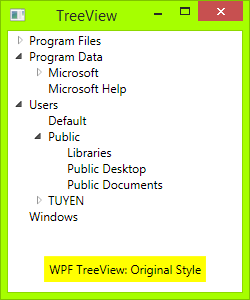
WPF default TreeView is very good, but many people still want it to have lines join each of its child elements, like Windows Forms TreeView, including me. I have searched on the internet and have some examples, but they were not designed well enough.

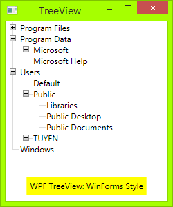
Now, I myself designed a TreeView with style as WinForms. Hope this will help many people!

Table of Contents

Source Code

All you need is an XAML file and a code behind.

First, you need draw Toggle Button: From Triangle button to Plus-Minus button: draw a rectangle with dark border, then draw two lines, one vertical line and one horizontal line. When TreeViewItem is expanded, the vertical line will hide:

XML
<!-- Toggle Button -->
<Style x:Key="ExpandCollapseToggleStyle" TargetType="ToggleButton">
    <Setter Property="Focusable" Value="False"/>
    <Setter Property="Template">
        <Setter.Value>
            <ControlTemplate TargetType="ToggleButton">
                <Grid Width="15" Height="13" SnapsToDevicePixels="True">
<!-- Rectangle 9x9 pixels -->
                    <Rectangle Width="9" Height="9" 
                    Stroke="#919191" SnapsToDevicePixels="true">
                        <Rectangle.Fill>
                            <LinearGradientBrush EndPoint="0.5,2" StartPoint="0.5,0">
                                <GradientStop Color="White" Offset="0"/>
                                <GradientStop Color="Silver" Offset="0.5"/>
                                <GradientStop Color="LightGray" Offset="1"/>
                            </LinearGradientBrush>
                        </Rectangle.Fill>
                    </Rectangle>
<!-- Vertical line inside rectangle -->
                    <Rectangle x:Name="ExpandPath" Width="1" 
                    Height="5" Stroke="Black" SnapsToDevicePixels="true"/>
<!-- Horizontal line inside rectangle -->
                    <Rectangle Width="5" Height="1" 
                    Stroke="Black" SnapsToDevicePixels="true"/>
                </Grid>
                <ControlTemplate.Triggers>
                    <Trigger Property="IsChecked" Value="True">
                        <Setter Property="Visibility"  
                        TargetName="ExpandPath" Value="Collapsed"/>
                    </Trigger>
                </ControlTemplate.Triggers>
            </ControlTemplate>
        </Setter.Value>
    </Setter>
</Style>  

In the above code, you can see a trigger, it will make the vertical line inside toggle button hide if item is expanded, or show if its children collapsed.

Then, you need to draw vertical and horizontal connecting lines between nodes: You need to redesign TreeViewItem control. Add these connecting lines:

XML
 <!-- Horizontal line -->
<Rectangle x:Name="HorLn" Margin="9,1,0,0" Height="1" 
Stroke="#DCDCDC" SnapsToDevicePixels="True"/>
<!-- Vertical line -->
<Rectangle x:Name="VerLn" Width="1" Stroke="#DCDCDC" 
Margin="0,0,1,0" Grid.RowSpan="2" SnapsToDevicePixels="true" 
Fill="White"/>

to your TreeViewItem template like this:

XML
<!-- TreeViewItem -->
<Style x:Key="{x:Type TreeViewItem}" TargetType="{x:Type TreeViewItem}">
    <Setter Property="Template">
        <Setter.Value>
            <ControlTemplate TargetType="{x:Type TreeViewItem}">
                <Grid>
                    <Grid.ColumnDefinitions>
                        <ColumnDefinition MinWidth="19" Width="Auto"/>
                        <ColumnDefinition Width="Auto"/>
                        <ColumnDefinition Width="*"/>
                    </Grid.ColumnDefinitions>
                    <Grid.RowDefinitions>
                        <RowDefinition Height="Auto"/>
                        <RowDefinition/>
                    </Grid.RowDefinitions>

                    <!-- Connecting Lines -->
                    <!-- Horizontal line -->
                    <Rectangle x:Name="HorLn" Margin="9,1,0,0" Height="1" 
			Stroke="#DCDCDC" SnapsToDevicePixels="True"/>
                    <!-- Vertical line -->
                    <Rectangle x:Name="VerLn" Width="1" 
                    Stroke="#DCDCDC" Margin="0,0,1,0" Grid.RowSpan="2" 
                    SnapsToDevicePixels="true" Fill="White"/>
                    <!-- Insert Toggle Button -->
                    <ToggleButton Margin="-1,0,0,0" x:Name="Expander" 
                    Style="{StaticResource ExpandCollapseToggleStyle}" 
                    IsChecked="{Binding Path=IsExpanded, 
                    RelativeSource={RelativeSource TemplatedParent}}" ClickMode="Press"/>
                    <Border Name="Bd" Grid.Column="1" 
                    Background="{TemplateBinding Background}" 
                    BorderBrush="{TemplateBinding BorderBrush}" 
                    BorderThickness="{TemplateBinding BorderThickness}" 
                    Padding="{TemplateBinding Padding}" SnapsToDevicePixels="True">
                        <ContentPresenter x:Name="PART_Header" 
                        ContentSource="Header" 
                        HorizontalAlignment="{TemplateBinding HorizontalContentAlignment}" 
                        MinWidth="20"/>
                    </Border>
                    <ItemsPresenter x:Name="ItemsHost" Grid.Row="1" 
                    Grid.Column="1" Grid.ColumnSpan="2"/>
                </Grid>
            </ControlTemplate>
        </Setter.Value>
    </Setter>
</Style> 

Then, you need put the class TreeViewLineConverter to your namespace. This class will change the connecting lines if the item is the last in the list:

C#
using System;
using System.Windows;
using System.Windows.Controls;
using System.Windows.Data;

namespace TreeViewEx
{
    public partial class MainWindow : Window
    {
        public MainWindow()
        {
            InitializeComponent();
        }
    }

    class TreeViewLineConverter : IValueConverter
    {
        public object Convert(object value, Type targetType, 
        object parameter, System.Globalization.CultureInfo culture)
        {
            TreeViewItem item = (TreeViewItem)value;
            ItemsControl ic = ItemsControl.ItemsControlFromItemContainer(item);
            return ic.ItemContainerGenerator.IndexFromContainer(item) == ic.Items.Count - 1;
        }

        public object ConvertBack(object value, Type targetType, 
        object parameter, System.Globalization.CultureInfo culture)
        {
            return false;
        }
    }
} 

Insert your namespace to your XAML, i.e.:

XML
<Window x:Class="TreeViewEx.MainWindow"
        xmlns="http://schemas.microsoft.com/winfx/2006/xaml/presentation"
        xmlns:x="http://schemas.microsoft.com/winfx/2006/xaml"
        xmlns:local="clr-namespace:TreeViewEx"/> 

Add this line to Window.Resources:

XML
<local:TreeViewLineConverter x:Key="LineConverter"/>  

Add trigger to TreeViewItem template, this trigger changes the connecting lines if the item is the last in the list:

XML
<!-- This trigger changes the connecting lines if the item is the last in the list -->
<DataTrigger Binding="{Binding RelativeSource={RelativeSource Self}, 
Converter={StaticResource LineConverter}}" Value="true">
    <Setter TargetName="VerLn" Property="Height" Value="9"/>
    <Setter TargetName="VerLn" Property="VerticalAlignment" Value="Top"/>
</DataTrigger> 

The TreeView will have WinForms style now. You can add more trigger to control behavior of TreeView if you want. The full trigger can be found in the attached file.

To Do

There is a problem with vertical line when you add a new TreeViewItem into TreeView, then the connecting line is not updated:

Problem

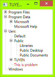
This problem also occurs when you change font size of treeview item.

If you know how to fix this issue, please post it as a comment. Thank you!

Reference

This is the code I referenced before I wrote my own:

My rewrite code is almost the same as that, the differences are:

  • Changed triangle toggle button to plus-minus button
  • Adjusted better position/size of connecting lines
  • Added some explanation and pointed out the issue

History

  • 10/24/2013: First release
  • 01/28/2015: Minor update

License

This article, along with any associated source code and files, is licensed under The Code Project Open License (CPOL)


Written By
Software Developer
Vietnam Vietnam
My English is not very good and I know this. So, if you find any translation bugs, misspelled words or sentences on these pages, please, drop a line to my email.

Comments and Discussions

 
QuestionMessage Closed Pin
7-Aug-21 23:32
Member 153168707-Aug-21 23:32 
GeneralMy vote of 5 Pin
Member 153168707-Aug-21 23:30
Member 153168707-Aug-21 23:30 
PraiseTip for Data Binding Pin
khatcher24-Feb-21 8:34
khatcher24-Feb-21 8:34 
SuggestionA Simple Solution Pin
iDream202015-Dec-20 21:43
iDream202015-Dec-20 21:43 
GeneralRe: A Simple Solution Pin
Member 1544500826-Nov-21 13:21
Member 1544500826-Nov-21 13:21 
QuestionMy vote of 4 Pin
Kenneth Haugland14-Apr-15 3:40
mvaKenneth Haugland14-Apr-15 3:40 
AnswerRe: My vote of 4 Pin
TuyenTk19-Apr-15 15:59
professionalTuyenTk19-Apr-15 15:59 
GeneralRe: My vote of 4 Pin
Kenneth Haugland19-Apr-15 20:11
mvaKenneth Haugland19-Apr-15 20:11 
That's what one of the replies did in his code here[^](Same linke as your referance). If you create a new class in C# like this:
C#
using System;
using System.Windows;
using System.Windows.Controls;
using System.Windows.Controls.Primitives;

namespace WindowsApplication3
{
  public class TVIExtender
  {
    private TreeViewItem _item;

    public static DependencyProperty UseExtenderProperty =
      DependencyProperty.RegisterAttached("UseExtender", typeof(bool), typeof(TVIExtender),
                                          new PropertyMetadata(false, new PropertyChangedCallback(OnChangedUseExtender)));

    public static bool GetUseExtender(DependencyObject sender)
    {
      return (bool)sender.GetValue(UseExtenderProperty);
    }
    public static void SetUseExtender(DependencyObject sender, bool useExtender)
    {
      sender.SetValue(UseExtenderProperty, useExtender);
    }

    private static void OnChangedUseExtender(DependencyObject sender, DependencyPropertyChangedEventArgs e)
    {
      TreeViewItem item = sender as TreeViewItem;
      if (null != item)
      {
        if ((bool)e.NewValue)
        {
          if (item.ReadLocalValue(ItemExtenderProperty) == DependencyProperty.UnsetValue)
          {
            TVIExtender extender = new TVIExtender(item);
            item.SetValue(ItemExtenderProperty, extender);
          }
        }
        else
        {
          if (item.ReadLocalValue(ItemExtenderProperty) != DependencyProperty.UnsetValue)
          {
            TVIExtender extender = (TVIExtender)item.ReadLocalValue(ItemExtenderProperty);
            extender.Detach();
            item.SetValue(ItemExtenderProperty, DependencyProperty.UnsetValue);
          }
        }
      }
    }

    public static DependencyProperty ItemExtenderProperty =
      DependencyProperty.RegisterAttached("ItemExtender", typeof(TVIExtender), typeof(TVIExtender));

    public static DependencyProperty IsLastOneProperty =
      DependencyProperty.RegisterAttached("IsLastOne", typeof(bool), typeof(TVIExtender));

    public static bool GetIsLastOne(DependencyObject sender)
    {
      return (bool)sender.GetValue(IsLastOneProperty);
    }
    public static void SetIsLastOne(DependencyObject sender, bool isLastOne)
    {
      sender.SetValue(IsLastOneProperty, isLastOne);
    }

    public TVIExtender(TreeViewItem item)
    {
      _item = item;

      ItemsControl ic = ItemsControl.ItemsControlFromItemContainer(_item);
      ic.ItemContainerGenerator.ItemsChanged += OnItemsChangedItemContainerGenerator;

      _item.SetValue(IsLastOneProperty,
               ic.ItemContainerGenerator.IndexFromContainer(_item) == ic.Items.Count - 1);
    }

    void OnItemsChangedItemContainerGenerator(object sender, ItemsChangedEventArgs e)
    {
      ItemsControl ic = ItemsControl.ItemsControlFromItemContainer(_item);

      if (null != ic)
        _item.SetValue(IsLastOneProperty,
                       ic.ItemContainerGenerator.IndexFromContainer(_item) == ic.Items.Count - 1);
    }

    private void Detach()
    {
      if (_item != null)
      {
        ItemsControl ic = ItemsControl.ItemsControlFromItemContainer(_item);
        ic.ItemContainerGenerator.ItemsChanged -= OnItemsChangedItemContainerGenerator;

        _item = null;
      }
    }
  }
}

The real clue here is that he attatch a handle to the ItemsChange:
C#
ic.ItemContainerGenerator.ItemsChanged += OnItemsChangedItemContainerGenerator;
And this will get triggered each time the TreeView gets a new item. And he also has some code to remove the handle in the Detatch section.

Now you replace some section of the XAML code, as AlexP explained, and the new code looks like this:
XML
<!-- TreeViewItem -->
      <Style x:Key="{x:Type TreeViewItem}" TargetType="{x:Type TreeViewItem}">
          <Setter Property="local:TVIExtender.UseExtender" Value="True"/>
          <Setter Property="Background" Value="Transparent"/>
          <Setter Property="Padding" Value="1,0,0,0"/>
          <Setter Property="Template">
              <Setter.Value>
                  <ControlTemplate TargetType="{x:Type TreeViewItem}">
                      <Grid>
                          <Grid.ColumnDefinitions>
                              <ColumnDefinition MinWidth="19" Width="Auto"/>
                              <ColumnDefinition Width="Auto"/>
                              <ColumnDefinition Width="*"/>
                          </Grid.ColumnDefinitions>
                          <Grid.RowDefinitions>
                              <RowDefinition Height="Auto"/>
                              <RowDefinition/>
                          </Grid.RowDefinitions>

                          <!-- Connecting Lines -->
                          <Rectangle x:Name="HorLn" Margin="9,1,0,0" Height="1" Stroke="Black" SnapsToDevicePixels="True"/>
                          <Rectangle x:Name="VerLn" Width="1" Stroke="Black" Margin="0,0,1,0" Grid.RowSpan="2" SnapsToDevicePixels="true" Fill="White"/>
                          <ToggleButton Margin="-1,0,0,0" x:Name="Expander" Style="{StaticResource ExpandCollapseToggleStyle}" IsChecked="{Binding Path=IsExpanded, RelativeSource={RelativeSource TemplatedParent}}" ClickMode="Press"/>
                          <Border Name="Bd" Grid.Column="1" Background="{TemplateBinding Background}" BorderBrush="{TemplateBinding BorderBrush}" BorderThickness="{TemplateBinding BorderThickness}" Padding="{TemplateBinding Padding}" SnapsToDevicePixels="True">
                              <ContentPresenter x:Name="PART_Header" ContentSource="Header" HorizontalAlignment="{TemplateBinding HorizontalContentAlignment}" MinWidth="20"/>
                          </Border>
                          <ItemsPresenter x:Name="ItemsHost" Grid.Row="1" Grid.Column="1" Grid.ColumnSpan="2"/>
                      </Grid>
                      <ControlTemplate.Triggers>

                          <!-- This trigger changes the connecting lines if the item is the last in the list -->
                          <Trigger Property="local:TVIExtender.IsLastOne" Value="True">
                              <Setter TargetName="VerLn" Property="Height" Value="9"/>
                              <Setter TargetName="VerLn" Property="VerticalAlignment" Value="Top"/>
                          </Trigger>

                          <Trigger Property="IsExpanded" Value="false">
                              <Setter TargetName="ItemsHost" Property="Visibility" Value="Collapsed"/>
                          </Trigger>
                          <Trigger Property="HasItems" Value="false">
                              <Setter TargetName="Expander" Property="Visibility" Value="Hidden"/>
                          </Trigger>
                          <MultiTrigger>
                              <MultiTrigger.Conditions>
                                  <Condition Property="HasHeader" Value="false"/>
                                  <Condition Property="Width" Value="Auto"/>
                              </MultiTrigger.Conditions>
                              <Setter TargetName="PART_Header" Property="MinWidth" Value="75"/>
                          </MultiTrigger>
                          <MultiTrigger>
                              <MultiTrigger.Conditions>
                                  <Condition Property="HasHeader" Value="false"/>
                                  <Condition Property="Height" Value="Auto"/>
                              </MultiTrigger.Conditions>
                              <Setter TargetName="PART_Header" Property="MinHeight" Value="19"/>
                          </MultiTrigger>
                          <Trigger Property="IsSelected" Value="true">
                              <Setter TargetName="Bd" Property="Background" Value="{DynamicResource {x:Static SystemColors.HighlightBrushKey}}"/>
                              <Setter Property="Foreground" Value="{DynamicResource {x:Static SystemColors.HighlightTextBrushKey}}"/>
                          </Trigger>
                          <MultiTrigger>
                              <MultiTrigger.Conditions>
                                  <Condition Property="IsSelected" Value="true"/>
                                  <Condition Property="IsSelectionActive" Value="false"/>
                              </MultiTrigger.Conditions>
                              <Setter TargetName="Bd" Property="Background" Value="Blue"/>
                              <Setter Property="Foreground" Value="White"/>
                          </MultiTrigger>
                          <Trigger Property="IsEnabled" Value="false">
                              <Setter Property="Foreground" Value="{DynamicResource {x:Static SystemColors.GrayTextBrushKey}}"/>
                          </Trigger>
                      </ControlTemplate.Triggers>
                  </ControlTemplate>
              </Setter.Value>
          </Setter>
      </Style>
And the problem is gone. Smile | :)

Oh, and there is no need for the value converter any more, as the property now comes from this attached behavior instead.
GeneralRe: My vote of 4 Pin
Kenneth Haugland21-May-15 5:19
mvaKenneth Haugland21-May-15 5:19 
GeneralMy vote of 5 Pin
Member 1126773327-Jan-15 5:33
Member 1126773327-Jan-15 5:33 
GeneralRe: My vote of 5 Pin
TuyenTk27-Jan-15 20:12
professionalTuyenTk27-Jan-15 20:12 
QuestionNice Pin
Sacha Barber23-Jan-15 9:20
Sacha Barber23-Jan-15 9:20 
GeneralThank you Pin
Zalmo Degikos22-Jan-15 3:12
Zalmo Degikos22-Jan-15 3:12 
QuestionMy vote of 5 Pin
Member 1069183912-Apr-14 14:13
Member 1069183912-Apr-14 14:13 

General General    News News    Suggestion Suggestion    Question Question    Bug Bug    Answer Answer    Joke Joke    Praise Praise    Rant Rant    Admin Admin   

Use Ctrl+Left/Right to switch messages, Ctrl+Up/Down to switch threads, Ctrl+Shift+Left/Right to switch pages.