Menu items without icons look poorly because of extremely poor alignment and redundant separators, and those with icons cannot be properly rendered as the menu font increases. The issue is so bad that many people asked how to remove the icon area of all menu items completely. Not all solutions for removing the icon area are satisfactory but, more importantly, the real goal is to keep all the essential existing elements of the menu with correct alignment and scaling. This article is an attempt to solve this problem through a minimal set of changes to the default MenuItem Template.
Contents
Why are they so Ugly?
Improved Look
Analysis
Solution
Testing
Conclusions
Why are they so Ugly?
Why do the menu items look so ugly? Let’s see. First, let’s create the menu without any icons:
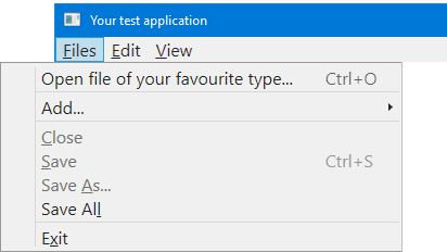
This is what most people complained about: there is a visually empty cell on the left. It is designed to show an icon, but without an icon, it all looks disturbing, like The Headless Horseman. People asked, first of all, to remove this area and give up icons. There are many solutions, and I found them unsatisfactory. More importantly, why give up icons? It would be much nicer to have them at least optionally, but with proper rendering.
It looks much better if all or most menu items in the popup area of a parent menu item have icons:

Is it good enough? Not at all! To see the problem, let’s enlarge the menu font:
Now, the icons are not rendered properly. Here I’m using characters for icons, for simplicity, and some other good reasons, and it does work. Note that with a non-default font size, the character, representing a glyph is not aligned with the characters of the menu headers. If I use a bitmap glyph with the size exactly 16x16, it always fits, but looks misaligned with text. With different image sizes, some other problems with rendering appear, but, generally, rendering of anything with larger sizes is never accurate. Needless to say, the attempt to match sizes for every required font would be quite a bad idea. Not only it is totally unreliable, but it means killing the maintenance.
WPF Menu works with textual menu items of the type MenuItem and icons represented by data of arbitrary type.
Improved Look
Isn’t it better?
The image above shows my final result. I intentionally made the font pretty large to show all the details. Before discussing the problem and the solution, let’s look at it. Is it perfect? No, it is not. First, I had to sacrifice the vertical separator between the icon and the header areas. Is it acceptable? You decide. I would say, this look is not perfectly fine, but still better than without a fix.
And for those who chose not to use those horizontal menu separators, not having the vertical separator is even better by all counts. Moreover, the icons of different menu items became centered around the same vertical line.
I tested many font sizes, even going to extremes, and different contents — everything works.
Now, let’s discuss the solution.
Analysis
When I looked at a default WPF MenuItem template from Microsoft, I found a bloody mess of many hard-coded values affecting the sizes and layout of the items. It seems obvious that the Menu control is designed to be used with a default fixed font and the icons of only one fixed size, 16x16. In other words, this is a typical example of ad hoc layout, from my point of view — one big design bug.
However, the structure is a bit too complicated and can be broken easily. I’ve tried to modify it as conservatively as possible. First of all, I found that the size 16 found in several places is redundant and can be removed. I also found that there is a limitation to the height of the items, the limit is equal to 22. I decided to remove it not everywhere, but only from the Grid row sizes. I worked out.
The most difficult problem is the vertical separator between the icon and the header areas. It can be found in XAM by my comments “SA!!!”. I decided to give it up and remove it because its correct placement would require a radical restructuring of everything. In the default XAML code, three Grid elements overlap in the same Grid.Raw, so the layout of the Rectangle representing the separator is defined by the hard-coded Margins attribute. I understand that this is a trick done to align all the separators of several stacked menu items, but this is a bad practice. Note that other WPF controls (ListView, DataGrid) don’t have this problem.
Solution
This code can be used as a separate ResourceDictionary file:
<ResourceDictionary xmlns="http://schemas.microsoft.com/winfx/2006/xaml/presentation"
xmlns:x="http://schemas.microsoft.com/winfx/2006/xaml">
<SolidColorBrush x:Key="Menu.Static.Background" Color="#FFF0F0F0"/>
<SolidColorBrush x:Key="Menu.Static.Border" Color="#FF999999"/>
<SolidColorBrush x:Key="Menu.Static.Foreground" Color="#FF212121"/>
<SolidColorBrush x:Key="Menu.Disabled.Foreground" Color="#FF707070"/>
<SolidColorBrush x:Key="MenuItem.Selected.Background" Color="#3D26A0DA"/>
<SolidColorBrush x:Key="MenuItem.Selected.Border" Color="#FF26A0DA"/>
<SolidColorBrush x:Key="MenuItem.Highlight.Background" Color="#3D26A0DA"/>
<SolidColorBrush x:Key="MenuItem.Highlight.Border" Color="#FF26A0DA"/>
<SolidColorBrush x:Key="MenuItem.Highlight.Disabled.Background" Color="#0A000000"/>
<SolidColorBrush x:Key="MenuItem.Highlight.Disabled.Border" Color="#21000000"/>
<MenuScrollingVisibilityConverter x:Key="MenuScrollingVisibilityConverter"/>
<Geometry x:Key="DownArrow">M 0,0 L 3.5,4 L 7,0 Z</Geometry>
<Geometry x:Key="UpArrow">M 0,4 L 3.5,0 L 7,4 Z</Geometry>
<Geometry x:Key="RightArrow">M 0,0 L 4,3.5 L 0,7 Z</Geometry>
<Geometry x:Key="Checkmark">F1 M 10.0,1.2 L 4.7,9.1 L 4.5,9.1 L 0,5.2 L 1.3,3.5 L 4.3,6.1L 8.3,0 L 10.0,1.2 Z</Geometry>
<Style x:Key="MenuScrollButton" BasedOn="{x:Null}" TargetType="{x:Type RepeatButton}">
<Setter Property="ClickMode" Value="Hover"/>
<Setter Property="Template">
<Setter.Value>
<ControlTemplate TargetType="{x:Type RepeatButton}">
<Border x:Name="templateRoot" Background="Transparent" BorderBrush="Transparent" BorderThickness="1" SnapsToDevicePixels="true">
<ContentPresenter HorizontalAlignment="Center" Margin="6" VerticalAlignment="Center"/>
</Border>
</ControlTemplate>
</Setter.Value>
</Setter>
</Style>
<Style x:Key="{ComponentResourceKey ResourceId=MenuScrollViewer, TypeInTargetAssembly={x:Type FrameworkElement}}" BasedOn="{x:Null}" TargetType="{x:Type ScrollViewer}">
<Setter Property="HorizontalScrollBarVisibility" Value="Hidden"/>
<Setter Property="VerticalScrollBarVisibility" Value="Auto"/>
<Setter Property="Template">
<Setter.Value>
<ControlTemplate TargetType="{x:Type ScrollViewer}">
<Grid SnapsToDevicePixels="true">
<Grid.ColumnDefinitions>
<ColumnDefinition Width="*"/>
</Grid.ColumnDefinitions>
<Grid.RowDefinitions>
<RowDefinition Height="Auto"/>
<RowDefinition Height="*"/>
<RowDefinition Height="Auto"/>
</Grid.RowDefinitions>
<Border Grid.Column="0" Grid.Row="1">
<ScrollContentPresenter CanContentScroll="{TemplateBinding CanContentScroll}" Margin="{TemplateBinding Padding}"/>
</Border>
<RepeatButton Command="{x:Static ScrollBar.LineUpCommand}" CommandTarget="{Binding RelativeSource={RelativeSource TemplatedParent}}" Grid.Column="0" Focusable="false" Grid.Row="0" Style="{StaticResource MenuScrollButton}">
<RepeatButton.Visibility>
<MultiBinding ConverterParameter="0" Converter="{StaticResource MenuScrollingVisibilityConverter}" FallbackValue="Visibility.Collapsed">
<Binding Path="ComputedVerticalScrollBarVisibility" RelativeSource="{RelativeSource TemplatedParent}"/>
<Binding Path="VerticalOffset" RelativeSource="{RelativeSource TemplatedParent}"/>
<Binding Path="ExtentHeight" RelativeSource="{RelativeSource TemplatedParent}"/>
<Binding Path="ViewportHeight" RelativeSource="{RelativeSource TemplatedParent}"/>
</MultiBinding>
</RepeatButton.Visibility>
<Path Data="{StaticResource UpArrow}" Fill="{StaticResource Menu.Static.Foreground}"/>
</RepeatButton>
<RepeatButton Command="{x:Static ScrollBar.LineDownCommand}" CommandTarget="{Binding RelativeSource={RelativeSource TemplatedParent}}" Grid.Column="0" Focusable="false" Grid.Row="2" Style="{StaticResource MenuScrollButton}">
<RepeatButton.Visibility>
<MultiBinding ConverterParameter="100" Converter="{StaticResource MenuScrollingVisibilityConverter}" FallbackValue="Visibility.Collapsed">
<Binding Path="ComputedVerticalScrollBarVisibility" RelativeSource="{RelativeSource TemplatedParent}"/>
<Binding Path="VerticalOffset" RelativeSource="{RelativeSource TemplatedParent}"/>
<Binding Path="ExtentHeight" RelativeSource="{RelativeSource TemplatedParent}"/>
<Binding Path="ViewportHeight" RelativeSource="{RelativeSource TemplatedParent}"/>
</MultiBinding>
</RepeatButton.Visibility>
<Path Data="{StaticResource DownArrow}" Fill="{StaticResource Menu.Static.Foreground}"/>
</RepeatButton>
</Grid>
</ControlTemplate>
</Setter.Value>
</Setter>
</Style>
<ControlTemplate x:Key="{ComponentResourceKey ResourceId=TopLevelItemTemplateKey, TypeInTargetAssembly={x:Type MenuItem}}" TargetType="{x:Type MenuItem}">
<Border x:Name="templateRoot" Background="{TemplateBinding Background}" BorderBrush="{TemplateBinding BorderBrush}" BorderThickness="{TemplateBinding BorderThickness}" SnapsToDevicePixels="true">
<Grid VerticalAlignment="Center">
<Grid.ColumnDefinitions>
<ColumnDefinition Width="Auto"/>
<ColumnDefinition Width="Auto"/>
</Grid.ColumnDefinitions>
<ContentPresenter x:Name="Icon" ContentSource="Icon" HorizontalAlignment="Center" Margin="3" SnapsToDevicePixels="{TemplateBinding SnapsToDevicePixels}" VerticalAlignment="Center" />
<Path x:Name="GlyphPanel" Data="{StaticResource Checkmark}" FlowDirection="LeftToRight" Fill="{StaticResource Menu.Static.Foreground}" Margin="3" VerticalAlignment="Center" Visibility="Collapsed"/>
<ContentPresenter ContentSource="Header" Grid.Column="1" Margin="{TemplateBinding Padding}" RecognizesAccessKey="True" SnapsToDevicePixels="{TemplateBinding SnapsToDevicePixels}"/>
</Grid>
</Border>
<ControlTemplate.Triggers>
<Trigger Property="Icon" Value="{x:Null}">
<Setter Property="Visibility" TargetName="Icon" Value="Collapsed"/>
</Trigger>
<Trigger Property="IsChecked" Value="true">
<Setter Property="Visibility" TargetName="GlyphPanel" Value="Visible"/>
<Setter Property="Visibility" TargetName="Icon" Value="Collapsed"/>
</Trigger>
<Trigger Property="IsHighlighted" Value="True">
<Setter Property="Background" TargetName="templateRoot" Value="{StaticResource MenuItem.Highlight.Background}"/>
<Setter Property="BorderBrush" TargetName="templateRoot" Value="{StaticResource MenuItem.Highlight.Border}"/>
</Trigger>
<Trigger Property="IsEnabled" Value="False">
<Setter Property="TextElement.Foreground" TargetName="templateRoot" Value="{StaticResource Menu.Disabled.Foreground}"/>
<Setter Property="Fill" TargetName="GlyphPanel" Value="{StaticResource Menu.Disabled.Foreground}"/>
</Trigger>
<MultiTrigger>
<MultiTrigger.Conditions>
<Condition Property="IsHighlighted" Value="True"/>
<Condition Property="IsEnabled" Value="False"/>
</MultiTrigger.Conditions>
<Setter Property="Background" TargetName="templateRoot" Value="{StaticResource MenuItem.Highlight.Disabled.Background}"/>
<Setter Property="BorderBrush" TargetName="templateRoot" Value="{StaticResource MenuItem.Highlight.Disabled.Border}"/>
</MultiTrigger>
</ControlTemplate.Triggers>
</ControlTemplate>
<ControlTemplate x:Key="{ComponentResourceKey ResourceId=TopLevelHeaderTemplateKey, TypeInTargetAssembly={x:Type MenuItem}}" TargetType="{x:Type MenuItem}">
<Border x:Name="templateRoot" Background="{TemplateBinding Background}" BorderBrush="{TemplateBinding BorderBrush}" BorderThickness="{TemplateBinding BorderThickness}" SnapsToDevicePixels="true">
<Grid VerticalAlignment="Center">
<Grid.ColumnDefinitions>
<ColumnDefinition Width="Auto"/>
<ColumnDefinition Width="Auto"/>
</Grid.ColumnDefinitions>
<ContentPresenter x:Name="Icon" ContentSource="Icon" HorizontalAlignment="Center" Margin="3" SnapsToDevicePixels="{TemplateBinding SnapsToDevicePixels}" VerticalAlignment="Center" />
<Path x:Name="GlyphPanel" Data="{StaticResource Checkmark}" FlowDirection="LeftToRight" Fill="{TemplateBinding Foreground}" Margin="3" VerticalAlignment="Center" Visibility="Collapsed"/>
<ContentPresenter ContentSource="Header" Grid.Column="1" Margin="{TemplateBinding Padding}" RecognizesAccessKey="True" SnapsToDevicePixels="{TemplateBinding SnapsToDevicePixels}"/>
<Popup x:Name="PART_Popup" AllowsTransparency="true" Focusable="false" IsOpen="{Binding IsSubmenuOpen, RelativeSource={RelativeSource TemplatedParent}}" Placement="Bottom" PopupAnimation="{DynamicResource {x:Static SystemParameters.MenuPopupAnimationKey}}" PlacementTarget="{Binding ElementName=templateRoot}">
<Border x:Name="SubMenuBorder" Background="{StaticResource Menu.Static.Background}" BorderBrush="{StaticResource Menu.Static.Border}" BorderThickness="1" Padding="2">
<ScrollViewer x:Name="SubMenuScrollViewer" Style="{DynamicResource {ComponentResourceKey ResourceId=MenuScrollViewer, TypeInTargetAssembly={x:Type FrameworkElement}}}">
<Grid RenderOptions.ClearTypeHint="Enabled">
<Canvas HorizontalAlignment="Left" Height="0" VerticalAlignment="Top" Width="0">
<Rectangle x:Name="OpaqueRect" Fill="{Binding Background, ElementName=SubMenuBorder}" Height="{Binding ActualHeight, ElementName=SubMenuBorder}" Width="{Binding ActualWidth, ElementName=SubMenuBorder}"/>
</Canvas>
<ItemsPresenter x:Name="ItemsPresenter" KeyboardNavigation.DirectionalNavigation="Cycle" Grid.IsSharedSizeScope="true" SnapsToDevicePixels="{TemplateBinding SnapsToDevicePixels}" KeyboardNavigation.TabNavigation="Cycle"/>
</Grid>
</ScrollViewer>
</Border>
</Popup>
</Grid>
</Border>
<ControlTemplate.Triggers>
<Trigger Property="IsSuspendingPopupAnimation" Value="true">
<Setter Property="PopupAnimation" TargetName="PART_Popup" Value="None"/>
</Trigger>
<Trigger Property="Icon" Value="{x:Null}">
<Setter Property="Visibility" TargetName="Icon" Value="Collapsed"/>
</Trigger>
<Trigger Property="IsChecked" Value="true">
<Setter Property="Visibility" TargetName="GlyphPanel" Value="Visible"/>
<Setter Property="Visibility" TargetName="Icon" Value="Collapsed"/>
</Trigger>
<Trigger Property="IsHighlighted" Value="True">
<Setter Property="Background" TargetName="templateRoot" Value="{StaticResource MenuItem.Highlight.Background}"/>
<Setter Property="BorderBrush" TargetName="templateRoot" Value="{StaticResource MenuItem.Highlight.Border}"/>
</Trigger>
<Trigger Property="IsEnabled" Value="False">
<Setter Property="TextElement.Foreground" TargetName="templateRoot" Value="{StaticResource Menu.Disabled.Foreground}"/>
<Setter Property="Fill" TargetName="GlyphPanel" Value="{StaticResource Menu.Disabled.Foreground}"/>
</Trigger>
<Trigger Property="ScrollViewer.CanContentScroll" SourceName="SubMenuScrollViewer" Value="false">
<Setter Property="Canvas.Top" TargetName="OpaqueRect" Value="{Binding VerticalOffset, ElementName=SubMenuScrollViewer}"/>
<Setter Property="Canvas.Left" TargetName="OpaqueRect" Value="{Binding HorizontalOffset, ElementName=SubMenuScrollViewer}"/>
</Trigger>
</ControlTemplate.Triggers>
</ControlTemplate>
<ControlTemplate x:Key="{ComponentResourceKey ResourceId=SubmenuItemTemplateKey, TypeInTargetAssembly={x:Type MenuItem}}" TargetType="{x:Type MenuItem}">
<Border x:Name="templateRoot" Background="{TemplateBinding Background}" BorderBrush="{TemplateBinding BorderBrush}" BorderThickness="{TemplateBinding BorderThickness}" SnapsToDevicePixels="true">
<Grid Margin="-1">
<Grid.ColumnDefinitions>
<ColumnDefinition MinWidth="22" SharedSizeGroup="MenuItemIconColumnGroup" Width="Auto"/>
<ColumnDefinition Width="13"/>
<ColumnDefinition Width="*"/>
<ColumnDefinition Width="30"/>
<ColumnDefinition SharedSizeGroup="MenuItemIGTColumnGroup" Width="Auto"/>
<ColumnDefinition Width="20"/>
</Grid.ColumnDefinitions>
<ContentPresenter x:Name="Icon" ContentSource="Icon" HorizontalAlignment="Center" Margin="3" SnapsToDevicePixels="{TemplateBinding SnapsToDevicePixels}" VerticalAlignment="Center" />
<Border x:Name="GlyphPanel" Background="{StaticResource MenuItem.Selected.Background}" BorderBrush="{StaticResource MenuItem.Selected.Border}" BorderThickness="1" ClipToBounds="False" HorizontalAlignment="Center" Height="22" Margin="-1,0,0,0" VerticalAlignment="Center" Visibility="Hidden" Width="22">
<Path x:Name="Glyph" Data="{StaticResource Checkmark}" FlowDirection="LeftToRight" Fill="{StaticResource Menu.Static.Foreground}" Height="11" Width="10"/>
</Border>
<ContentPresenter x:Name="menuHeaderContainer" ContentSource="Header" Grid.Column="2" HorizontalAlignment="Left" Margin="{TemplateBinding Padding}" RecognizesAccessKey="True" SnapsToDevicePixels="{TemplateBinding SnapsToDevicePixels}" VerticalAlignment="Center"/>
<TextBlock x:Name="menuGestureText" Grid.Column="4" Margin="{TemplateBinding Padding}" Opacity="0.7" Text="{TemplateBinding InputGestureText}" VerticalAlignment="Center"/>
</Grid>
</Border>
<ControlTemplate.Triggers>
<Trigger Property="Icon" Value="{x:Null}">
<Setter Property="Visibility" TargetName="Icon" Value="Collapsed"/>
</Trigger>
<Trigger Property="IsChecked" Value="True">
<Setter Property="Visibility" TargetName="GlyphPanel" Value="Visible"/>
<Setter Property="Visibility" TargetName="Icon" Value="Collapsed"/>
</Trigger>
<Trigger Property="IsHighlighted" Value="True">
<Setter Property="Background" TargetName="templateRoot" Value="{StaticResource MenuItem.Highlight.Background}"/>
<Setter Property="BorderBrush" TargetName="templateRoot" Value="{StaticResource MenuItem.Highlight.Border}"/>
</Trigger>
<Trigger Property="IsEnabled" Value="False">
<Setter Property="TextElement.Foreground" TargetName="templateRoot" Value="{StaticResource Menu.Disabled.Foreground}"/>
<Setter Property="Fill" TargetName="Glyph" Value="{StaticResource Menu.Disabled.Foreground}"/>
</Trigger>
<MultiTrigger>
<MultiTrigger.Conditions>
<Condition Property="IsHighlighted" Value="True"/>
<Condition Property="IsEnabled" Value="False"/>
</MultiTrigger.Conditions>
<Setter Property="Background" TargetName="templateRoot" Value="{StaticResource MenuItem.Highlight.Disabled.Background}"/>
<Setter Property="BorderBrush" TargetName="templateRoot" Value="{StaticResource MenuItem.Highlight.Disabled.Border}"/>
</MultiTrigger>
</ControlTemplate.Triggers>
</ControlTemplate>
<ControlTemplate x:Key="{ComponentResourceKey ResourceId=SubmenuHeaderTemplateKey, TypeInTargetAssembly={x:Type MenuItem}}" TargetType="{x:Type MenuItem}">
<Border x:Name="templateRoot" Background="{TemplateBinding Background}" BorderBrush="{TemplateBinding BorderBrush}" BorderThickness="{TemplateBinding BorderThickness}" SnapsToDevicePixels="true">
<Grid Margin="-1">
<Grid.ColumnDefinitions>
<ColumnDefinition MinWidth="22" SharedSizeGroup="MenuItemIconColumnGroup" Width="Auto"/>
<ColumnDefinition Width="13"/>
<ColumnDefinition Width="*"/>
<ColumnDefinition Width="30"/>
<ColumnDefinition SharedSizeGroup="MenuItemIGTColumnGroup" Width="Auto"/>
<ColumnDefinition Width="20"/>
</Grid.ColumnDefinitions>
<ContentPresenter x:Name="Icon" ContentSource="Icon" HorizontalAlignment="Center" Margin="3" SnapsToDevicePixels="{TemplateBinding SnapsToDevicePixels}" VerticalAlignment="Center" />
<Border x:Name="GlyphPanel" Background="{StaticResource MenuItem.Highlight.Background}" BorderBrush="{StaticResource MenuItem.Highlight.Border}" BorderThickness="1" Height="22" Margin="-1,0,0,0" VerticalAlignment="Center" Visibility="Hidden" Width="22">
<Path x:Name="Glyph" Data="{DynamicResource Checkmark}" FlowDirection="LeftToRight" Fill="{StaticResource Menu.Static.Foreground}" Height="11" Width="9"/>
</Border>
<ContentPresenter ContentSource="Header" Grid.Column="2" HorizontalAlignment="Left" Margin="{TemplateBinding Padding}" RecognizesAccessKey="True" SnapsToDevicePixels="{TemplateBinding SnapsToDevicePixels}" VerticalAlignment="Center"/>
<TextBlock Grid.Column="4" Margin="{TemplateBinding Padding}" Opacity="0.7" Text="{TemplateBinding InputGestureText}" VerticalAlignment="Center"/>
<Path x:Name="RightArrow" Grid.Column="5" Data="{StaticResource RightArrow}" Fill="{StaticResource Menu.Static.Foreground}" HorizontalAlignment="Left" Margin="10,0,0,0" VerticalAlignment="Center"/>
<Popup x:Name="PART_Popup" AllowsTransparency="true" Focusable="false" HorizontalOffset="-2" IsOpen="{Binding IsSubmenuOpen, RelativeSource={RelativeSource TemplatedParent}}" Placement="Right" PopupAnimation="{DynamicResource {x:Static SystemParameters.MenuPopupAnimationKey}}" VerticalOffset="-3">
<Border x:Name="SubMenuBorder" Background="{StaticResource Menu.Static.Background}" BorderBrush="{StaticResource Menu.Static.Border}" BorderThickness="1" Padding="2">
<ScrollViewer x:Name="SubMenuScrollViewer" Style="{DynamicResource {ComponentResourceKey ResourceId=MenuScrollViewer, TypeInTargetAssembly={x:Type FrameworkElement}}}">
<Grid RenderOptions.ClearTypeHint="Enabled">
<Canvas HorizontalAlignment="Left" Height="0" VerticalAlignment="Top" Width="0">
<Rectangle x:Name="OpaqueRect" Fill="{Binding Background, ElementName=SubMenuBorder}" Height="{Binding ActualHeight, ElementName=SubMenuBorder}" Width="{Binding ActualWidth, ElementName=SubMenuBorder}"/>
</Canvas>
<Rectangle Fill="{DynamicResource {x:Static SystemColors.ControlDarkBrushKey}}" HorizontalAlignment="Left" Margin="29,2,0,2" Width="1"/>
<ItemsPresenter x:Name="ItemsPresenter" KeyboardNavigation.DirectionalNavigation="Cycle" Grid.IsSharedSizeScope="true" SnapsToDevicePixels="{TemplateBinding SnapsToDevicePixels}" KeyboardNavigation.TabNavigation="Cycle"/>
</Grid>
</ScrollViewer>
</Border>
</Popup>
</Grid>
</Border>
<ControlTemplate.Triggers>
<Trigger Property="IsSuspendingPopupAnimation" Value="true">
<Setter Property="PopupAnimation" TargetName="PART_Popup" Value="None"/>
</Trigger>
<Trigger Property="Icon" Value="{x:Null}">
<Setter Property="Visibility" TargetName="Icon" Value="Collapsed"/>
</Trigger>
<Trigger Property="IsChecked" Value="True">
<Setter Property="Visibility" TargetName="GlyphPanel" Value="Visible"/>
<Setter Property="Visibility" TargetName="Icon" Value="Collapsed"/>
</Trigger>
<Trigger Property="IsHighlighted" Value="True">
<Setter Property="Background" TargetName="templateRoot" Value="Transparent"/>
<Setter Property="BorderBrush" TargetName="templateRoot" Value="{StaticResource MenuItem.Highlight.Border}"/>
</Trigger>
<Trigger Property="IsEnabled" Value="False">
<Setter Property="TextElement.Foreground" TargetName="templateRoot" Value="{StaticResource Menu.Disabled.Foreground}"/>
<Setter Property="Fill" TargetName="Glyph" Value="{StaticResource Menu.Disabled.Foreground}"/>
<Setter Property="Fill" TargetName="RightArrow" Value="{StaticResource Menu.Disabled.Foreground}"/>
</Trigger>
<Trigger Property="ScrollViewer.CanContentScroll" SourceName="SubMenuScrollViewer" Value="false">
<Setter Property="Canvas.Top" TargetName="OpaqueRect" Value="{Binding VerticalOffset, ElementName=SubMenuScrollViewer}"/>
<Setter Property="Canvas.Left" TargetName="OpaqueRect" Value="{Binding HorizontalOffset, ElementName=SubMenuScrollViewer}"/>
</Trigger>
</ControlTemplate.Triggers>
</ControlTemplate>
<Style x:Key="MenuItemStyle1" TargetType="{x:Type MenuItem}">
<Setter Property="HorizontalContentAlignment" Value="{Binding HorizontalContentAlignment, RelativeSource={RelativeSource AncestorType={x:Type ItemsControl}}}"/>
<Setter Property="VerticalContentAlignment" Value="{Binding VerticalContentAlignment, RelativeSource={RelativeSource AncestorType={x:Type ItemsControl}}}"/>
<Setter Property="Background" Value="Transparent"/>
<Setter Property="BorderBrush" Value="Transparent"/>
<Setter Property="BorderThickness" Value="1"/>
<Setter Property="ScrollViewer.PanningMode" Value="Both"/>
<Setter Property="Stylus.IsFlicksEnabled" Value="False"/>
<Setter Property="Template" Value="{DynamicResource {ComponentResourceKey ResourceId=SubmenuItemTemplateKey, TypeInTargetAssembly={x:Type MenuItem}}}"/>
<Style.Triggers>
<Trigger Property="Role" Value="TopLevelHeader">
<Setter Property="Background" Value="Transparent"/>
<Setter Property="BorderBrush" Value="Transparent"/>
<Setter Property="Foreground" Value="{StaticResource Menu.Static.Foreground}"/>
<Setter Property="Template" Value="{DynamicResource {ComponentResourceKey ResourceId=TopLevelHeaderTemplateKey, TypeInTargetAssembly={x:Type MenuItem}}}"/>
<Setter Property="Padding" Value="6,0"/>
</Trigger>
<Trigger Property="Role" Value="TopLevelItem">
<Setter Property="Background" Value="{StaticResource Menu.Static.Background}"/>
<Setter Property="BorderBrush" Value="{StaticResource Menu.Static.Border}"/>
<Setter Property="Foreground" Value="{StaticResource Menu.Static.Foreground}"/>
<Setter Property="Template" Value="{DynamicResource {ComponentResourceKey ResourceId=TopLevelItemTemplateKey, TypeInTargetAssembly={x:Type MenuItem}}}"/>
<Setter Property="Padding" Value="6,0"/>
</Trigger>
<Trigger Property="Role" Value="SubmenuHeader">
<Setter Property="Template" Value="{DynamicResource {ComponentResourceKey ResourceId=SubmenuHeaderTemplateKey, TypeInTargetAssembly={x:Type MenuItem}}}"/>
</Trigger>
</Style.Triggers>
</Style>
</ResourceDictionary>
There is no need to reference the style created in this resource dictionary. It is enough to include it in the XAML using menus. Then this resource dictionary will affect all the items of the application.
Note that a resource dictionary can be included in an XAML using ResourceDictionary.MergedDictionaries — see the documentation article Merged resource dictionaries (WPF .NET).
A source resource dictionary can be merged into XAML not only as a file but also as a resource or a separately built assembly, using the reference to the assembly resource of a referenced assembly project. It can be achieved through using the Pack URI Scheme — see the documentation article Pack URIs in WPF.
Testing
This solution was tested on .NET 5 to .NET 7 with different contents and font sizes.
Conclusions
The solution does work. However, it is the fix aimed to be minimal, without the attempt to introduce a radically improved structure. I thoroughly tested it, and the solution gives much better results than the default MenuItem template. But potentially insufficient reliability may remain — the original Microsoft craft is way too dirty. ☹
I would be very grateful if some readers informed me if something goes wrong. I would be even more grateful for any suggestions.


 General
  News
News  Suggestion
  Question
  Bug
Bug  Answer
  Joke
Joke  Praise
  Rant
Rant  Admin
Admin 


 Submit an article or tip


