WPF: Calendar and Datepicker -Final
4.90/5 (43 votes)
Animated and themed calendar and datepicker controls
Introduction
Writing my grid control, (which is for yet another project -a registry cleaner- and people wonder why it takes so long to get this stuff done..), I came to the point where I created filters in the header columns, like in windows explorer, this is when I found myself in need of a Calendar and.. surprise! there is none. I looked at the calendar control in the wpf toolkit, but it wasn't really what I wanted, and I didn't want any dependencies so.. the next best example I could find was Arash Sahebolamri' Persian Date control. Now aside from the fact that it was, well.. in persian, it was in the right neighborhood of what I required, and this control is loosely based on that control. The example provided should give you some idea how to use the control, but here's an overview:
Properties
Calendar Properties
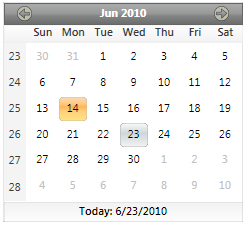
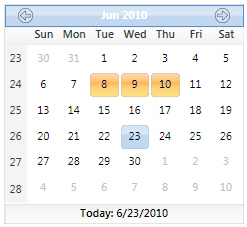
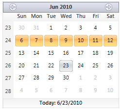
DisplayDate-date that is being displayed in the calendarDisplayMode-calender display modeDisplayDateStart-minimum date that is displayedDisplayDateEnd-maximum date that is displayedFooterVisibility-footer visibilitySelectedDate-currently selected dateSelectedDates-currently selected date collectionSelectionMode-selection mode [single/multiple/week]ShowDaysOfAllMonths-days of all months written to gridTheme-calendar themeWeekColumnVisibility-week column visibilityIsTodayHighlighted-highlights current dateHeaderHeight-adjust header height [18-30]AllowDrag-enable draggingAdornDrag-adorn with the button imageBlackoutDates-set dates to a blackout styleHeaderFontSize-button header font sizeHeaderFontWeight-button header font weight
Calendar Events
SelectedDatesChanged-returns date collections (old new)SelectedDateChanged-returns selected dates (old new)PropertyChanged-fired when a property changes
DatePicker Properties
ButtonStyle-button appearence [Brush/Image]CalendarHeight-calendar heightCalendarWidth-calendar widthCalendarTheme-calendar themeSelectedDate-currently selected dateDateFormat-date display formatDispayDate-date being displayedDisplayDateStart-minimum date that is displayedDisplayDateEnd-maximum date that is displayedIsReadOnly-text is readonlyWeekColumnVisibility-calendar week column visibilityFooterVisibility-calendar footer visibilityButtonBackgroundBrush-style override on button background brushButtonBorderBrush-style override on button border brushCalendarPlacement-position of calendar popup [left/right]IsCheckable-adds a checkboxIsChecked-checkbox stateText-control text
Animation
There are two different animations at work, the first is a transition made when scrolling between months. A bitmap is created of the current day grid, laid overtop, then the grid is updated and its margin changed to place it out of view. The two elements are then scrolled into place using two ThicknessAnimations applied to their respective margins:
private void RunMonthTransition()
{
    UniformGrid grdMonth = (UniformGrid)FindElement("Part_MonthGrid");
    Grid scrollGrid = (Grid)FindElement("Part_ScrollGrid");

    if (grdMonth != null && scrollGrid != null)
    {
        // not first run
        if (grdMonth.ActualWidth > 0)
        {
            IsAnimating = true;
            int width = (int)grdMonth.ActualWidth;
            int height = (int)grdMonth.ActualHeight;
            scrollGrid.Visibility = Visibility.Visible;

            // alternative method
            //RenderTargetBitmap bitmap = new RenderTargetBitmap(width, height, 96, 96, PixelFormats.Default);
            //bitmap.Render(grdMonth);
            //scrollGrid.Background = new ImageBrush(bitmap);

            // get bitmap for the current state
            BitmapSource screen = CaptureScreen(grdMonth, 96, 96);
            scrollGrid.Background = new ImageBrush(screen);
            // reset month grid
            SetMonthMode();

            // two animations one for image, other for month grid
            ThicknessAnimation marginAnimation = new ThicknessAnimation();
            marginAnimation.Duration = TimeSpan.FromMilliseconds(1000);
            marginAnimation.Completed += new EventHandler(marginAnimation_Completed);

            ThicknessAnimation marginAnimation2 = new ThicknessAnimation();
            marginAnimation2.Duration = TimeSpan.FromMilliseconds(1000);

            // expected direction of flow
            if (IsMoveForward)
            {
                grdMonth.Margin = new Thickness(width, 0, width, 0);
                marginAnimation.From = new Thickness(0);
                marginAnimation.To = new Thickness(-width, 0, width, 0);
                marginAnimation2.From = new Thickness(width, 0, -width, 0);
                marginAnimation2.To = new Thickness(0);
            }
            else
            {
                grdMonth.Margin = new Thickness(-width, 0, width, 0);
                marginAnimation.From = new Thickness(0);
                marginAnimation.To = new Thickness(width, 0, -width, 0);
                marginAnimation2.From = new Thickness(-width, 0, width, 0);
                marginAnimation2.To = new Thickness(0);
            }
            // launch animations
            scrollGrid.BeginAnimation(UniformGrid.MarginProperty, marginAnimation);
            grdMonth.BeginAnimation(UniformGrid.MarginProperty, marginAnimation2);
        }
        else
        {
            // first pass
            SetMonthMode();
        }
    }
}
The second animation is used when switching between view modes, (month/year/decade), this is just a simple DoubleAnimation applied to the containing grids width and height:
private void RunYearTransition()
{
    Calendar c = (Calendar)this;
    Grid grdAnimationContainer = (Grid)FindElement("Part_AnimationContainer");

    if (grdAnimationContainer != null)
    {
        IsAnimating = true;
        // width animation
        double width = grdAnimationContainer.ActualWidth;
        double height = grdAnimationContainer.ActualHeight;
        DoubleAnimation widthAnimation = new DoubleAnimation();
        widthAnimation.From = (width * .5f);
        widthAnimation.To = width;
        widthAnimation.Duration = new Duration(TimeSpan.FromMilliseconds(200));

        // height animation
        DoubleAnimation heightAnimation = new DoubleAnimation();
        heightAnimation.From = (height * .5f);
        heightAnimation.To = height;
        heightAnimation.Duration = new Duration(TimeSpan.FromMilliseconds(200));

        // add width and height propertiy targets to animation
        Storyboard.SetTargetName(widthAnimation, grdAnimationContainer.Name);
        Storyboard.SetTargetProperty(widthAnimation, new PropertyPath(Grid.WidthProperty));
        Storyboard.SetTargetName(heightAnimation, grdAnimationContainer.Name);
        Storyboard.SetTargetProperty(heightAnimation, new PropertyPath(Grid.HeightProperty));

        Storyboard stbCalenderTransition = new Storyboard();
        // add to storyboard
        stbCalenderTransition.Children.Add(widthAnimation);
        stbCalenderTransition.Children.Add(heightAnimation);

        // resize grid
        grdAnimationContainer.Width = (this.Width * .1f);
        grdAnimationContainer.Height = (this.Height * .1f);
        stbCalenderTransition.Completed += new EventHandler(stbCalenderTransition_Completed);
        // run animation
        stbCalenderTransition.Begin(grdAnimationContainer);
    }
}
Themes
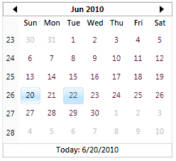
There are currently 8 themes, you may also create your own theme and add it using the RegisterTheme method either within the control or as an xaml file added through the application, (thanks go out to Oliver Simon' ExplorerBar code for the how-to). Ive included to examples of custom themes with this project
Named Themes
I'm still very new to WPF, (and not so sure I like the programming model much..), and just starting to learn about the method changes that apply to creating custom controls. One of the things I do like, is the Theming option. I have spent a lot of time over the years creating different looks targeting various OS flavours, and it's a lot easier to simply swap in an xaml file to make the desired changes. One thing I have noticed in my research for the Calendar, and its parent grid control, is that there appears to be few good examples of using named themes with a custom control, and yet it seems to me to be a very powerful feature.
When a custom control is created, a Generic.xaml file is automatically generated. If you don't require themes, the styles, templates and resources can be written into this file. If you choose you can also apply styles in code by using the controls Resources.MegedDictionaries class to add or remove a resource dictionary:
this.Resources.MergedDictionaries.Add(_MyDictionary);
Named Themes can be applied automatically by the OS theming system, selecting a theme file from your controls theme library that corresponds to the current theme the OS is using. For instance if you are using the default theme in XP, and you add an xaml file Luna.NormalColor.xaml, the control will load with the style in that xaml file. For each OS theme you intend on supporting there is a corresponding theme name that must be applied to the respective xaml file, for example the Aero them is 'Aero.NormalColor.xaml'. If the OS theme title is not found, the Classic.xaml file is loaded. Themes also need to be stored in the Themes folder of the controls root directory. Here's a list of common themes and their file names:
- Aero.NormalColor.xaml - aero theme vista/win7
- Classic.xaml -classic theme
- Luna.Homestead.xaml -xp homestead
- Luna.Metallic.xaml -xp metallic
- Luna.NormalColor.xaml -xp default
- Royale.xaml -media center
- Zune.xaml -zune
Now you need to tell the operating system that you are using named themes, this is done with a small change to the controls assembly information. In the Properties\AssemblyInfo.cs file. In the ThemeInfo class section change the ResourceDictionaryLocation entries from 'None' to 'SourceAssembly':
[assembly: ThemeInfo(
ResourceDictionaryLocation.SourceAssembly, //where theme specific resource dictionaries are located
//(used if a resource is not found in the page,
// or application resource dictionaries)
ResourceDictionaryLocation.SourceAssembly //where the generic resource dictionary is located
//(used if a resource is not found in the page,
// app, or any theme specific resource dictionaries)
)]
In this implementation of the Calendar control, I have it loading the Aero theme by default through a call in the class constructor, (this was just a writing aid, and kind of circumvents all this.. I'll remove it in the last version), but if you rem that call, it should load the xaml file that corresponds to your OS..
Using ResourceKeys
ComponentResourceKeys allow you to swap resources into a control dynamically, so you can use a named resource across different templates, and change their values just by loading an xaml file. ComponentResourceKeys are stored in a static class, that consist of a declaration, and in my implementation a property that returns the resource key from a key name:
using System.Windows;

namespace vhCalendar
{
    public static class ResourceKeys
    {
        // header
        private static ComponentResourceKey _HeaderNormalForegroundBrushKey = null;

       ...

        /// <summary>Header normal foreground</summary>
        public static ComponentResourceKey HeaderNormalForegroundBrushKey
        {
            get { return GetRegisteredKey(_HeaderNormalForegroundBrushKey, "HeaderNormalForegroundBrush"); }
        }

       ...

         private static ComponentResourceKey GetRegisteredKey(ComponentResourceKey resKey, string resourceId)
        {
            if (resKey == null)
                return new ComponentResourceKey(typeof(ResourceKeys), resourceId);
            else
                return resKey;
        }
Keys are then added as dynamic values to an element in the style or template:
<!--header selector-->
<Style x:Key="HeaderButtonStyle" TargetType="Button">
    <Setter Property="FocusVisualStyle" Value="{StaticResource ClearFocusVisualStyle}" />
    <Setter Property="SnapsToDevicePixels" Value="true"/>
    <Setter Property="OverridesDefaultStyle" Value="true"/>
    <Setter Property="Template">
        <Setter.Value>
            <ControlTemplate TargetType="local:DateButton">
                <Border x:Name="ButtonBorder"
                        BorderThickness="0"
                        Background="{DynamicResource {x:Static local:ResourceKeys.ButtonTransparentBrushKey}}"
                        BorderBrush="{DynamicResource {x:Static local:ResourceKeys.ButtonTransparentBrushKey}}">
                    <ContentPresenter Margin="2"
                                      HorizontalAlignment="Center"
                                      VerticalAlignment="Center"
                                      RecognizesAccessKey="True" />
                </Border>
                <ControlTemplate.Triggers>
                    <Trigger Property="IsKeyboardFocused" Value="true">
                        <Setter Property="Foreground" Value="{DynamicResource {x:Static local:ResourceKeys.HeaderFocusedBorderBrushKey}}"/>
                    </Trigger>
                    <Trigger Property="IsMouseOver" Value="true">
                        <Setter Property="Foreground" Value="{DynamicResource {x:Static local:ResourceKeys.HeaderFocusedForegroundBrushKey}}"/>
                    </Trigger>
                    <Trigger Property="IsPressed" Value="true">
                        <Setter Property="Foreground" Value="{DynamicResource {x:Static local:ResourceKeys.HeaderPressedForegroundBrushKey}}"/>
                    </Trigger>
                    <Trigger Property="IsMouseOver" Value="false">
                        <Setter Property="Foreground" Value="{DynamicResource {x:Static local:ResourceKeys.HeaderNormalForegroundBrushKey}}"/>
                    </Trigger>
                </ControlTemplate.Triggers>
            </ControlTemplate>
        </Setter.Value>
    </Setter>
</Style>
In the above code the header buttons foreground brush is a dynamic resource from the static class ResourceKeys, with a property name of HeaderNormalForegroundBrushKey:
<Setter Property="Foreground" Value="{DynamicResource {x:Static local:ResourceKeys.HeaderNormalForegroundBrushKey}}" />
In this implementation all of the named Theme files use a merged dictionary import to combine brush files with style and template files, allowing you to create radically different styles and layouts with a theme change, as an example Luna.Homestead.xaml:
<ResourceDictionary.MergedDictionaries>
    <ResourceDictionary Source="/vhCalendar;component/Themes/Luna.Style.xaml"/>
    <ResourceDictionary Source="/vhCalendar;component/Themes/Luna.Homestead.Brushes.xaml"/>
</ResourceDictionary.MergedDictionaries>
Brush resources are declared in seperate files, this is done because an OS may have several different themes, but only really requires one style of layout with a color change, like XP's Luna style, declared as Luna.Style.xaml, and merged with one of three different pallettes.
In the brush files, the brush objects are assigned a key that corresponds to a ComponentResourceKey:
<!--control-->
<Brush x:Key="{ComponentResourceKey TypeInTargetAssembly={x:Type local:ResourceKeys}, ResourceId=ControlBorderBrush}">#9196A2</Brush>
<Brush x:Key="{ComponentResourceKey TypeInTargetAssembly={x:Type local:ResourceKeys}, ResourceId=ControlBackgroundBrush}">White</Brush>
<Brush x:Key="{ComponentResourceKey TypeInTargetAssembly={x:Type local:ResourceKeys}, ResourceId=ButtonTransparentBrush}">Transparent</Brush>
I have included keys to almost every brush that might be used on the various elements in the control, making this as flexible as possible for someone who wants to create a custom theme, here's the list:
Header
HeaderNormalForegroundBrushKeyHeaderFocusedForegroundBrushKeyHeaderPressedForegroundBrushKeyHeaderNormalBorderBrushKeyHeaderFocusedBorderBrushKeyHeaderPressedBorderBrushKeyHeaderNormalBackgroundBrushKeyHeaderFocusedBackgroundBrushKeyHeaderPressedBackgroundBrushKey
Direction buttons
ArrowBorderBrushKeyArrowNormalFillBrushKeyArrowFocusedFillBrushKeyArrowPressedFillBrushKey
Date buttons
ButtonNormalForegroundBrushKeyButtonNormalBorderBrushKeyButtonNormalBackgroundBrushKeyButtonFocusedForegroundBrushKeyButtonFocusedBorderBrushKeyButtonFocusedBackgroundBrushKeyButtonSelectedForegroundBrushKeyButtonSelectedBorderBrushKeyButtonSelectedBackgroundBrushKeyButtonPressedForegroundBrushKeyButtonPressedBorderBrushKeyButtonPressedBackgroundBrushKeyButtonDefaultedForegroundBrushKeyButtonDefaultedBorderBrushKeyButtonDefaultedBackgroundBrushKeyButtonTransparentBrushKeyButtonDisabledForegroundBrushKeyButtonDisabledBorderBrushKeyButtonDisabledBackgroundBrushKey
Week column
WeekColumnForegroundBrushKeyWeekColumnBackgroundBrushKeyWeekColumnBorderBrushKey
Footer
FooterForegroundBrushKeyFooterBorderBrushKeyFooterBackgroundBrushKey
Day column
DayNamesForegroundBrushKeyDayNamesBorderBrushKeyDayNamesBackgroundBrushKey
Control
ControlBorderBrushKeyControlBackgroundBrushKey
Creating your own Theme
In the example code, I've included a custom theme loaded in the forms code behind. The CustomTheme.xaml merges the vhCalendar.Generic.xaml file, and sets the brush values, then is loaded using the RegisterTheme method in the Calendar control:
/// <summary>
/// Theme Declaration
/// </summary>
ThemePath CustomTheme = new ThemePath("CustomTheme", "vhDatePickerHarness;component/CustomTheme/CustomTheme.xaml");

#region Form Controls
/// <summary>
/// Initialize components
/// </summary>
public Window1()
{
    InitializeComponent();

    // register the custom theme
    Cld.RegisterTheme(CustomTheme, typeof(Calendar));

...

private void cbTheme_SelectionChanged(object sender, SelectionChangedEventArgs e)
{
    e.Handled = true;
    switch (cbTheme.SelectedItem.ToString())
    {
        ...

        case "Custom":
            Cld.Theme = CustomTheme.Name;
            break;
            ...
Example Themes
Aero
XP
Office


Classic

Custom

BlackMamba

BlackOut Dates

Date ranges can be disabled with a visual cue, using a transparent path that is colored if the DateButtons IsBlackedOut property is set to true. The BlackoutDates collection is a class derived from ObservableCollection, and this implementation was largely taken from the wpf toolkits strategy, with some mods and implementation differences. To set a date range to blacked-out, you can write it in xaml like so:
 <vc:Calendar.BlackoutDates>
    <vc:DateRangeHelper Start="6/3/2010" End="6/6/2010"/>
    <vc:DateRangeHelper Start="6/11/2010" End="6/12/2010"/>
</vc:Calendar.BlackoutDates>
Dragging

I had some fun with this one.. You can either perform a standard drag operation, (which passes a DateTime object stored in the selected DateButtons tag), or you can use the AdornDrag feature. The AdornDrag creates an ImageBrush with a screen capture of the selected button, and passes it through the constructor to the DragAdorner class. The DragAdorner is the class written by Josh Smith with some minor changes. I did have some trouble with mouse tracking, so what I did was find the parent window, then add the drag handler events off the window. This was working great, but I couldn't get the PreviewMouseUp notification, so I added a DispatchTimer fired after the DoDragDrop was invoked, (different thread), that polls the mouse button state, and resets the drag operation when the button is released:
private void _dispatcherTimer_Tick(object sender, EventArgs e)
{
    if (Mouse.LeftButton != MouseButtonState.Pressed)
    {
        StopDragTimer();
    }
}
private void ParentWindow_PreviewQueryContinueDrag(object sender, QueryContinueDragEventArgs e)
{
    if (e.EscapePressed)
    {
        StopDragTimer();
        e.Action = DragAction.Cancel;
    }
}
private void ParentWindow_PreviewGiveFeedback(object sender, GiveFeedbackEventArgs e)
{
    if (_dragData.Adorner != null)
    {

       Point pt = new Point(_currentPos.X + 16, _currentPos.Y + 16);
        _dragData.Adorner.Offset = pt;
    }
    Mouse.SetCursor(Cursors.Arrow);
    e.UseDefaultCursors = false;
    e.Handled = true;
}
private void ParentWindow_PreviewDragOver(object sender, DragEventArgs e)
{
    _currentPos = e.GetPosition(this);
}
private void element_PreviewMouseMove(object sender, MouseEventArgs e)
{
    if (AllowDrag)
    {
        // Get the current mouse position
        _currentPos = e.GetPosition(null);
        Vector diff = _dragStart - _currentPos;

         if (e.LeftButton == MouseButtonState.Pressed &&
            Math.Abs(diff.X) > SystemParameters.MinimumHorizontalDragDistance &&
                Math.Abs(diff.Y) > SystemParameters.MinimumVerticalDragDistance)
        {
            if (!IsDragging)
            {
                IsDragging = true;
                DateButton button = sender as DateButton;
                DateTime data = (DateTime)button.Tag;

                if (AdornDrag)
                {
                    _dragData = new DragData(button, data, CreateDragWindow(button));
                    if (_dragData.Parent != null && _dragData.Data != null)
                    {
                        this.AllowDrop = true;
                        AddDragEventHandlers();
                        DataObject dragData = new DataObject("DateTime", _dragData.Data);
                        DragDrop.DoDragDrop(_dragData.Parent, dragData, DragDropEffects.Copy);
                        StartDragTimer();
                    }
                }
                else
                {
                    _dragData = new DragData(button, data, null);
                    if (_dragData.Parent != null && _dragData.Data != null)
                    {
                        DataObject dragData = new DataObject("DateTime", _dragData.Data);
                        DragDrop.DoDragDrop(_dragData.Parent, dragData, DragDropEffects.Copy);
                    }
                }
            }
        }
    }
}
If the parent window can't be found, or an error occurs, the control handles this by reverting to an unadorned drag mode.
So what did I learn?
The usual hard-learned growing pains that I've experienced with half a dozen other languages, (they sure do like framing things in complex jargon, dont they though.. makes the technologies sound *real* impressive). I think animations will begin to play a larger role in my future offerings, something I'd like to explore in depth. In fact I was thinking about tooltips again, real fancy lookin' tooltips...
Change Log
Version 1.0 published June 20, 2010
-Updates to v1.2
-Fixed-
- -Selection bug on multiselect (math error)
- -Some adjustments made to xaml (I'll flesh it out in next rev)
- -SelectedDatesChanged event -returns collections of old and new dates
- -PropertyChange event -notifications added to most properties
- -DisplayModeChanged event -fires when view is changed
- -IsTodayHighlighted property -highlight current date
- -HeaderHeight property -adjust header height [18-30]
-Updates to v1.3-
-Fixed-
- -'stutter' at end of scrolling animation
- -Some minor discrepencies in vhCalendar.Generic.xaml
- -Theme routines adjusted to work on a per control instance (what I wanted)
- -Example of applying a custom theme
- -ResourceKeys for WeekColumn, Footer, and DayColumn Forecolor
- -updated example code
- -a lot of small tweaks to xaml
-Updates to v1.4-
- xaml style files created for each theme category
- graphics updates
- updated the custom style theme
-Updates to v1.5-
- rewrote most of the Calendar class
- reorganized code into seperate classes
- added blackout dates
- fixed some xaml issues
- added drag and drop facility
- fixed a math bug in MonthModeDateToRowColumn
- added IsAnimated property
- fixed decade title
- added header font properties
- rewrote DatePicker control
- added checkbox
- added button brush overrides
- added calendar placement
- updated example code
- fixed a bug in theme change
- fixed footer visibility bug
- fixed datepicker placement bug
- fixed multi select persist bug
- added selecteddate binding to datepicker control


