
Contextfilter for DataGrid
4.90/5 (6 votes)
Enables filtering in standard DataGrid control.
Update
I updated the filter control to cover some more scenarios. The filter now works when the data grid column is bound to sub properties like this:
<datagridcheckboxcolumn binding="{Binding Path=Character.Reliable}" header="Is reliable">
In my last project I also bound data grid columns to dictionary values. Now, these bindings are supported, too:
<datagridtextcolumn binding="{Binding Path=StringDictionary[Favorite name]}" header="Favorite name">
Furthermore, I added two filter related events to the filter control:
- FilterTurnedOn - Raised after a filter was applied
- FilterTurnedOff - Raised after the filter was removed
I use these events in the updated demo project to display the binding of the last filter action.
Update II
Although there are nearly no votes for this article, it has a constant flow of downloads documenting the interest in this subject. This is why I decided to release an update, providing the filter control with some new features.
The new features include:
- Properly displaying Filter criterias (e.g. before: LessOrEqual" now: "Less or Equal")
- When filtering strings, you now choose if capitalization is taken into account or not
- When the datasource of the DataGrid is updated by assigning a new collection, the filter is resetted
- The filter control's width grows when entering a verly long filter criteria
Here is how the updated filter control looks like:

Introduction
You still remember the plain old Access GUI? Believe it or not, our development team still runs Access based apps. But as time advances, even we are going to feed them with modern desktop technology including animations, background threading and all that stuff to make users happy.
Unfortunately, the path to complete happiness is tempered by the missing filter in the WPF standard datagrid, which is a real shame, because the WPF infrastructure includes everything needed to implement this feature.
This is why I created an Access like custom filter control which opens in a context menu like when the user right clicks the mouse button.
Here is how it looks like if it opens on a datatime column:

Selecting one of the possible filter operations in the list executes the filter on the underlying collection view.
Features
The filter control is sensitive to the property type the data column is bound and to the underlying column type.
If the datacolumn is bound to an enum or the column type is a
DataGridCombobox column, the filter control offers a combobox to you choose the filter value. Custom types can be filtered as well if they are bound to a combobox column. Otherwise you get a textbox with disabled filter criteria.

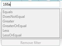
If the datacolumn is bound to simple value type like Int or to a string, a TextBox will be shown.

In this case you also get additional filter options like "Contains" and "DoesNotContain". If the datacolumn is bound to an int or another number type, you get this.
The filter criterias are disabled, because I entered an invalid number into the textbox. The same goes for invalid dates and other input, thanks to a validation on keystroke.
Next the datacolumn is bound to a boolean.

If the underlying boolean is nullable, the checkbox is in triple state, allowing you to filter for null values as well. Filtering nullable values is supported for other value types as well.
Filter description and removing the filter
After the filter is applied, the DataGrid header will show a filter icon. Hoovering over the icon displays the active filter criteria.

Of course, you can sequentially filter on different columns and multiple times on the same column. Every new filter action acts as an additional criteria the data must comply with to be displayed in the datagrid.
After the first filter condition is applied, the "Remove filter" button is enabled. Pressing this button returns the unfiltered data set and returns the column header back to normal state.
Using the filter control in you application
Additionally to having a working filter, the second objective was to integrate the control as easily as possible into your application. Following steps need to be done:
- Add a reference to the DataGridContextMenuFilter DLL
- Set the
ContextMenuproperty of theDataGridCellto theDataGridContextMenuFilterto make the filter control appear when the user right clicks on any cell to add a new filter or to remove all filter settings - Set the
ContextMenuproperty of theDataGridColumnHeaderto theDataGridContextMenuFiltercontrol to make the filter control appear when the user right clicks on any header of the data grid. This is usefull to remove the filter in case you filtered all rows away.
    <Window.Resources>

        <fc:FilterContextMenu x:Key="FilterControl" />

        <Style TargetType="DataGridColumnHeader">
            <Setter Property="ContextMenu" Value="{StaticResource FilterControl}" />
        </Style>

        <Style TargetType="DataGridCell">
            <Setter Property="ContextMenu" Value="{StaticResource FilterControl}" />
        </Style>

    </Window.Resources>
Implementation details
The basic structure
The filter control is a custom control (as opposed to a user control) deriving from the context menu control, enabling us to assign the filter control to the context menu property of the datagrid cell and getting the desired pop up behavior for free.
As usual, this custom control consists of two parts:
The code file of the class containing (dependency) properties and behavior:
Namespace FilterControls

    Partial Public Class FilterContextMenu
        Inherits ContextMenu

	' Definition of properties and behaviour

    End Class
End Namespace
The Generic.XAML file (in this case only one) for its look:
<resourcedictionary xmlns="http://schemas.microsoft.com/winfx/2006/xaml/presentation" xmlns:x="http://schemas.microsoft.com/winfx/2006/xaml" xmlns:cv="clr-namespace:DataGridContextMenuFilter.Converter" xmlns:local="clr-namespace:DataGridContextMenuFilter.FilterControls">
<cv:invaliddatetonullconverter x:key="InvalidDateToNullConverter">
<cv:invalidbooleantonullconverter x:key="InvalidBooleanToNullConverter">
<style targettype="{x:Type local:FilterContextMenu}">
<!—Definition of control elements including binding, etc. -->
</style>
</cv:invalidbooleantonullconverter></cv:invaliddatetonullconverter> </resourcedictionary> Looking at
the code first, the class ContextMenuFilter declares some properties needed for
filtering:
FilterSourceof typeobjectcontaining the data/itemssource the data grid is bound toCriteriaValueof typeobjectrepresenting the criteria value used for filtering. You determine this value either by typing a string into at textbox, selecting a date in the datepicker, or by selecting an enum or another custom object in a comboboxCriteriaPropertyof typePropertyInforepresenting the data type of the data being bound to the grid column being filtered. This property is used to determine which filter operations (of enum typeCompareOperation) are allowed, to check if the criteria value you entered is valid and to determine which data entry control wil be shown
Switching to the XAML file (Generic.XAML) representing the elements of the filter control, the first thing to note is that only some of the controls are shown when the filter control opens. This is mainly because we have four controls (textbox, checkbox, datepicker, combobox) all serving the same purpose, namely allowing the user to enter the criteria value used for filtering. But only one of them is shown. Also note that all of these controls are bound to the CriteriaValue property. To avoid binding errors, e.g. in the datepicker if you filter with CriteriaProperty of type string, converters are used.
<cv:InvalidDateToNullConverter x:Key="InvalidDateToNullConverter" />
<cv:InvalidBooleanToNullConverter x:Key="InvalidBooleanToNullConverter" />
InvalidDateToNullConverter is to test if the binding source value is a valid date. If yes, the binding target (the DatePicker.SelectedDate property in our example) gets the value, if not, the binding target gets a null value (or nothing in VB.NET).
Setting the visibility of the criteria value controls is done in code behind and determined by the CriteriaProperty value.
ContextMenuFilter configuration
So, how does the control gets to know the information needed to do its job? This happens in a two step process.
Basic configuration is done in the ApplyTemplate method, because this method is being called only once: the first time you open the filter control.
Public Overrides Sub OnApplyTemplate()
	MyBase.OnApplyTemplate()

' Creating references to controls defined in the Generic.XAML file

' Register some event handlers

End Sub
The real magic (or simply most of the stuff) happens in the OnOpened-method inherited from the ContextMenu being called every time the filter control opens.
Protected Overrides Sub OnOpened(e As System.Windows.RoutedEventArgs)
	MyBase.OnOpened(e)

 ' Determine the DataGridCell, the DataGridRow, the DataGridColumn and the DataGrid on which filtering occurs

 ' Based on this information set the filter relevant properties described above (FilterSource, CriteriaValue, CriteriaProperty)

 ' Determine visibility of criteria value and other controls

 ' Update list of allowed compare operations

End Sub
Feel free to have a deeper look into this and its helper methods, if you are interested in the details.
The filter operation
Filtering is done setting the Filter-property of the default CollectionView of the ItemsSource of the datagrid being a predicate (a function returning true or false). To enable sequential filtering I encapsulated every filter action into a class called Filter.
Public Class Filter
        ' Some filter relevant properties
	' The “Filter” method it-self
End Class
This class contains some similar values as the ContextFilterClass like CriteriaValue and CriteriaProperty needed for the filter operation and a method called “Filter” returning true or false. This method will be called for each item in the datasource. When returning true, the item passes the filter, otherwise the item will be filtered away.
One filter instance can only act for a single filter operation. This is why multiple filter actions are grouped together in a class called FilterGroup.
Public Class FilterGroup

        ' A list containing all filters
	Private _FilterList As List(Of Filter)

        ' Execution of all filters
        Private Function ApplyFilter(o As Object) As Boolean
            For Each f In _FilterList
                If Not f.FilterLogic.Invoke(o) Then
                    Return False
                End If
            Next

            Return True
        End Function

	' Other stuff not relevant for understanding
End Class
This class contains a list of Filter-objects and a method called ApplyFilter being executed when the filter operation starts. This method iterates through the Filter objects and invokes each Filter method on it. Only if all method calls return true, the item will passes the filter.
Possible headaches
Binding in WPF is very flexible and complex, because it supports many scenarios. The filter control coveres my use cases so far, but there may be something you need which is not supported. I heavily documented the code, so you may add the missing support yourself. Furthermore, because my data source i work with is always based on an OberservableCollection, I only payed attention that the control supports this kind of data source. If your data source is based on a BindingList or a DataTable, you may experience problems.
Demo project
The screenshots and code snippets are taken from the demo project also containing the source code of the filter control.
Enjoy!