
WPF 2 Dimensional Editable Grid
4.67/5 (3 votes)
I will dive into a way we can create reusable generic 2D grid which is bound to object collections.
Problem
Two dimensional (2D) grid is not supported out-of-box in WPF. It is also not very trivial to create one. In this article, I will dive into a way we can create reusable generic 2D grid which is bound to object collections. This can be easily customized by setting appropriate attributes. Let’s look at the general grid requirements:
- Grid should have flexible design / layout.
- X-Axis or Y-Axis headers should not scroll with content.
- All binding should be done against object collections, so that we have more control over the data which is being displayed and on any user interactions.
- Easy to customize the data display and UI look and feel.
- Grid can be readonly or editable.
Grid Examples
In short we might need grids like: Grid 1: Notebook price (editable) by Brand and City.

Grid 2: Notebook price (editable) with readonly notebook details by Brand and City - With auto scroll bars.
Let's see how we can create an Editable or ReadOnly 2 D (Two Dimensional) generic grid in WPF which will be bound to objects directly.
Solution
We can design using various WPF controls. As shown in following figure, we can divide grid into 3 major areas – Column Headers, Row Headers, and Body cells. We can use panels to layout these and achieve structure of a grid.

Assuming this layout, let’s see how we can achieve this through code:
For this to demo: I will use following models:

Our final goal is to visualize product (Notebook in this case) information in a 2D grid where product price is shown by Brand name and City name. Product price should be editable. As shown in this grid:

To achieve this grid layout, we would need following collections:
- Column Headers:
IEnumerable<object> Columns - Row Headers:
ObservableCollection<object> RowsHeader - Rows:
ObservableDictionary<object, ObservableCollection<object>> RowsByYAxis
*RowsHeader collection will be generated from RowsByYAxis dictionary. So, ideally we would need only
two collections. Let's dive into the code:
Solution design

The solution contains two projects:
- WpfGenericGrid: A class library for generic grid (User Control, View Model, Converters, Messages).
- WpfGeneric2DGrid: A client WPF application which consumes above class library to demo 2D editable grid.
In this WPF project, I have used GalaSoft.MvvmLight.WPF4 package for making it easy to implement MVVM pattern. It is a light weight solution which supports generic RelayCommand and Asynchronous Messaging to facilitate communication between view models. Now we can peek into the real code to create this generic grid:
GenericGrid.xaml (User control)
<usercontrol x:class="WpfGenericGrid.UserControls.GenericGrid"
          xmlns="http://schemas.microsoft.com/winfx/2006/xaml/presentation"
          xmlns:x="http://schemas.microsoft.com/winfx/2006/xaml"
          xmlns:utility="clr-namespace:WpfGenericGrid.Utility"
          xmlns:mc="http://schemas.openxmlformats.org/markup-compatibility/2006"
          xmlns:d="http://schemas.microsoft.com/expression/blend/2008"
          xmlns:customctl="clr-namespace:WpfGenericGrid.UserControls"
          xmlns:converter="clr-namespace:WpfGenericGrid.Converter"
          mc:ignorable="d" d:designwidth="900" d:designheight="700">
    <usercontrol>
        <converter:custombooleantovisibilityconverter x:key="CustomVisibilityCnv">
        <converter:custombooleantoscrollvisibilityconverter x:key="CustomScrollVisibilityCnv">
    </converter:custombooleantoscrollvisibilityconverter>
    </converter:custombooleantovisibilityconverter>
    </usercontrol>

    <grid>
        <rowdefinition height="Auto">
        </rowdefinition>

        <columndefinition width="{Binding YAxisWidth}" />
        <columndefinition width="Auto" />

        <dockpanel verticalalignment="Center" grid.row="0" grid.column="0">
            <border borderthickness="0 0 1 0" borderbrush="White">
                <grid height="{Binding RowHeight}" width="{Binding YAxisWidth}" removed="Gray">
                    <textblock verticalalignment="Center" tooltip="{Binding Key}"
                        text="{Binding YAxisHeaderText}" margin="25 0 0 0" foreground="White">
                    </textblock>
                </grid>
            </border>
        </dockpanel>
        <scrollviewer name="SvColHeaders" width="{Binding GridXAxisHeaderWidth}" grid.row="0"
                  grid.column="1" verticalscrollbarvisibility="Hidden" uid="SvColHeaders"
                  horizontalscrollbarvisibility="Hidden" horizontalalignment="Left">
            <itemscontrol itemssource="{Binding Columns}">
                <itemscontrol>
                    <itemspaneltemplate>
                        <stackpanel verticalalignment="Top" orientation="Horizontal">
                    </stackpanel></itemspaneltemplate>
                </itemscontrol>
                <itemscontrol>
                    <datatemplate>
                        <border borderthickness="0 0 1 0" borderbrush="White">
                            <grid height="{Binding DataContext.XAxisHeight,
                                          RelativeSource={RelativeSource AncestorType={x:Type ItemsControl}}}"
                                    width="{Binding DataContext.XAxisColumnWidth, RelativeSource=
                                            {RelativeSource AncestorType={x:Type ItemsControl} }}"
                                    removed="Gray" minwidth="90" minheight="30">
                                <textblock verticalalignment="Center" tooltip="{Binding Description}"
                                   text="{Binding Name, Mode=OneWay}" foreground="White" padding="5 0 0 0">
                                </textblock>
                            </grid>
                        </border>
                    </datatemplate>
                </itemscontrol>
            </itemscontrol>
        </scrollviewer>
        <scrollviewer name="SvRowYAxis" height="{Binding GridYAxisHeaderHeight}"
                 grid.row="1" grid.column="0" margin="{Binding GridYAxisHeaderMargin}"
                 verticalscrollbarvisibility="Hidden" uid="SvRowYAxis" horizontalscrollbarvisibility="Hidden">
            <itemscontrol itemssource="{Binding RowsHeader}">
                <itemscontrol>
                    <datatemplate>
                        <stackpanel height="{Binding DataContext.RowHeight, RelativeSource=
                                            {RelativeSource AncestorType={x:Type ItemsControl}}}"
                               width="{Binding DataContext.YAxisWidth, RelativeSource=
                                      {RelativeSource AncestorType={x:Type ItemsControl}}}"
                               removed="Gray" orientation="Horizontal" minwidth="165" minheight="30">
                            <button borderthickness="0" command="{Binding DataContext.DeleteRow,
                                  RelativeSource={RelativeSource AncestorType={x:Type ItemsControl}}}"
                                  commandparameter="{Binding}" height="18"
                                  margin="2 2 3 0" style="x: Static ToolBar.ButtonStyleKey}};"
                                  uid="btnDeleteRow" verticalalignment="Center" width="18">
                                <img visibility="{Binding DataContext.CanDelete, Converter={StaticResource
                                  CustomVisibilityCnv}, RelativeSource={RelativeSource
                                  AncestorType={x:Type ItemsControl}}}" source="..\Images\delete.png" />
                            </button>
                            <grid height="{Binding DataContext.RowHeight, RelativeSource={RelativeSource
                                  AncestorType={x:Type ItemsControl}}}" width="{Binding DataContext.YAxisWidth,
                                  RelativeSource={RelativeSource AncestorType={x:Type ItemsControl} }}" removed="Gray">
                                <textblock verticalalignment="Center"
                                  tooltip="{Binding Description}" text="{Binding Name}" foreground="White">
                                </textblock>
                            </grid>
                        </stackpanel>
                    </datatemplate>
                </itemscontrol>
            </itemscontrol>
        </scrollviewer>
        <scrollviewer name="SvGridCells" height="{Binding GridBodyScrollHeight}"
                width="{Binding GridBodyScrollWidth}" grid.row="1" grid.column="1"
                verticalscrollbarvisibility="{Binding VerticalScrollBarVisible,
                Converter={StaticResource CustomScrollVisibilityCnv}}" uid="SvGridCells"
                horizontalscrollbarvisibility="{Binding HorizontalScrollBarVisible,
                Converter={StaticResource CustomScrollVisibilityCnv}}"
                horizontalalignment="Left" scrollchanged="SvGridCells_OnScrollChanged">
            <itemscontrol x:name="RowsByYAxis" itemssource="{Binding RowsByYAxis}">
                <itemscontrol>
                    <datatemplate>
                        <stackpanel orientation="Horizontal">
                            <itemscontrol itemssource="{Binding Value}">
                                    <itemspaneltemplate>
                                    </itemspaneltemplate>
                                        <grid height="{Binding DataContext.RowHeight,
                                              RelativeSource={RelativeSource AncestorType={x:Type ScrollViewer}}}"
                                              width="{Binding DataContext.CellWidth, RelativeSource=
                                              {RelativeSource AncestorType={x:Type ScrollViewer}}}">
                                            <utility:gridcelltextbox height="{Binding DataContext.RowHeight,
                                                      RelativeSource={RelativeSource AncestorType={x:Type ScrollViewer}}}"
                                                      width="{Binding DataContext.CellWidth, RelativeSource=
                                                      {RelativeSource AncestorType={x:Type ScrollViewer}}}"
                                                      verticalalignment="Center" text="{Binding Value}"
                                                      horizontalalignment="Stretch" minwidth="91" minheight="30"
                                                      padding="5 4 0 0" uniquename="{Binding GridCellId}"
                                                      rowheadername="{Binding DataContext.Key, RelativeSource=
                                                      {RelativeSource AncestorType={x:Type ItemsControl}}}"
                                                      previewtextinput="CellTextBox_PreviewTextInput"
                                                      previewkeydown="textCellValue_OnPreviewKeyDown"
                                                      isreadonly="{Binding DataContext.IsReadOnly,
                                                      RelativeSource={RelativeSource AncestorType={x:Type ScrollViewer}}}">
                                                <utility:gridcelltextbox>
                                                    <style targettype="{x:Type TextBox}">
                                                        <Style.Triggers>
                                                            <trigger value="False" property="IsFocused">
                                                                <setter value="Gray" property="BorderBrush">
                                                                <setter value="0 0 1 1" property="BorderThickness">
                                                            </setter>
                                                            <trigger value="True" property="IsFocused">

                                                                <setter value="LightSkyBlue" property="Background">
                                                                <setter value="0 0 1 1" property="BorderThickness">
                                                            </setter>
                                                        </Style.Triggers>
                                                    </style>
                                                </setter>

                                        </trigger>
                                    </setter>
                                </trigger>
                            </utility:gridcelltextbox>
                        </utility:gridcelltextbox>
                    </grid>
        </itemscontrol>
    </stackpanel>
</datatemplate>
GenericGrid.xaml.cs (To handle some of the events like synchronize scroll between body and header or validations)
public partial class GenericGrid : UserControl
{
    public GenericGrid()
    {
        InitializeComponent();
    }

    private void SvGridCells_OnScrollChanged(object sender, ScrollChangedEventArgs e)
    {
        if (e.HorizontalChange != 0.0f)
        {
            try
            {
                SvColHeaders.ScrollToHorizontalOffset(e.HorizontalOffset);
            }
            catch (Exception ex)
            {
                MessageBox.Show(ex.Message);
            }
        }
        else
        {
            SvRowYAxis.ScrollToVerticalOffset(e.VerticalOffset);
        }
    }

    private void CellTextBox_PreviewTextInput(object sender, TextCompositionEventArgs e)
    {
        var regex = new Regex("[^0-9.-]+"); //regex that matches disallowed text
        e.Handled = regex.IsMatch(e.Text);
    }
}
GenericGridViewModel.cs: (View Model for GenericGrid user control) This class contains all the necessary properties like:
CanDelete (True to enable row delete), ReadOnly (True/False, false for editable grid),
Columns (XAxis column headers),
GridHeight, GridWidth, RowHeight, XAxisHeight,
YAxisWidth, ColumnWidth, ScrollBarVisibility.
public class GenericGridViewModel : ViewModelBase
{
    private ObservableDictionary<object, ObservableCollection<object>> _rowsByYAxis;
    private double _xAxisColumnWidth = 100;
    private double _yAxisWidth = 150;
    private double _xAxisHeight = 30;
    private double _rowHeight = 30;
    private double _gridWidth = 600;
    private double _gridHeight = 170;
    private string _gridName = string.Empty;
    private bool _isVerticalScrollVisible;
    private bool _isHorizontalScrollVisible;
    private double _gridXAxisHeaderWidth;
    private double _gridYAxisHeaderHeight;
    private double _gridBodyScrollHeight;
    private double _gridBodyScrollWidth;
    private ObservableCollection<object> _rowsHeader;
    private string _gridYAxisHeaderMargin;

    public GenericGridViewModel(string gridName)
    {
        _gridName = gridName;
        HorizontalScrollBarVisible = true;
        VerticalScrollBarVisible = true;
        DeleteRow = new RelayCommand<object>(rowIdentifier =>
        {
            if (!RowsByYAxis.ContainsKey(rowIdentifier)) return;
            var rowHeaderToRemove = RowsByYAxis[rowIdentifier];
            _rowsByYAxis.Remove(rowIdentifier);
            _rowsHeader.Remove(rowIdentifier);
            Messenger.Default.Send(
                new GenericMessage<GridDataUpdateMessage>(new GridDataUpdateMessage()
                    {
                        RowHeader = rowHeaderToRemove,
                        ActionType = GridAction.RowDelete
                    }));
            RowsByYAxis = _rowsByYAxis;
        });
        Columns = new ObservableCollection<object>();
        RowsByYAxis = new ObservableDictionary<object, ObservableCollection<object>>();
    }

    protected void ComputeGridLayout(int colCount, int rowCount)
    {
        _isVerticalScrollVisible = GridHeight - RowHeight < rowCount * RowHeight;
        _isHorizontalScrollVisible = GridWidth - YAxisWidth < colCount * CellWidth;

        GridXAxisHeaderWidth = HorizontalScrollBarVisible ? _isHorizontalScrollVisible ?
          GridWidth - YAxisWidth : colCount * CellWidth : GridWidth - YAxisWidth;
        GridYAxisHeaderHeight = VerticalScrollBarVisible ? _isVerticalScrollVisible ?
          GridHeight - RowHeight : rowCount * RowHeight : GridHeight - RowHeight;

        GridBodyScrollWidth = _isVerticalScrollVisible ? GridXAxisHeaderWidth + 18 : GridXAxisHeaderWidth;
        GridBodyScrollHeight = _isHorizontalScrollVisible ? GridYAxisHeaderHeight + 18 : GridYAxisHeaderHeight;

        GridYAxisHeaderMargin = HorizontalScrollBarVisible || VerticalScrollBarVisible ?
          _isVerticalScrollVisible || _isHorizontalScrollVisible ? "0 -20 0 0" : "0" : "0";
    }

    public double XAxisColumnWidth
    {
        get { return _xAxisColumnWidth; }
        set { _xAxisColumnWidth = value; }
    }

    public double YAxisWidth
    {
        get { return _yAxisWidth; }
        set { _yAxisWidth = value; }
    }

    public double RowHeight
    {
        get { return _rowHeight; }
        set { _rowHeight = value; }
    }

    public double XAxisHeight
    {
        get { return _xAxisHeight; }
        set { _xAxisHeight = value; }
    }

    public double CellWidth
    {
        get { return XAxisColumnWidth + 1; }
    }
    public double GridWidth
    {
        get { return _gridWidth; }
        set { _gridWidth = value; }
    }

    public double GridHeight
    {
        get { return _gridHeight; }
        set { _gridHeight = value; }
    }

    public double GridXAxisHeaderWidth
    {
        get { return _gridXAxisHeaderWidth; }
        private set { _gridXAxisHeaderWidth = value;
          RaisePropertyChanged("GridXAxisHeaderWidth"); }
    }

    public double GridYAxisHeaderHeight
    {
        get { return _gridYAxisHeaderHeight; }
        private set { _gridYAxisHeaderHeight = value;
          RaisePropertyChanged("GridYAxisHeaderHeight"); }
    }

    public double GridBodyScrollHeight
    {
        get { return _gridBodyScrollHeight; }
        private set { _gridBodyScrollHeight = value;
          RaisePropertyChanged("GridBodyScrollHeight"); }
    }

    public double GridBodyScrollWidth
    {
        get { return _gridBodyScrollWidth; }
        private set { _gridBodyScrollWidth = value; RaisePropertyChanged("GridBodyScrollWidth"); }
    }

    public string YAxisHeaderText { get; set; }
    public bool IsReadOnly { get; set; }
    public bool CanDelete { get; set; }
    public bool HorizontalScrollBarVisible { get; set; }
    public bool VerticalScrollBarVisible { get; set; }
    public RelayCommand<object> DeleteRow { get; protected set; }
    public IEnumerable<object> Columns { get; set; }
    public string GridYAxisHeaderMargin
    {
        get { return _gridYAxisHeaderMargin; }
        private set { _gridYAxisHeaderMargin = value; RaisePropertyChanged("GridYAxisHeaderMargin"); }
    }
    public ObservableCollection<object> RowsHeader
    {
        get { return _rowsHeader; }
        private set { _rowsHeader = value; RaisePropertyChanged("RowsHeader"); }
    }
    public ObservableDictionary<object, ObservableCollection<object>> RowsByYAxis
    {
        get { return _rowsByYAxis; }
        set
        {
            _rowsByYAxis = value;
            if (_rowsByYAxis.Any())
            {
                ComputeGridLayout(Columns.Count(), _rowsByYAxis.Count);
                RowsHeader = new ObservableCollection<object>(_rowsByYAxis.Keys);
            }
            RaisePropertyChanged("RowsByYAxis");
        }
    }
}
Note: You would need ObservableDictionary to implement
two-way binding. This you can find in the linked source code.
GridDataUpdateMessage.cs (It is to communicate data edits or row deletion commands to view model).
public class GridDataUpdateMessage
{
    public object CellData { get; set; }

    public object RowHeader { get; set; }

    public GridAction ActionType { get; set; }
}
Few Utility classes: GridCellTextBox.cs (Custom text box control with extra bindable properties).
public class GridCellTextBox : TextBox
{
    public static readonly DependencyProperty UniqueNameProperty =
        DependencyProperty.Register("UniqueName", typeof(string), typeof(GridCellTextBox));
    public static readonly DependencyProperty RowHeaderNameProperty =
        DependencyProperty.Register("RowHeaderName", typeof(string), typeof(GridCellTextBox));

    public string UniqueName
    {
        get { return (string)GetValue(UniqueNameProperty); }
        set { SetValue(UniqueNameProperty, value); }
    }

    public string RowHeaderName
    {
        get { return (string)GetValue(RowHeaderNameProperty); }
        set { SetValue(RowHeaderNameProperty, value); }
    }
}
ColumnHeader.cs (A class for binding columns headers).
public class ColumnHeader
{
    public string Name { get; set; }

    public string Description { get; set; }
}
RowHeader.cs: (A class for binding row headers).
public class RowHeader
{
    public string Name { get; set; }

    public string Description { get; set; }
}
We are done with important pieces of generic grid. If you want to dive more into details. I would advise to look into the source code.
Now let’s see how to use all these to create grid in a WPF project: We need to add the reference of the WpfGenericGrid assembly to the client project, and then add reference of the user control to the view. As shown below:
MainWindow.xaml (View in the client app).
<window title="MainWindow" x:class="WpfGeneric2DGrid.View.MainWindow"
          xmlns="http://schemas.microsoft.com/winfx/2006/xaml/presentation"
          xmlns:x="http://schemas.microsoft.com/winfx/2006/xaml" height="650" width="925"
          xmlns:gengrid="clr-namespace:WpfGenericGrid.UserControls;assembly=WpfGenericGrid"
          xmlns:cusgrid="clr-namespace:WpfGeneric2DGrid.UserControls">
    <grid>
        <dockpanel>
            <gengrid:genericgrid x:name="productGrid" datacontext="{Binding GridViewModel}" />
        </dockpanel>
    </grid>
</window>
MainWindowViewModel.cs: Create sample product data and the view model instance for the grid. Set required properties appropriately.
class MainWindowViewModel : ViewModelBase
{
private GenericGridViewModel _gridViewModel;
public MainWindowViewModel()
{
List<Product> products = CreateSampleData();
var colHeaders = products.GroupBy(p => p.City).FirstOrDefault().Select(
p => new ColumnHeader {Name = p.BrandName, Description = p.BrandName});
var rowHeaders = products.GroupBy(p => p.BrandName).FirstOrDefault().Select(
p => new RowHeader {Name = p.City, Description = p.City});
var rowByYAxis = products.GroupBy(p => p.City).ToDictionary(p => p.Key, p => p.ToList());
var observRowByYAxis = new ObservableDictionary<object, ObservableCollection<object>>();
rowByYAxis.Keys.ToList().ForEach(key => observRowByYAxis.Add(
rowHeaders.FirstOrDefault(r => r.Name == key),
new ObservableCollection<object>(rowByYAxis[key])));
GridViewModel = new GenericGridViewModel("productGrid")
{
RowHeight = 30,
XAxisColumnWidth = 100,
YAxisWidth = 120,
GridHeight = 200,
GridWidth = 700,
Columns = colHeaders,
RowsByYAxis = observRowByYAxis,
CanDelete = true,
HorizontalScrollBarVisible = true,
VerticalScrollBarVisible = true,
YAxisHeaderText = "City"
};
Messenger.Default.Register<GenericMessage<GridDataUpdateMessage>>(this, (a) =>
{
//Updated data
var message = a.Content;
if (message.ActionType == GridAction.CellUpdate)
{
//Cell value change
}
else if (message.ActionType == GridAction.RowDelete) {
//Row deleted
}
});
Load = new RelayCommand(() =>
{
//Run some logic
});
}
public RelayCommand Load { get; set; }
public GenericGridViewModel GridViewModel
{
get { return _gridViewModel; }
private set
{
_gridViewModel = value;
}
}
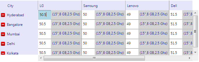
}Once everything is put in place correctly, we can see following grid:
In case, if you want to see the running code, I would advise you to download it from the link and play with it.
Source Code
I have developed this generic grid as a class library which can be easily referenced and used in a WPF project. If needed, the same can be copied to any existing WPF project. This sample application demonstrates how to create both of the grids (Grid-1 and Grid-2) discussed in the problem statement. To run this application, you would need Visual Studio 2010.
- Source code location: https://github.com/manoj-kumar1/WPF-2D-Editable-Grid
Conclusion
In this article, I have tried to demonstrate an easy way to create a 2D grid in WPF. This grid can be easily customized as one or two dimensional; or readonly or editable. Many of the customization can be achieved by setting appropriate properties in grid view model. Please get in touch with me if you have any questions or you think otherwise @ manoj.kumar[at]neudesic.com.