
WPF Slider Menu
3.73/5 (5 votes)
A menu item that displays a slider control with child menu items
Introduction
A slider menu control is a useful tool to put into your toolbox. It can be used to control anything which takes a range. Useful applications include a zoom control or a rotate control. Putting this slider into a menu is a good way to present this control because it makes it easy to reach, yet does not add visual clutter.
Features
- Displays a WPF slider control in a menu element along with child menu that specify individual values.
- The binding is two way. The
SliderMenuItemcan be either the source or the target of the binding. - The range for the entire slider does not have to be linear. The range is only linear between individual slider tick stops.
- Derives directly from
MenuItem. The control retains all of the standardMenuItembehavior. If you tried to use aUserControlinstead, the menu item hot track highlight would highlight the entire menu. - Uses
ItemsPresenterin the control template. Child menu items are rendered using the existing behavior. This means you can use icons for the individual child items just like they were part of a regular menu item. - The content of each child menu item is separate from the formal value. You can use the richness of the WPF content model to put most anything within a child menu item, and still specify an exact value.
- A click on a menu item will automatically set the actual value to the formal value of the child item. (Only if it is a
MenuItem)
Using the Code
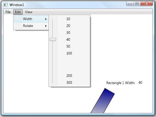
The code below is a sample of how to use the SliderMenuItem. Just place it into the XAML declaration as you would a regular menu item. The child items have individual attached properties which describe how to interact with the slider.
<sm:SliderMenuItem
    x:Name="sliderMenu"
    Value="{Binding ElementName=rectangle1,Path=Width,Mode=TwoWay}">
    <MenuItem Header="10" sm:SliderMenuItem.Value="10" />
    <MenuItem Header="20" sm:SliderMenuItem.Value="20" />
    <MenuItem Header="30" sm:SliderMenuItem.Value="30" />
    <MenuItem Header="40" sm:SliderMenuItem.Value="40" />
    <MenuItem Header="50" sm:SliderMenuItem.Value="50" />
    <MenuItem Header="100" sm:SliderMenuItem.Value="100" />
    <Separator Height="50" sm:SliderMenuItem.Skip="True" Visibility="Hidden" />
    <MenuItem Header="200" sm:SliderMenuItem.Value="200" sm:SliderMenuItem.Steps="5" />
    <MenuItem Header="300" sm:SliderMenuItem.Value="300" />
</sm:SliderMenuItem>
...
<Rectangle
    x:Name="rectangle1"
    Canvas.Left="353"
    Canvas.Top="255"
    Height="100"
    Width="50"
    Stroke="Black"
    />
Attached Properties
Value
The Value property has two meanings. The value of the SliderMenuItem object is the actual range value for the target object. The Value property on each child is the formal range value for that child.
Skip
The skip property allows you to add child menu items which do not have formal values. This is useful for separators.
Steps
Specifies the number of steps, or ticks between the child menu item and the previous menu item. A high number of steps can provide a pseudo-continuous range between consecutive items. A small number of steps can provide a limited number of discrete steps between consecutive items.
Data Binding
The most important part of what makes this control work is the data binding. The databinding can work in two ways:
SliderMenuItem.Value as the Source
When the slider menu item value is the source, multiple framework elements can be targets. An example of this is to bind both ScaleX and ScaleY to a slider value. When using this technique, you specify the initial value on the SliderMenuItem object in the XAML declaration.
<MenuItem Header="Zoom">
    <sm:SliderMenuItem x:Name="zoomMenu" Value="1">
        <MenuItem Header="10%" sm:SliderMenuItem.Value="0.1" />
        <MenuItem Header="25%" sm:SliderMenuItem.Value="0.25" />
        <MenuItem Header="50%" sm:SliderMenuItem.Value="0.5" />
        <Separator Height="40" sm:SliderMenuItem.Skip="True" Visibility="Hidden"/>
        <MenuItem Header="100%" sm:SliderMenuItem.Value="1"
                sm:SliderMenuItem.Steps="40" />
        <Separator Height="40" sm:SliderMenuItem.Skip="True" Visibility="Hidden"/>
        <MenuItem Header="200%" sm:SliderMenuItem.Value="2"
                sm:SliderMenuItem.Steps="40" />
        <MenuItem Header="400%" sm:SliderMenuItem.Value="4" />
    </sm:SliderMenuItem>
</MenuItem>
...
<Canvas.RenderTransform>
    <ScaleTransform
        ScaleX="{Binding ElementName=zoomMenu,Path=Value}"
        ScaleY="{Binding ElementName=zoomMenu,Path=Value}" />
</Canvas.RenderTransform>
SliderMenuItem.Value as the Target
When the slider menu item is the target, the initial property value is specified by the element itself. This syntax seems to be more natural, but it requires that the binding mode be BindingMode.TwoWay. The first code snippet is an example of this where the Width property is set to 50.
Implementation
A slider control represents a single linear range. But, since this control contains multiple child items, it must be mapped to multiple linear ranges which exist between consecutive child menu items. The range for the slider control is fixed in the control template at 0-1000. The individual ranges for the child items are determined by the Value attached property. Because there can exist multiple steps between child menu items, the value must be calculated by finding the appropriate child range. The relation between the single linear range of the slider control and the multiple child ranges is stored in a sorted dictionary. There are two functions SliderMenuItem.SetTickToValue() and SliderMenuItem.SetValueToTick() which use this mapping to calculate the necessary value.
The control uses the arrange pass to figure out where to place the tick marks. The first thing that must be done is to figure out the margin for the slider control. This is done by finding the top and bottom elements which will represent the top and bottom of the total range. Next, the tick marks must be placed on the slider control. Since the child menu items have already been arranged with a call to the base method, their coordinates can be retrieved with a call to LayoutInformation.GetLayoutSlot(). A calculation is performed to place each tick mark.
Limitations
- The values on each child must be in ascending order. Child menu items which have out of order formal values will be ignored.
- The slider menu item cannot contain another instance of itself. I don't know why this would be tried, but suffice to say, a bad thing may happen!
- If the slider menu item acts as the binding target, it may not be able to represent the value within the slider range. In this case, the slider will be placed at the best possible location.
- Child items must derive from
MenuItemif a click on it should automatically set the value.
History
- 13th June, 2008 - First version