
XPlorerBar : Part 2 - Adding design-time support to the WPF explorer bar control
4.98/5 (45 votes)
This library provides Visual Studio 2008 design-time support to customize WPF XPlorerBar features.
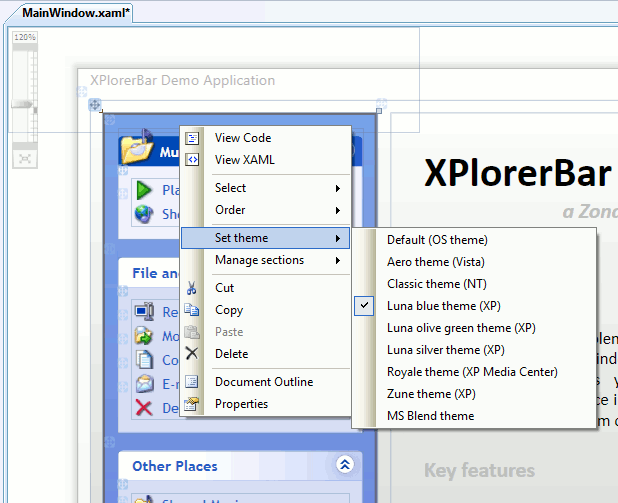
Table of Contents
- Introduction
- Functional Requirements
- Using the Code
- How it Works (Theory)
- How it Works (Application)
- Project Structure
- Adding Context-Menu Items
- Adding Adorners
- Defining Default Initial Values
- Registering the New Features
- Digging Deeper
- Tools
- Feedback
- Future Work
- History
- License
Introduction
In my previous article called XPlorerBar: A WPF Windows XP Style Explorer Bar Control, I provided a WPF implementation of the left side pane that was introduced in Windows XP's Explorer. As this article assumes that you are familiar with the XPlorerBar control, if you have not yet read it, please take a few minutes and read it.
Even if this control is easy to use and easily customizable, its handling still requires writing many lines of code. So, what if we added some design-time shortcuts to write this code for us? I'm sure you agree with me: It would be cool!!!
Therefore, in this second article dedicated to the XPlorerBar control, we will see how design-time features such as custom context-menus, custom adorners or custom initial default values can be added to the various elements of the WPF XPlorerBar control.
Functional Requirements
- Req 01 -
XPlorerBar,XPlorerSectionandXPlorerItemfeatures can easily be configured from design-time context-menus.
The requirements 02 to 05 apply to a selected XPlorerBar in design-time:
- Req 02 - The theme of the selected
XPlorerBarcan be configured from the "Set theme" menu item of its design-time context-menu. - Req 03 - The "Set theme" menu item displays (in a sub-menu) the list of all the built-in themes of the
XPlorerBarlibrary. Remark: The current theme of the selectedXPlorerBaris checked in the list. - Req 04 - The "Allow multiple expands" property of the selected
XPlorerBarcan be configured from the "Manage sections --> Allow multiple expands" menu item of its design-time context-menu. Remark: If the value of the property of thisXPlorerBaristruethen the "Allow multiple expands" menu item is checked. - Req 05 - An
XPlorerSectioncan be added to the selectedXPlorerBarby clicking the "Manage sections --> Add an XPlorerSection" menu item of its design-time context-menu. Remark: The newXPlorerSectionis added at the bottom of theXPlorerBar.
The requirements 06 to 09 apply to a selected XPlorerSection in design-time:
- Req 06 - According to its current state, the selected
XPlorerSectioncan be expanded (or collapsed) by clicking the "Expand" (or "Collapse") menu item of its design-time context-menu. - Req 07 - According to its current position, the selected
XPlorerSectioncan be moved up (or down) by clicking the "Manage section --> Move up" (or "Manage section --> Move down") menu item of its design-time context-menu. Remark: If the selectedXPlorerSectionis at the top of theXPlorerBar, the "Move up" menu item is disabled. Likewise, if the selectedXPlorerSectionis at the bottom of theXPlorerBar, the "Move down" menu item is disabled. - Req 08 - The selected
XPlorerSectioncan be set as "Primary" by clicking the "Manage section --> IsPrimary" menu item of its design-time context-menu. Remark: if the selectedXPlorerSectionis set as "Primary", the "IsPrimary" menu item is checked. - Req 09 - An
XPlorerItemcan be added to the selectedXPlorerSectionby clicking the "Manage items --> Add an XPlorerItem" menu item of its design-time context-menu. Remark: The newXPlorerItemis added at the bottom of theXPlorerSection.
The requirement 10 applies to a selected XPlorerItem in design-time:
- Req 10 - According to its current position, the selected
XPlorerItemcan be moved up (or down) by clicking the "Manage item --> Move up" (or "Manage item --> Move down") menu item of its design-time context-menu. Remark: if the selectedXPlorerItemis at the top of theXPlorerSection, the "Move up" menu item is disabled. Likewise, if the selectedXPlorerItemis at the bottom of theXPlorerSection, the "Move down" menu item is disabled.
Remark: for a better understanding, all the requirements are illustrated in the next part.
Using the Code
All the design-time features are located in the ZonaTools.XPlorerBar.VisualStudio.Design library. To enable the design-time support, make sure this library is located in the same folder as the ZonaTools.XPlorerBar library or in a "Design" folder under the ZonaTools.XPlorerBar library location.
Configuring an XPlorerBar
Setting the theme
- Right-click on the XPlorerBar to be configured, and choose the new theme as shown in the figure below (Req. 02 and 03):

Setting the "Allow multiple expands" property
- Right-click on the XPlorerBar to be configured, and click the "Allow multiple expands" menu item as shown in the Figure below (Req. 04):

Adding a new XPlorerSection
- Right-click on the XPlorerBar to be configured, and click the "Add an XPlorerSection" menu item as shown in the figure below (Req. 05):

Configuring an XPlorerSection
Expanding/Collapsing an XPlorerSection
- Right-click on the section to be collapsed (or expanded), and click the "Collapse" (or "Expand") menu item as shown in the figure below (Req. 06):

Moving up/down an XPlorerSection
- Right-click on the section to be moved up (or down), and click the "Move up" or ("Move down") menu item as shown in the Figure below (Req. 07):

Setting an XPlorerSection as "Primary"
- Right-click on the section to be configured, and click the "IsPrimary" menu item as shown in the figure below (Req. 08):

Adding a new XPlorerItem
- Right-click on the section to be configured, and click the "Add an XPlorerItem" menu item as shown in the figure below (Req. 09):

Configuring an XPlorerItem
Moving up/down an XPlorerItem
- Right-click on the item to be moved up (or down) and click the "Move up" or ("Move down") menu item as shown in the figure below (Req. 10):

How it Works (Theory)
Overview
From the MSDN documentation: "The WPF designer (also called 'Cider') is based on a framework with an extensible architecture, which you can extend to create your own custom design experience".
The extensibility points in Cider (used to "create your own custom design experience") are all metadata based: That means that you use attributes to attach design-time features to your custom controls. Moreover, those attributes are added (for each type of object to extend) to a MetadataStore which is then loaded by the designer. This way, it will be as if you had added those attributes declaratively, but ONLY for design-time.
The Metadata Store
When you create a custom control, the code for your custom control and the metadata defining the design-time behavior of your control are factored into separate assemblies (in order to "physically" separate designer logic from runtime logic).
Thus, for a custom control stored in a library called myCustomControl.dll, there are three kinds of design-time assemblies, loaded in the following order:
- myCustomControl.Design.dll: Used to add design-time features common to both Visual Studio and Expression Blend,
- myCustomControl.VisualStudio.Design.dll: Used to add design-time features to Visual Studio only,
- myCustomControl.Expression.Design.dll: Used to add design-time features to Expression Blend only.
The metadata are factored into an entity called the MetadataStore, that attaches custom design-time features, such as custom adorners or custom context-menus, to specific types.
The MetadataStore is implemented as code-based attributes tables, that means that new features are declared in attributes tables which are then added to the MetadataStore in the Register() method of a class that implements IRegisterMetadata.
Three Categories of Design-Time Features
At this point, we have seen that attributes play a key role in the designer, but we still have not seen the kind of features we can implement with those attributes.
There are three main categories of features you can add to a custom control:
- Context menus - displayed by right-clicking on a selected element, they are used to add new actions to apply to the element (as the existing "View Code", "Order --> Bring to Front", "Delete" and "Properties" context-menu actions).
- Adorners - put on the design surface when a WPF element is selected, they are used to interact with the element and make updates to the XAML. For example, grid lines, anchor lines and the grab handles are all done with adorners.
- Default initializers - they are used to configure initial values for a new object created in the designer.
Those three categories share some basic services provided by the FeatureProvider abstract class. In fact, each time you have to extend design-time for a custom control, you have to derive from the FeatureProvider class or one of its child class.
Thus, the above categories are managed through the following classes:
PrimarySelectionContextMenuProvider: derive from this class to add the context menu items that appear when a control is selected on the design surface,PrimarySelectionAdornerProvider: derive from this class to add adorners that appear when a control is selected on the design surface,DefaultInitializer: derive from this class to configure initial values for a newly created control.
How it Works (Application)
Project Structure
Before we dive into the design-time library code, let's have a look at the library project structure, as seen in Visual Studio's Solution Explorer:

The role of the library classes is explained below:
- [XPlorer*]ContextMenuProvider.cs: this class is used to add new context-menu items to the XPlorer* selected class. It also implements the actions to apply when a new context-menu item is selected.
- [XPlorer*]DefaultInitializer.cs: this class is used to define the initial values to apply to an XPlorer* class created in the designer.
- VisualStudioMetadata.cs: this class is used to add all the new design-time features (as attributes) to the
MetadataStore. - ModelItemCollectionHelper.cs: this class is used to navigate in a
ModelItemcollection.
Remark 1: XPlorer* represents XPlorerBar as well as XPlorerSection or XPlorerItem.
Remark 2: this project only provides new features through new context-menus items. The "Extra_XPlorerBarAdorner" folder is provided as an example, to show how custom adorners could be added to the XPlorerBar object.
- XPlorerBarAdornerProvider.cs: this class is used to add (as well as size and set its placement) the
DesignTimeGlyphadorner to theXPlorerBarclass. - DesignTimeGlyph.cs and .xaml: these classes are used to define the look and feel of the adorner.
Remark 3: in the following sections, all the examples are illustrated with the XPlorerBar object.
Adding Context-Menu Items
Adding context-menu items to an object as the XPlorerBar, is a three-part process:
- defining the new context-menu items,
- updating the status of the context-menu items,
- performing the actions associated to a selected context-menu item.
Defining the New Context-Menu Items
This part takes place in the constructor of the XPlorerBarContextMenuProvider class as shown below:
internal class XPlorerBarContextMenuProvider : PrimarySelectionContextMenuProvider
{
   #region [       Fields       ]

   //'Manage sections' sub-menu item
   private MenuAction _allowMultipleExpandsMenuAction = new MenuAction(
       "Allow multiple expands");
   private MenuAction _addXPlorerSectionMenuAction = new MenuAction(
       "Add an XPlorerSection");

   ...

   #endregion


   #region [       Constructor       ]

   public XPlorerBarContextMenuProvider()
   {
      ...

      #region 'Manage sections' menu

      //Creates the 'Manage sections' menu which holds the MenuAction items
      MenuGroup sectionsFlyoutGroup =  new MenuGroup("SectionsGroup", "Manage sections");
      sectionsFlyoutGroup.HasDropDown = true;

      //Adds the MenuAction which allows multiple expands on the selected XPlorerBar
      sectionsFlyoutGroup.Items.Add(_allowMultipleExpandsMenuAction);
      _allowMultipleExpandsMenuAction.Checkable = true;
      _allowMultipleExpandsMenuAction.Execute +=
         new EventHandler<MenuActionEventArgs>(_allowMultipleExpands_Execute);

      //Adds the MenuAction which adds a new XPlorerSection to the selected XPlorerBar
      sectionsFlyoutGroup.Items.Add(_addXPlorerSectionMenuAction);
      _addXPlorerSectionMenuAction.Execute +=
         new EventHandler<MenuActionEventArgs>(_addXPlorerSection_Execute);

      //Adds the menu to the ContextMenu provider
      this.Items.Add(sectionsFlyoutGroup);

      #endregion

      //Handles the event raised when the menu is about to be shown
      UpdateItemStatus += new EventHandler<MenuActionEventArgs>

         (XPlorerBarContextMenuProvider_UpdateItemStatus);
   }

   #endregion

   ...
}
There are two points of interest in the listing above:
- an event handler is added on the
Executeevent of each of theMenuAction, which enables to perform the actions associated with the selected context-menu item, - an event handler is added on the
UpdateItemStatusevent of theXPlorerBarContextMenuProviderclass, which gives the opportunity to update the context-menu items just before the context-menu is displayed.
Updating the Status of the Context-Menu Items
The listing below shows the way the status of the "Allow multiple expands" context-menu item is updated:
#region [       Updates the context menu       ]

private void XPlorerBarContextMenuProvider_UpdateItemStatus(object sender,
   MenuActionEventArgs e)
{
   //Gets a ModelItem which represents the selected control
   ModelItem selectedControl = e.Selection.PrimarySelection;

   ...

   #region 'Manage sections' menu

   //Enables and unchecks the 'AllowMultipleExpands' MenuAction item
   _allowMultipleExpandsMenuAction.Enabled = true;
   _allowMultipleExpandsMenuAction.Checkable = true;
   _allowMultipleExpandsMenuAction.Checked = false;

   //Gets the value of the selected XPlorerBar 'AllowMultipleExpands' property
   ModelProperty allowMultipleExpandsProperty =
        selectedControl.Properties[XPlorerBar.AllowMultipleExpandsProperty];
   bool allowMultipleExpands = (bool)allowMultipleExpandsProperty.ComputedValue;

   //Updates the 'AllowMultipleExpands' MenuAction status
   _allowMultipleExpandsMenuAction.Checked = allowMultipleExpands;

   #endregion
}

#endregion
There are again two points of interest in the listing above:
- The type (
ModelItem) of the selected control. In the designer, the design environment interacts with controls through a programming interface called an editing model. The design environment uses theModelItemtype to communicate with the underlying model. All changes are made to theModelItemwrappers, which then, affect the underlying model (see more on the editing model later). - The two-part process to extract the value of a property from the selected control:
- First, the
selectedControlproperties are accessed through itsPropertiescollection. To retrieve a specific property (as aModelProperty), use the name of the dependency property to be retrieved as an index in thePropertiescollection:selectedControl.Properties[<DPName>]. - Then, cast the
ComputedValueof theModelPropertyto the proper type.
- First, the
Performing the Actions Associated to a Selected Context-Menu Item
As seen previously, these actions are triggered by handling the Execute event of the context-menu items.
The listing below shows how to set the value of a property of the currently selected control. The main point of interest here is the use of the SetValue method on the proper ModelProperty instance.
#region [       Sets the selected XPlorerBar 'AllowMultipleExpands' property       ]

private void _allowMultipleExpands_Execute(object sender, MenuActionEventArgs e)
{
   //Gets a ModelItem which represents the selected control
   ModelItem selectedControl = e.Selection.PrimarySelection;

   //Gets the value of the selected XPlorerBar 'AllowMultipleExpands' property
   ModelProperty allowMultipleExpandsProperty =
      selectedControl.Properties[XPlorerBar.AllowMultipleExpandsProperty];

   //Gets the value of the item selected by the user
   bool selectedAllowMultipleExpands = ((MenuAction)sender).Checked;

   //Updates the selected XPlorerBar 'AllowMultipleExpands' property
   allowMultipleExpandsProperty.SetValue(selectedAllowMultipleExpands);
}

#endregion
The next listing points out another use of the editing model of the designer with the ModelEditingScope class.
The ModelEditingScope represents a group of changes made to the editing store, that can be commited or aborted as a unit. When an editing scope is committed (by calling the Complete method on the ModelEditingScope instance), the editing store takes all changes that occurred in it and applies them to the model. Remark: to abort the changes, call the Revert method instead of the Complete method.
Another important thing to point out, is the use of the ModelFactory static class that enables the creation of instances of model items in the designer.
#region [       Adds a new XPlorerSection       ]

private void _addXPlorerSection_Execute(object sender, MenuActionEventArgs e)
{
   //Gets a ModelItem which represents the selected control
   ModelItem selectedControl = e.Selection.PrimarySelection;

   //Opens edit mode
   using (ModelEditingScope batchedChange =
      selectedControl.BeginEdit("Adds a new XPlorerSection"))
   {
      //Creates a new XPlorerSection
      ModelItem newItem = ModelFactory.CreateItem(e.Context, typeof(XPlorerSection),
         CreateOptions.InitializeDefaults, new Object[0]);
      //and adds it to the selected control children
      selectedControl.Properties["Items"].Collection.Add(newItem);

      //Commits all changes made in edit mode
      batchedChange.Complete();
   }
}

#endregion
Adding Adorners
Even if this part is not required to fulfill the functional requirements detailed at the beginning of this article, some code is provided in the "Extra_XPlorerBarAdorner" folder as an example of how adorners can be integrated into the design model.
To see the design-time adorner in action, uncomment the code below (located in the AddAdornerProviders method of the VisualStudioMetadata.cs file):
#region [       Adds specific adorner providers to the XPlorerBar elements       ]

private void AddAdornerProviders(AttributeTableBuilder builder)
{
   //builder.AddCustomAttributes(typeof(XPlorerBar),
   //    new FeatureAttribute(typeof(XPlorerBarAdornerProvider)));
}

#endregion
And here is the result (notice the "smart tag"-like symbol that appears at the top-right of the selected XPlorerBar):

Programming such an adorner is a two-part process:
- First, the definition of the object to display: done in DesignTimeGlyph.xaml - for the look and feel of the adorner - and DesignTimeGlyph.cs - for the definition of the way the object is created (see more in the
InitializeComponentmethod). - Second, the definition of the way the adorner will be displayed on the design surface: Done in the
XPlorerBarAdornerProviderclass, the process is detailed below.
Except the creation of the DesignTimeGlyph object, done in the constructor, the main points of interest are located in the overridden Activate method shown below:
public class XPlorerBarAdornerProvider : PrimarySelectionAdornerProvider
{
   #region [       Fields       ]

   //ModelItem representation of the selected control
   private ModelItem m_adornedControlModel;
   //Adorner look and feel
   private DesignTimeGlyph m_designTimeGlyph;
   //Panel that holds design-time adorners
   private AdornerPanel m_xplorerBarAdornerPanel;

   #endregion


   #region [       Properties       ]

   //Public accessor of the panel that holds the design-time adorners
   public AdornerPanel Panel
   {
      get { ...}
   }

   #endregion

   ...

   #region [       Creates and sets up the panel that holds the adorners       ]

   protected override void Activate(ModelItem item, DependencyObject view)
   {
      //Saves the ModelItem (adorned element) and handles its changes
      m_adornedControlModel = item;
      m_adornedControlModel.PropertyChanged +=
         new System.ComponentModel.PropertyChangedEventHandler(
         m_adornedControlModel_PropertyChanged);

      //Gets the adorner panel
      AdornerPanel adornerPanel = this.Panel;

      //Sets the size of the design-time glyph
      AdornerPanel.SetHorizontalStretch(m_designTimeGlyph, AdornerStretch.Scale);
      AdornerPanel.SetVerticalStretch(m_designTimeGlyph, AdornerStretch.Scale);

      //Sets the placement of the design-time glyph within the adorner panel
      AdornerPlacementCollection placement = new AdornerPlacementCollection();
      placement.SizeRelativeToAdornerDesiredWidth(1.0, 0.0);
      placement.SizeRelativeToAdornerDesiredHeight(1.0, 0.0);
      placement.PositionRelativeToAdornerHeight(-1.0, 0.0);
      placement.PositionRelativeToContentWidth(1.0, -17.0);
      AdornerPanel.SetPlacements(m_designTimeGlyph, placement);

      base.Activate(item, view);
   }

   ...

   #endregion
}
The overrided Activate method is called when adorners are requested for the first time by the designer. Its main activities are:
- Save a
ModelItemrepresentation of the adorned element and hooks into when it changes. This is useful when the adorner has to be updated each time the adorned element changed. - Create an
AdornerPanelthat will host one (or more) adorner(s). - Set the size of each adorner included in the
AdornerPanel. - Set the placement of each adorner included in the
AdornerPanel.
Defining Default Initial Values
Defining default initial values for a newly created (in the designer) instance of a custom control is the simplest part of the design-time work, as shown in the listing below.
internal class XPlorerBarDefaultInitializer : DefaultInitializer
{
   #region [       Initialization       ]

   public override void InitializeDefaults(ModelItem item)
   {
      //Opens edit mode
      using (ModelEditingScope batchedChange = item.BeginEdit("Creates an XPlorerBar"))
      {
         //Clears 'Height' and 'Width' values of the new XPlorerBar
         item.Properties["Width"].ClearValue();
         item.Properties["Height"].ClearValue();

         //Adds a new XPlorerSection to the new XPlorerBar
         XPlorerSection newSection = new XPlorerSection();
         item.Properties["Items"].Collection.Add(newSection);

         //Commits all changes made in edit mode
         batchedChange.Complete();
      }
   }

   #endregion
}
Registering the New Features
As seen in the How it Works (Theory) part, the final piece of design-time features programming is adding all the new features to a MetadataStore (entity that stores information about the design-time behavior).
When the designer loads a custom control, it looks for a type in the corresponding design-time assembly that implements IRegisterMetadata, instantiates it and calls its Register method automatically.
As a consequence, all the new attributes adding to the MetadataStore are implemented in the Register method of the VisualStudioMetadata class, that inherits from IRegisterMetadata as shown in the listing below:
internal class VisualStudioMetadata : IRegisterMetadata
{
   #region [       Registers attributes to the metadata store       ]

   public void Register()
   {
      //Creates an attribute table that can be passed to the metadata store
      AttributeTableBuilder builder = new AttributeTableBuilder();

      //Adds default initializers of the XPlorerBar elements to the attribute table
      AddDefaultInitializerClasses(builder);

      //Adds context menus on the XPlorerBar elements to the attribute table
      AddContextMenuProviders(builder);

      //Adds specific adorners on the XPlorerBar elements to the attribute table
      AddAdornerProviders(builder);

      //Adds the attribute table to the metadata store
      MetadataStore.AddAttributeTable(builder.CreateTable());
   }

   #endregion

   ...

}
The listing above shows how the new design-time attributes are collected through an instance of AttributeTableBuilder that is then added to the MetadataStore static class.
Finally, let's see how the design-time features are "converted" into attributes and added to the AttributeTableBuilder instance. As the process is identical for context-menus providers, adorners providers and default initializers, let's see the details of the AddContextMenuProviders method only, shown in the listing below:
#region [       Adds context menu providers to the XPlorerBar elements       ]

private void AddContextMenuProviders(AttributeTableBuilder builder)
{
   //XPlorerBar
   builder.AddCustomAttributes(typeof(XPlorerBar),
      new FeatureAttribute(typeof(XPlorerBarContextMenuProvider)));

   //XPlorerSection
   builder.AddCustomAttributes(typeof(XPlorerSection),
      new FeatureAttribute(typeof(XPlorerSectionContextMenuProvider)));

   //XPlorerItem
   builder.AddCustomAttributes(typeof(XPlorerItem),
      new FeatureAttribute(typeof(XPlorerItemContextMenuProvider)));
}

#endregion
The most important point to bear in mind here is that each of the providers implemented is added to the AttributeTableBuilder instance as a new FeatureAttribute associated to the proper custom type.
Digging Deeper
To learn a lot more about the designer, check out these links:
- WPF Designer Extensibility home page in the MSDN,
- Jim Nakashima's (Cider Program Manager) blog,
- Jim Galasyn's Learning Curve 'MyFun' blog,
- 'Urban Potato' blog.
Tools
The project was developed with the following tools:
Feedback
As the reader of this article, your opinion is the most valuable contribution to make this article better. So, please let me know what you think.
I definitely want to hear what the community thinks.
Future Work
- improve the design-time interaction by adding custom panels to configure the various elements,
- enable the setting of text and icon for XPlorerItem and XPlorerSection headers,
- add Blend design-time support.
History
- November 5, 2008 - v1.0
- Initial release
- December 8, 2008 - v1.1
- Added the Blend theme to the built-in themes of the library.
- Added a completely new class for theme management which allows to apply themes to any
FrameworkElementobject. This class replaces the previousThemeManagerclass. - Removed the now useless
ThemeDictionaryclass. - Updated the
XPlorerBarclass so that anXPlorerBarcan now be built dynamically with bindings to a data source. - Renamed the
ExpandableDecoratorclass inXPandableDecorator.
- December xx, 2008 - v1.2
- Added Visual Studio 2008 design-time support.
License
This article, along with any associated source code and files, is licensed under the Code Project Open License (CPOL).